In the god-forsaken year that is 2020, there have at least been a few success stories. Food delivery services have fared well during lockdown, and as the market grows increasingly crowded, leading meal kit company HelloFresh has rolled out a new rebrand designed to help it stand out.
With a new logo and app icon as well as updated illustrations, the rebrand by London-based DesignStudio is a comprehensive new identity for the company. It's certainly a more contemporary look, but users have pointed out a rather glaring problem with the logo and app icon (keeping it well away from our best logos list).

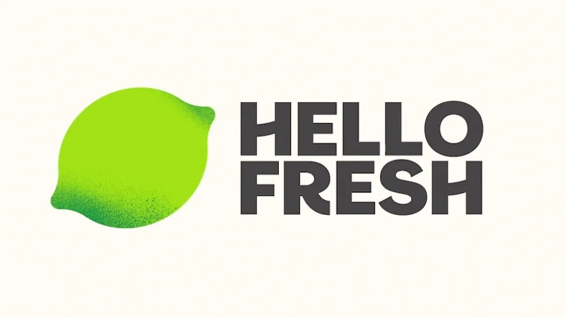
The logo's handwritten font has been replaced by a sharper serif affair, while the smooth, almost cartoon-style lime has been replaced by a flat version with grungier shading. "Our new lime logo still has all the recognisable qualities of its predecessor," says DesignStudio, "but has been simplified to work anywhere – big or small, online or in print, static or rolling across the screen."
The studio has also introduced a delightful series of illustrated 'cooking gestures' (below), designed to give HelloFresh "a fun and distinctive homemade feeling". These will include whisk, simmer and stir, and will adorn the company's packaging.

HelloFresh's previous logo and identity were arguably looking a little tired, and the new look is certainly bolder and more contemporary. Taken at face value, we'd say this is a pleasingly modern new look. The only problem, as users have taken to Reddit to point out, is that it the grungy style doesn't exactly scream 'fresh'.
The new logo is hideous. Just sayin’ from r/hellofresh
"Those colours do not say "fresh food" to me," one user complains. "That looks like something that's been in the fridge too long." Another adds that the icon "looks dirty," while one even suggests that the dark, speckled shading resembles "mould creeping in from the corners." Eek.
The issue here seems to be the app's icon (above) rather than the logo as a whole. Without the context of the lime, it isn't clear that the speckled shading is intended to convey the texture and shape of the fruit, hence the 'dirty' appearance. If HelloFresh could find a way to incorporate the lime itself into the icon, perhaps users would find the new look a little easier to swallow.
While many of the most hated rebrands are top-to-bottom failures, HelloFresh's 'dirty' icon feels like an unfortunate oversight within an otherwise fresh rebrand. Indeed, the icon on users' homescreens will often be the first they see of a new rebrand, so it's important to get it right. If you're looking for inspiration, our best iOS app icons list is a great place to start.
Read more:

