"Lively, buzzy and spirited": Rockstar rebrand ditches traditional energy drink aesthetics
No more dark colours and heavy type.
From Pepsi to Sprite, we've seen plenty of carbonated drink brands refresh their visual identities over the last year. The latest is energy drink Rockstar, part of the PepsiCo family, which has revealed a new look that's all about fun. For more rebrand intel, take a look at our How we made series.
The energy drink market has expanded over the last few years, with the likes of Huel and Prime joining established brands like Red Bull. Founded in 1991, Rockstar is one of the original energy drinks. Its stylised star is one of the sector's more recognisable assets – and it remains front-and-centre in the new identity, the brand's first since being acquired by PepsiCo in 2020. (Check out Pepsi's own nostalgic rebrand from last year.)
To appeal to "more diverse and modern energy drink fans," Rockstar's new look is centred around the 'Press Play' platform it launched in 2023, urging customers to "embrace new experiences and press play on the things they love". A refreshed wordmark joins a new, bright and diverse colour scheme in the new, flavour-forward look and feel. We caught up with Marie-Therese Cassidy, Rockstar's Vice President of Design, Europe, to learn more about the new identity.

How does the new branding bring the ‘Press Play’ ethos to life?
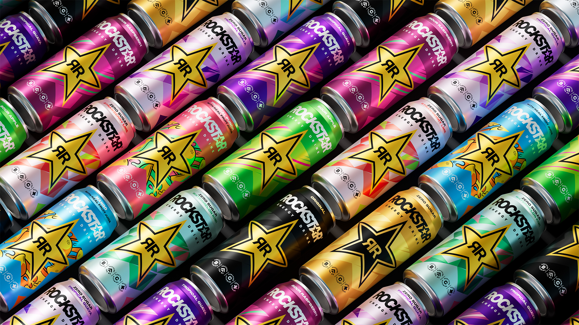
With “Press Play,” Rockstar is encouraging fans to prioritise the things they love to do in life. It's intended to celebrate the decisive, make-or-break moments we experience between work and play. The new look and feel we created is injected with energy and more distinction. It appeals more broadly to “social ignitors” who say yes to the things they love to do. You’ll see this boost of energy in our refreshed star shape and the bright, diverse colour palettes that vary throughout the product range.
How is the new branding designed to reach a new audience?
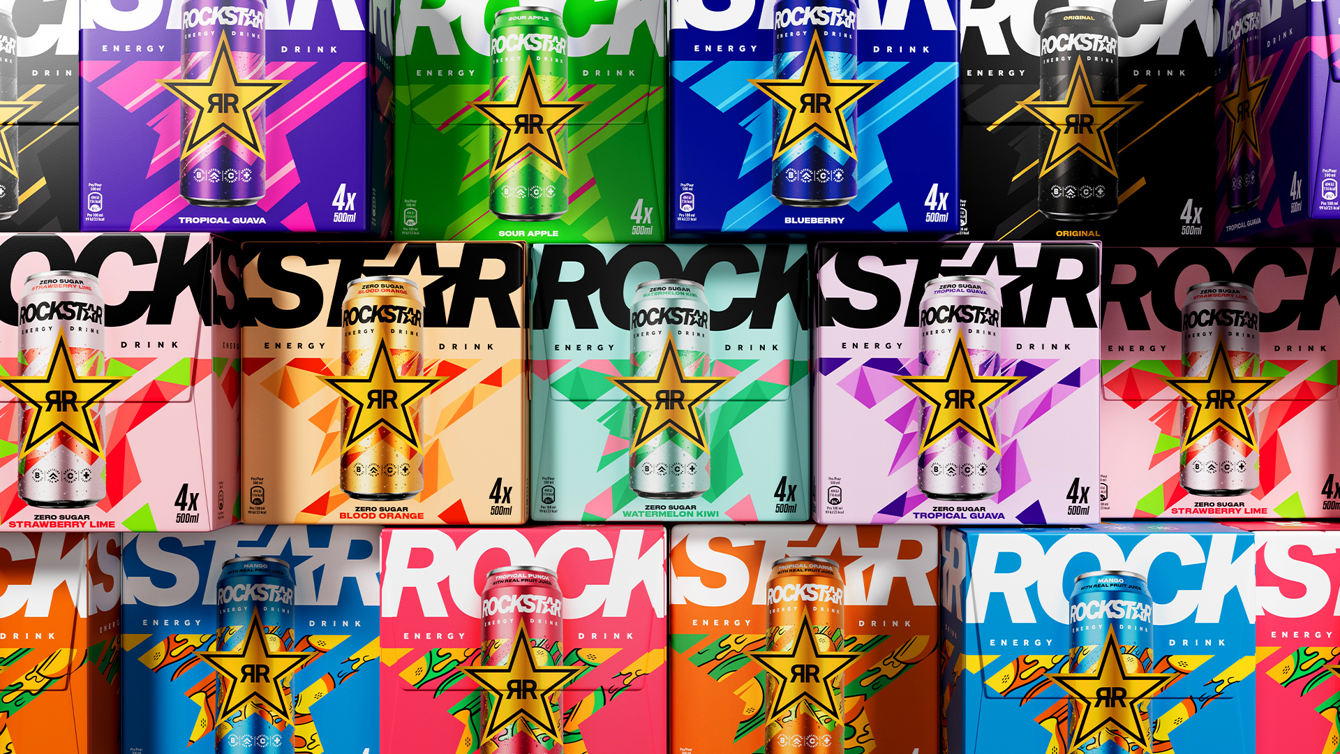
We wanted to draw attention to the variety of flavours, full-sugar, and zero-sugar options we offer, illustrating that there is a Rockstar for everyone. So, for example, behind the iconic Rockstar star, you can find juicy fruits on some cans and dynamic, colourful illustrations on others. Across the Rockstar portfolio, the typography was lightened and given a confident legibility. And the cans and packaging are overall more vivid and bold.
Sign up to Creative Bloq's daily newsletter, which brings you the latest news and inspiration from the worlds of art, design and technology.
What sets Rockstar’s branding apart from that of other energy drinks?
The new visual identity aims for greater inclusivity by differentiating from traditional energy drink norms, which can veer towards darker colours, heavier typography, and high-contrast graphics. We introduced simplicity and levity into the look and feel.
Were there any particular challenges in creating this new branding?
With this new visual identity, we wanted to improve shelf navigability. To accomplish this, we merged the iconic gold star with the refreshed Rockstar wordmark so that both elements are visible to shoppers simultaneously.

There is a playfulness to the new branding and colour palette - how important is this to Rockstar’s refreshed identity?
It’s super important! In addition to the new colour palettes as you mentioned, we infused playfulness with our new repeating star shape throughout the visual identity. This element provides a visual gateway into Rockstar's diverse world of flavours and experiences. And the mood throughout our campaign photography is very lively. It embodies the buzzy, spirited feeling that our social ignitors bring to the world.

Daniel John is Design Editor at Creative Bloq. He reports on the worlds of design, branding and lifestyle tech, and has covered several industry events including Milan Design Week, OFFF Barcelona and Adobe Max in Los Angeles. He has interviewed leaders and designers at brands including Apple, Microsoft and Adobe. Daniel's debut book of short stories and poems was published in 2018, and his comedy newsletter is a Substack Bestseller.
