US Space Force reveals new logo (and gets roasted AGAIN)
To boldly go where others have already been.
Sign up to Creative Bloq's daily newsletter, which brings you the latest news and inspiration from the worlds of art, design and technology.
You are now subscribed
Your newsletter sign-up was successful
Want to add more newsletters?
The United States Space Force hasn't had the smoothest of take-offs when it comes to graphic design. Its first logo was mercilessly mocked for resembling Star Trek's, then Netflix's Space Force show nabbed the trademark rights from right under its nose. The US Space Force has now revealed a brand new logo – but judging by the response online, its woes are far from over.
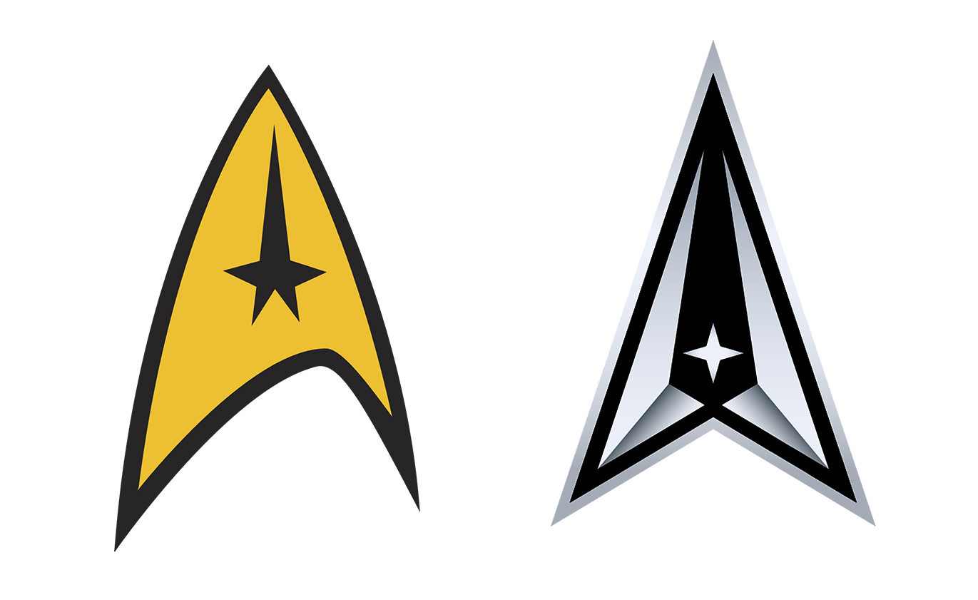
The new logo was revealed yesterday on Twitter, along with a new motto: "Semper supra" (which means 'always above'). The new logo features a triangular delta, adorned with various details related to space (more on those below). But one of the main qualities of our best logos is that they can't be mistaken for anything else – and Twitter users thinks the new US Space Force logo looks very, very familiar.
Today we are proud to showcase the Space Force logo to the world. Over the next few hours, we will share the history and legacy of our new logo. pic.twitter.com/tKe8QCWEiGJuly 22, 2020
Just like the agency's first logo (which the agency is now calling a 'seal', by the way), many are seeing this new symbol as a Star Trek rip-off – only more-so this time. Indeed, the triangular shape containing a star is very reminiscent of the fictional Starfleet's insignia (below). With the Netflix trademark rights debacle and this new round of online roasting, it seems the US Space Force design team can't catch a break (UPDATE: for more galactic logo fun, see the US intelligence office logo that appears to feature a UFO).
Article continues below 
SPACE FORCE: hey can I copy your homework?STAR TREK: sure, just change it up a bit so it doesn’t look obvious you copied.SPACE FORCE: sure thing https://t.co/IxrTpAOM1FJuly 22, 2020
The Space Force has apparently finally settled on a logo and a motto.The logo, to the surprise of no one, is a continued plagiarism of Star Trek (a delta symbol with a North Star inset)Their motto? "Semper Supra," which is Latin for "Always Above."🤦♂️🤦♂️🤦♂️🤦♂️🤦♂️July 22, 2020
As though pre-empting the accusations of plagiarism, the US Space Force account tweeted a series of explanations for why it's definitely not the Star Trek logo. The silver border is said to represent "protection from all adversaries," while the star symbolises the north star, Polaris. The two spires inside the delta represents "the action of a rocket launching into the outer atmosphere".
Space Force logo left. Upside-down Pontiac logo right. pic.twitter.com/jLDX1fvuwqJuly 22, 2020
Despite the explanations, it's hard not to wonder why the US Space Force has launched a second logo that looks even more like Star Trek's, particularly with the addition of the star. Not only that, but said star has opened the logo up to a second comparison – many Twitter users are also suggesting it resembles that of car brand Pontiac (above). Next time the the US government finds itself in need of inspiration, we'd recommend checking out our logo design guide.
Read more:
- Incredible new iPhone leak – you won't believe what Apple might have up its sleeve
- Is this the most confusing movie poster of 2020?
- These are Pantone's most uncomfortable colour tones
Sign up to Creative Bloq's daily newsletter, which brings you the latest news and inspiration from the worlds of art, design and technology.

Daniel John is Design Editor at Creative Bloq. He reports on the worlds of design, branding and lifestyle tech, and has covered several industry events including Milan Design Week, OFFF Barcelona and Adobe Max in Los Angeles. He has interviewed leaders and designers at brands including Apple, Microsoft and Adobe. Daniel's debut book of short stories and poems was published in 2018, and his comedy newsletter is a Substack Bestseller.
