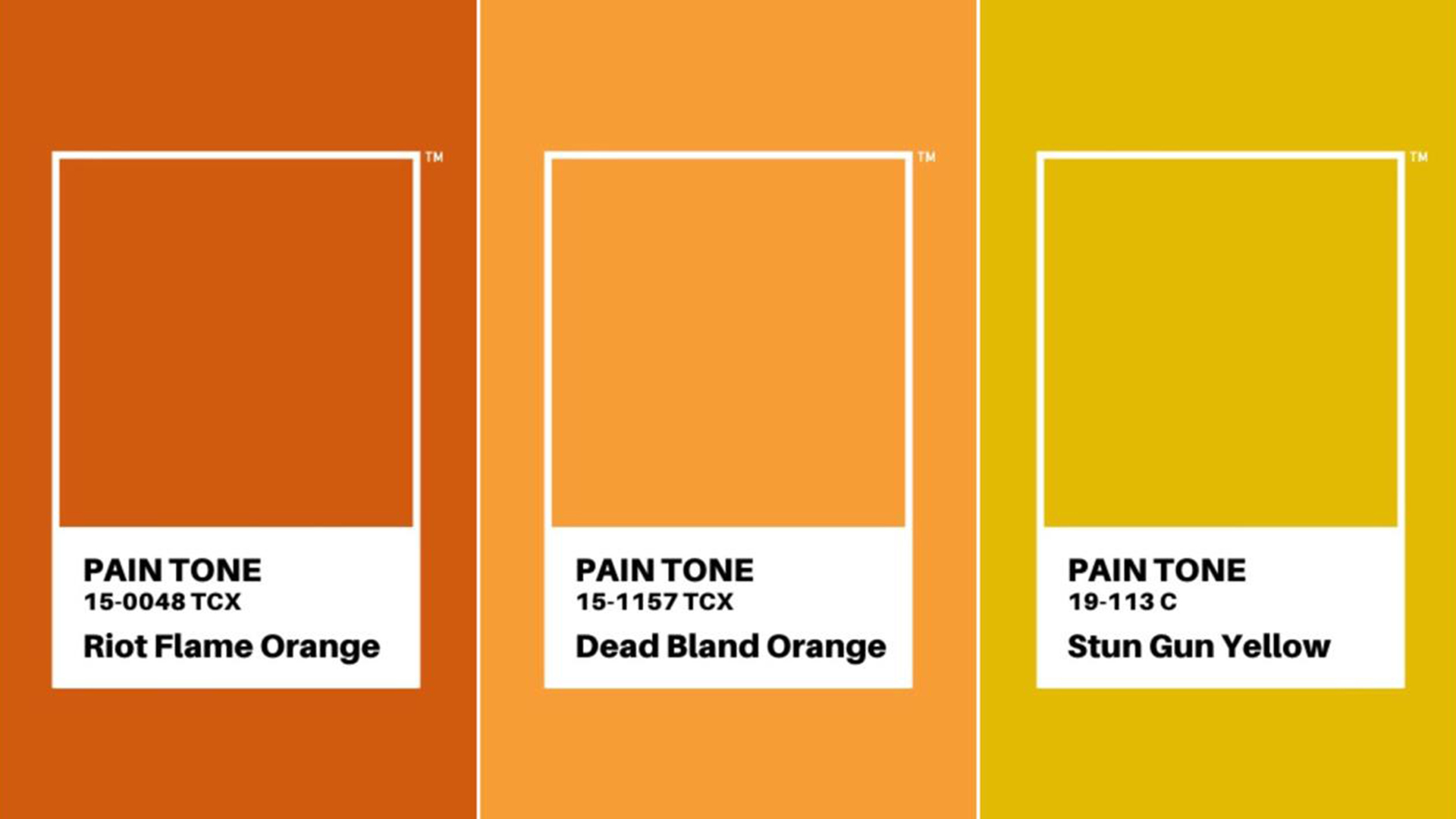
These are Pantone's most uncomfortable colour tones
'Pain Tone' pays tribute to black lives lost.
Sign up to Creative Bloq's daily newsletter, which brings you the latest news and inspiration from the worlds of art, design and technology.
You are now subscribed
Your newsletter sign-up was successful
Want to add more newsletters?
Colour authority Pantone is known for forecasting visual trends with its Colour of the Year, with 2020's Classic Blue offering some much-needed "calm, confidence and connection". But a new project has used the company's colour matching system to capture a much more uncomfortable reality of 2020.
'Pain Tone' features colours taken from footage of the killings of innocent black men, matching aspects to various colours from Pantone's library, with names such as Riot Flame Orange, Stun Gun Yellow and Chokehold Green. The project calls them "the world’s most uncomfortable colour tones". (Check out our guide to colour theory to find out more about the relationship between colour and design.)
Created by Jean Quarcoopome, art director at Ghanaian creative agency Insel Communications, along with art director Abdelrahman Galal and copywriter Pranav Sabharwal, the project is designed to "serve as an immortal reminder in memoriam of each victim, whose last living moment was coloured by hate". The team used plane-tracking AR technology to match the colours against footage of police brutality.
Article continues below 
You can see the full list of 'Pain Tones' on Quarcoopome's LinkedIn page. As well creating and naming the new tones, the team changed Pantone's 2020 colour of the year from Classic Blue to Transparent, as "a call to action for the world to choose to see through a person’s skin colour".
A photo posted by @pantone on Jun 3, 2020 at 8:20am PDT
Pantone also recently showed support for the Black Lives Matter movement by teaming up with artist Fuzzed Up Bear to create a piece called 'Human Being' (above), featuring a black arm framed by Pantone's colour matching system. The piece also contains details for adding your name to the Colour of Change petition, seeking justice for George Floyd after his death at the hands of Minnesota Police officers.
The creative community has come together in support of Black Lives Matter, with one artist even installing a temporary statue of a BLM protestor in Bristol last week. Here are some examples of creative projects supporting the movement, as well as information on how you can help.
Read more:
Sign up to Creative Bloq's daily newsletter, which brings you the latest news and inspiration from the worlds of art, design and technology.

Daniel John is Design Editor at Creative Bloq. He reports on the worlds of design, branding and lifestyle tech, and has covered several industry events including Milan Design Week, OFFF Barcelona and Adobe Max in Los Angeles. He has interviewed leaders and designers at brands including Apple, Microsoft and Adobe. Daniel's debut book of short stories and poems was published in 2018, and his comedy newsletter is a Substack Bestseller.
