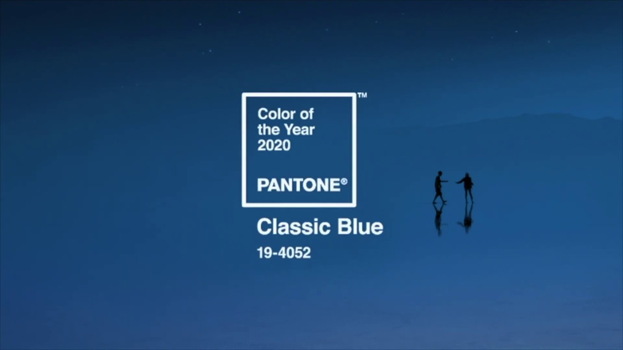
Pantone Color of the Year 2020 has been announced! And this year it has gone for a traditional shade: Classic Blue. Or PANTONE 19-4052 to be exact. The shade is elegant, simple and enduring, and Pantone says it instills "calm confidence and connection". Whatever your opinions on this enduring shade, it's sure to influence graphic design trends in 2020.
It makes sense that we're trending towards less outlandish palettes right now – it feels like we're living in turbulent times, and a calming, dependable shade could the perfect antidote. Or as Pantone puts it: "This enduring blue highlights our desire for a dependable and stable foundation on which to build as we cross the threshold into a new era."
Colour theory suggests blues like this particular shade are restful and tranquil, and Pantone also says it'll promote concentration. Ideal. There's a very zen video you can watch below, if you're feeling frazzled.
Do you agree that we could do with a little stability in our lives right now, or does Classic Blue feel like a dull choice? The jury is still out.
It's certainly a bit of a departure from recent Colours of the Year. In the past few years Pantone has opted for more invigorating or unusual choices – 2019 celebrated the vibrant Living Coral, 2018 was all about the enigmatic Ultra Violet, and in 2017 it threw out all the rules and chose two shades, blended together. Of course, this could just be the repeating cycle of trends making another loop, rather than something more profound.
Read more at Pantone.
Read more:

