Pantone reveals its Colour of the Year 2018
Is this enigmatic colour set to dominate design in 2018?

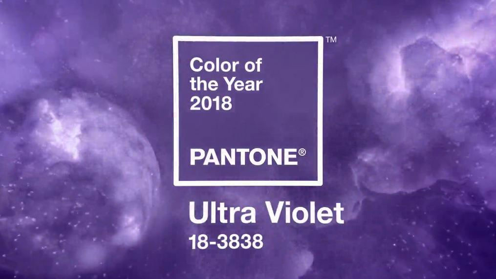
The world authority of colours, Pantone, has just revealed its hotly anticipated Color of the Year 2018. It's the mysterious PANTONE 18-3838 – or to use its catchier name: Ultra Violet. What does this mean from a colour theory perspective? Well, this provocative shade of purple is said by Pantone to communicate originality, ingenuity, and visionary thinking.
Ultra Violet is a stark contrast to Pantone's Color of the Year 2017, which was the zesty and refreshing Greenery, AKA PANTONE 15-0343. Whereas Greenery was all about seeking clarity and finding harmony in a chaotic world, Ultra Violet appears to embrace the unknown.
“We are living in a time that requires inventiveness and imagination. It is this kind of creative inspiration that is indigenous to PANTONE 18-3838 Ultra-Violet, a blue-based purple that takes our awareness and potential to a higher level,” said Leatrice Eiseman, Executive Director of the Pantone Color Institute.
Article continues below“From exploring new technologies and the greater galaxy, to artistic expression and spiritual reflection, intuitive Ultra Violet lights the way to what is yet to come.”
On the Pantone website they go on to explain that Ultra Violet is a complex and contemplative colour that suggests the mysteries of the cosmos. Given that nobody can tell what's going to happen next in the world anymore, we think that it's the perfect choice of colour for 2018.

Ultra Violet isn't the first purple to come out of Pantone this year though. Back in August it honoured the late musician Prince with his own shade of purple, which was inspired by the colour of his custom-made purple Yamaha piano.
However this doesn't mean that the famously counterculture colour is set to become homogenised. “The Pantone Color of the Year has come to mean so much more than ‘what’s trending’ in the world of design; it’s truly a reflection of what’s needed in our world today,” says Laurie Pressman, Vice President of the Pantone Color Institute.
Sign up to Creative Bloq's daily newsletter, which brings you the latest news and inspiration from the worlds of art, design and technology.
“As individuals around the world become more fascinated with colour and realise its ability to convey deep messages and meanings, designers and brands should feel empowered to use colour to inspire and influence.
"The Color of the Year is one moment in time that provides strategic direction for the world of trend and design, reflecting the Pantone Color Institute’s year-round work doing the same for designers and brands.”
Related articles:

Dom Carter is a freelance writer who specialises in art and design. Formerly a staff writer for Creative Bloq, his work has also appeared on Creative Boom and in the pages of ImagineFX, Computer Arts, 3D World, and .net. He has been a D&AD New Blood judge, and has a particular interest in picture books.
