Pantone announces its Color of the Year 2019
Why Living Coral is the colour we need for the year ahead.

Sign up to Creative Bloq's daily newsletter, which brings you the latest news and inspiration from the worlds of art, design and technology.
You are now subscribed
Your newsletter sign-up was successful
Want to add more newsletters?
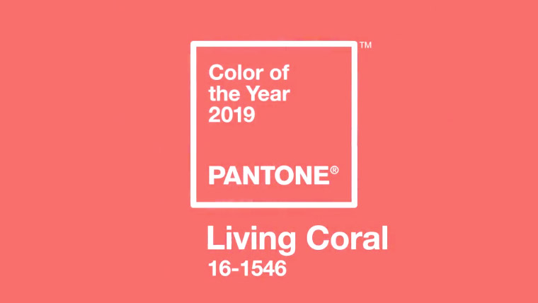
It's that time of year again, Pantone has just revealed its much-speculated Color of the Year 2019. This year the world authority of colours has chosen PANTONE 16-1546, AKA Living Coral, as the hue that's set to shape the year ahead. In terms of colour theory, this shade is a sharp contrast to last year's Ultra Violet, but what does it mean for designers and creatives?
Described by Pantone itself as vibrant, yet mellow, Living Coral is a colour of dynamic contrasts. Although packed with warmth, this colour doesn't dominate. This makes it perfect for bringing out the strength of surrounding colours. We can already see how Living Coral can accentuate other colours, especially smoky blues and teals.
Living Coral also represents an interesting thematic fusion. In its press release, Pantone describes the colour as a nurturing hue that taps into our natural surroundings, while at the same time has the strength of presence to stand out on social media.
Article continues belowThis online awareness was deliberate. Pantone settled on the colour as a reaction to the "onslaught of digital technology and social media increasingly embedding into daily life." It hopes that the engaging nature of Living Colour will encourage lighthearted activity and playful expression, both of which would be warmly welcomed on increasingly fractured and polarised online spaces.

The title of 2019's Color of the Year is no mistake, either. In both name and appearance, Living Coral evokes the vibrant undersea ecosystems that are sadly under threat and becoming more elusive.
And considering that Pantone chooses its Color of the Year with a careful selection process that takes into account trend analysis and socio-economic factors, the decision to reflect threatened sea life gives an idea of how the colour experts currently view the world.
"Colour is an equalising lens through which we experience our natural and digital realities and this is particularly true for Living Coral," says colour specialist Leatrice Eiseman.
Sign up to Creative Bloq's daily newsletter, which brings you the latest news and inspiration from the worlds of art, design and technology.
"With consumers craving human interaction and social connection, the humanising and heartening qualities displayed by the convivial PANTONE Living Coral hit a responsive chord."
Related articles:

Dom Carter is a freelance writer who specialises in art and design. Formerly a staff writer for Creative Bloq, his work has also appeared on Creative Boom and in the pages of ImagineFX, Computer Arts, 3D World, and .net. He has been a D&AD New Blood judge, and has a particular interest in picture books.
