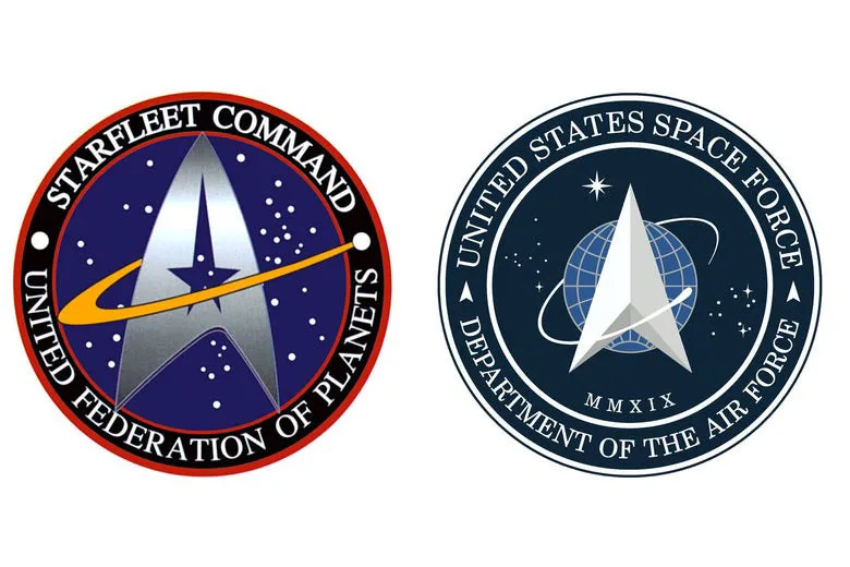
The internet has gone wild over President Trump's 'Star Trek' redesign of the Space Force logo (above right), which was unveiled on Friday 24 January. Reactions to the design have judged it as a hilarious rip off of the fictional Starfleet's logo (above left), and it's true that the new Space Force insignia is extraordinarily similar to that found on the uniforms of the Starfleet personnel. But is it really that simple?
We're somewhat disappointed to point out that the logo redesign may not be as ridiculous as we first thought. Or at least, it looks as if Trump wasn't the first one to emulate the Star Trek logo, anyway. (See our logo design tips for how to craft a unique logo that won't be accused of plagiarism.)
For those excitedly tweeting that Trump stole the Star Trek logo!!!!, the patch on the left was the existing Air Force Command logo. The same one I wore as a Lieutenant in 2005. pic.twitter.com/mYb60YioBPJanuary 24, 2020
John Noonan tweeted the above just after the Space Force furore began, alerting the Twittersphere to the fact that the logo already looked a lot like the Starfleet Command one from Star Trek. The Space Force emblem is the same as it has been since 1982 (when the Government department was called Air Force Space Command – the name changed to Space Force in 2019), the starry background is reminiscent of the original, and there are still loops circling it.
The reduction of the number of loops from four to one definitely emulates the design of the Starfleet logo, that's for sure. But there's more precedent to this design in the history of US space branding, which may let the current incarnation off the hook.

The image above (from this SlashGear article which examines the origins of the various logo incarnations in more detail) shows that the single loop is a proud part of the NASA logo. And different numbers of loops can be found in all of the US Space Command insignia, dating back to 1985.
The circling typography is also in the Space Command logo, though the font and placement is definitely more Star Trek than it has been previously.

So who copied who? Well, the Starfleet logo was actually first found in... drumroll please... 1996. In fact, according to Ex Astris Scientia, the Star Trek Sticker book contains an inscription from Mike Okuda (a graphic designer who worked on Star Trek and created the insignia) that states: "The Starfleet Command seal was first seen on 'Homefront' (DS9) and later in 'In the Flesh' (VGR), although the agency itself, of course, dates back to the original Star Trek series. The symbol was intended to be somewhat reminiscent of the NASA emblem."
The US government branding existed first, and Star Trek emulated it intentionally. However, the current Space Force incarnation is clearly the most like the Star Trek insignia out of all the previous versions, and it could definitely be argued that Trump and his team should have noticed. The design definitely takes parts of the previous logos and puts them together in a decidedly Star Trek-like fashion.
Maybe it's a deliberate branding decision (note: the government says it isn't). Playing with the connotations of futuristic space travel, and enhancing a link between popular culture and the government is sure to invoke strong feeling from the public – whether positive or negative. In either case, it's one of those controversial branding moments that's got people talking – and just before an election, too.
Read more:

