18 controversial moments in logo design and branding
These logo and brand redesigns split opinion right down the middle.
Branding has always had the potential to stir up strong reactions, both in the design community itself and the general public. And the reach of social media means that, nowadays, the news can spread across the globe in no time at all.
Whether it's a rebrand that causes outrage because it undermines an already much-loved brand, an advert that offends or just a widespread dislike for the creative work itself – there are plenty of examples to choose from. Here are some of the most notable logo and branding designs that split opinion across the board on their release. Some are just as controversial today.
01. Slack's logo refresh splits opinion
Speaking of redesigns that under-mine a much loved brand, Slack prompted a backlash from designers and users alike earlier this year when it refined its colourful hashtag logo design.
Article continues belowOn paper, we can see why Slack decided it was time for a brand refresh. Its existing logo involved a lot of overlapping colours that simply didn't work across all mediums. Sure, it looked groovy online, but when printed on advertisements, the design found itself limited by background colours.
In its place, Slack unveiled a new logo that boiled the previous design down to its component parts, refined the concept, and ensured that it had a flexibility the previous version didn't. So of course, everyone hated it.
Many criticised Slack for moving away from a perfectly functional design and for creating something generic. Even our defence of the Slack redesign couldn't win everyone over.
This wasn't the end of the Slack hate though. Shortly after the new logo was announced, Slack changed the background of its mobile from a plummy purple to a crisp white. Cue further outrage that the generic design was now more vanilla.
Sign up to Creative Bloq's daily newsletter, which brings you the latest news and inspiration from the worlds of art, design and technology.
02. Formula 1 gets in hot water
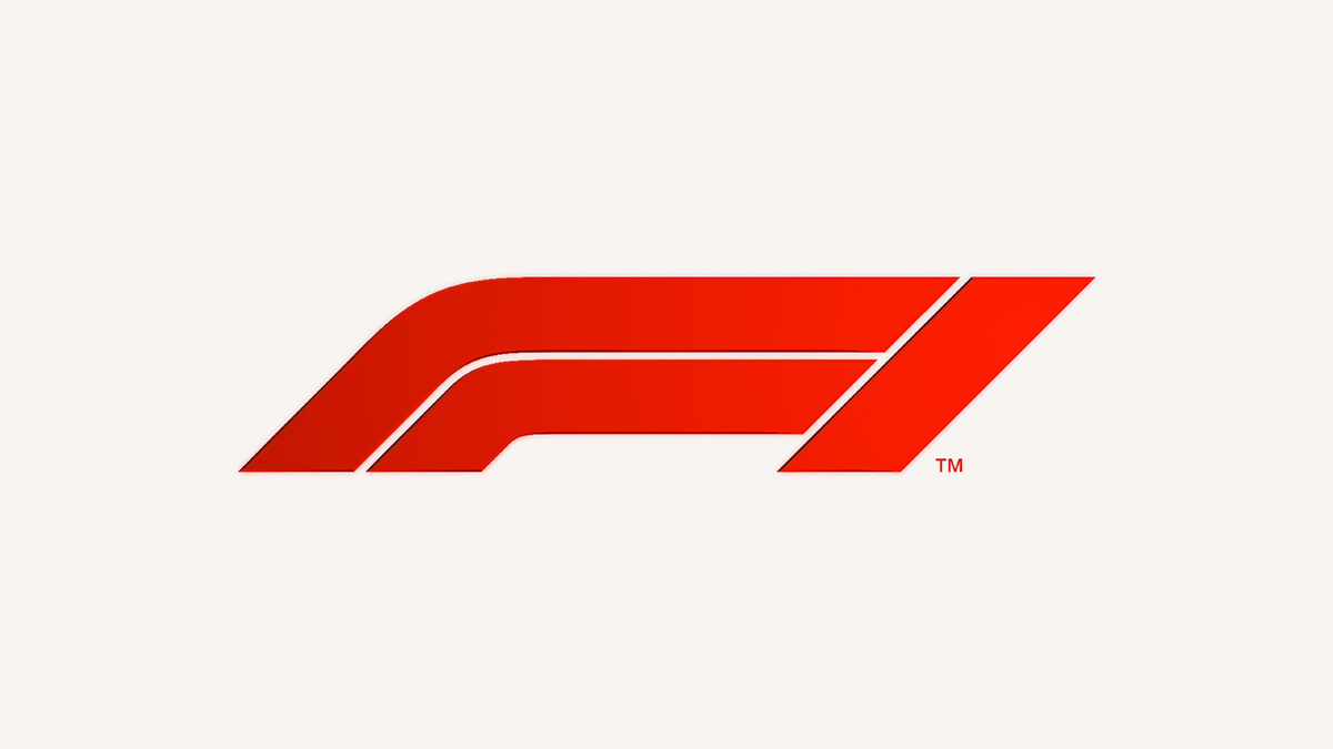
You know a project is controversial once the lawyers get involved, and that's exactly what happened with Wieden+Kennedy's much-discussed rebrand of Formula 1. W+K's work split opinion from the start, with many fervent F1 fans lamenting the loss of its predecessor by Carter Wong, which cleverly nestled the '1' inside the 'F'.
However, the aesthetics of the new logo soon became the least of its problems, when its similarities to a brand of compression tights sold by 3M, maker of Post-It Notes and Scotch sellotape, came to light. Thanks to the existence of F1-branded clothing, the two trademarks in seemingly unrelated sectors came head-to-head in a storm of controversy.
03. Leeds United angers its fans
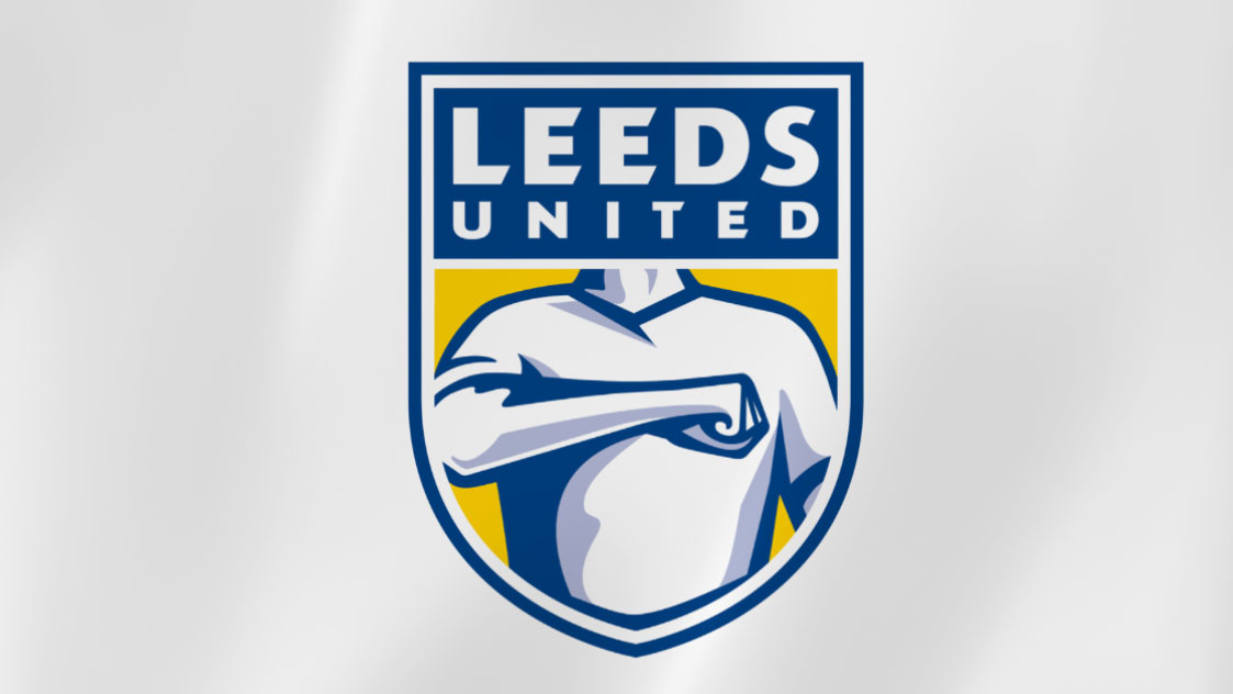
Ostensibly all about celebrating the fans, Leeds United's short-lived rebrand instead incurred their quite considerable, merciless wrath. Leeds' new crest was launched with the proud claim that it had six months of research behind it, and the team had apparently consulted 10,000 people. It soon became abundantly clear that they'd asked all the wrong people.
Taking a gesture used by Leeds FC fans – the fist across the chest – and converting it into an almost clip-art-like vector really didn't resonate. With anyone. After a storm of controversy that went far beyond the fanbase, the new logo was canned.
04. Premier League doesn't kill its lion
Having already courted its fair share of controversy a couple of years before, thanks to Airbnb (number 8 on this list), DesignStudio was publicly in the firing line again in 2016 with its Premier League rebrand.
Premier League commands an engaged, passionate global fanbase, and they were not a bit happy when they heard – as it turned out, entirely incorrectly – that the much-loved lion was being axed from the new logo.
The 'news' was spread far and wide across the media, and fans went ballistic. In one tweet, DesignStudio was even accused of "mocking the death of Cecil" the dentist-murdered lion by doing so. When the bold new rebrand launched, of course, the lion was very much front and centre – which had been the plan all along.
05. Uber drops its giant U

Uber managed to outrage someone other than licensed taxi drivers when it ditched its big 'U' logo – which if nothing else was vital for spelling out icon obscenities on your phone's homescreen – and replaced it with a pair of app icons: one for the 'rider' app, and one for the app used by drivers, or 'partners'.
CEO Travis Kalanick – who worked alongside Uber's design team to create the new logos – has described it as bringing out the company's human side. Others have been less kind, with some pointing out that it's going to be a lot harder to find this new logo on your phone when it's 2am and you're tired and emotional, and others noting its resemblance to a sperm.
As if that wasn't enough, Uber then rebranded again in 2018. This time it was the work of Wolff Olins that caused a stir, with the brand using a wordmark as its new logo. Cue Twitter outrage, naturally.
06. Instagram goes flat
When Instagram changed its logo in 2016, the rebrand was something of a milestone in the shift from skeuomorphism to flat design. The carefully crafted, realistic depiction of a retro camera became a simple, graphic shape filled with a neon rainbow gradient.
Simplicity and minimalism was the goal, but for many Insta fans, it went too far. Like Gap before it (example 13 on this list), it spawned an outcry of derision from 'I could have done that' critics.
Some people called it garish, some said it could have been made using MS Paint in 1995. Others argued that Instagram was desperately trying to be cool, and had thrown the baby out with the bathwater to do so.
Unlike Gap, however, the logo stuck. The brand stuck to its guns, and as it began to grow on people, the fury ultimately died down.
07. The Met kerns with enthusiasm
Wolff Olins stirred up another pot of designer fury with its logo for New York's Metropolitan Museum of Art.
A bold – some might say brave – typographic treatment that merges flare serifs together while playing fast and loose with leading, it was described by Wolff Olins as, "a crafted mark that looks to the past and to the future, or any place in between," while Justin Davidson of Vulture thought it looked more like, "a red double-decker bus that has stopped short, shoving the passengers into each other’s backs."
08. Hillary Clinton's logo misses the mark
When Hillary Clinton revealed her presidential election campaign logo in 2015, people were lining up to criticise its design. Some reckoned it looked like a hospital sign, many believed that its big red arrow symbolised a shift to the right, and many disliked the simple design on the grounds that it just looked amateurish.
Meanwhile WikiLeaks claimed that it had ripped off its own logo, and others with an even slenderer grasp on reality were convinced it contained hidden messages about Hillary sliding into the White House or moving the country sideways.
09. Airbnb makes people snigger
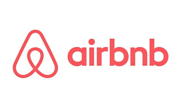
In 2014, accommodation listings website Airbnb launched an entirely new look. The 'Bêlo' logo aimed to symbolise a new era for the business but instead, it got a whole lot of fun poked at it.
Consumers weren't shy in saying what they thought of the look, with some claiming it to be a copy of Automation Anywhere's logo, as well as a few interesting anatomical comparisons (you can read DesignStudio's response to the criticism here).
10. Dirty Bird lives up to its name
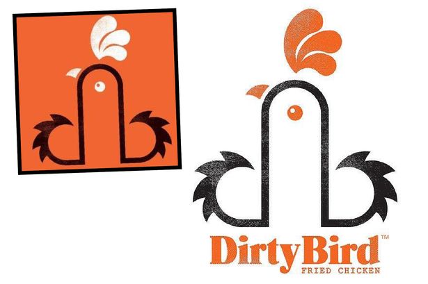
Dirty Bird is a catering company that attends music festivals in and around Wales. While its food is popular, its logo is anything but. The owner has stated that it's "just a clever way for the 'd' and 'b' to go together", but customers have complained about its phallic aesthetics.
Designer Mark James said: "We were given the name Dirty Bird as the brief, and started working on ideas. We looked at the initials, DB. Then worked with the lowercase 'db' linking them to form the shape of a rooster. It's graphic representation of a rooster incorporating the initials. It depends on how you look at it."
The company has also produced posters asking customers to 'Touch My Thigh' and 'Touch My Breast', and 'Get some cock in', so we're guessing it's not entirely innocent.
11. BP attempts a greenwash
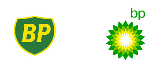
British Petroleum’s $200m rebrand in 2000 was part of a concerted effort to bring 'green' credentials to the global oil giant.
Thereafter known simply as BP, the company adopted the tagline ‘Beyond Petroleum’ and a green-tinged 'Helios' mark, but it was met with considerable public skepticism at the time, with many parodies springing up.
12. London 2012 stokes debate
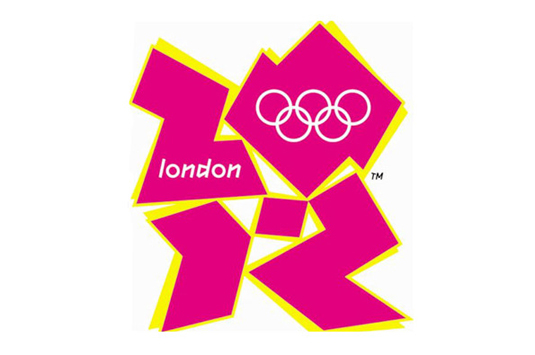
This one went through the mill for sure. Wolff Olins' £400k logo was unveiled in June 2007 to an almost unanimous global chorus of derision – with 80 per cent of people in a BBC poll giving it the lowest score possible.
Of course, WO stuck to its guns and in the patriotic haze of the British Olympic summer it all paid off. Learn about how the logo was originally put together in our piece Typography in Olympics logo design, and read a spirited defence of the much-maligned design in our article Celebrating the majesty of the 2012 Olympics logo.
13. Yves St Laurent goes nude
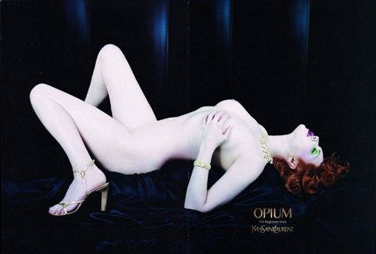
Sporting a provocative, completely nude portrait of fashion model Sophie Dahl, Yves St Laurent's 2000 ad campaign set switchboards alight at the Advertising Standards Authority (ASA), with 948 complaints. The ASA ruled that it was "sexually suggestive" and "likely to cause serious or widespread offence".
14. Gap tries to go vanilla
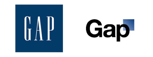
Arguably one of the most famous design-based PR disasters in recent years – and a strong listing in our piece on Classic logos that should never have been changed – Gap's woeful attempt to rethink its iconic navy blue box in 2010 sent ripples around the world. There was universal damnation of its suggested replacement, which combined vanilla Helvetica with a simple gradient. The new logo was withdrawn after a week.
15. Ashley Madison gets banned from Superbowl
Designed to encourage and facilitate 'discreet' extra-marital affairs, AshleyMadison.com is a controversial proposition in its own right. So it's little surprise that its ads (including this one, in which a betrayed wife rips off her clothes and promptly joins the site to get her own back) have been banned from the coveted Superbowl slot several times.
16. Starbucks pares things back
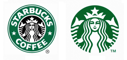
January 2011 brought the coffee giant's decision to drop 'coffee' and even the word 'Starbucks' from its primary logo, bringing the iconic mermaid to the fore instead. Dubbed a "natural evolution", it also heralded the company’s move into different product ranges – but over 500 complaints were left on the company's blog. The logo is widely recognised now, and even made it onto our list of the top 10 big-brand logos.
17. KFC encourages bad manners
Nudity and sexual provocation is one thing, but this 2005 spot for Kentucky Fried Chicken attracted 1,671 complaints in total. Why? Because the call centre operatives in the ad were singing with mouths stuffed with chicken – which according to enraged parents, encouraged bad manners. I wonder if they knew that Kentucky actually looks like fried chicken.
18. University of California gets flushed
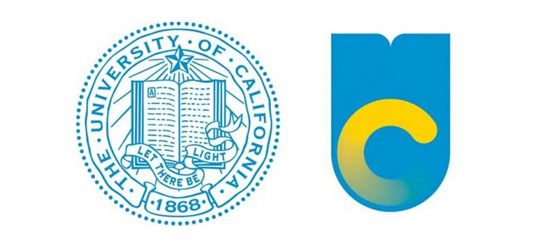
Finally, the University of California's very own 'Gap' moment came in 2012, during which its modernised logo was dubbed a 'toilet bowl' and soundly panned. Created by an in-house design team, it was designed for communications materials and never intended to replace the official seal – but the damage was done, and it was withdrawn from use.
Related articles:

Nick has worked with world-class agencies including Wolff Olins, Taxi Studio and Vault49 on brand storytelling, tone of voice and verbal strategy for global brands such as Virgin, TikTok, and Bite Back 2030. Nick launched the Brand Impact Awards in 2013 while editor of Computer Arts, and remains chair of judges. He's written for Creative Bloq on design and branding matters since the site's launch.
