Celebrating the majesty of the 2012 Olympics logo
Sign up to Creative Bloq's daily newsletter, which brings you the latest news and inspiration from the worlds of art, design and technology.
You are now subscribed
Your newsletter sign-up was successful
Want to add more newsletters?

Five times a week
CreativeBloq
Sign up to Creative Bloq's daily newsletter, which brings you the latest news and inspiration from the worlds of art, design and technology.

Once a week
By Design
Sign up to Creative Bloq's daily newsletter, which brings you the latest news and inspiration from the worlds of art, design and technology.
Once a week
State of the Art
Sign up to Creative Bloq's daily newsletter, which brings you the latest news and inspiration from the worlds of art, design and technology.
Seasonal (around events)
Brand Impact Awards
Sign up to Creative Bloq's daily newsletter, which brings you the latest news and inspiration from the worlds of art, design and technology.
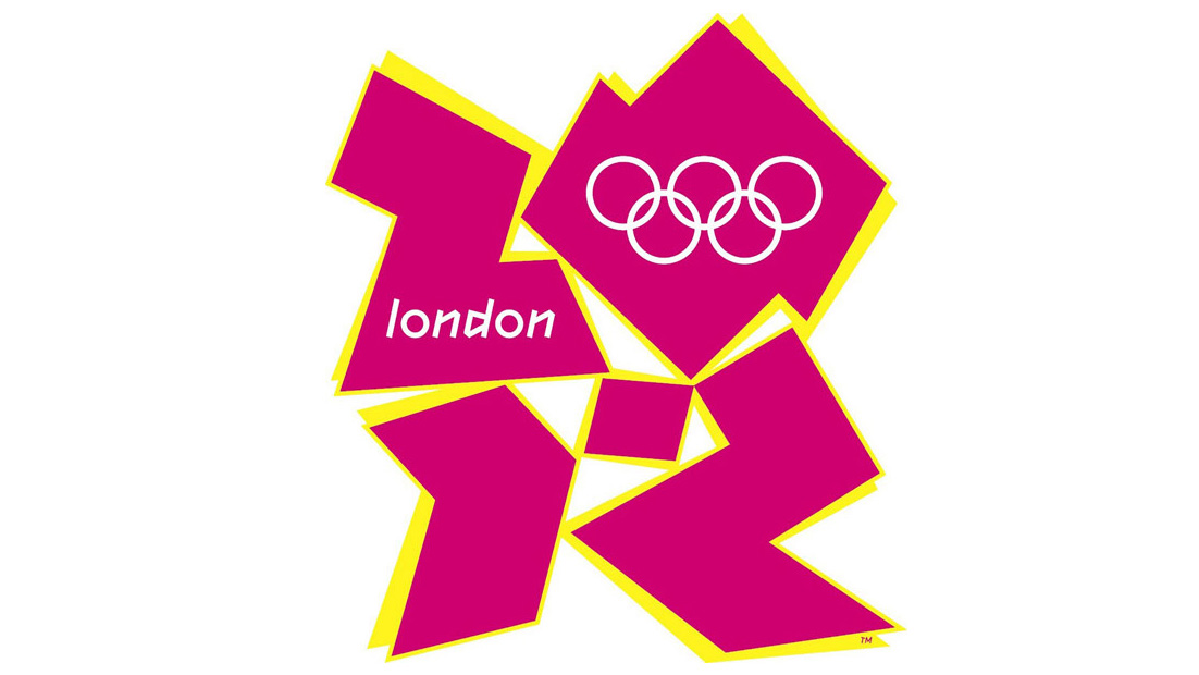
To celebrate the five-year anniversary of the London 2012 Olympics and 10 years since the London 2012 logo design was unveiled (we know, 10 years right), let's revisit designer Joe Stone's opinion piece where he explains why he loves the logo...
It's been mocked and satirised, turned into cubist sexual cartoon imagery and had petitions against it, but Stone believes that the London 2012 Olympics logo design is a fantastic piece of branding that has got everything right.
Ever since the London Olympics logo debuted back in 2007, people have been talking about the logo and whether they love it or hate it. And while there are still plenty of negative reactions to this day, it's stayed in the limelight and remains instantly recognisable.
People love to hate and insult it – after all, we all know that British public love to complain – but, negative comments or not, it remains impossible to ignore. I think the divisive nature of the logo had to be intentional to draw attention to something that could have ended up looking incredibly dull had the designers gone down the obvious route of previous Olympics logos.
Almost every other Olympics logo I can think of compromises the five rings and a colourful swoosh. The fact that Wolff Olins was so bold as to go in such an utterly different direction immediately makes it stand out among the group of otherwise dull and samey icons.
The brilliant use of the CMYK-inspired colour scheme also goes against the tradition of using the host nation's colours, saving us from yet another lame use of the Union Flag plastered across a brand identity.
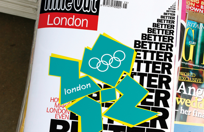
There is nothing wrong in the slightest with being proud of one's nation or heritage, but to do something that stands out as much as this logo does is such a brave and exciting development that really helps to push the expectations of future Olympics branding forward into fantastic new directions, and can only enhance Britain's standing and importance in the design world.
The most common complaint I've heard among the design community is that it simply doesn't look very nice. It's obviously a very subjective matter in the first place, but more importantly I don't think that's what the designers were going for.
London's a cool city. It's cultural and busy and exciting and forward thinking.
The logo isn't representing the Olympic games, it represents London as the venue for them, and frankly 'nice' is too weak a word to describe our bustling capital. It's an edgy city. It's a cool city. It's cultural and busy and exciting and forward thinking, and a flaccid adjective like 'nice' doesn't summarise it at all.
Sign up to Creative Bloq's daily newsletter, which brings you the latest news and inspiration from the worlds of art, design and technology.
Some people think the logo is downright ugly, but London itself was never designed to be aesthetically pleasing. It's a mesh of organically grown streets full of different styles and cultures. It's not an ugly city by any means, but it's not 'pretty'. I think the logo with it's sharp angles, strong shapes, defined edges and bright colours does a great job of representing the actual traits of London.
I see it as a bold, unique and forward thinking logo, which has been applied across the identity in exciting and engaging ways that are impossible to ignore. It does everything that a good identity should do, and it does them well. A triumph, whether you like it or not.
There's not much I remember of the #London2012 Olympics, but one thing I certainly won't forget is the hideous logo for it.27 July 2017
Oh.
This opinion piece was originally written in 2012, and updated in July 2017.
Related articles:
