The good, the bad and the ugly: typography in Olympics logo design
Director of Words & Letters at Monotype Imaging Allan Haley provides unique insight into the use of typography in recent Olympics logo designs.
Sign up to Creative Bloq's daily newsletter, which brings you the latest news and inspiration from the worlds of art, design and technology.
You are now subscribed
Your newsletter sign-up was successful
Want to add more newsletters?
The logo design of the modern Olympics have been striking, sometimes iconic, and always a representation of the design ethic of the time. Powerful and in some cases controversial, designs often become symbolic of a time and place in history, playing a colossal part in the task of marketing of the games around the globe. With technological advancements in typography as the world moves digital, these visual representations have evolved, and their role has become a hybrid solution of facilitating seamless communication between the games and its audience (much `like a brand would communicate with customers) and creating a lasting legacy for the tournament.
The first image and type Olympics logo
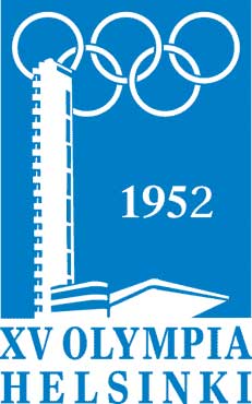
Logos from the early part of the 20th century tended to be designed as if they were a hallmark to be cast or inscribed, and it was not until the 1952 Helsinki games that the first “image and type” design appeared. This was followed by more traditional designs until the 1964 Tokyo games when modern concepts began to be consistently applied to Olympic branding. The simple red Japanese sun, five Olympic rings and sans serif typeface of the 1964 logo still resonates as an icon of contemporary design.
Let's get started
Here I’ll give my own interpretation of the methodologies behind recent Olympic identities, and question what effect the respective hosts were trying to achieve through their choice of font and design.
Article continues belowThe 1996 Atlanta Games
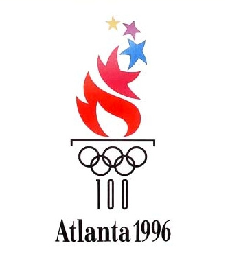
The 1996 Atlanta Games used symbolism for its branding along with a very unusual typeface. The base of the logo, made of the five Olympic rings and the number 100, resembles a classical Greek column and pays homage to the centennial of the games. The flames of the symbolic torch gradually evolve into a star symbolising the pursuit of excellence. Colour also plays an important role. Gold represents gold medals, while green signifies the olive branches worn by winners in ancient games – in addition to Atlanta's reputation as the “City of Trees.”
The designers selected Georgia, a typeface commissioned by Microsoft to address the challenges of on-screen display
The typeface? The design used in the logo is a nondescript serif design reminiscent of Century Schoolbook. The choice for all signage and official content copy, however, was set in a commercial typeface – one which I believe is somewhat of an odd choice. The designers selected Georgia, a typeface commissioned by Microsoft to address the challenges of on-screen display. Created by Matthew Carter, Georgia is a paragon of design legibility – but was not intended for hardcopy communication. Its use marks the first important hardcopy implementation of the design.
While the name “Georgia” probably helped to attract the Olympic committee designers to the typeface, it’s doubtful that they knew the true origins behind the moniker. Carter’s choice was a bit of a jest. He named the typeface after a tabloid headline that was part of the copy he used to set test headlines: “Alien heads found in Georgia.”
The 2000 Sydney Games
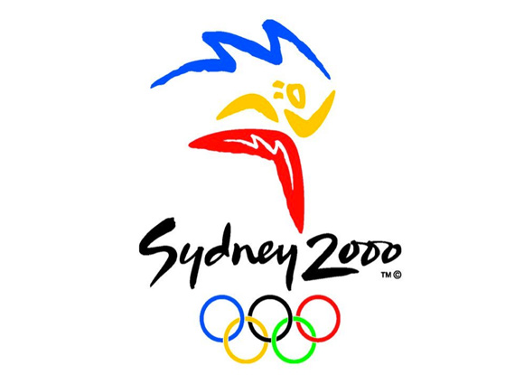
The Sydney Olympic logo is comprised of a brush-drawn figure, also known as the Millennium Athlete. “Sydney 2000” is written in a harmonising brush script and the five Olympic rings. The figure is made from symbols and colours emblematic to Australia. Boomerangs and suggestions of the sun, together with the colours of the ocean and the red of the desert evoke a landscape unique to that continent.
Sign up to Creative Bloq's daily newsletter, which brings you the latest news and inspiration from the worlds of art, design and technology.
Designed in 1997, by Mauricio Reyes, ITC Binary is a soft, semi-serif typeface
While the typography for the logo is hand lettering, the typeface ITC Binary was chosen by the Sydney Olympic committee to be the official 2000 Olympic font. Designed in 1997, by Mauricio Reyes, ITC Binary is a soft, semi-serif typeface that complements the overall design. At the time the logo was unveiled, Reyes said, “Perhaps the greatest honor to me as a designer is to see ITC Binary used as the Olympic font.”
The 2004 Athens Games
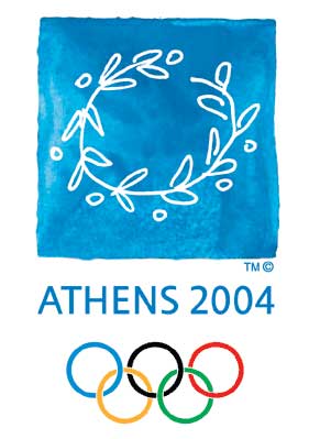
The 2004 Athens Olympic Games logo contains a drawing of an olive branch wreath, “ATHENS 2004” in a hand-drawn epigraphic typeface design, and the five Olympic rings. The wreath, or kotinos, is a reference to the ancient Olympic Games, where it was the official award of Olympic champions.
As in the branding for the previous Summer Olympic Games, the typography for the logo is hand lettering and a commercial typeface was chosen for all the signage and textual content. Gill Sans, drawn by Eric Gill in 1928 for the Monotype Corporation Ltd., was the official typeface for the Athens Games.
Gill Sans, drawn by Eric Gill in 1928 for the Monotype Corporation Ltd., was the official typeface
The Olympic committee’s selection of Gill Sans was influenced partly by ancient stone-cut inscriptions, abundant in Greece. “The shapes of these letterforms, particularly the capital letters, are akin to those of Gill Sans,” said Theodora Mantzari of the 2004 Olympic committee.
In addition to being a lettering artist, Gill also considered himself a stone carver. “He was active in many different fields, from wood-engraving to sculpture, but he always proclaimed this love of one of his earliest skills, letter-cutting in stone, which he continued to practice throughout his life,” wrote James Mosley, a visiting professor at the University of Reading in the UK, in his introduction to Athens 2004 Olympic Games: The Typeface.
The 2008 Beijing games
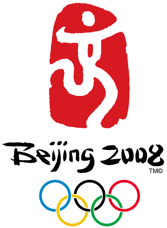
The logo for the Beijing 2008 Olympic Games continued the tradition of incorporating an image, the name of the games in hand lettering, and five Olympic rings.
The image is a stylised person running, or embracing triumph. This figure is intended to represent the Olympic motto of “Citius, Altius, Fortius” or “Faster, Higher, Stronger.” It is also based on the Chinese character “jing” which means capital in Chinese and is the second word of the Beijing’s name. The emblem and the figure within were drawn to look like a Chinese seal. Red, because of its importance to Chinese culture, is the predominate colour in the logo.
The typeface used for the English copy is an italic sans serif that resembles Font Bureau’s Agenda Medium Italic
The tagline to the Beijing Games is “one world one dream,” which is set in both Chinese and English. The typeface used for the English copy is an italic sans serif that resembles Font Bureau’s Agenda Medium Italic.
The 2012 London Games
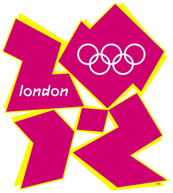
Based on the numbers “2012” and a custom typeface design, the logo for the 2012 London Olympic Games is, perhaps, the most controversial design in the 116-year history of the modern games. Developed by the branding firm Wolff Olins, the logo has been reviled by graphic designers, bloggers, design critics – and the general public. In the International Herald Tribune, Alice Rawsthorn observed that “it looks like the graphic equivalent of what we Brits scathingly call – ‘dad dancing’– namely a middle-aged man who tries so hard to be cool on the dance floor that he fails.”
Developed by the branding firm Wolff Olins, the logo has been reviled by graphic designers, bloggers, design critics – and the general public
The custom typeface, named “2012 Headline,” is an odd combination of characters vaguely looking like a melding of Greek stone carving and graffiti lettering. All letters are angular and slanted – with no curved strokes, save the cap and lowercase ‘O’ – which are also upright in design. (Perhaps these are intended to pay homage to the Olympic rings.) In fairness to the design, however, it is not intended for informational elements. It is meant to create awareness, impact and memorability as a headline typeface. 2012 Headline is combined with Futura (a much more legible typeface design) for textual content.
In addition to triggering controversy, the custom typeface for the 2012 London Games certainly carries on the tradition of designs that are striking and powerful. It remains to be seen if it will also be iconic.
Why not check out our typography tutorials, and view glossary of type terms if you've ever pondered the question What is Typography?.

The Creative Bloq team is made up of a group of art and design enthusiasts, and has changed and evolved since Creative Bloq began back in 2012. The current website team consists of eight full-time members of staff: Editor Georgia Coggan, Deputy Editor Rosie Hilder, Ecommerce Editor Beren Neale, Senior News Editor Daniel Piper, Editor, Digital Art and 3D Ian Dean, Tech Reviews Editor Erlingur Einarsson, Ecommerce Writer Beth Nicholls and Staff Writer Natalie Fear, as well as a roster of freelancers from around the world. The ImagineFX magazine team also pitch in, ensuring that content from leading digital art publication ImagineFX is represented on Creative Bloq.
