
If something's struck you as not quite right about your phone's home screen this morning, here's the reason: Uber has just launched its second new logo design in under three years, and it's making waves, if not for the best reasons.
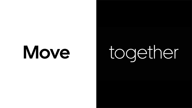
On first sight, the new Uber logo looks like it's doggedly following the recent trend for wordmarks in bespoke fonts. It's the work of the ever-controversial Wolff Olins – who you'll remember for the 2012 Olympics logo and the similarly provocative Met rebrand – along with the Uber Brand Experience Team. Of course, it includes a bespoke font, Uber Move – a sans serif by MCKL Type Foundry, which was inspired by typefaces usually associated with transportation, and designed to look friendlier than the previous, more aggressive typeface, Clan Pro.
If you've just found the new logo on your phone, you might find it hard to be pumped about this new design; it's the word 'Uber' in white on a black background, a style we've seen just a little too much of over the past year.
Thankfully, however, there's more to this rebrand than a disappointing wordmark. It is, you'll doubtless be astounded to learn, part of a larger design system that's built to embody a sense of mobility and to look good and be understood in any of 660-plus cities in the world that Uber operates. As Wolff Olins explains, "instead of pursuing a complex system to be localised through colours and patterns, we moved towards a universal 'beyond-simple' global brand that teams on the ground could localise with content relevant to their audiences."

Naturally, a rebrand like this is never going to please everyone, and reaction to the Uber redesign has been deliciously mixed, ranging from cautious approval through to traditional designer rage.
I'm sorry what the fuck just happened to the @uber logo #ReleaseNotes pic.twitter.com/gQrCgJph1mSeptember 13, 2018
Say it louder for the people in the back: Uber's new logo is poorly kerned and doesn't compensate for the round b and e letterforms in the middle. It looks like Ub er pic.twitter.com/ij4qIpsusESeptember 12, 2018
New Uber logo is friendly :) I like this part of the brand book next to photos of road segments. I def. like the idea of pushing a wordmark. Good job folks who worked on this! (FWIW I still use @lyft primarily)Uber brand book: https://t.co/mHwmZ4puPG pic.twitter.com/22Gfh6923bSeptember 13, 2018
I like Uber's rebrand a lot. #designtwitter gave a lot of 💩 about how simple the logo is. I highly recommend you look at the whole system, and its purpose. Even though I loved the authenticity of the last Uber brand, I think the new brand is ace! Much more flexible, and slick.September 13, 2018
Uber's new identity seems friendlier, though given their rep idk why they didn't add some happy colors, go full rounded sans for the wordmark, or just make the new logo a kitten https://t.co/FpRmL6acKrSeptember 12, 2018
Uber rebranded but the problem is the company is still called “Uber.” https://t.co/wcRnrV4x08September 13, 2018
You can take a closer look at the new Uber logo and design system over at Wolff Olins.
Related articles:

