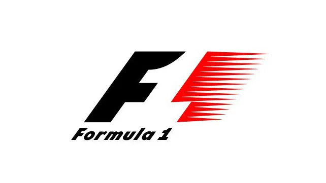
The world's premier racing championship, Formula 1, unveiled its first rebrand for 23 years at the close of the Etihad Abu Dhabi Grand Prix on Sunday. Featuring a sleek red logo and three typefaces, the rebrand replaces the familiar Carter Wong studio negative space logo (above), which Formula 1 has been using since 1994.
The new identity (shown below) was created by a team at Wieden + Kennedy London led by Richard Turley. Formula 1's director of marketing, Ellie Norman, says that the refresh “speaks to the core of why people loved the sport in the first place."
Eagle-eyed fans were aware that a change was on the way when trademarks were applied for new Formula 1 logos earlier in the month. Out of these three candidates, the streamlined logo was chosen. See it below by clicking left to right through our gallery.


Whereas the previous logo focused on a clever use of negative space to showcase the Formula 1 name, the new design echoes the long, flat shape of an F1 car. By keeping the design close to the ground, this helps to communicate a sense of speed. This is a subtler representation compared to the old logo, which used dynamic red spikes to get the racing angle across.
Turley reveals the thought process behind the logo: "creatively, the challenge was to reposition Formula 1 as a forward-facing entertainment brand, which works across a multitude of channels."
Norman talked to fans of the sport to find out what the rebrand needed to focus on. "It was about racing," she explains. "But many felt those days were behind us and that the sport has become almost impenetrable for fans, particularly new ones.
“It was clear we were going to need to address some fundamentals of our brand, if we were to realise our ambition to make Formula 1 a major entertainment player and claim our rights to be the global media brand we should be. What we say and do now is so important for our future, but it must always be driven by our fans. They come first.”
Accompanying the new logo is a trio of typefaces by French designer Marc Rouault, which you can explore in our gallery below.


Rouault hopes that the sleek and curved look of the typefaces evoke the retro aspect of the motorsport in a similar fashion to the new logo.
To give designers an insight into how the logo developed, the team behind it has shared pages from an internal booklet that collect together dozens of potential variants.
It's interesting to see the various ways in which the design team reimagined the Carter Wong F1 icon, a design which set an intimidating benchmark for all involved.


When it comes to new logos there are always detractors who cling on to the previous iteration. But for a property as huge as Formula 1, the amount of attention has been immense. Fans seem to be split on what to make of it, and racing drivers themselves have also weighed in on the debate.
Lewis Hamilton said: "The old one was iconic, and the new one isn't." Meanwhile former World Champion Sebastian Vettel was more blunt with his observation: "I liked the old one better."
Rebrands always take time to settle, though, and perhaps once we see it in action properly more people will be won over by the new logo. In fact you can get a taste of what to expect right now by watching it in this teaser promo for the next season.
Related articles:

