Bentley just changed its iconic logo (and it's perfect)
Sometimes it pays not to reinvent the steering wheel.

Sign up to Creative Bloq's daily newsletter, which brings you the latest news and inspiration from the worlds of art, design and technology.
You are now subscribed
Your newsletter sign-up was successful
Want to add more newsletters?
While it seems like every car brand under the sun has rebranded in the last half a decade, the luxury brands have been a little slower on the uptake. This might because when it comes to logos, these brands have even more heritage to honour. F**k around and they might, like Jaguar, find out.
The best rebrands we've seen from luxury car brands in recent years have been of the subtler variety, updating existing assets to give them a hint of modernism while retaining that sense of storied history. Rolls-Royce did it well, and now Bentley has shown it has the right idea.
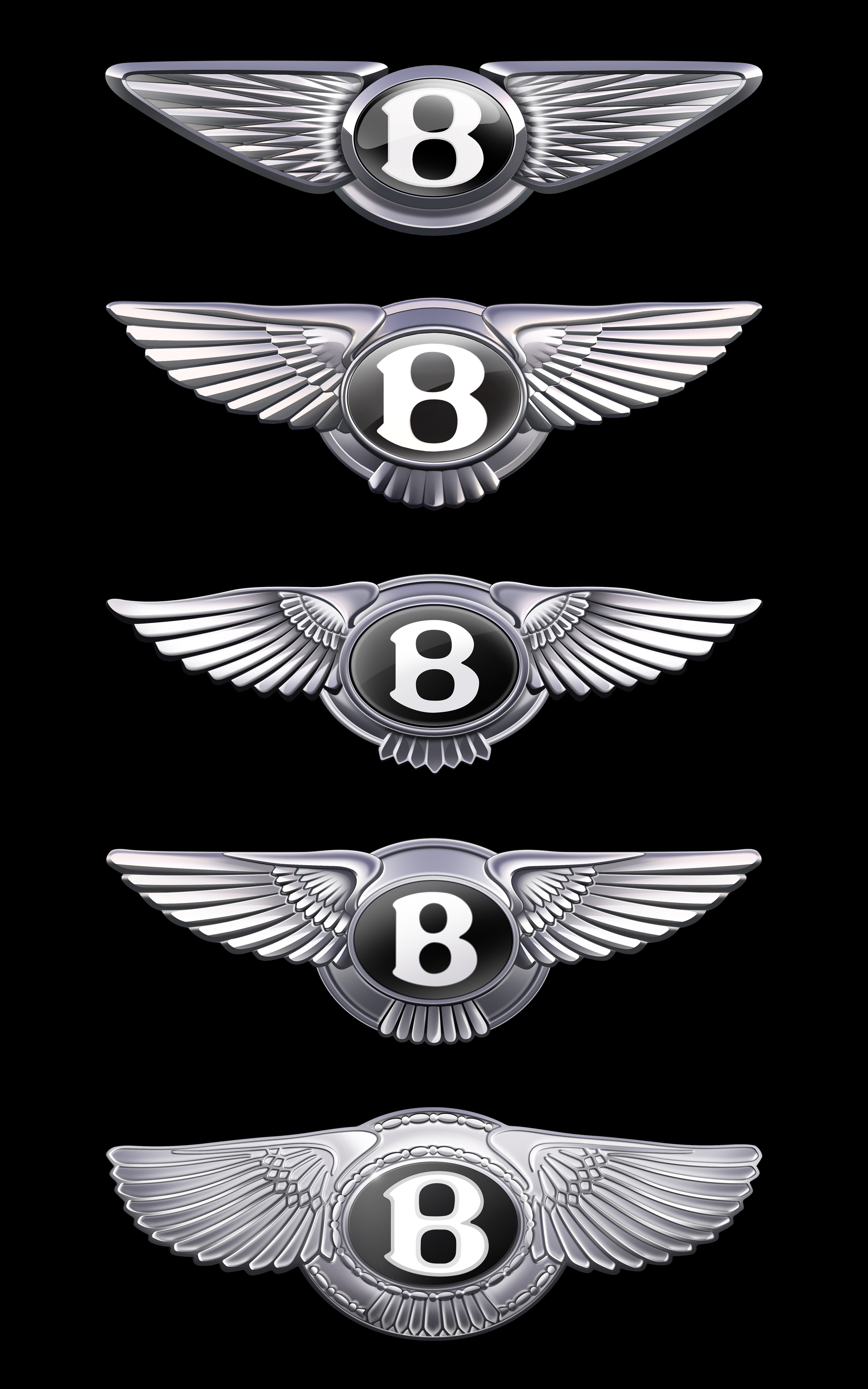
Bentley has revealed what is just the fifth iteration of its logo in the luxury car brand's 106-year history, and as with every update so far, it's a subtle tweak on the existing design.
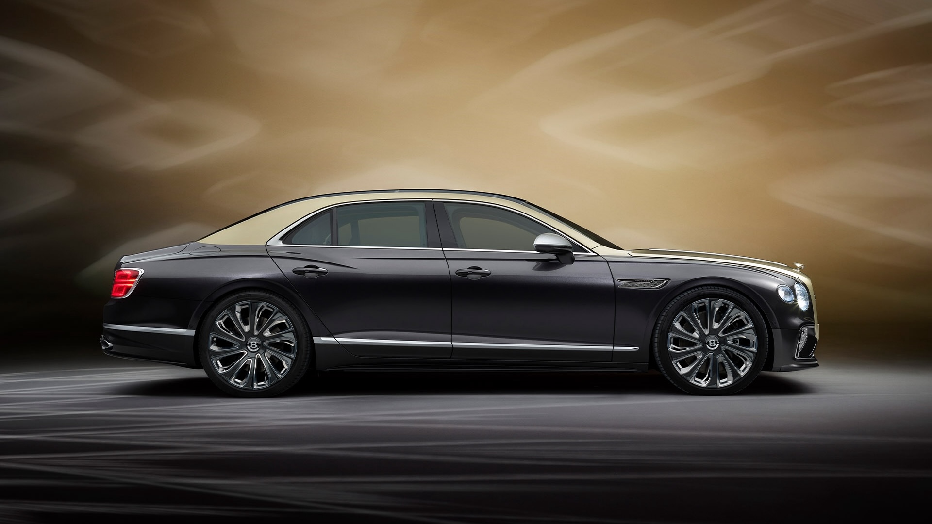
Article continues belowSet to appear on a new concept car due to be revealed on 8 July, the new emblem sees the 'winged B' updated to feature wings that are "sharper and more dramatic than the outgoing version – more reminiscent of the angled wings of a Peregrine Falcon."

Bentley says the new design was proposed by Young Nam, a member of Bentley's Interior Design team, and was then developed and detailed into the final version by Robin Page, supported by a small and dedicated internal team.
"“If a luxury brand is the product of the stories it has created, then its emblem is its signature," Page says in a press release. "In more than a century of history, this is only the fourth evolution of Bentley’s iconic Winged B, and redesigning it was a formidable task for which we’ve taken great care. In an era of ever-increasing complexity and fidelity from digitalisation, an exercise of simplification and refinement is a modern necessity – and so the new emblem is cleaner, sharper and more impactful than its predecessor."
Indeed, while it might not reinvent the wheel, the new iteration of the logo manages to retain the shape and elements of the iconic original whilst simplifying it for digital applications. Whether viewed on a car bonnet or an iPhone screen, the logo still recognisably belongs to Bentley.
Sign up to Creative Bloq's daily newsletter, which brings you the latest news and inspiration from the worlds of art, design and technology.

Daniel John is Design Editor at Creative Bloq. He reports on the worlds of design, branding and lifestyle tech, and has covered several industry events including Milan Design Week, OFFF Barcelona and Adobe Max in Los Angeles. He has interviewed leaders and designers at brands including Apple, Microsoft and Adobe. Daniel's debut book of short stories and poems was published in 2018, and his comedy newsletter is a Substack Bestseller.
You must confirm your public display name before commenting
Please logout and then login again, you will then be prompted to enter your display name.
