The 20 biggest logos of 2017
Sign up to Creative Bloq's daily newsletter, which brings you the latest news and inspiration from the worlds of art, design and technology.
You are now subscribed
Your newsletter sign-up was successful
Want to add more newsletters?
Five times a week
CreativeBloq
Sign up to Creative Bloq's daily newsletter, which brings you the latest news and inspiration from the worlds of art, design and technology.
Once a week
By Design
Sign up to Creative Bloq's daily newsletter, which brings you the latest news and inspiration from the worlds of art, design and technology.
Once a week
State of the Art
Sign up to Creative Bloq's daily newsletter, which brings you the latest news and inspiration from the worlds of art, design and technology.
Seasonal (around events)
Brand Impact Awards
Sign up to Creative Bloq's daily newsletter, which brings you the latest news and inspiration from the worlds of art, design and technology.
Whether or not you work in logo design, whenever a big brand refreshes its identity it’s worth checking out.
New logos are released with such regularity it sometimes can be difficult to keep track of them. So to help you out, we’ve compiled the biggest logo designs of 2017. Together, they make an interesting snapshot of the last 12 months in design.
Note that the word here is ‘biggest’. We’re not saying that these were the ‘best’ of 2017; simply that they garnered the most attention, for whatever reason...
01. Tinder
This August, popular dating app Tinder took a radically approach to its visual identity. To accompany the launch of a cleaner new look and interface design, it discarded its sans-serif wordmark and replaced it with a simple icon; essentially a wider and rounder version of the flaming dot on the previous logo’s ‘i’.
The new symbol, which has been given a nice colour gradient to add warmth, was created by DesignStudio in collaboration with Tinder’s in-house design team. You can learn more about the new branding here.
02. Juventus
It’s not that surprising when an app abstracts its logo down into a simple symbol. But it’s far less
common (yet) for a sports team to do so. So it took the design community by surprise this January when Italian soccer superstars Juventus released this new design, taking a huge leap forward from its previous, fussier shield emblem.
Sign up to Creative Bloq's daily newsletter, which brings you the latest news and inspiration from the worlds of art, design and technology.
Surprisingly minimalist, the new logo, created in-house, shocked many by abandoning the shield element altogether, although does manage to incorporate the traditional black-and-white stripes of the team’s strip as a nod towards continuity. You can learn more about the new branding, which won two D&AD awards, here.
03. Dropbox


In October, file storage service Dropbox caused a big stir by announcing “the biggest change to [our] look in our 10-year history.” This colourful new visual identity was designed by American studio Collins in collaboration with Dropbox’s in-house team, Instrument, XXIX, Sharp Type and Animade. Its radical use of clashing colours attracted a lot of criticism, and the less dramatic changes to the logo itself flew under many people’s radars.
Despite the relatively minor nature of the logo update, though, it still alters the design from the previous version in some meaningful ways. More obviously, the icon has been transformed from a recognisable three-dimensional box into what the designers call “a collection of surfaces”.
This follows the general trend in logo design to simplify icons over time, but while the new shape is more minimal and geometric, many questioned whether it was still recognisable as a box.
Less controversially, the wordmark has also been updated, with a new cleaner look based on Sharp Grotesk, and shift in colour to black to more easily separate the two elements of the design. You can learn more about new Dropbox branding here.
04. YouTube
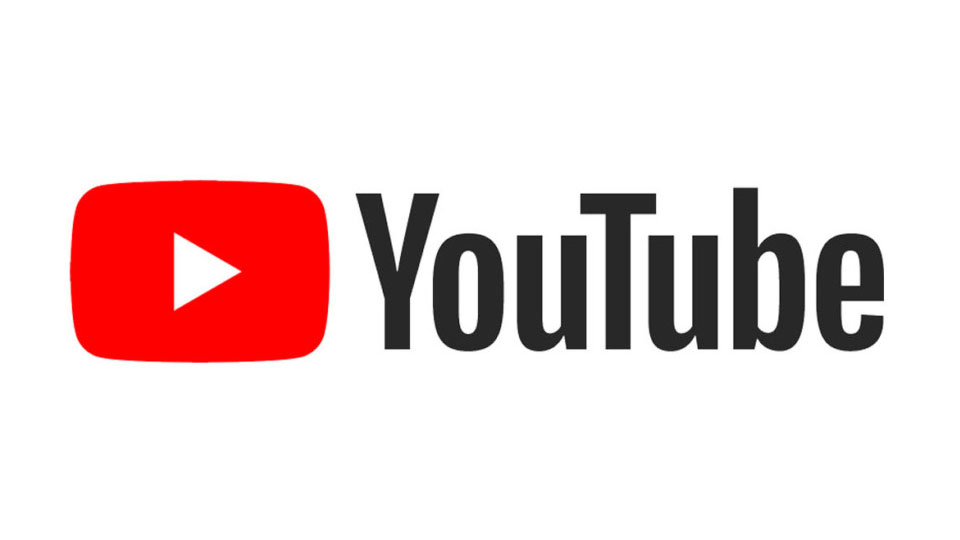
In August, YouTube launched a brand new logo , its first redesign since 2005. The name of the brand was no longer boxed by a red screen; that element has now been given a brighter, more vivid colour. It’s #FF0000, which the in-house designers told The Verge was “a really pure red that goes to the RGB of video”. The screen device now contains a play button, placing the brand’s central ‘call to action’ at the heart of the new branding.
The logo’s lettering has also been changed, with the team discarding the previous font, Alternate Gothic Number Two, and designing their own, which was inspired by styles from classic TV and the VHS era, as well as “the essence of print”. You can learn more about the new branding here.
05. Huffpost
Founded in 2005 by Arianna Huffington, the liberal news blog Huffington Post has gone from strength to strength. So it was about time that it got a proper wordmark, rather than the variety of newspaper-style titles it had been using.
In April, the newly named HuffPost released this logo, which was created by New York agency Work-Order. It’s typeset in the Klim Foundry font National, and set in bold italic because, according to a press release, “they point us forward”, as well as being “reminiscent of the slashes in URLs”.
You can see more of the new branding for HuffPost here, and read about how designers reacted here.
06. Pinterest
In August, another web titan released a new logo that pushed things forward without throwing the baby out with the bathwater. Without as much as a blog post, Pinterest sneaked out this new logo , which swaps the script lettering of the previous design for a new, more formal wordmark cast in Neue Haas Grotesk.
While there was no official explanation of the new identity, some have speculated that the website, which is popular for lovers of craft, scrapbooking and interior design, is trying to attract a broader audience, particularly amongst men. Others have suggested that the quite different fonts of the new wordmark and the (unchanged) icon work poorly together, presenting a brand that’s unsure of its identity.
You can read the full brand guidelines for the new logo here.
07. Converse
One of the biggest design trends of 2016 was the revival of old brand identities by the likes of NatWest, Kodak and Co-op. And there was a bit of that in this year’s new logo for Converse .
“The star chevron has been in use since the '70s and we wanted to make it a major part of our identity,” Adam Cohn, VP global brand design told Cool Hunting. “So the idea was: ‘Let’s leverage an icon that’s part of our heritage that’s also representative of moving forward. The challenge was getting our name in the mix so we had to develop a new wordmark.’”
That wordmark, based on heavyweight sans-serif fonts, was created by combining of four or five different past versions of the logo, harking back to lettering from the 1920s and 30s.
The reaction from the design community was mixed, though. Opinion was divided on the unusual angling of the star, and there wasn’t exactly a chorus of praise for the new wordmark either, with its apparent inconsistencies and questionable kerning.
It’s important to note, though, that this new logo was designed (in-house) to represent the Converse company; the well-known Converse All Star/Chuck Taylor brand logo is not affected by the redesign and remains intact.
08. Science Museum
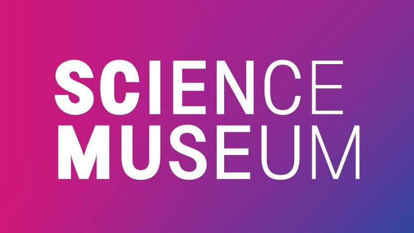
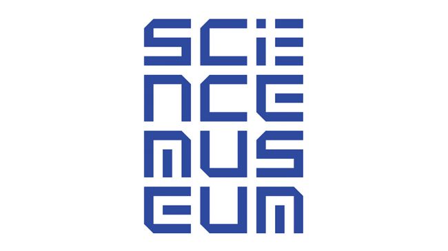
When your D&AD award-winning logo hasn’t been around that long, why replace it? That was the crux of the online storm that erupted this autumn when London’s Science Museum released this new logo courtesy of North Design.
The team behind the museum's previous logo at Johnson Banks took to Twitter to voice their opinions, other designers joined in, and it all kicked off.
Later on though, once the dust had settled, Johnson Banks had a seeming change of heart, obliquely referencing the new logo in a blog post titled Why Brands Change, which most people took as an attempt at a constructive apology.
As far as the new logo itself is concerned, the aim according to North Design was to create a “new visual language that helped the Science Museum Group project itself as a cohesive family of museums with a shared vision”.
With a horizontally tapering font, set against a colour gradient, the type is based on SMG Sans, a customised uni-width font developed in collaboration with type foundry Fontseek.
09. Mozilla
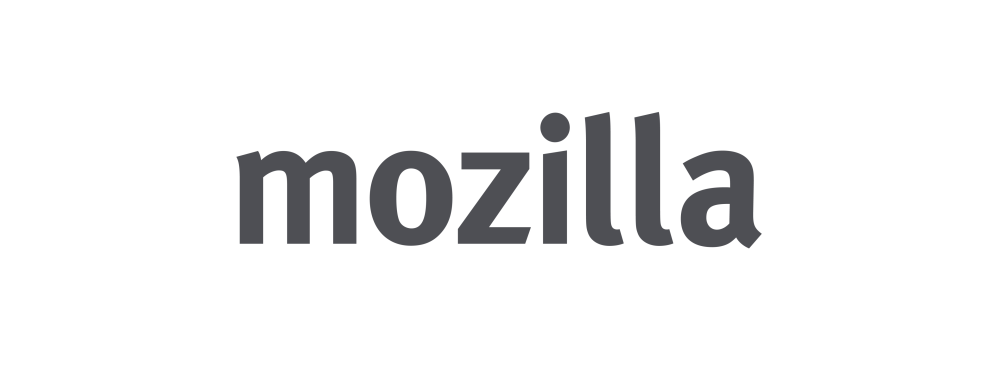
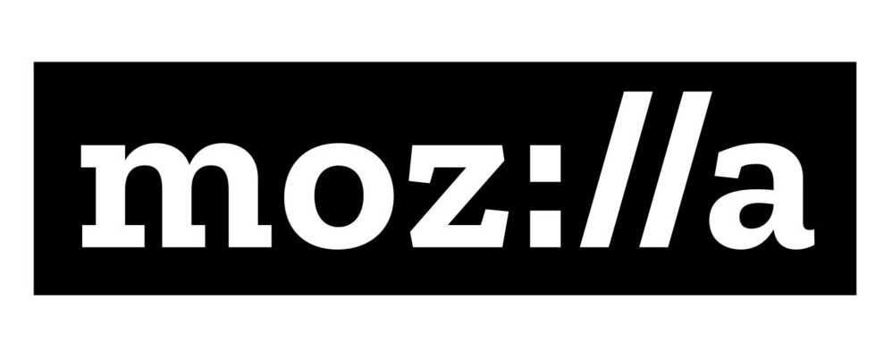
Mozilla is the global non-profit organisation behind the Firefox browser, and it harnessed the spirit of open source when it came to its new logo, released this January.
Beginning in June 2016, Mozilla worked with London-based agency johnson banks to develop the new identity. But rather than doing so behind closed doors, it let the design community follow along each step of the way, on this blog.
Most notably, the new logo incorporates the colon and forward slashes of a URL to reinforce the idea that the company is at the heart of today’s internet.
While the previous design used FF Meta, for the new wordmark Mozilla collaborated with Dutch type foundry Typotheque to create a custom slab serif font, Zilla (which is free and open to all to use, by the way).
Clean and clear, Zilla was intended to evoke Courier, which was used as the original font for coding back in the day.
You can learn more about the thinking behind the new Mozilla logo in this blog post.
10. Medium
Online publishing platform Medium last rebranded in late 2015. So it was a big surprise when this August, less than two years later, it unveiled a flat new logo and wordmark to replace the previous green, three-dimensional design.
Following sharp criticism of the latter’s inconsistent corners, this new logo took things back to basics, and was essentially a refinement of the site's original, 2012 monogram. This made sense in the context of the brand’s core offering; a simple, straightforward and classic way to publish your blog posts.
The new design was crafted by San Francisco studio Manual, in collaboration with Medium’s in-house design department. Check out the guidelines for using the logo in this blog post.
11. Nintendo Switch
If there was any doubt Nintendo was still able to innovate, it put that to rest with the worldwide launch of its hybrid tablet/home console this March. And its accompanying logo was pretty darned innovative too.
The icon for the Switch references its two controllers with subtle asymmetry to counterbalance the different visual weights of the two halves. And the ‘yin yang’ theme of the symbol also evokes the theme of being able to switch between the two uses of the device.
With competitors like the XBox and Playstation going more a more macho approach to branding, Nintendo’s in-house designers have come up with something more original, distinctive and gender neutral, helping to position the brand for the console wars ahead.
12. Ubisoft

In May, gaming development giant Ubisoft unveiled its first logo change in 14 years. Minimalist and monochromatic, the new design features a swirl and letter O which were both deliberately created to evoke hand-drawn shapes. These represent, they said, “the human qualities of enthusiasm, curiosity and the grain de folie that Ubisoft is known for”.
Going from a colourful, busy 3D design to a flatter, simpler design is not a bad idea for a gaming company that needs to stay relevant in a digital, social and mobile world. However, many designers queried the execution of this redesign, suggesting it fails to convey the sleeker, more professional look the company was aiming for and just looked… well… a little odd.
You can read more about the new Ubisoft branding here.
13. Fanta
Fed up with all the monochrome reductionism on this list of logos? Then here’s something that might refresh your palette: a new Fanta logo created from hand-cut paper, which was released in May.
Designed by Koto, it uses bespoke typography intended to be “playful and natural”. Which is perhaps surprising as the curvy, jolly lettering of the previous design has clearly been jettisoned for straighter, hard-edged characters.
You can learn more about how the logo was created in this blog post.
14. IBM IX
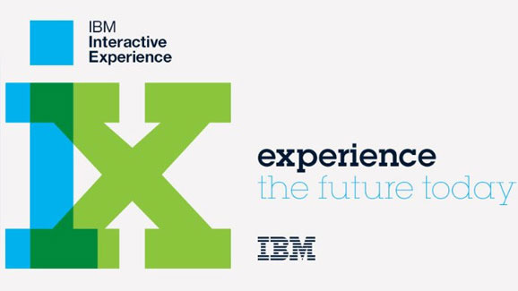
IBM iX, the design and consulting arm of IBM, works directly with clients in much the way an independent design studio would. So it wants to convey a separate feel to that of its behemoth parent, and this new logo, released in 2017, certainly does that.
Created in-house, in collaboration with Moving Brands and CATK, the design is defiantly abstract and geometric. The stated concept is that it breaks apart the classic IBM lettering, created by Paul Rand in 1972, into eight distinctive bars. Whether that’s immediately obvious to the uninitiated is debatable, but it’s certainly an interesting experiment.
15. SYFY
To celebrate its 25th birthday, Syfy worked with loyalkaspar, a US studio based in New York and Los Angeles, to develop new branding. The aim was to find a style that embraces and conveyed the various visual styles of science fiction.
Replacing the curvy, purple type of the previous logo, the blocky stencil-like logo certainly looks like the kind of graphic lettering that’s likely to appear within a sci-fi scenario. You can learn more about the new branding in this case study.
16. Kickstarter


A yearly roundup normally offers the opportunity to take a look back at big brand redesigns with some distance. But that’s not quite possible in the case of Kickstarter, which has only just this month released a radical new look for its wordmark.
Created by Kickstarter's in-house design team and New York-based design office Order, the new identity purposely puffs up the letters and turns them all one colour. The new lettering was designed by typographer Jesse Ragan. The new logo has attracted a fair amount of flack from designers on release, but whether or not that will be forgotten once it’s properly bedded in remains to be seen.
17. Audi
Is there anyone left who hasn’t abandoned skeuomorphism for flatness when it comes to their logo? In 2017, Audi became yet another brand to simplify its logo to the bare essentials, and did a pretty nice job of it.
The rebrand was carried out by German studios Strichpunkt and KMS Team, with the aim to create a seamless experience throughout all media and devices. But this was not just a narrow technical exercise in making a flexible logo; it’s also a statement of intent. By celebrating the fact that its brand is recognisable from a simple symbol alone, Audi is making a powerful statement about the power and value of its brand.
To learn more about the rebrand, watch the case study video.
18. Calvin Klein
Underwear brand Calvin Klein aimed to go back to the future with its latest new logo, which was released this February.
Swapping the lowercase letters of the previous design for all-caps, the new design was announced by the company as: “A return to the spirit of the original; an acknowledgement of the founder and foundations of the fashion house.”
The new logo was created by Calvin Klein’s in-house creative team, led by chief creative officer Raf Simons, in collaboration with famed British art director and graphic designer Peter Saville.
19. Aldi

With a 50-year history behind it, German supermarket chain Aldi is today represented in nine countries with more than 5,600 branches and around 124,200 employees. In March, it released a new version of its logo, designed by German consultancy Illion Markensocietaet.
The new design gives the stripes of the old logo more flow, coherence and three-dimensionality. There’s also been a colour change, a refinement of the border and a new curved typeface.
In contrast to current trends, then, the new logo represents a move away from the aesthetics of flat design, rather than towards them.
You can read what designers had to say about the new Aldi logo here.
20. Euro 2020
In April, the organisers of European’s biggest soccer tournament released this new logo, created by Y&R Branding Portugal.
Normally, logos for the Euro championships showcase the host nation in some way: the 2016 logo for example, represented France’s art tradition.
But in 2020, the competition will be played across all corners of Europe for the first time, in 13 host cities. The new logo celebrates this by using the metaphor of a bridge, bringing together fans and players across Europe, represented as happy, colourful, waving figures.
Related articles:

Tom May is an award-winning journalist specialising in art, design, photography and technology. His latest book, The 50 Greatest Designers (Arcturus Publishing), was published this June. He's also author of Great TED Talks: Creativity (Pavilion Books). Tom was previously editor of Professional Photography magazine, associate editor at Creative Bloq, and deputy editor at net magazine.
