Why the Nintendo Switch logo is subtly asymmetrical
Discover why the logo for Nintendo's new console is deliberately asymmetrical.

Nintendo have a long history of making innovative consoles with unusual designs. Take the DS for example, which shook up handheld consoles by introducing a second screen. And who could forget the Wii, which got gamers on their feet and flailing about with its motion sensing controller?
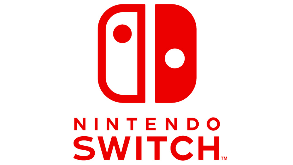
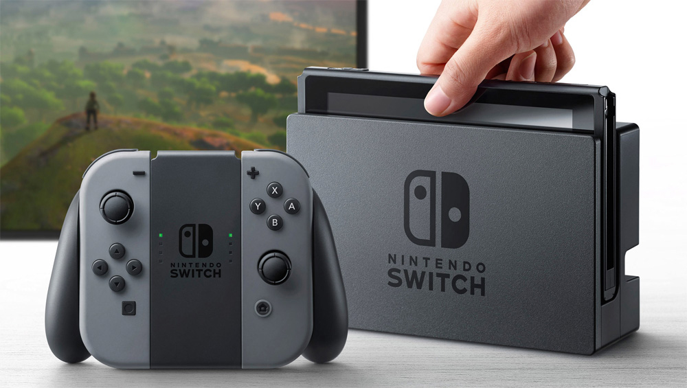
Their latest creation, the Nintendo Switch, continues the trend with a asymmetrical controller that has resulted in an asymmetrical logo design for the console.

Don't believe the logo's asymmetrical? Admittedly you do have to look rather closely, but once you notice the difference you'll be glad Nintendo opted for the slightly lopsided design.
Artist David Hellman noticed the imbalance on Twitter and shared his findings with his followers.
Did you notice the Switch logo is not symmetrical? Each side has a different apparent visual weight, so the logo is "balanced" by eye… pic.twitter.com/rFp34LyOoAJanuary 6, 2017
This isn't an oversight on Nintendo's part, though. The asymmetry counterbalances the different visual weights of the two halves. The solid half has a more prominent position, so to compensate for this it makes sense that its size is ever so slightly narrowed.
You'd soon notice the difference if the logo was symmetrical. In fact Hellman has mocked up how the design would look. It'll hurt both your eyes and your brain.
If the sides were really equal it would look like this. pic.twitter.com/klrwTWpNviJanuary 6, 2017
Related articles:
Sign up to Creative Bloq's daily newsletter, which brings you the latest news and inspiration from the worlds of art, design and technology.

Dom Carter is a freelance writer who specialises in art and design. Formerly a staff writer for Creative Bloq, his work has also appeared on Creative Boom and in the pages of ImagineFX, Computer Arts, 3D World, and .net. He has been a D&AD New Blood judge, and has a particular interest in picture books.

