Why the SYFY rebrand avoided traditional genre visuals
Designers share how the science fiction and fantasy channel found a way to connect with its broad audience.

Sign up to Creative Bloq's daily newsletter, which brings you the latest news and inspiration from the worlds of art, design and technology.
You are now subscribed
Your newsletter sign-up was successful
Want to add more newsletters?
Communicating to a fanbase isn’t always easy. As a brand you’re talking to an audience that knows its preferred subject inside-out and will be all-too eager to call you out if it spots a misstep in your messaging or imagery.
For the global, multi-platform media brand SYFY, the situation gets even more complicated as it caters to a diverse range of interests. It covers genres including science fiction, fantasy, horror, supernatural and the paranormal, with the different TV shows, movies, comics and other things it reports on having little in common when it comes to creating an overarching aesthetic.
So for its latest rebrand, which celebrates its 25 birthday, SYFY decided to take a different approach. Working with creative branding agency loyalkaspar and NBC Universal, SYFY’s revamped look, custom font and new logo design are all editorial-led and follow the channel’s focus to deliver round-the-clock content.
SYFY rebrand design brief

Loyalkaspar’s executive creative director Daniel Dörnemann explains that when SYFY approached the studio, there was no physical brief to speak of: “So in a way the brief was: ‘This is going to be a whole new SYFY. You shouldn’t hold on to any of the current identity, including the logo and distinct purple colour palette.
"'We need an identity that goes beyond the traditional On-Air package. We need an identity that allows us to connect to our community through our passion and POV.’”

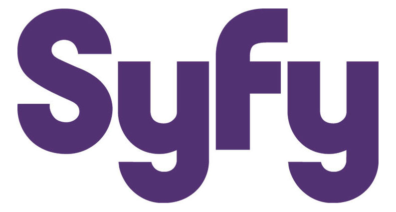
The new yellow SYFY logo with its blocky letter shapes is certainly a stark contrast to the channel’s previous, curvy version. Thanks to its distinctive geometric shape, the new SYFY logo is a flexible design that is perfectly suited to different platforms. What’s more, it’s not tied down to a specific genre.
“That was one of the challenges – to make sure we didn’t lean too much into one specific vernacular,” says Dörnemann “SYFY isn’t just about science fiction and space, but includes fantasy, horror and superheroes. All these genres have very different and specific visual languages. So, we needed to create a logo and font that would nod at the genre overall without feeling out of place in any one specifically.
Sign up to Creative Bloq's daily newsletter, which brings you the latest news and inspiration from the worlds of art, design and technology.
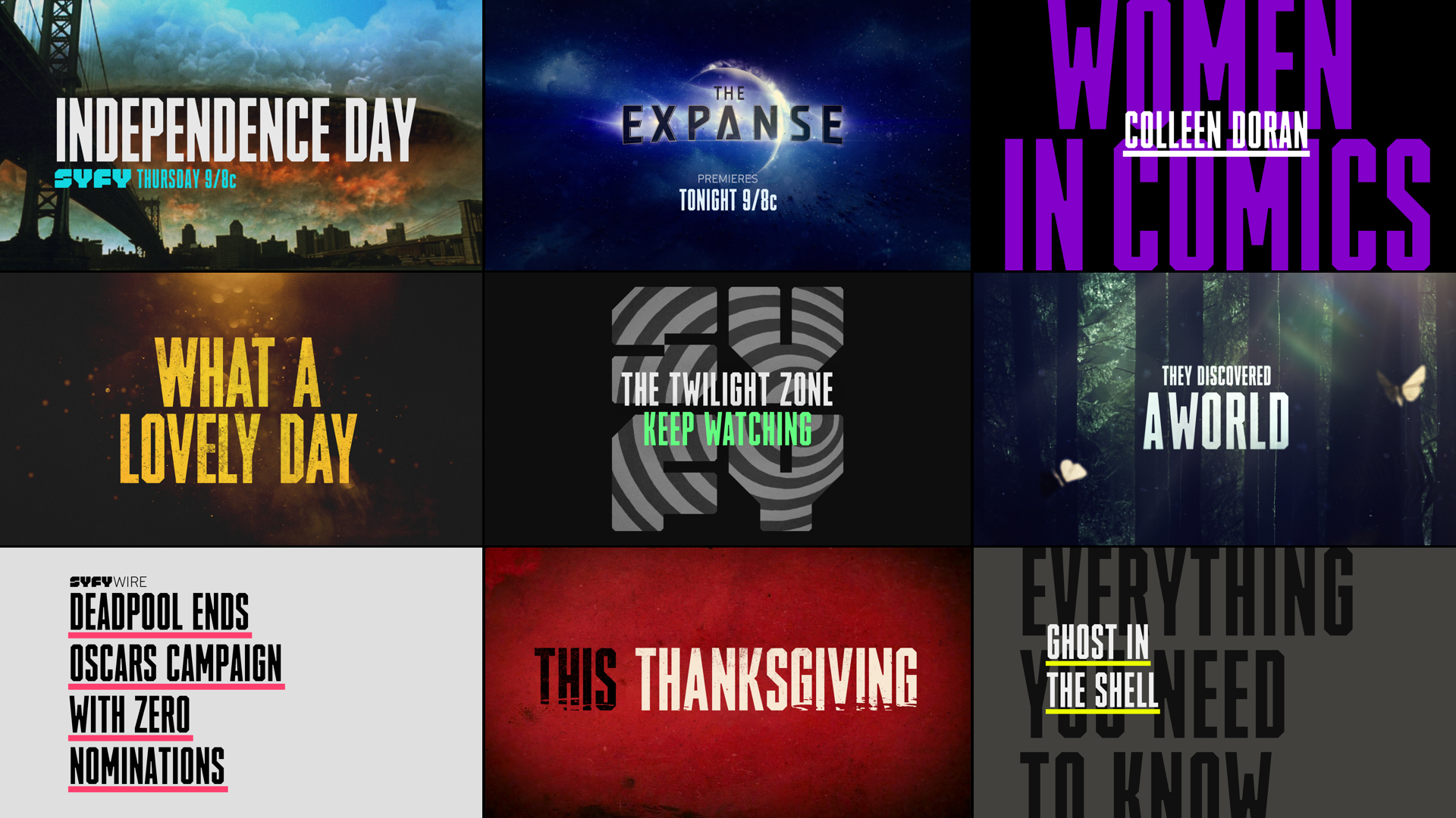
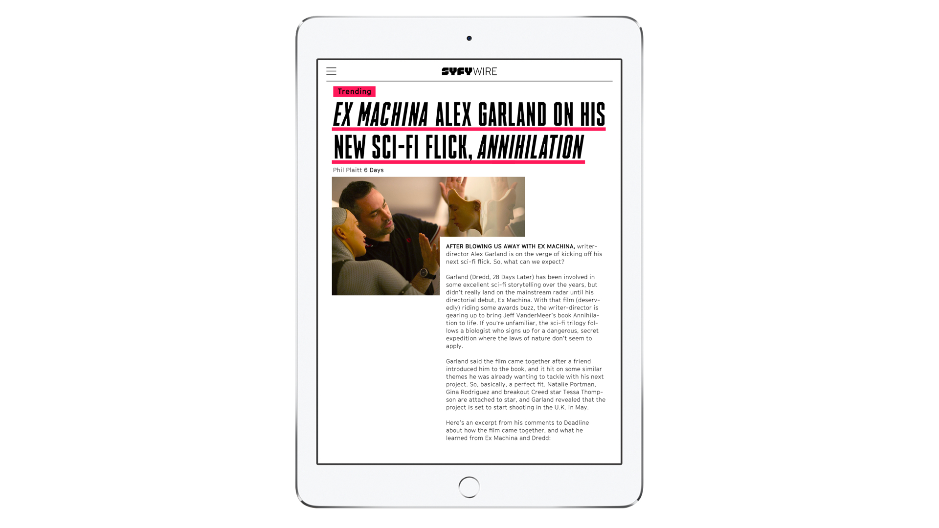
“As far as the font goes, we wanted to evoke the quality of a headline font, since a lot of the communication centres around covering events and news.”
Showing brand personality
For the bulk of SYFY’s programming there is a lot of associated imagery, whether this is a particular show with prominent symbols and characters, or a genre with longstanding stylistic cues. Crafting a fresh identity for a platform that reports on these shows therefore took a lot of careful consideration. It would be all-too easy to rely on images that a fan base was attached to rather than creating something new.
“We often say: The hardest thing about creating a solution is to really understand the problem,” Dörnemann reveals. “So, in a way, I think the secret to creating any identity is to really understand the brand’s personality, its goals and the experience the brand wants to create for its audience and then make sure we deliver on that.”
Fans of genre entertainment have often been represented in a less than positive light (the socially awkward stars of The Big Bang Theory spring to mind), so for the loyalkaspar creative team it was important to make sure they weren’t talking down to their audience. Luckily for them they were surrounded by the very people they were trying to target.
“Working so closely with the team at SYFY, it became clear very early on that we were working with people who didn’t just understand their audience, they were the audience – fans with passion, insights and opinions,” says Dörnemann. And it was this interaction that fed back into the personality of the rebrand.
“Their opinions were often differing, which led to passionate debate around one central theme: making connections within the larger universe of everything science fiction, without ever being authoritative or exclusive,” he explains.
News inspiration

Part of the rebrand problem-solving process involved highlighting what had gone before and avoiding it. For SYFY this meant looking at traditional sci-fi TV networks. What loyalkaspar found was a predilection for dark palettes and cinematic visuals – elements that weren’t in keeping with the engaging, content-driven approach SYFY was going for. This led loyalkaspar to look outside SYFY's genre stablemates.
“With the shift in focus to not only content, but conversations, we took inspiration from news outlets like WIRED magazine and The New York Times, which inspired a more editorial approach,” Dörnemann says.
“The result is an approach centred around a simple typographic system that could step back and let the message take centre stage, while always being (visually) clear about where that message is coming from.”
Liked this? Then read these:

Dom Carter is a freelance writer who specialises in art and design. Formerly a staff writer for Creative Bloq, his work has also appeared on Creative Boom and in the pages of ImagineFX, Computer Arts, 3D World, and .net. He has been a D&AD New Blood judge, and has a particular interest in picture books.
