How to mix art mediums for more powerful images
Learn to use markers, watercolour, and brush pens to get rich, layered illustrations.
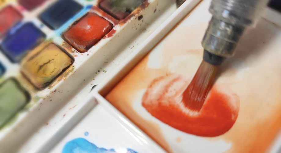
PAPER
■ Canson watercolour sheet, acid-free
MARKERS
■ ShinHan Touch Twin, Cool Grey 1, 3, and 5
■ Generic alcohol markers, dark grey and neutral tones
■ White acrylic brush markers
PAINT
■ Sakura Koi watercolours
■ Student-grade watercolour tubes
MISCELLANEOUS
■ Masking tape
■ Flat brush
■ Round brush
■ Water for glaze only
Over my 25-year career, I’ve always moved between the best digital art software and traditional art supplies. Not because one is better, but because combining them keeps me engaged, fast, and curious. When I paint, I look for impact first: strong values, bold shapes, and expressive brushwork that pops visually and gives the piece clarity and presence.
In this tutorial, I’ll show you how I take a digital sketch and turn it into a finished traditional artwork using affordable, accessible materials and a mixed-media workflow. You’ll learn to go from loose greyscale values up to a layered and colourful final render that uses a combination of some of the best markers, acrylic brush pens, and the best watercolour paints I’ve found through years of trial and error.
I like to treat affordable traditional art materials like Photoshop layers. I start by printing my digital sketch on watercolour paper, then block in values using Touch Twin Markers, part of what I’d consider the best art supplies for this kind of workflow. Once the structure is solid, I’ll use watercolour for colour washes, thin layers with minimal water, and build them up like digital overlays. With cheap acrylic brush markers, we’ll lift volumes with white or subtle tones, then glaze over those areas again in watercolour. It’s a fast, intuitive process that lets me build texture and light while staying loose.
Article continues below 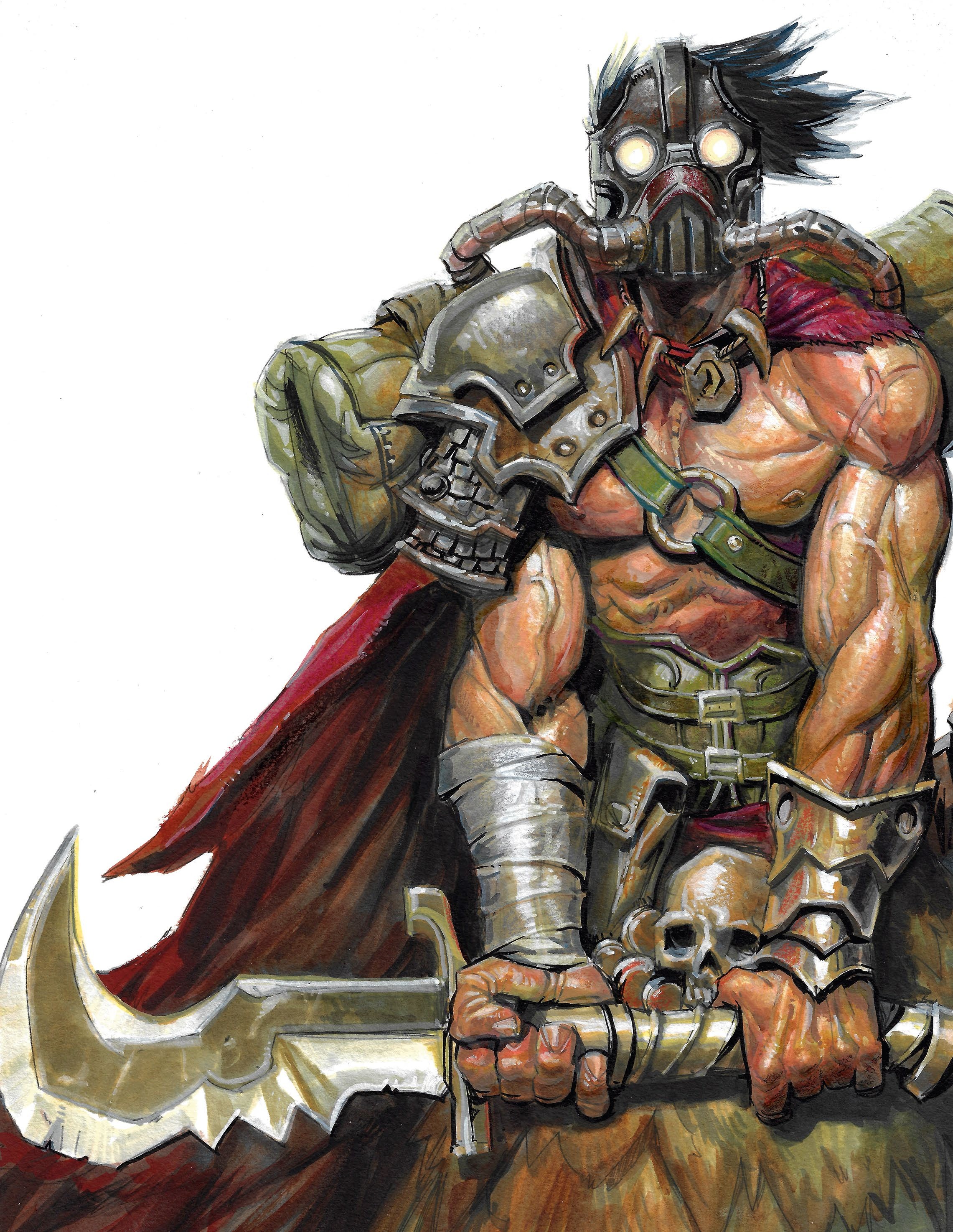
One key takeaway is that you don’t need to use fancy gear to make your art sing. The results are strong because of the approach: thinking in layers, committing to lighting, and letting tools surprise me.
I also believe in the power of the unexpected. I use my fingers to smudge paint, let the water do weird things on paper, and don’t try to control every edge. It’s about finding a sense of life and momentum.
By the end of this tutorial, you’ll have seen the full journey from sketch to final, with all the chaos, problem-solving, and texture that comes with it. If you’re a digital artist looking to get your hands dirty or a traditional painter who wants to speed up their process, this hybrid method might open new doors.
Want to see more like this? Check out Carlos’ action-packed science fiction comic project Riptide Fighters.
Sign up to Creative Bloq's daily newsletter, which brings you the latest news and inspiration from the worlds of art, design and technology.
1. Draw a digital sketch
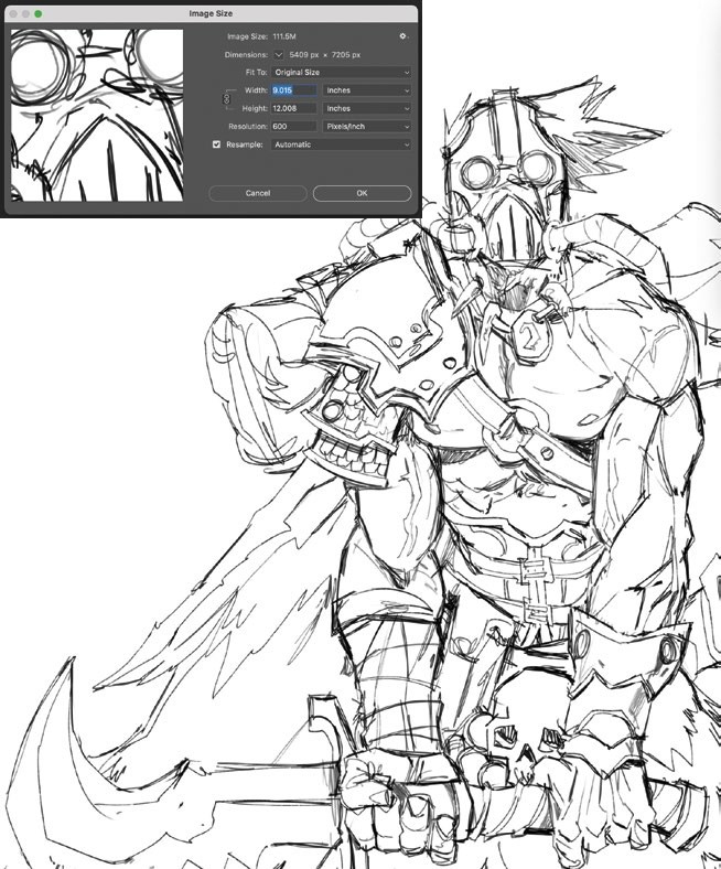
Start by sketching digitally using your usual tools and setup. This stage is about capturing the silhouette, composition, and rhythm of the piece. My character is a mutant warrior with a cloak and mechanical elements, so I focus on balancing organic and hard-surface design. Don’t overwork the lines; leave just enough information to print. Mood is key, and I’m aiming for mystery and tension. I use Photoshop and a basic brush to establish a quick sketch with just the lines and no shading.
2. Print and tape the image
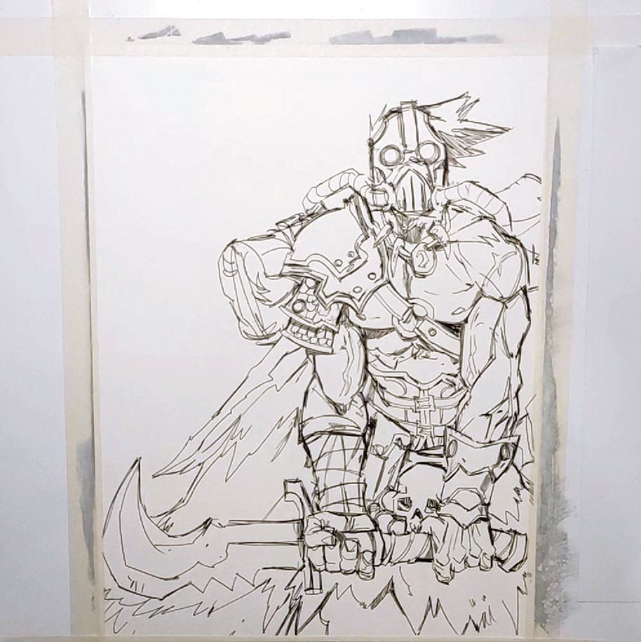
I print my digital sketch on a 9 x 12in Canson watercolour sheet. As the paper is on the thinner side, I tape it firmly on all sides using masking tape to prevent buckling when it gets wet. This step is often overlooked, but it makes a huge difference later on. It also helps to preserve a clean edge that makes for nice presentation. Once dry, the paper will stay flat as if it was never wet – that’s the whole point of this step!
3. Put down the initial greys
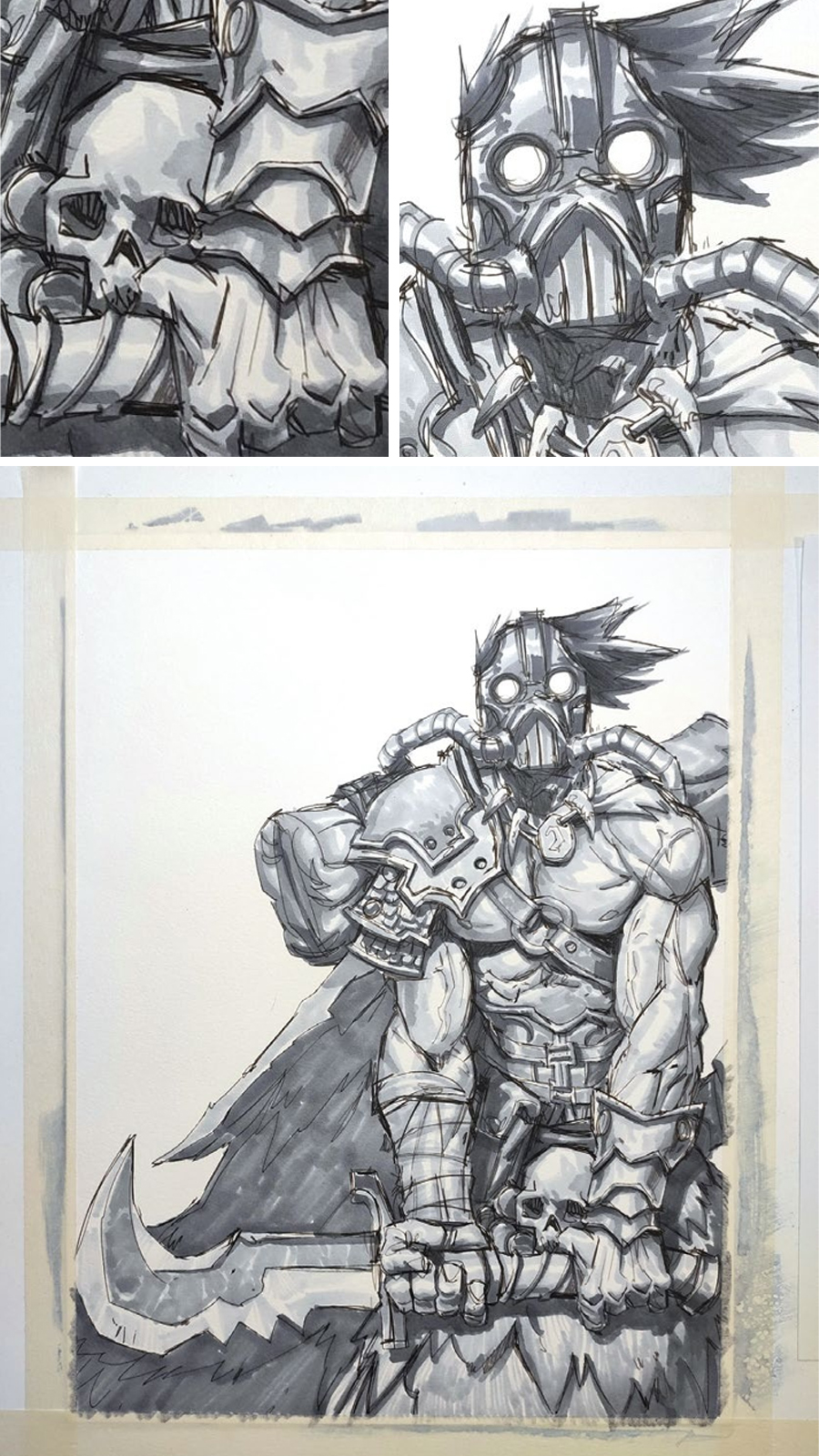
For the value pass in my image, I used ShinHan Touch Twin markers in Cool Grey 1, 3, and 5. These alcohol-based markers are perfect for laying down smooth transitions and blocking in the volume, but any alcohol-based marker works well here, even Copics. Treat this like a monochrome underpainting, thinking in terms of form, structure, and lighting. Avoid rendering every detail and instead focus on the light direction, shadow pattern,s and contrast between planes. Using quick and confident strokes makes this my favourite part of the process.
4. Apply thin watercolour washes
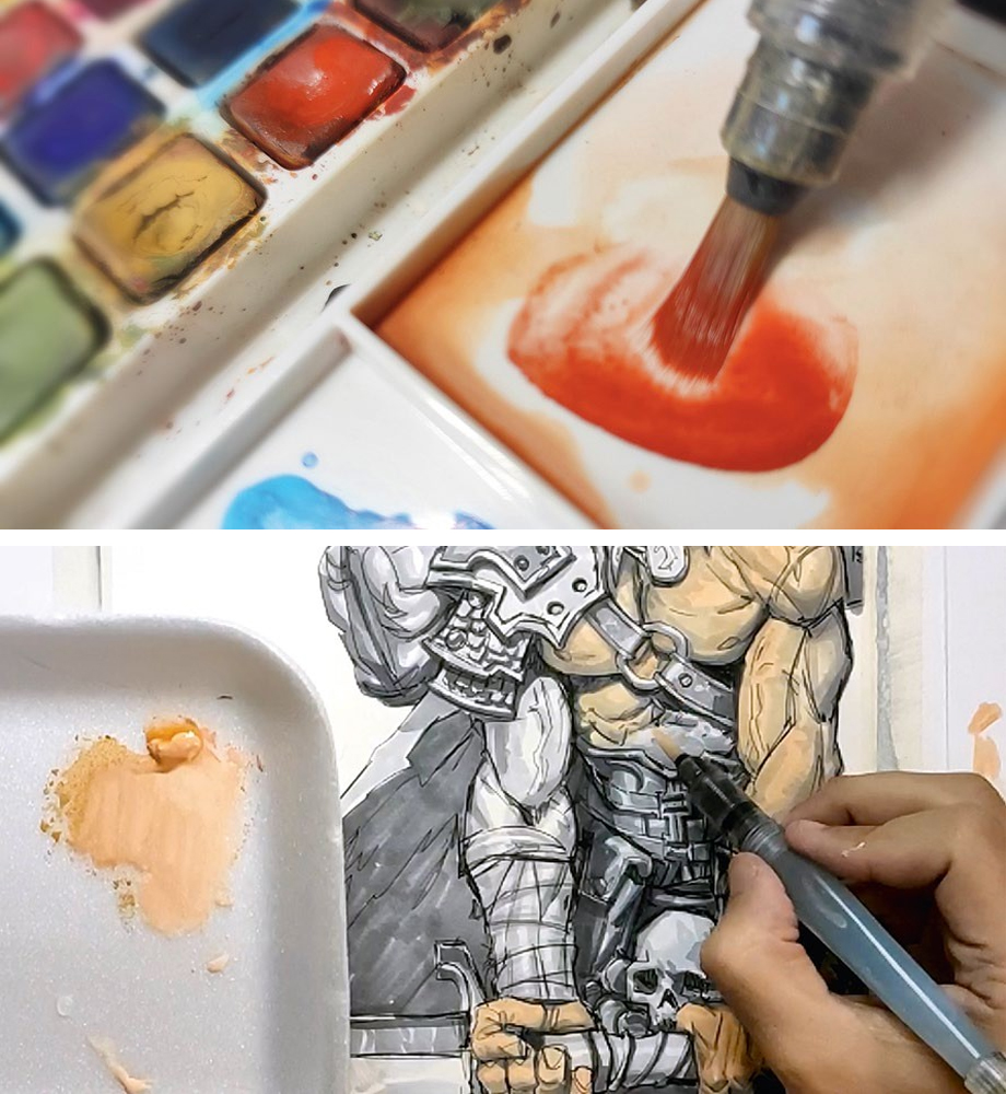
Begin layering subtle colour using a barely damp brush. These first washes are transparent and serve to shift the overall temperature of the piece. Use a mix of cool and warm tones depending on the area; blues in the shadows, and warmer ochres on skin or cloth. Don’t try to render, just stain the drawing and create a base colour mood. I use a mix of Sakura’s Koi watercolours and cheaper tubes, and prefer to avoid rounded student palettes as the pigment often dries dull.
5. Carefully add a colour glaze
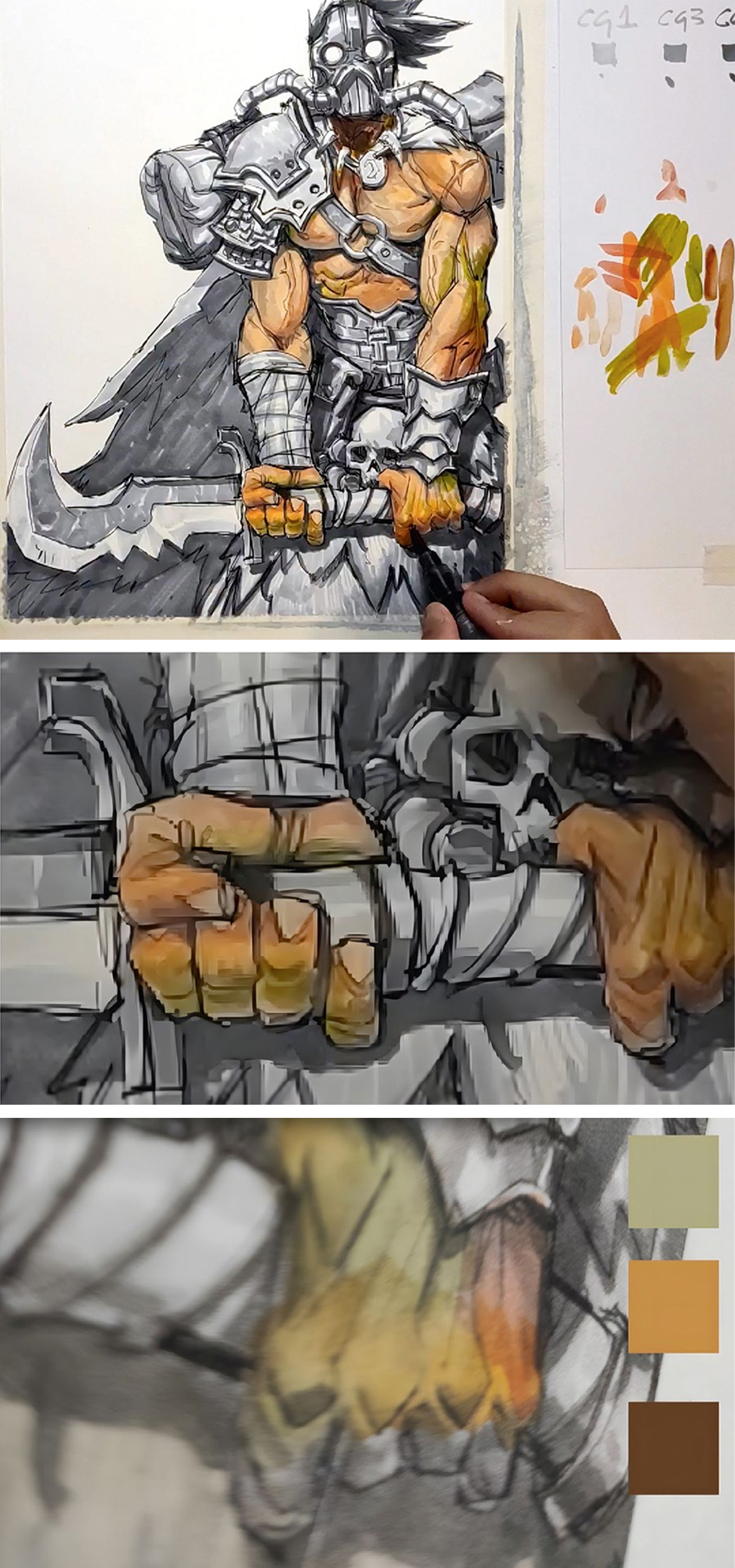
Once the light washes are dry, go in with more pigmented watercolour using a medium round brush. Glaze over certain areas with thin layers of more saturated colour, being careful not to reactivate underlying pigments. This is like a colour layer in Photoshop, adjusting warmth, hue and value subtly while keeping the marker values visible. Depending on my goal, I may stop here for a more graphic, comic-style look.
6. Lift with white
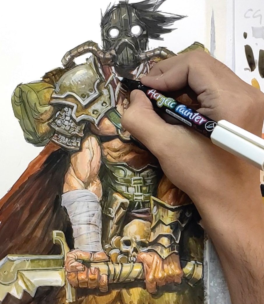
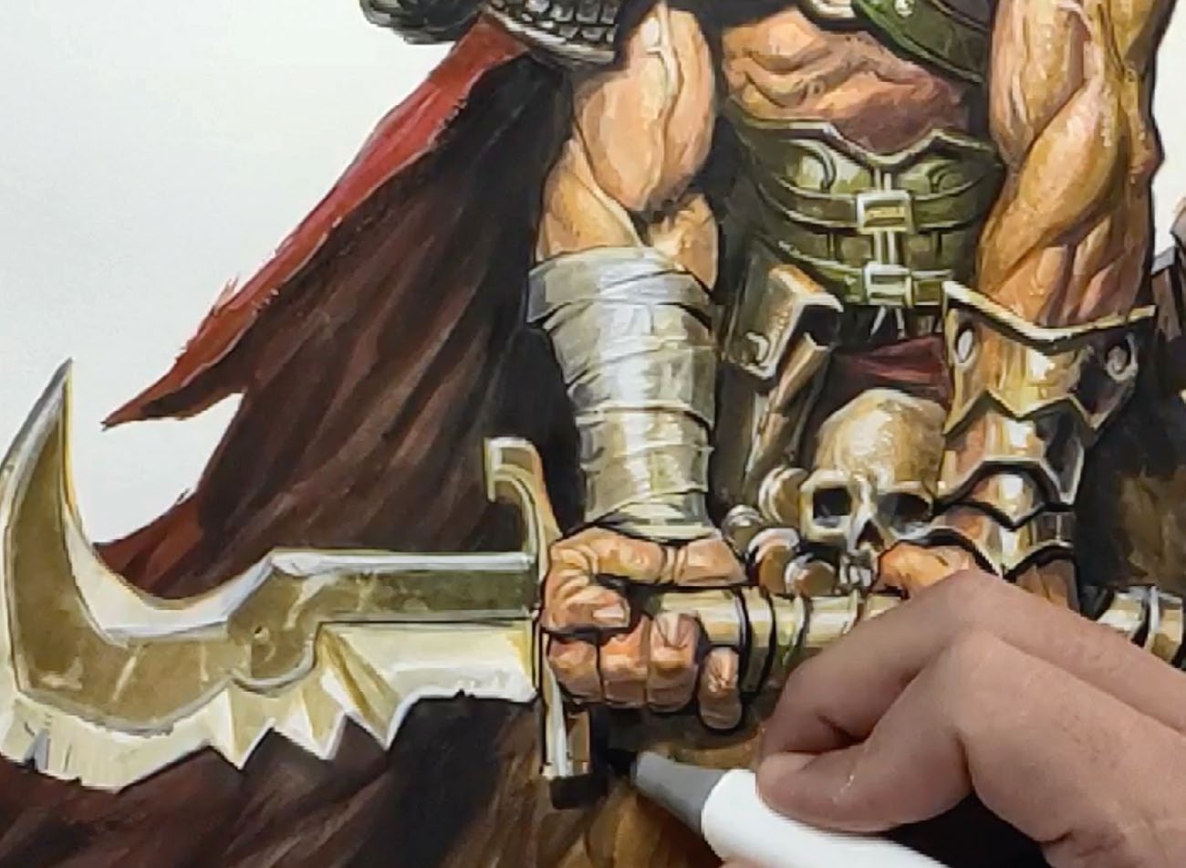
I use white acrylic brush markers from a cheap 48-pack to start adding highlights. I love these kinds of markers because I have a lot of control with the brush tip. I keep it soft and controlled, focusing on areas that catch the most light; edges of the mask, metal parts and the top of the shoulder. These markers don’t give solid opacity in one pass, but that’s actually useful – we can layer slowly and control the intensity of each highlight.
7. Overlay the colour again
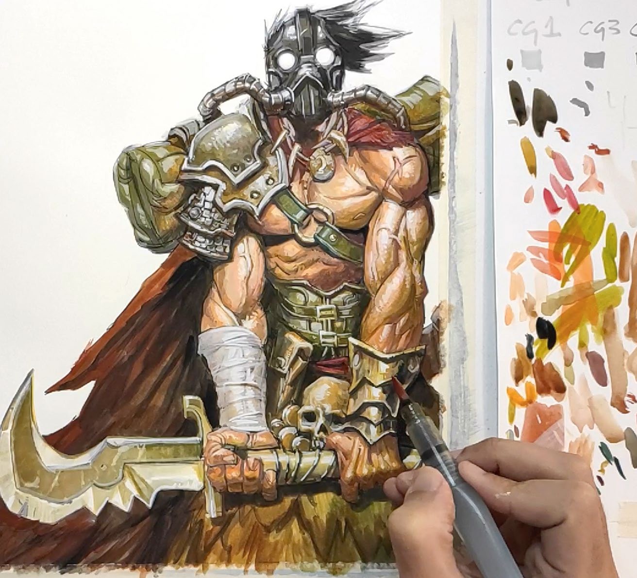
Once the white areas dry, glaze watercolour on top to tint the highlights. This helps them integrate with the local colour and creates subtle colour variation, like bouncing warm light on skin or cool glints on metal. It also tones down harsh white marks and keeps the image cohesive. Depending on the brand, overlays can be vivid or slightly dull. The key is finding balance between your materials.
8. Smudge for more detail
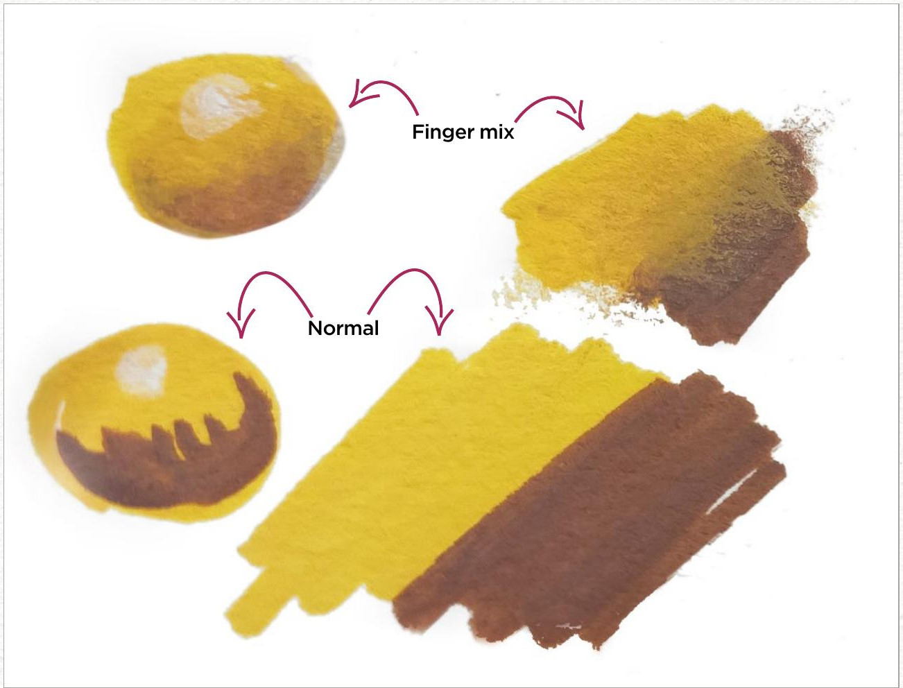
Use your fingers or a rag to smudge wet edges or soften transitions. This adds randomness and breaks symmetry, especially in the background or along cast shadows. It also gives a bit of analogue texture, which appears less stiff than brushstrokes. Sometimes I like to lift the colour intentionally to create textures. Your fingers are the most underrated tool, and sometimes I even use my palm or different materials to create the texture that I’m after.
9. Watercolour shading
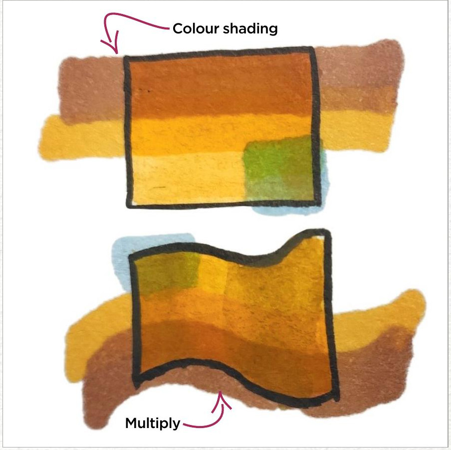
You can use cheap alcohol markers in neutral tones to deepen shadows and block out large shapes like a cloak or background elements. These markers blend smoothly over watercolour and help to reinforce form. Treat this pass as a way to re-establish strong darks and separate the figure from the background. I only do this if the piece calls for it – sometimes watercolour is enough, but alcohol markers deliver punch quickly.
10. Final push on the highlights
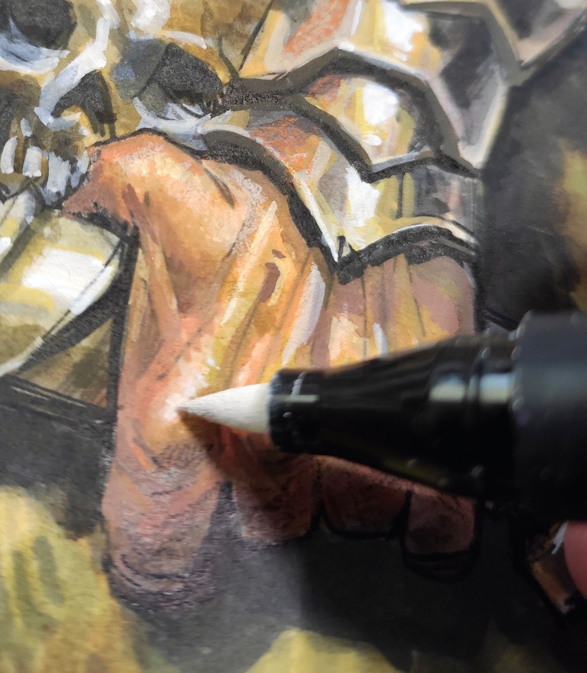
Let’s go back to our acrylic markers, but this time with more precision. Target rim lights, edge reflections and focal points. This is one of the last chances to bring contrast and punch to the piece, so be careful about placement. It also helps to guide the eye and emphasise form. If I need maximum opacity I’ll switch to gouache, but acrylic markers or paint usually do this job best.
11. Make any necessary tweaks to the colours
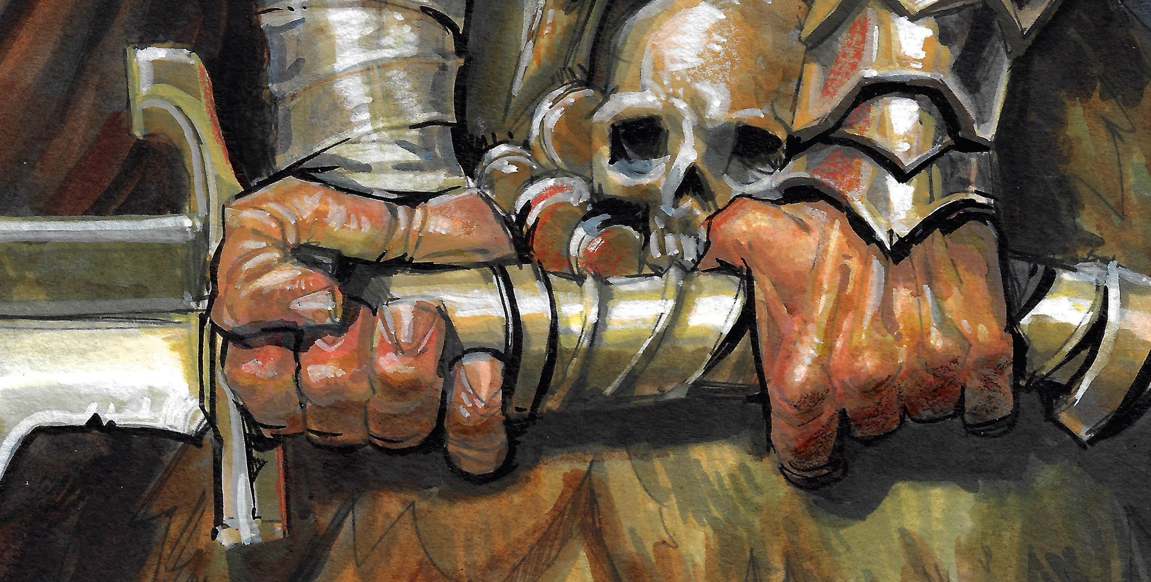
Assess the image as a whole and glaze over any areas that need colour balance. For example, you might warm up the skin by layering transparent red or orange, or cool down shadows with blues or violets. This gives variety and keeps surfaces from feeling too flat. You could also use this stage to soften or push shapes. On this piece, I used rusty tones on metal, skin tones and the sword, just playing freely.
12. Let the image dry flat and make adjustments
Once you’re happy with the paint, let the piece dry naturally while still taped down. This could take several hours depending on how wet it got during the glazes. The masking tape prevents warping and keeps the edges clean. It’s important not to rush as removing the tape too soon can ruin the finish. Never use a hair dryer because it stresses the paper; just let it sit and come back later. I’ll often notice things I missed after stepping away. For my piece, I returned to my Touch Twin Markers for one last pass, reinforcing the key shadows and punching up core edges. This sharpens the silhouette and helps to guide the viewer’s attention. I also unify areas where the watercolour dried unevenly and might add fine lines – you can use any waterproof ink for this.
13. Remove the tape
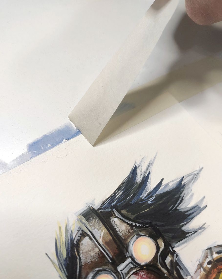
Carefully peel off the tape, pulling it slowly and at a low angle to avoid tearing the paper. It’s satisfying to see the clean border emerge, which gives the piece a professional, framed feel. This is when you can finally step back and look at the whole work. I used to rush this part, but now I enjoy it as the moment of closure.
This content originally appeared in ImagineFX magazine, the world's leading digital art and fantasy art magazine. ImagineFX is on sale in the UK, Europe, United States, Canada, Australia and more. Limited numbers of ImagineFX print editions are available for delivery from our online store (the shipping costs are included in all prices).

Carlos Cabrera is a concept artist and illustrator with more than 25 years in the industry. He’s worked with Marvel, DC, Ubisoft, Riot Games, and more.
You must confirm your public display name before commenting
Please logout and then login again, you will then be prompted to enter your display name.
