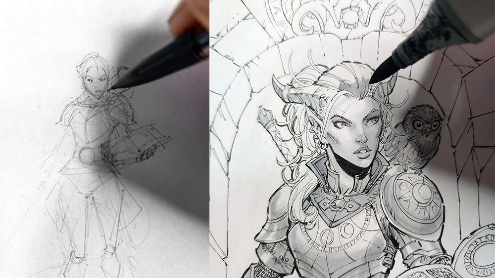
Marvel and DC Comics artist shows how to a draw a character with pencil, pens and markers
Follow step-by-step as Max Dunbar brings a fantasy character to life with pencil and ink work.
Sign up to Creative Bloq's daily newsletter, which brings you the latest news and inspiration from the worlds of art, design and technology.
You are now subscribed
Your newsletter sign-up was successful
Want to add more newsletters?
PENCILS & PENS
Mechanical pencil: 0.5mm HB
Copic Multiliner pens: 0.03, 0.05, 0.1, 0.3 and SP 0.03
Copic Sketch Markers Neutral Grey: N0, N1, N2, N3 and N4
PAPER
Printer paper: 8.5x 11-inch 20lb
Strathmore Bristol Board: Series 300 Smooth 9x12-inch 100lb
TOOLS
French curve, circular template, 6-inch ruler
Creating your own characters is one of the most gratifying things you can do as an artist. It’s a great way to solidify the various thoughts and concepts that can be churning around in your mind when dreaming up some exciting new creation.
Drawing a character pin-up brings together different disciplines and challenges that can be frustrating to encounter, but rewarding to overcome. Here, I’ll explain how I tackle this process, in a way that blends a healthy amount of pre planning to achieve a solid structure, but allows for enough spontaneity and freedom to keep the drawing energetic, exciting and fun.
You'll see the materials I used listed above, but you may also want to take a look at our guides to the best pencils for artists and the best pens and best markers for artists.
Article continues belowIf I could emphasise two particular points above everything else, it’s to be patient with yourself, and draw lightly. It’s easy to get frustrated when things aren’t going the way you want, but if you draw lightly, you can erase and try again. There is no shame in trying something out and redoing it if it doesn’t turn out the way you want it to.
When you’re drawing your character, there are many exciting things to consider that will breathe life into your creation. What kind of pose should the character be in? Do I want to show off their clothes and armour with something more reserved? Or showcase their abilities with something more dynamic and action oriented? What will their expression convey?
After the base structure, pose and anatomy are completed, what will they be wearing? What condition will the clothes or armour be in? What kind of equipment do they need, and what do they carry in their hands, on their belt or on their back? Do they have cultural embellishments, ancient relics or treasure from past adventures?
You can ask yourself all of these questions as you draw your creation, and each one will add personality and story into the visuals as they develop, and they will elevate your character into something special and personal to you
Sign up to Creative Bloq's daily newsletter, which brings you the latest news and inspiration from the worlds of art, design and technology.
01. Set up your work area and start small and loose
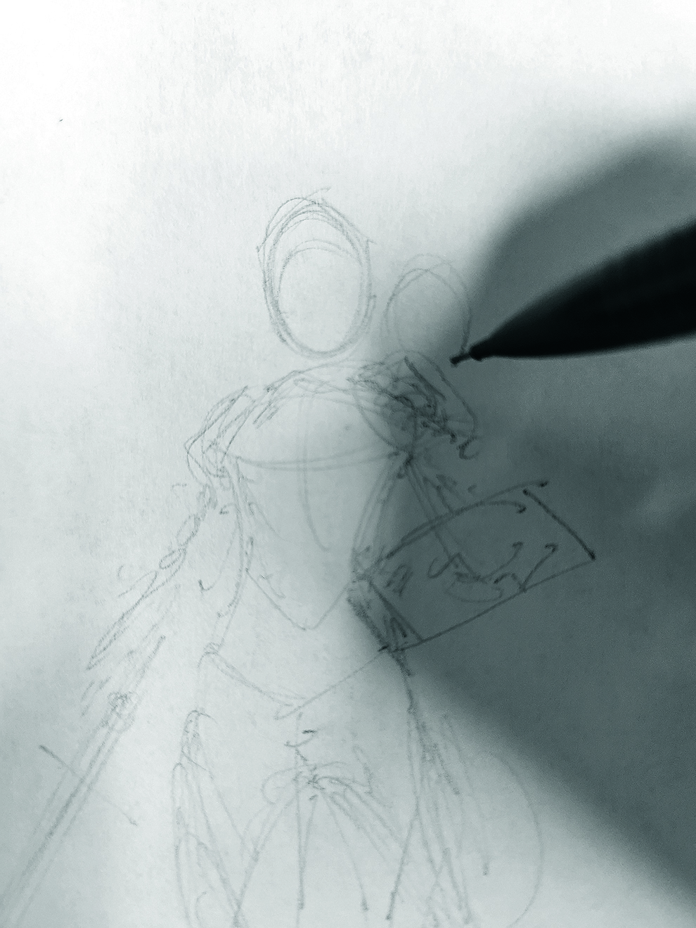
I like to begin with a piece of scrap paper and use my pencil to draw a small sketch to figure out the pose and proportions of the character. This way, it’s easy and quick to make changes or try new ideas.
As I’m sketching, I want to keep the line work nice and light, and scribble out a rough pose starting with very basic shapes to figure out the structure of the figure
02. Layer on loose details
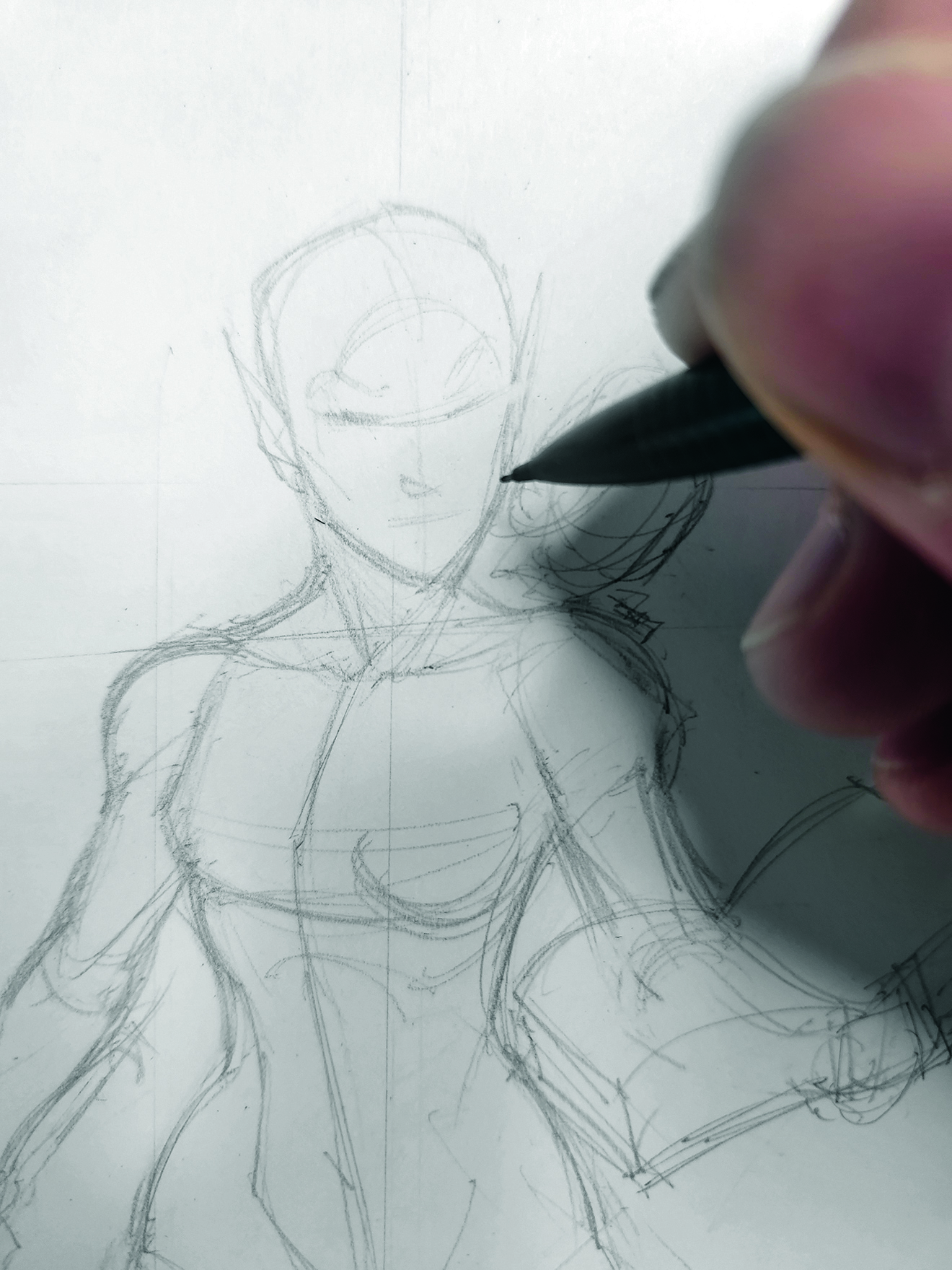
Keeping the pencil light, I rough in basic shapes for armour ideas, major pieces of equipment and even a hint at an expression if I can, just to see what looks good together. It’s also a great opportunity to sketch in an idea for a background. Once the small sketch is done, I’ll keep it near so I can reference it as I’m drawing the final, full-sized version.
03. Add refined details
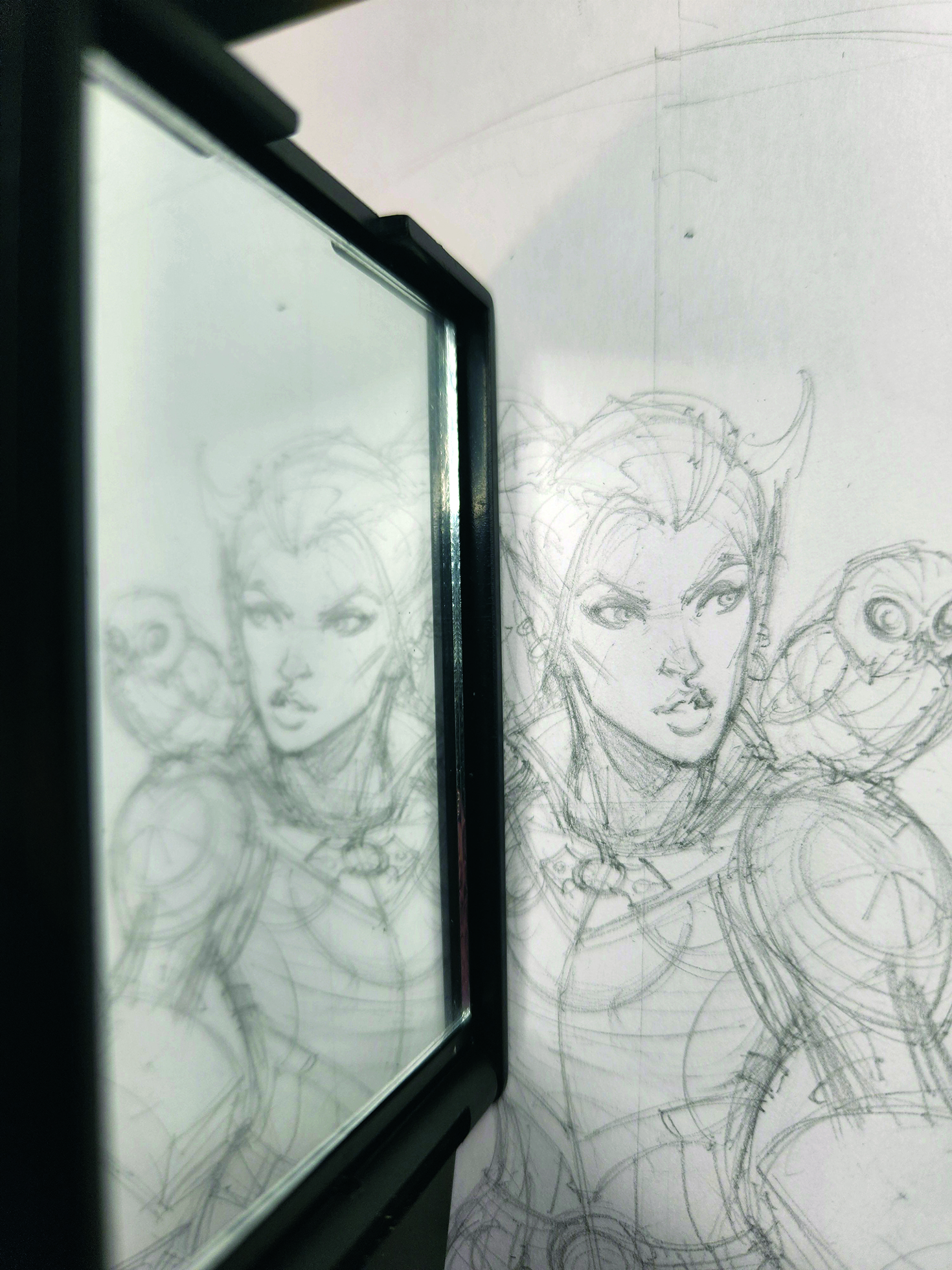
For the final drawing, I’ll use thicker paper to better handle the ink and markers. I’ll lightly sketch a rough form in light pencil, to block in the pose and make sure everything fits on the paper. I don’t want to get bogged down in detail and find out I’ve run out of room for the whole character.
Because the pencil is light, it’s easy to layer details right on top of it. I press slightly harder to make the more refined details stand out and use a small mirror to flip the image, which enables me to see any glaring mistakes more easily.
04. Begin inking
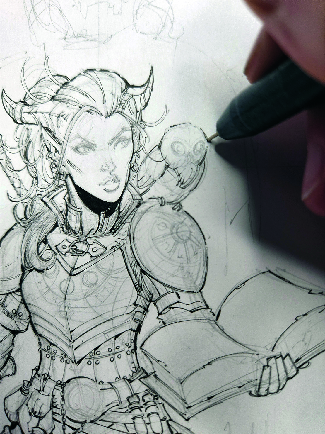
I like to start inking most of the fine details with one of my thinner pens, like a 0.05. Remember that fine lines are forgiving. Fine lines can be built up with repeated pen strokes, but you can’t take away from a line that’s too thick.
The face is the most important part of most characters, so I use the finest-tipped pen I have when inking here to give me the most control.
05. Build up a variety of line weights
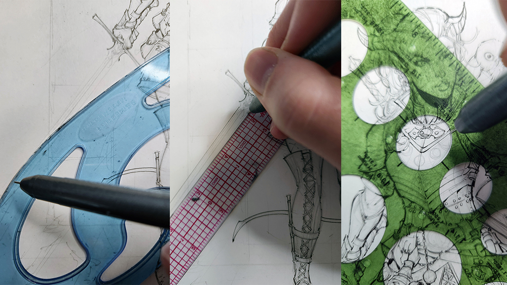
Thicker lines and black shadows add volume and weight to a character, and a variety of line weights can help your piece feel more energetic and less flat. Rulers and templates aren’t always necessary, but if you want to keep your lines uniform and clean (and convey finely crafted weapons and armour) then they can be handy to have nearby.
06. Fill in the surface details
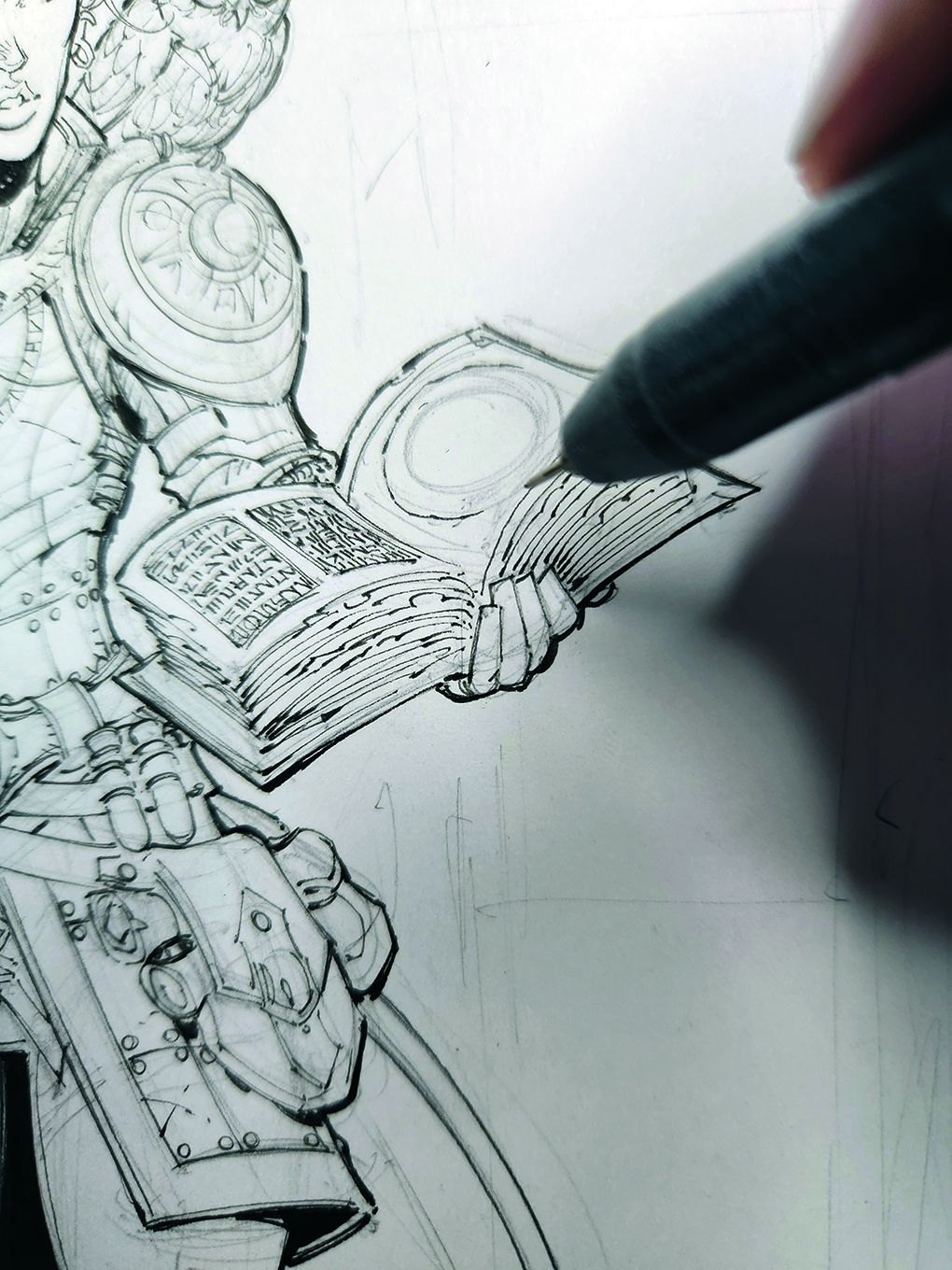
Once all the main parts of the character have been inked, I fill in the small surface details that can really help add that extra level of story and depth to a character, like small armour details, runic text and filigree.
07. Pencil the background
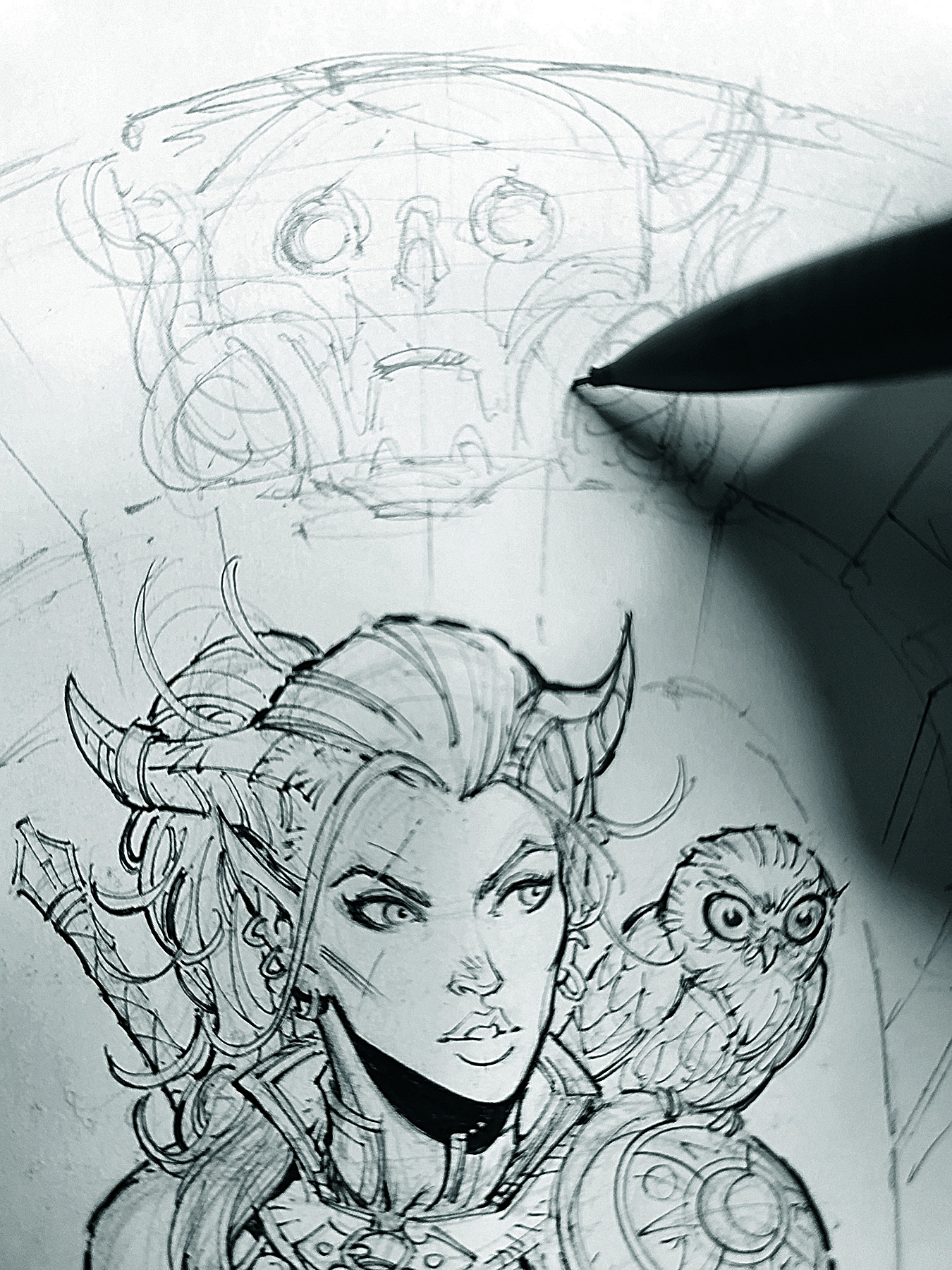
Now that the character is inked, the background can be tackled. Taking it from a light, roughed-in sketch to tighter pencils is always a good idea before inking, just to make sure that all the right details are in place.
08. Ink the background
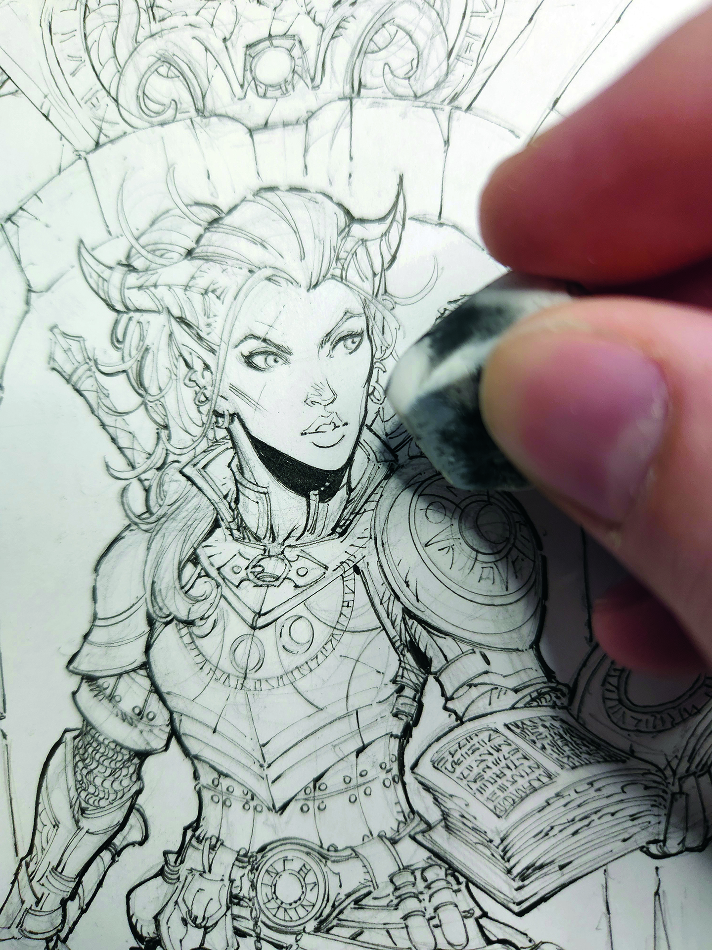
Even though the background isn’t as prominent as the character, rushing it can hurt the artwork, so I like to try to treat the background as a character unto itself, and add a story where I can.
Once the ink dries, I erase all the pencil lines and leave only the ink behind. The Bristol board and ink hold up to erasing well, but I still want to be careful and not press too hard or be too rough with the eraser.
09. Start with the lightest marker
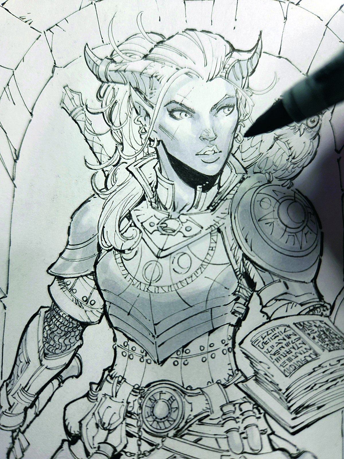
Using the lightest marker, N0, I render areas I know are going to have the lightest elements in them. Marker can act as either pigment or shadow, and I leave some areas blank to signify strong light reflection.
Moving to the next darker marker, N1, I fill in areas that are going to be slightly darker. If I layer on top of any of the N0, it will add to the tone already on the paper. This is a great way to do subtle gradients and blends
10. Render in the mid-tones
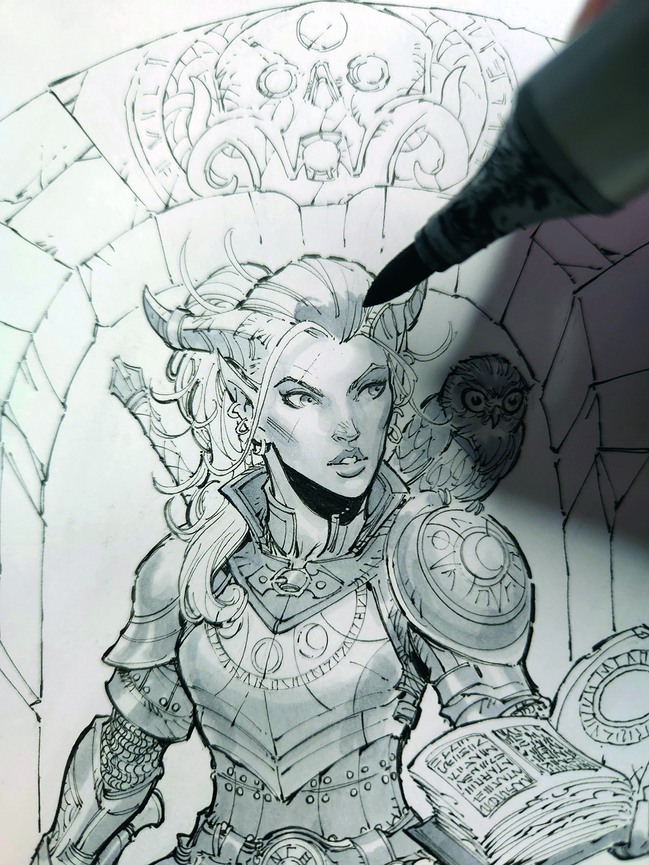
I like to use N2 for mid-tones. It’s still light enough to see all the line work, but dark enough to stand out substantially from the white paper. Using it for leather works really well, and for darker areas of the face such as lips and irises.
For my style of art, I like the line work to still shine through wherever possible. N3 is a good level of darkness for most of my characters, and works great to separate out the areas between leather or lighter metal.
11. Finish up
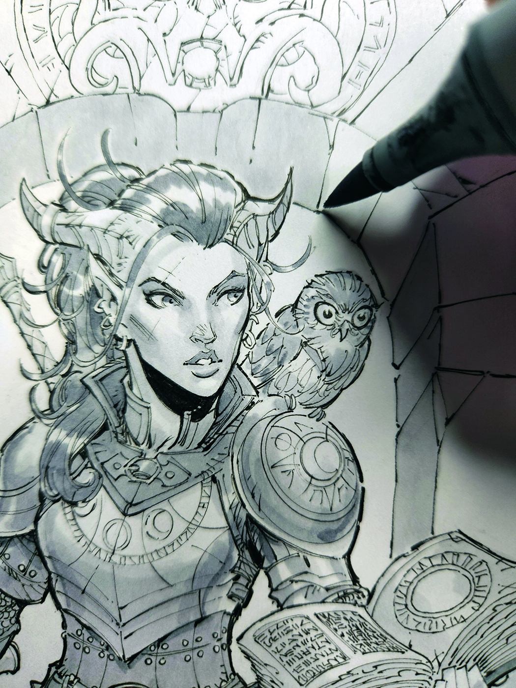
When drawing in this style, I don’t like to over render the background. Hopefully the line art will be strong enough to convey the mood you want, and a flatter grey tone can help make a rendered character pop.
For more tips on drawing characters, see Joshua Black's advice on how to get better at figure drawing and our 10 tips for drawing the human body.
This article originally appeared in ImagineFX. Subscribe to ImagineFX to never miss an issue. Print and digital subscriptions available.

Max Dunbar is a comic book and concept artist who has worked for DC and Marvel Comics, Wizards of the Coast and Avalon Hill. You can see more of his work at www.maxdunbar.com
You must confirm your public display name before commenting
Please logout and then login again, you will then be prompted to enter your display name.
