How I painted this One Piece character artwork for Big Mom's voice actress
Follow my process in Clip Studio Paint.
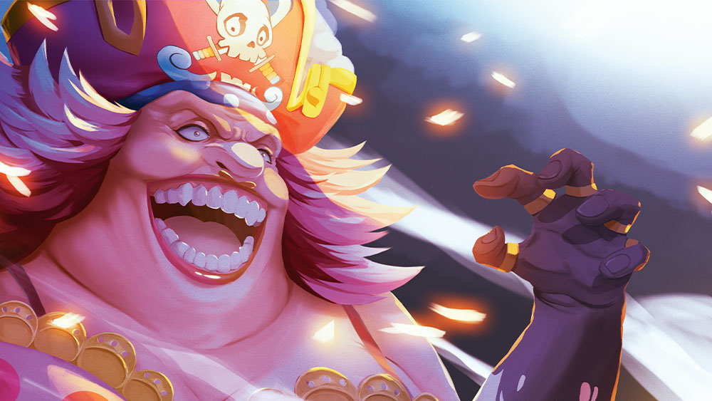
This commission was created for Pam Dougherty, the English voice actress of Charlotte Linlin, also known as Big Mom, from One Piece. I was asked to take inspiration from a scene within the anime where Charlotte goes on a rampage!
However, this brief had a unique request. The art was to be created in a style I hadn’t used in three years! Several factors had led me migrate to a more line-art dependent style for client work and now here I was, asked to use a process I wasn’t convinced would be used commercially. I was initially concerned about how rusty I’d be but was relieved to see how much of my skill remained in muscle memory.
I even managed to adapt some of what I’d learned from my regular commission style into the creation of this image. In the end, the client was thoroughly satisfied, and I was grateful to have the opportunity to attempt something different and challenging.
Article continues belowBelow I'll discuss some key elements that I think made the piece, and provide some tips for applying them. And at the bottom, I'll outline my general process. I worked in Clip Studio Paint, which is mentioned in our guide to the best digital art software. You might also want one of the best drawing tablets.
Hair styling
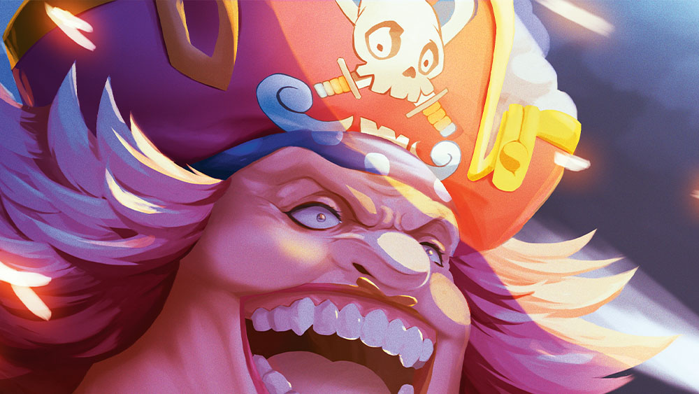
Setting the chalk brush to my Smudge tool lets me quickly suggest strands within the hair. The level of detail you add with this will depend on the amount of realism you hope to achieve. Don’t overdo it, as the Smudge tool can get messy if you overwork an area.
Sell the scene
Even in small areas like the eyes, I like to have some of the environment reflected within them. It’s a very tiny detail, but little touches like this help to sell the surroundings even more. Environments with strong light sources are an excellent opportunity to take advantage of this.
Give it real feel
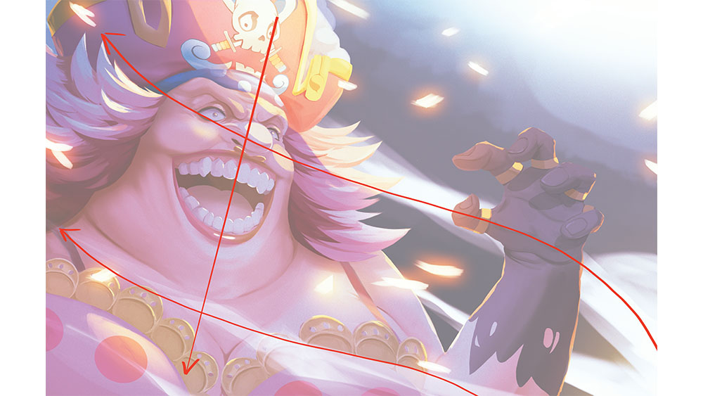
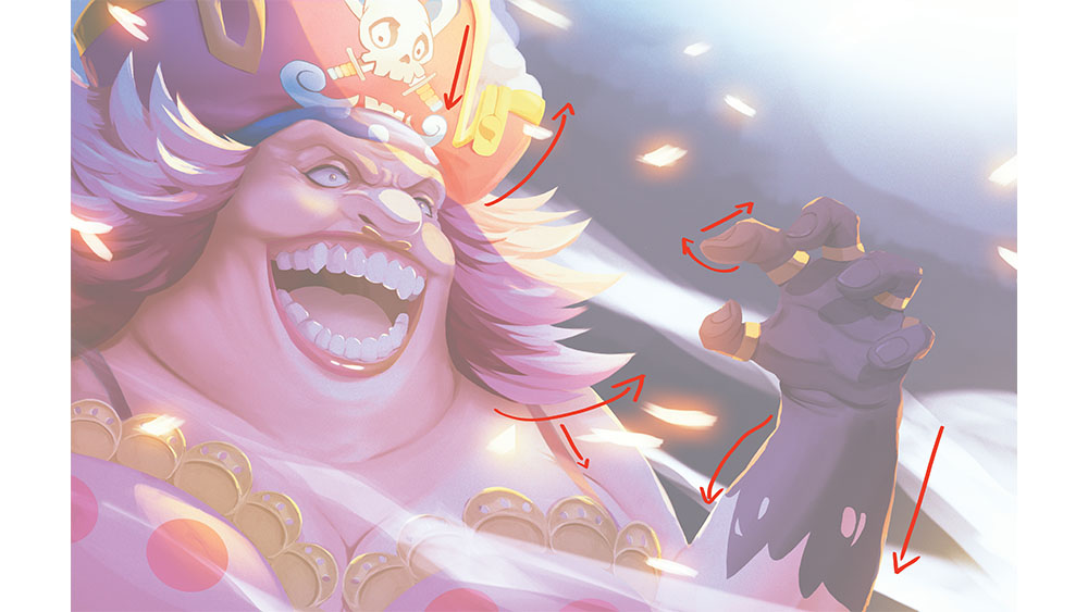
Contrast is important for creating believable artwork. I’ve touched on contrast in values, but just as important is the contrast used in the shapes and movement. Curved lines versus straight lines are a motif that I try to incorporate if possible. The flow of environmental elements over Big Mom’s resolute figure also helps creates contrast.
Sign up to Creative Bloq's daily newsletter, which brings you the latest news and inspiration from the worlds of art, design and technology.
Complementary glow
I usually paint my highlights on a new layer above everything and use a subtle outer glow to develop a feeling of illumination. Make sure you choose the colour of the glow carefully; it’s a handy way to complement the terminator (the boundary between the zone of light and form of the shadow).
Suggest a wider environment

I like particles and effects such as smoke and cinders, both of which I’ve used here. It can be a good way to suggest an environment’s existence even when it isn’t shown, as was the case with this image. The random movement of these elements is also great for visual interest.
Background
The flow direction of the smoke and cinders here also serve as a way to lead the viewer across the image towards her expression, while the variation in the depth of field also provides some measure of scale to the environment.
Hand gestures
The shadows across the hand do more than create contrast; they’re also a neat tool for adding a sense of expression to the fingers. The use of both curved and straight lines like this also add to the tension of the character’s expression.
My process for painting in Clip Studio Paint
01. Early sketch
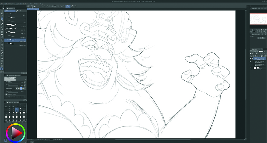
My sketching work is done in Clip Studio Paint. I use quick, loose strokes with the Line brush to create a rough base for the pose. Next, I lower the opacity of that layer, creating a new layer above where I then recreate the artwork, keeping the final lines and adding any last necessary details. After that I merge the layers.
02. Make it greyscale
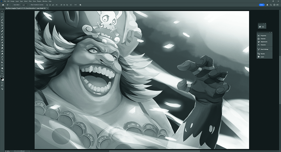
I avoid colour at first. Sometimes removing that distraction allows me to see my contrasting values more clearly. If your image isn’t coherent in greyscale, colour won’t make it any clearer. I take time to separate light from shadow and foreground from background. A lower background contrast helps the foreground stand out.
03. Add the colour
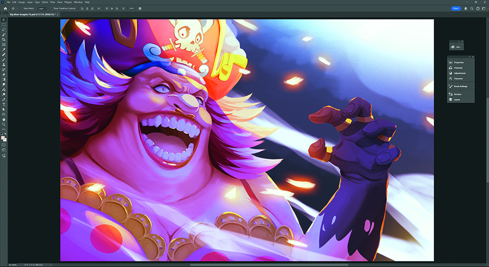
After creating a new colour layer over my greyscale, I work on getting a basic palette going. Colour layers don’t always give you the colour you need, so you may have to tweak the hue or saturation slightly. Once you’re at a point where you’re happy, you can merge the layers and paint in all the subtle little variations in colour.
For more inspiration, see the early character design sketches for DreamWorks' The Bad Guys 2.
You might also enjoy tying traditional art by following our piece on how to draw an dinosaur with pencils.
This article originally appeared in ImagineFX. Subscribe to ImagineFX to never miss an issue. Print and digital subscriptions available.
For more art workshops, don't miss Thomas Elliott's step-by-step guide to how he made the video game cover art for Doom: The Dark Ages.

Better known online as Ridd-Li, Sean is a self taught illustrator and concept artist from the small Caribbean island of Barbados. A lifelong consumer of animation and video games, he now works to grow within those industries as a creator.
You must confirm your public display name before commenting
Please logout and then login again, you will then be prompted to enter your display name.
