How I created the demonic video game cover art for Doom: The Dark Ages
Follow my process to see how I made this epic fantasy battle scene.
Sign up to Creative Bloq's daily newsletter, which brings you the latest news and inspiration from the worlds of art, design and technology.
You are now subscribed
Your newsletter sign-up was successful
Want to add more newsletters?
Doom has been a massive inspiration throughout my career. I love the blending of sci-fi and organic elements with religious imagery. Everything looks heavy and badass, and the soundtracks always gets me in the mood to paint. So it was a dream come true when publisher Bethesda contacted me to work on the cover for its latest title, Doom: The Dark Ages.
This was going to be a big project, and time was tight, so efficiency was the name of the game. The Dark Ages takes the franchise in a new direction with an overtly fantasy setting. The Doom Slayer has his classic array of guns but is now accompanied by a shield and mace.
Stressing the fantasy aspect of the game through the cover was important, so right off the bat we looked at the work of classic fantasy artists like Frank Frazetta to inform the composition and flavour. We briefly toyed with the idea of doing an oil painting for a real retro fantasy vibe, but time wasn’t on our side, so we went for full digital (see our guide to the best digital art software for alternatives, but I used Photoshop).
The brief described the Doom Slayer fighting his way through an army of hellish demons. With this many figures, I knew from previous battle scenes that if I got locked into rendering details too early that the piece would become a huge time sink.
The key is to have the image look punchy and impactful from the compositional, tonal and colour decisions alone, and it will then look even better when it comes to adding details. The key here is to manoeuvre the workflow to achieve this, which I’ll explain in depth as I go through my process below (if you need a tool to work with, see our guide to the best drawing tablets).
01. Read the brief and adjust the initial composition
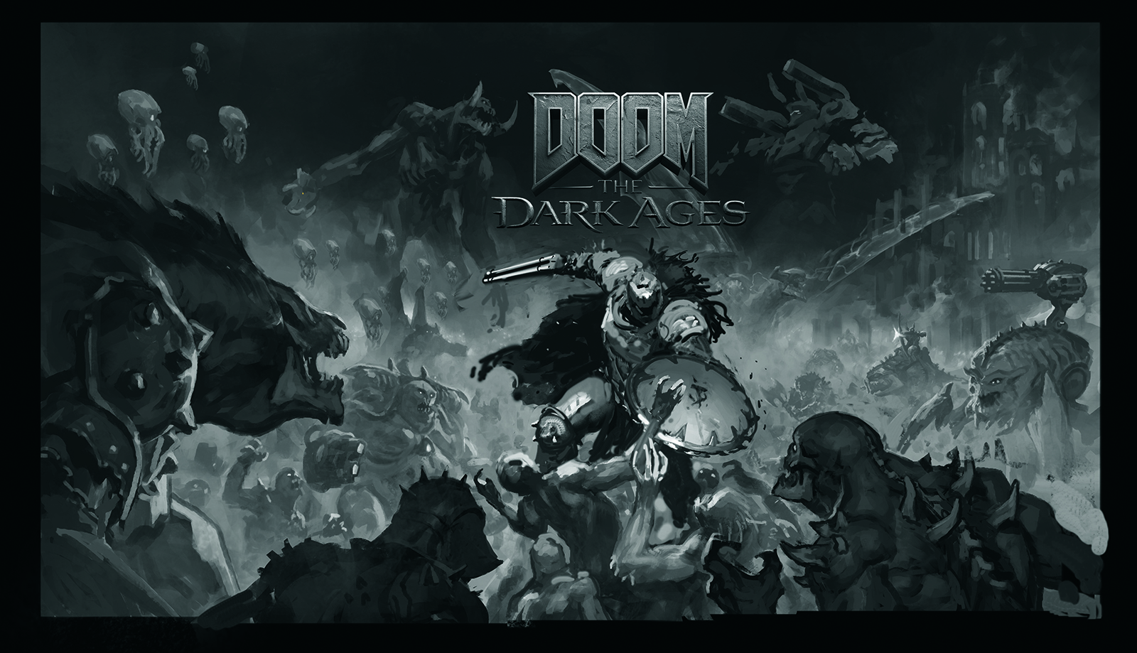
Before starting any picture, make sure you’re crystal clear on the brief and everything the client wants. Don’t be afraid to ask questions; it’s much quicker to figure something out verbally before you begin than to get halfway through the painting and then having to fix it.
I was provided with an approved thumbnail showing the layout and composition Bethesda wanted for this piece. From there, I began tweaking the pose of the Doom Slayer to get him looking as dynamic and action-packed as possible.
Sign up to Creative Bloq's daily newsletter, which brings you the latest news and inspiration from the worlds of art, design and technology.
02. Create colour thumbnails first
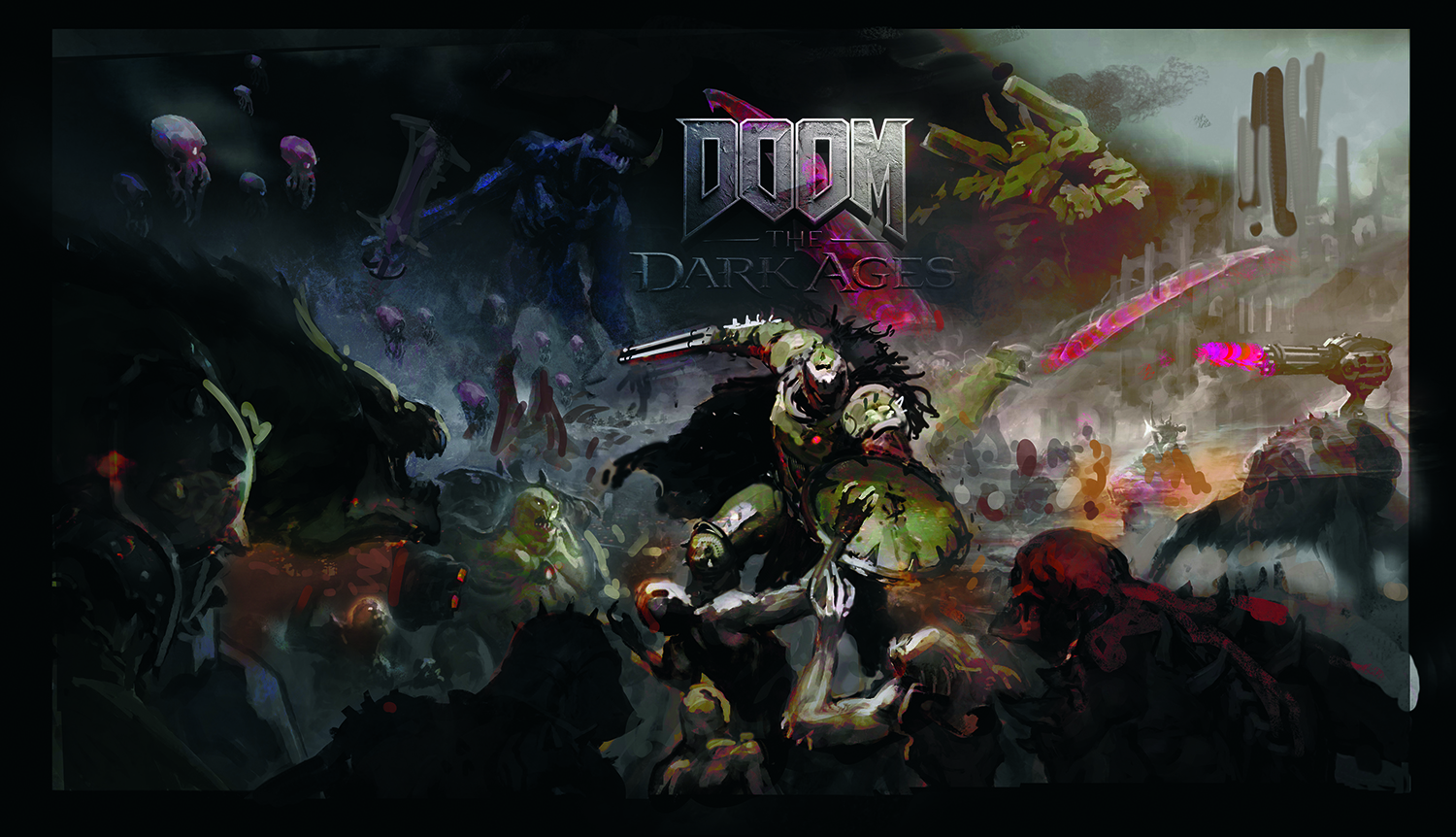
Colour is vitally important as it defines the mood and tonal balance of a piece. Getting this down first gives you a clear idea for the direction of the painting and means you can work in greyscale with greater confidence.
03. Colour thumbnail changes
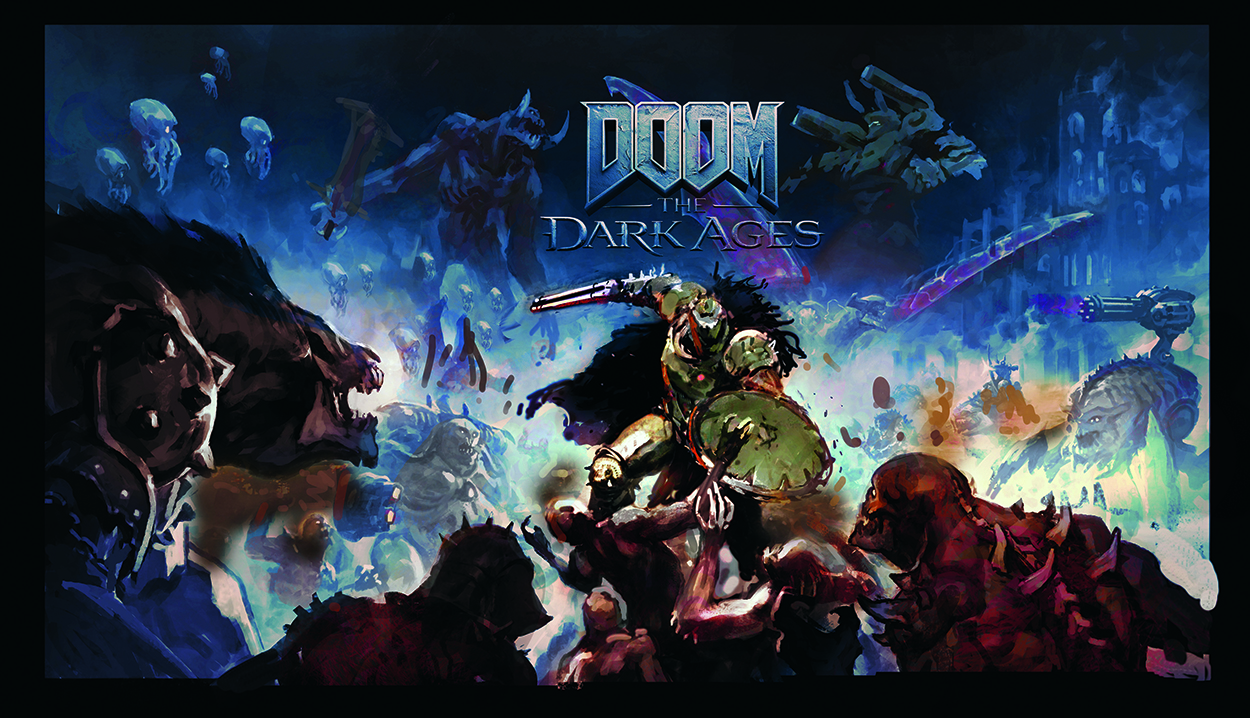
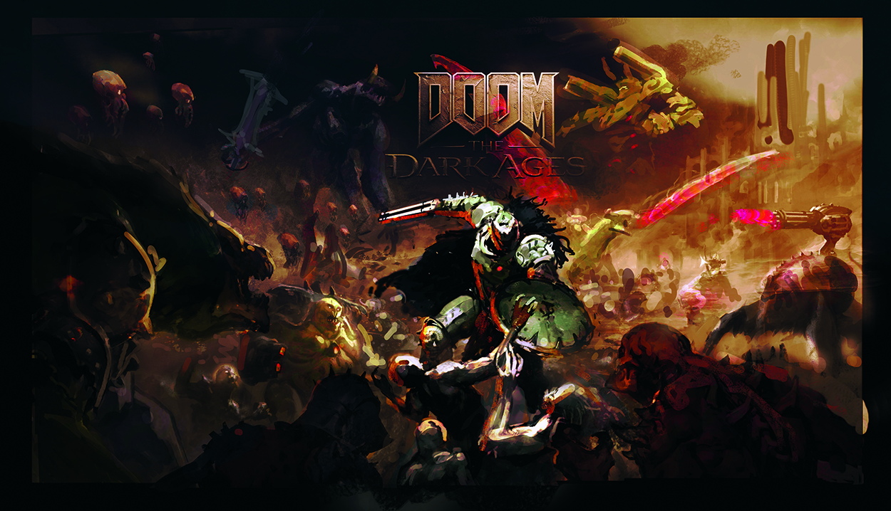
At this stage it’s important to check in and make sure the brief is being fulfilled. My first colour thumbnails had a strong blue background. This looked interesting but wasn’t communicating the fantasy vibes the brief stressed. Moving forward I went for something warmer, earthier and more traditional-looking that was in line with the hellish setting of the game.
04. Sketch out the characters for a guide
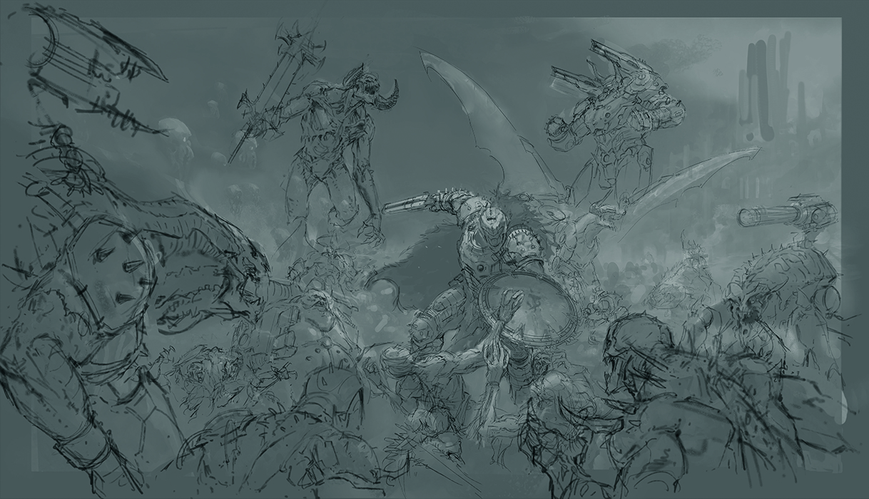
This picture features dozens of unique monsters that need to be accurately depicted. To get everything in the right place and know where the shadows would go, I made a loose sketch over a greyscale of the thumbnail. The layer was kept on top of everything from this point on.
05. Block in the values
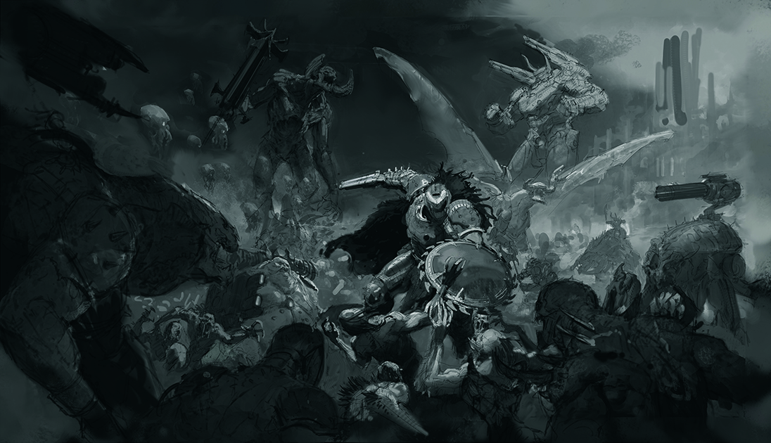
The key factor here is readability. With so much going on, it’s essential that the attention is on our central group of figures. I kept everything that wasn’t important either dark or rendered using two values so that the Doom Slayer would pop out above anything else.
06. Refine values and add detail
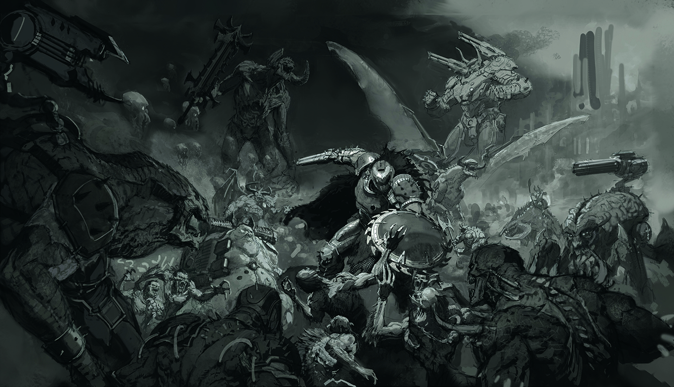
Now that we’ve roughly defined the values, it’s time to develop the next level of information. This is where I begin to give the impression of local values, the first hints of information, and start to define my shadows.
07. Shape the shadow
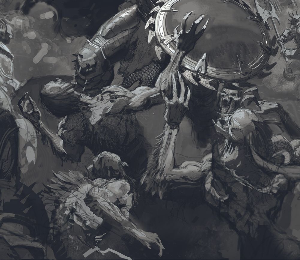
Image credit: Thomas Elliot
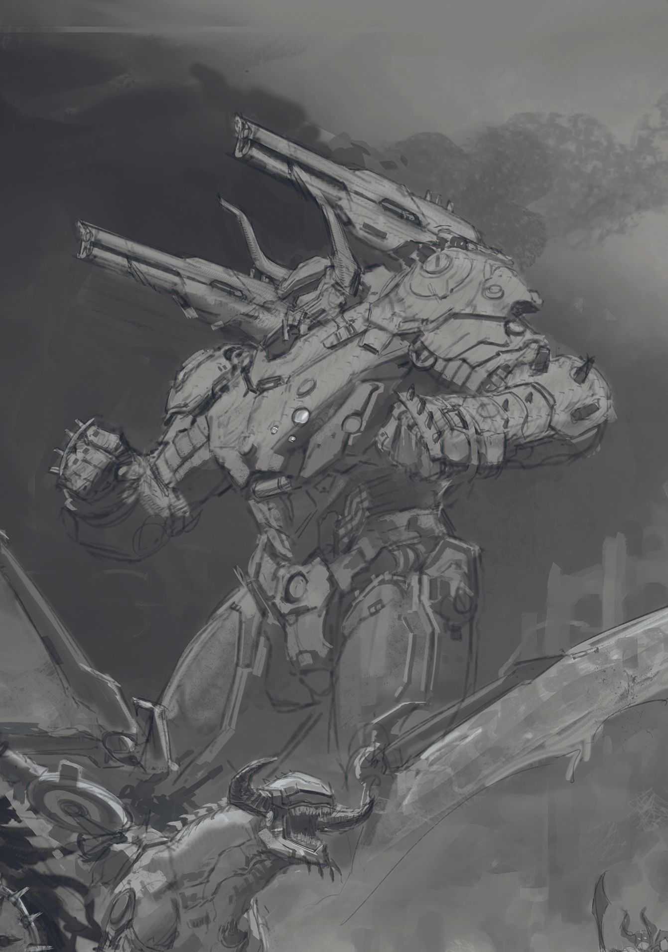
Image credit: Thomas Elliot
Knowing what’s in light and what’s in shadow is crucial. It defines the shape of the figure, can save you lots of time rendering, and looks great! If you find that your pictures are looking soft and mushy, try painting figures in just two values, shadow and light, and see how it can offer you a more painterly and dynamic look.
08. Place light against dark for clarity
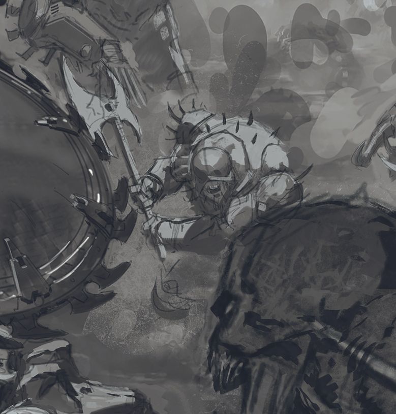
Image credit: Thomas Elliot
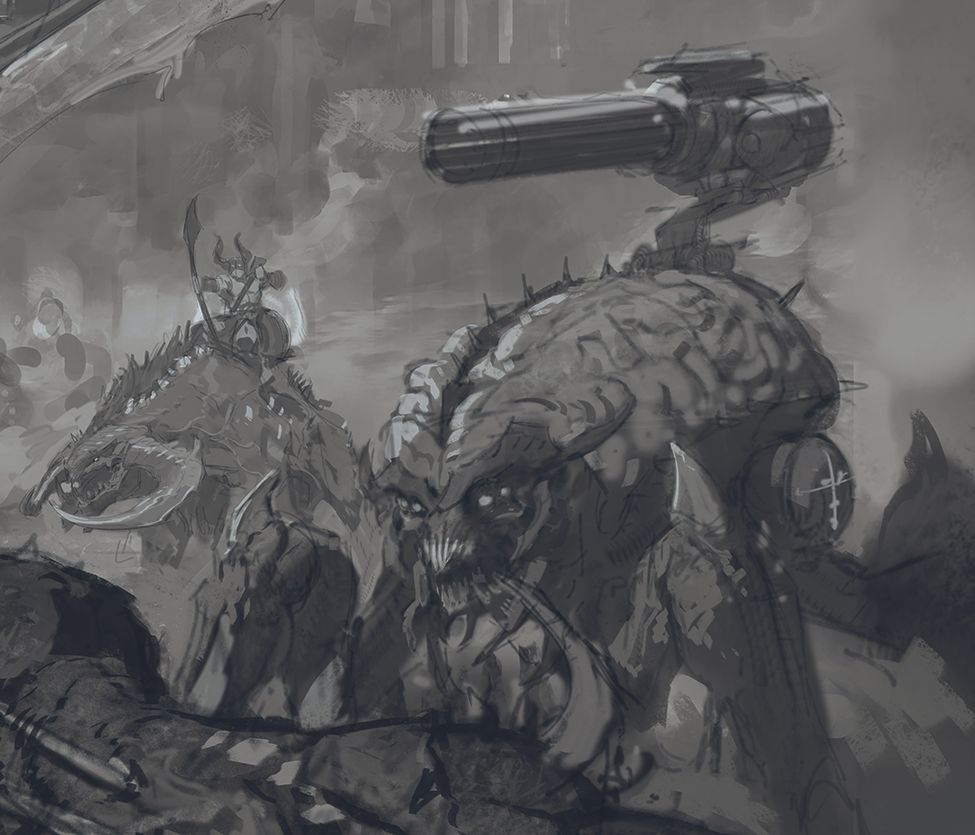
Image credit: Thomas Elliot
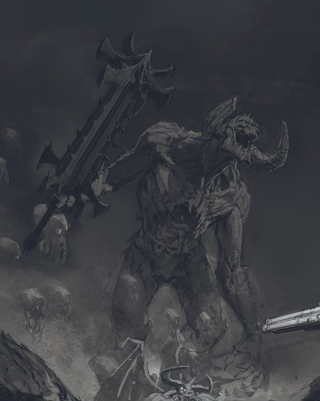
Image credit: Thomas Elliot
To help the characters read clearly, make sure that everything is either dark and framed against a light object, or visa versa. Doing this across the image allows your figures to stand out and be distinct from each other, especially in a busy, chaotic image such as mine.
09. Add the initial colours
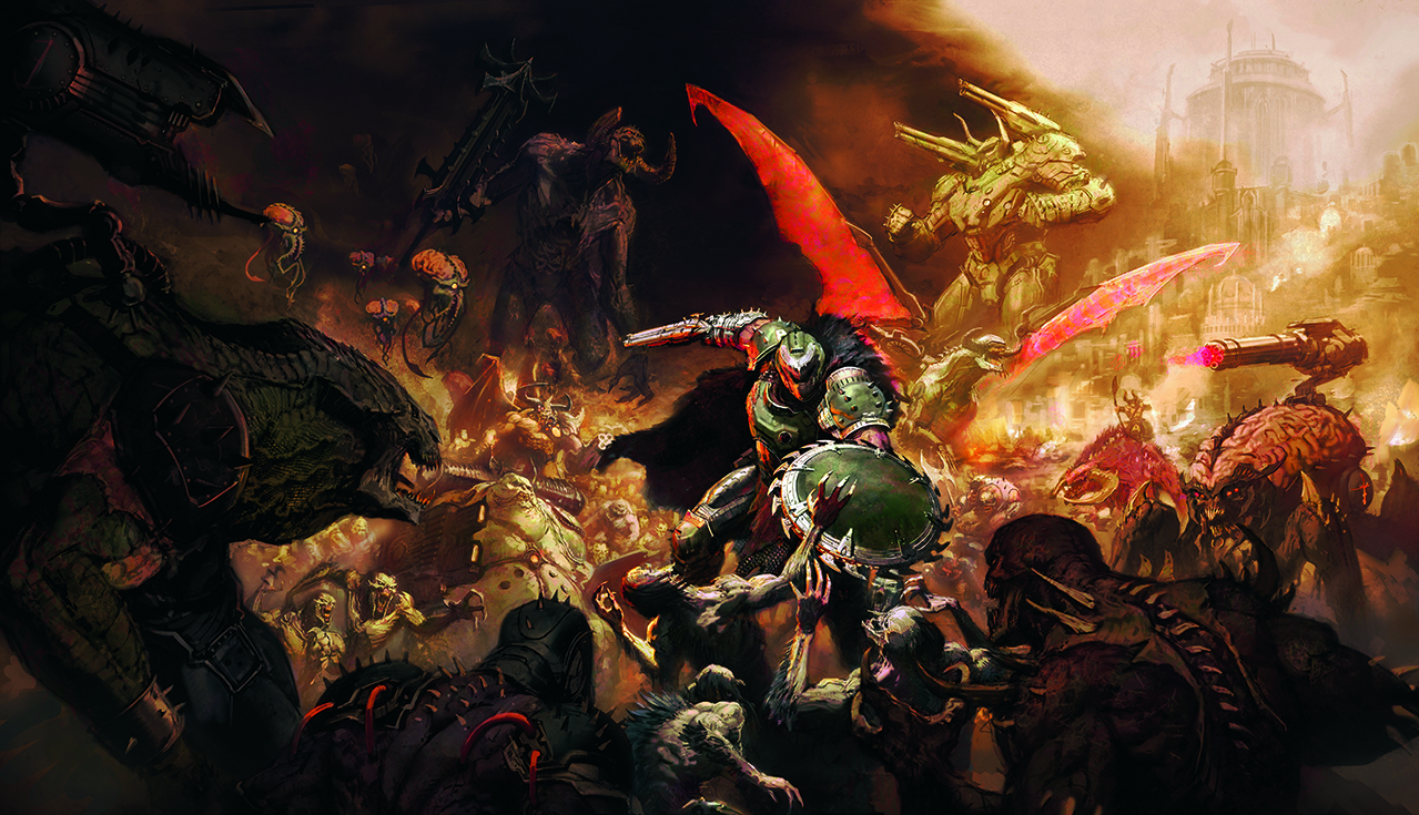
I use a combination of overlaid photos on various blending modes and Hard Light, Overlay and Multiply layers to add colour to the greyscale painting. Check back with the already approved colour thumbnail to guide your decisions here. Don’t worry if everything looks too intense or isn’t precisely right at this stage, as you’ll be painting over the piece moving forward.
10. Refine your palette
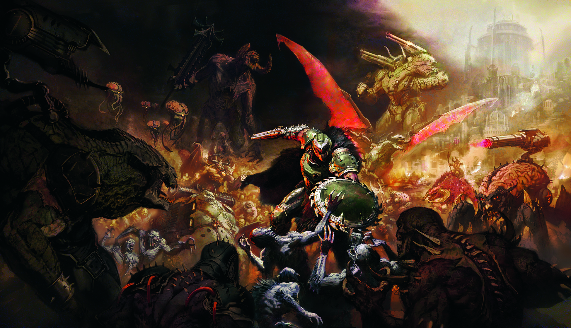
Now begin perfecting the colours, and smudging and knocking back areas so they don’t shout over parts we want to be noticed. I find that blending and glazing in this way while keeping what’s underneath visible gives a satisfyingly traditional look to a digital painting.
Use colour to control the focal point
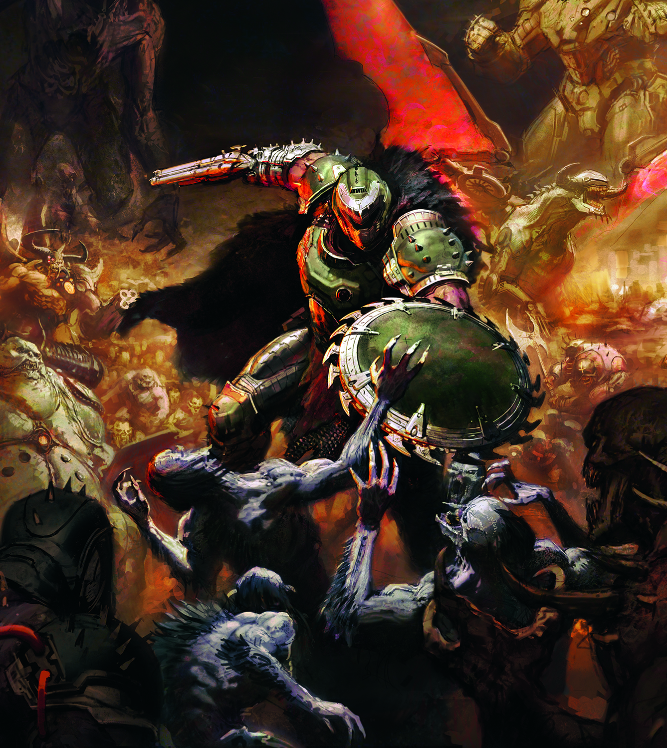
Colour is one of the many options you can use to focus the viewer’s attention on the right parts of the picture. Here I shifted the tone of the Imps below the Doom Slayer to a blueish hue in order to contrast with the rest of the picture.
12. First rendering pass
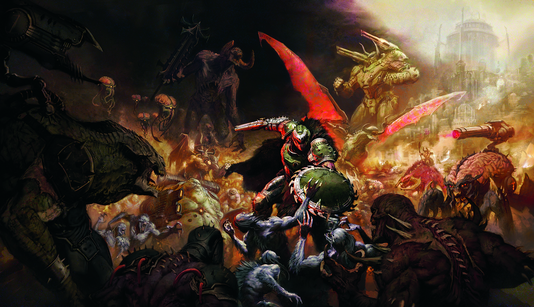
At long last we arrive at rendering! A lot of the information has already been established through the greyscale and colouring process, so it’s just a matter of breaking down the larger shapes into smaller shapes. I like to alternate between smudging and placing opaque marks to give a nice painterly look to this stage.
13. Keep the focus in check
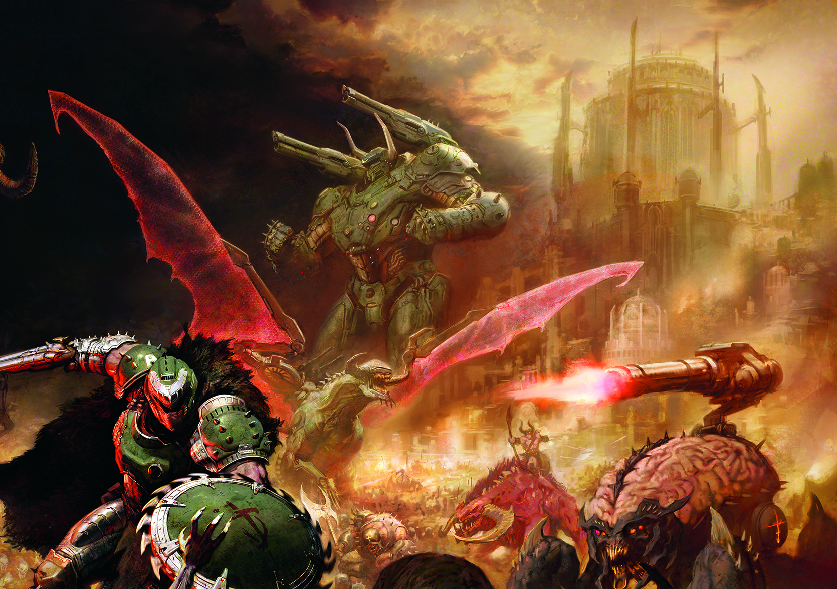
As a rule, your eye will always go to the brightest point on the image, so my plan was for the only pure white to be on the Doom Slayer. However, at some point I realised that the creamy colours in the top-right of the sky were pulling the viewer’s attention too, so it was necessary to knock that area back.
14. Create background figures
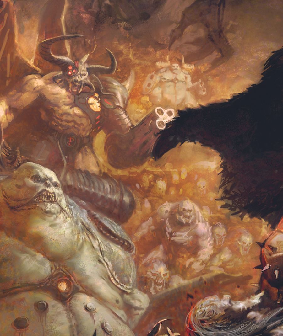
Image credit: Thomas Elliot
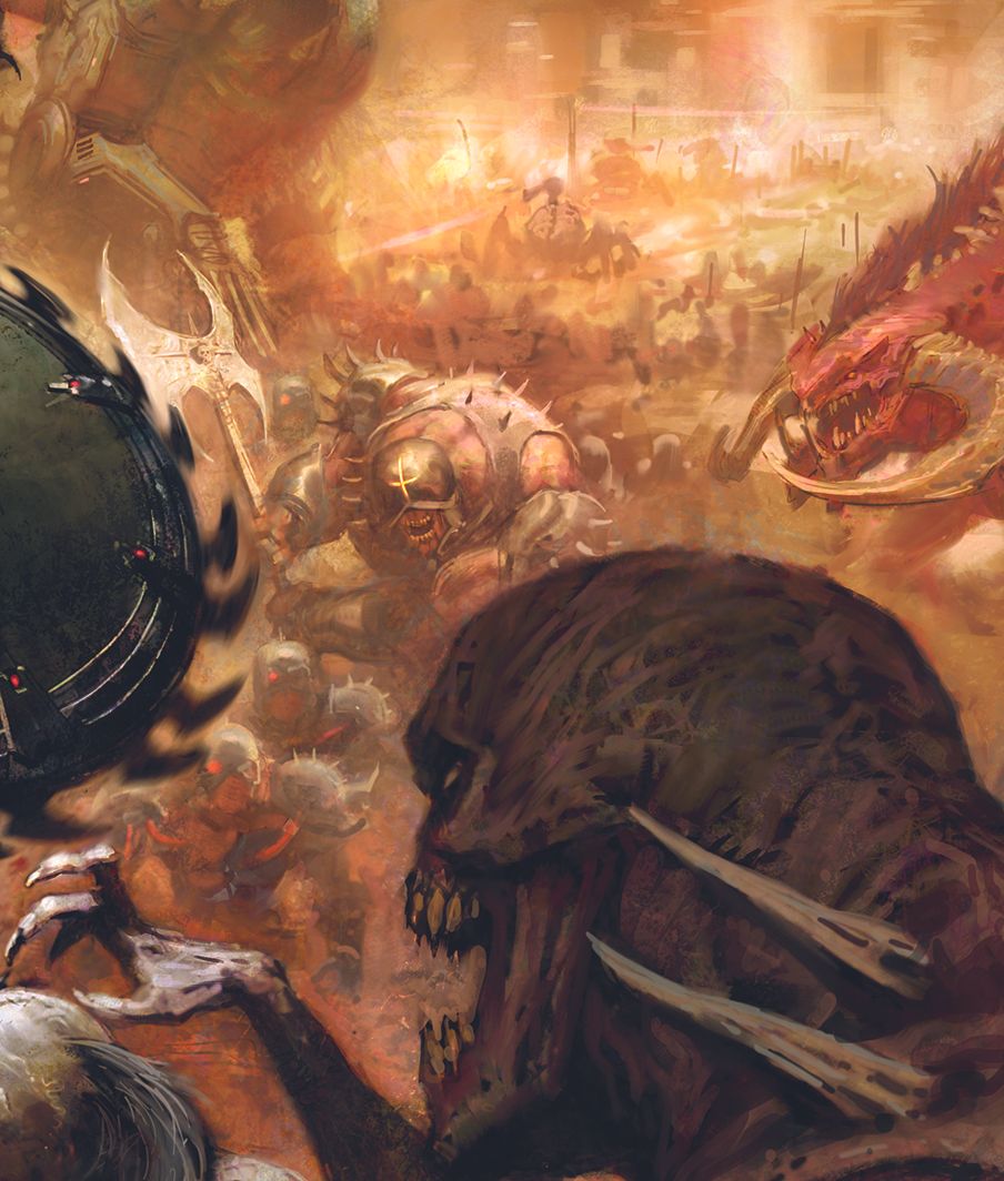
Image credit: Thomas Elliot
One of the satisfying things about painting battle scenes is that you can suggest dozens of background figures very quickly. To do this, imagine how the light would fall on them and just paint the highlights. This allows you to efficiently suggest lots of figures.
15. Last adjustments
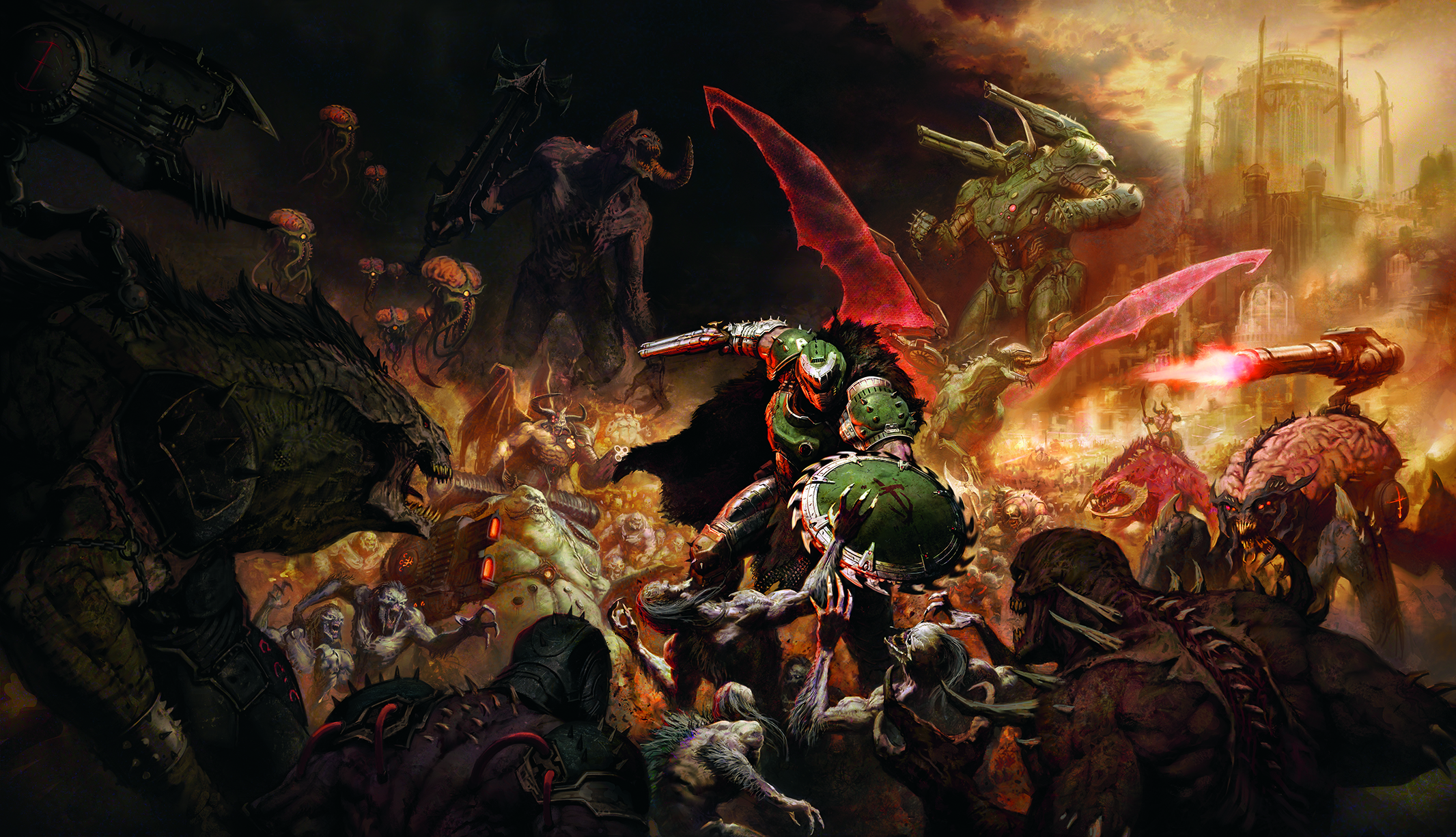
I bounce around within the picture addressing anything that needs fixing. This could be defining or softening silhouettes, sharpening details, or just adding information. If the painting has been built up properly these shouldn’t make a huge difference overall, but it’s always good to do nevertheless.
For more inspiration, see our guides to the best game art styles and the best indie devs. Also see our feature on the making of the character design for Sakamoto Days.
If you're looking for equipment, see today's best drawing tablet deals below.
This article originally appeared in ImagineFX. Subscribe to ImagineFX to never miss an issue. Print and digital subscriptions available.
Based in England, Thomas Elliott is a leading sci-fi and fantasy illustrator known for his intense battle scenes. Originally trained in fine art, Thomas brings his understanding of traditional mediums to his illustration. He is most well known for his work with Games Workshop, where he was part of their in-house art team for over five years. He now freelances for a range of major clients.
You must confirm your public display name before commenting
Please logout and then login again, you will then be prompted to enter your display name.
