Acclaimed book cover artist Dan dos Santos reveals his unused sketches
Sketching is a crucial part of the Marvel Masterpieces artist's process.
Dan dos Santos has hundreds of published book covers to his name, including dozens of New York Times Best Sellers. We had a lot of anticipation when we asked the seven times Hugo Award nominee if we could take a peek at his sketches, but we were still awestruck at what we saw. His talent explodes from the page, whether it’s cover art for bestselling books and comics, or his work on the Marvel Masterpieces trading cards.
Dan was kind enough to give us the lowdown on how sketching fits into his process. And to illustrate our interview, he shared with us some of his unused sketches from a range of projects.
“One of the sad facts about commercial illustration is that for every sketch that gets approved, three or four equally deserving sketches will be rejected, never to see the light of day again,” he says. “Sometimes those rejected sketches are actually my favourites. To me, they’re the inklings of paintings full of great potential that I’ll never get to see fulfilled”.
Article continues belowDan does his sketching digitally before making his finished pieces using oil paints. If you're inspired and need tools for your own cover art, see our guide to the best drawing tablets. If you prefer to work all traditionally, see our guides to the best sketchbooks and the best pencils for artists.
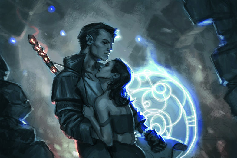
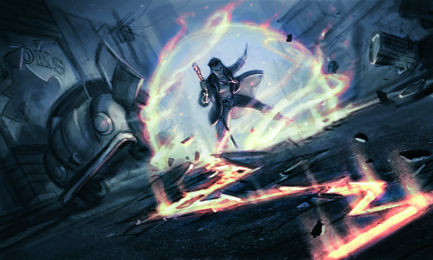
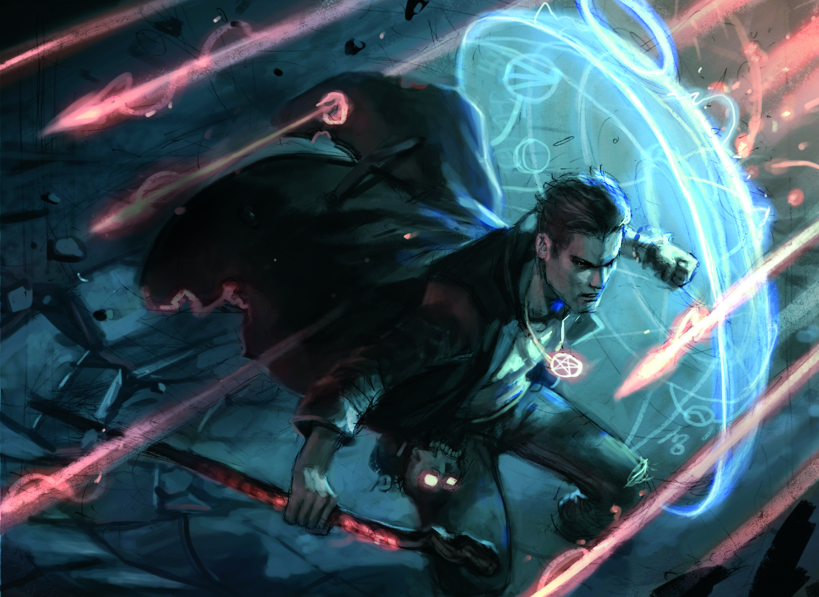
The Dresden Files: I’ve had the pleasure of painting Harry Dresden a multitude of times for various projects. These are a few unused ideas.
Option 1: With this sketch, I wanted to give the client the option for something more romantic, so I showed Harry more as the handsome leading man saving the damsel in distress.
Option 2: I thought it would be cool to show Harry summoning his force field. This zoomed-out street scene offered me the chance to add his car, an important narrative element.
Sign up to Creative Bloq's daily newsletter, which brings you the latest news and inspiration from the worlds of art, design and technology.
Option 3: My favourite of the bunch, this sketch was meant to be as cinematic as I could make it. I wanted to capture a sense of fireballs violently ricocheting off Harry’s shield.
Did you have a formal education in art, or are you self-taught?
I went to a four-year art school, and studied illustration pretty intensively. I focused as much as I could on traditional principals and painting techniques during my time at school, but learning art never really ends. I’ve picked up just as much since then from other sources over the years, including workshops, online courses, my peers, and just plain old experience.
How much of a part does sketching play in your workflow, and what does that look like?
Sketching has a huge role in my work. Because I’m a commercial illustrator, I’m always working within my client’s guidelines. Sketches provide my client not just with options, but a roadmap for the entire project. Sketches are absolutely integral to any project, and arguably the most important phase.
Is sketching more for practice or for playing with new ideas?
For me, sketching is always ideation. Every sketch that I do is an attempt at finding an elegant solution to whatever visual problem it is I’m trying to solve. Personally, I think of it a little like panning for gold. I spend most of my time sifting through countless bad ideas until I stumble across the glimmer of a good one, and that’s when I start digging there.
Option 1
Image credit: Dan Dos Santos
Option 2
Image credit: Dan Dos Santos
Option 3
Image credit: Dan Dos Santos
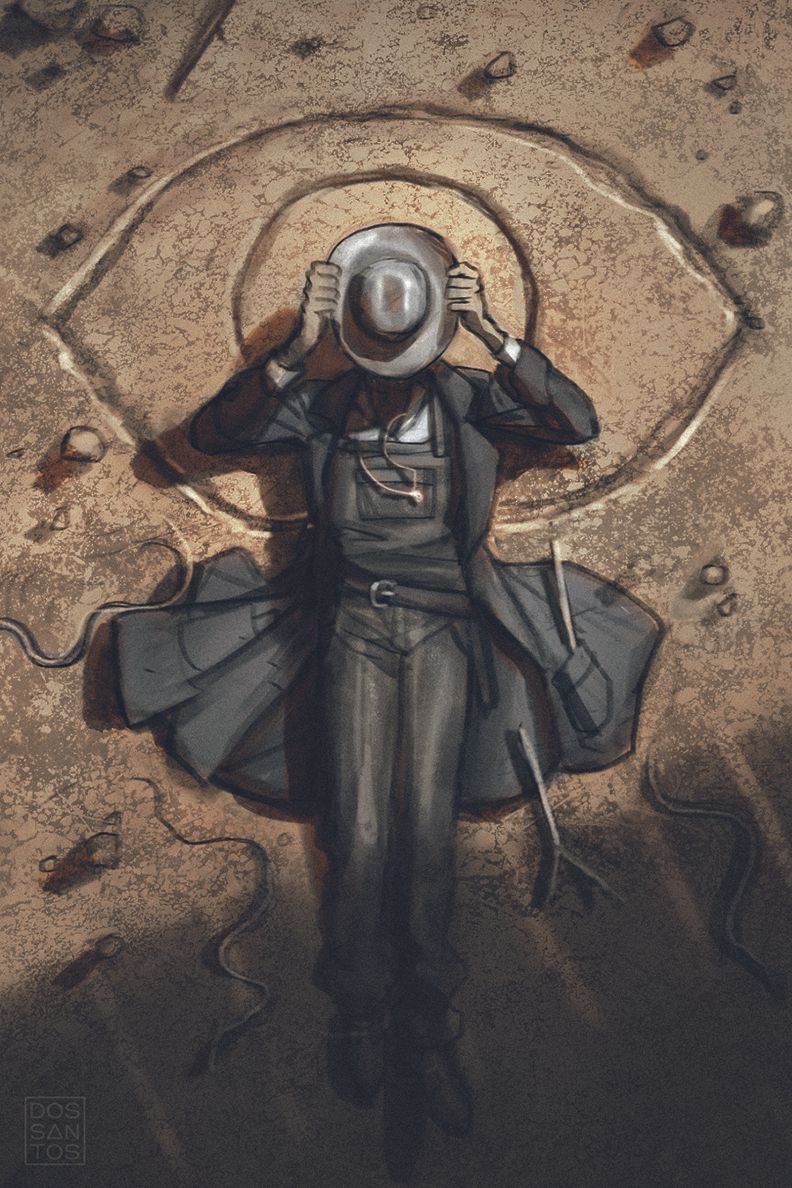
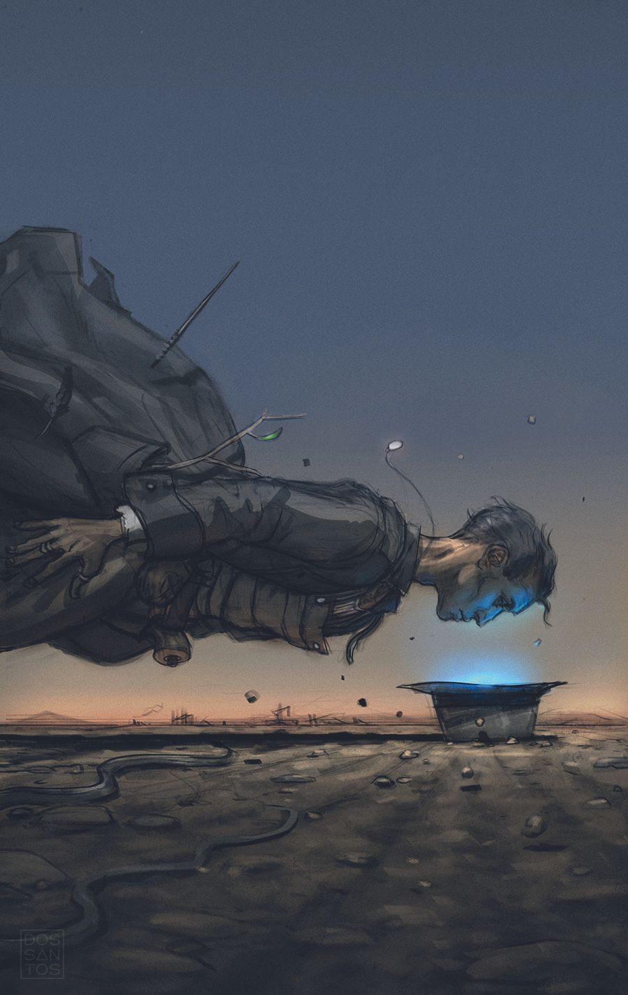
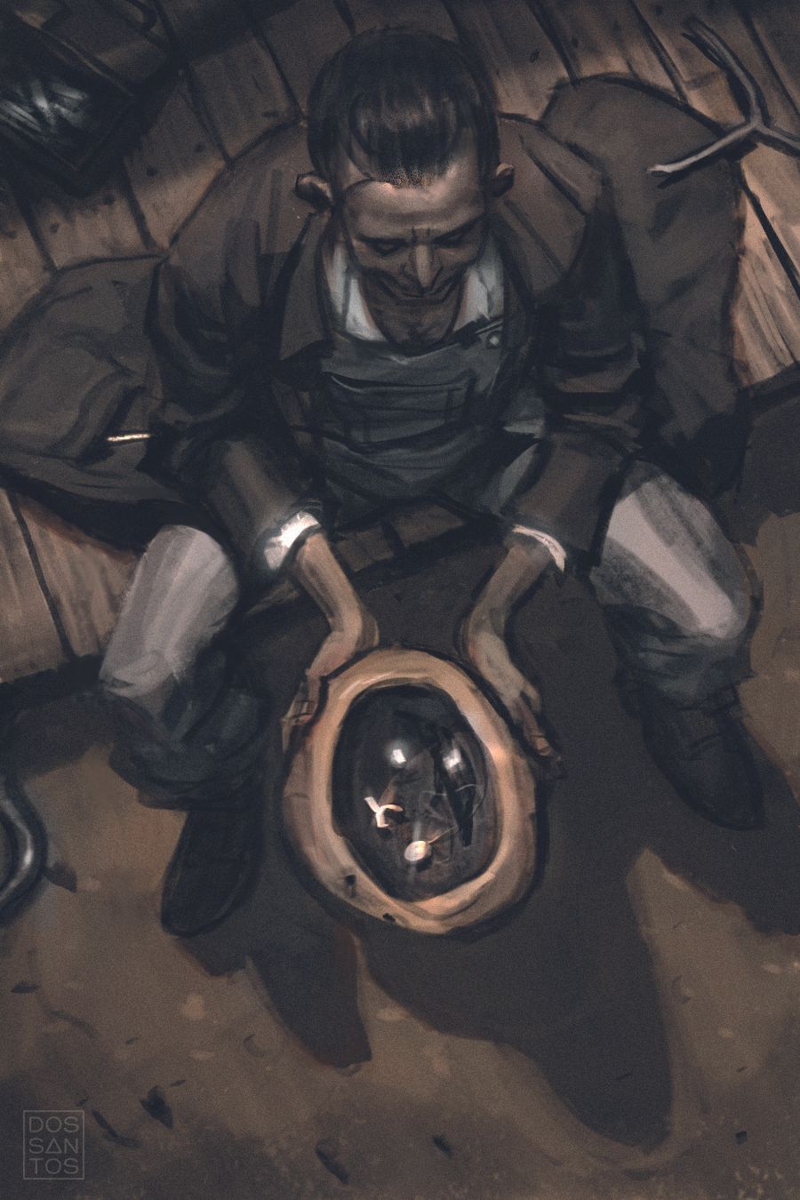
The Cunning Man. “This book, by D.J. Butler and Aaron Ritchey, had an amazing mood and focused on an American pioneer who uses an odd mix of Earth magic and demonism. A large part of the magic revolves around the main character’s hat.”
Option 1: “When the main character puts his face into his hat, he re-emerges on the other side in an alternate world where he can commune with demons. I thought the eye symbology would be a clever way to allude to this supernatural sight.”
Option 2: “This piece is bit more symbolic than literal, but captures the right vibe, and is ultimately what the client decided on.”
Option 3: Here, the hero is tossing bones inside his hat as a form of fortune telling.”
You’ve produced work across many mediums, from film and TV to comics and tabletop games. Is there one that sparks your enthusiasm more than others?
They each have their own appeal, but cover work, no matter the genre, will always be my real passion. Unlike sequential art, a cover provides you with just a single image in which you need to capture a sense of the whole story. I see that as a uniquely difficult challenge, and one that I really love.
Describe your process for us
However much time I have for a job, whether a day or a month, I typically spend half of it sketching out ideas. That may seem like a lot, and it is. It’s atypical for a lot of illustrators, but I prefer to really front-load all of my problem solving in the process.
I’ll often find that when an image develops past the sketching phase and closer into final, new problems start to arise that often spoil the piece for me. It doesn’t look as cool as I thought, or something is too confusing to understand.
Whatever it is, I want to make sure I figure out that fatal flaw before I offer it as an option to a client. Likewise, as I start to develop a sketch further, I’ll oftentimes stumble across something completely magical that I couldn’t have anticipated, and it ends up making the sketch so much better.
It’s because of these reasons that I typically bring my sketches to an incredibly high level of finish, usually in full colour. It wastes a lot of time in the initial phases, but once a sketch is approved, the final goes extremely quickly due to all of the pre-planning, and I easily make my time back.
Option 1
Image credit: Dan Dos Santos
Option 2
Image credit: Dan Dos Santos
Option 3
Image credit: Dan Dos Santos
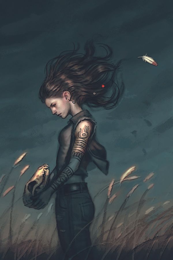
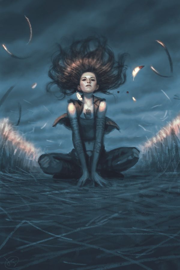
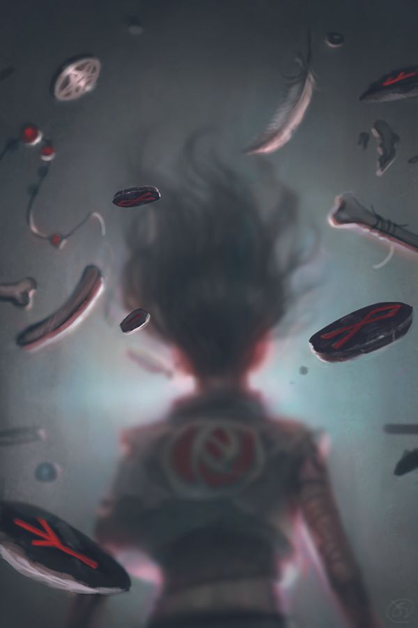
Mercy Thompson: “I often think of the book’s title when I’m concepting a cover. It’s often really important. For instance, if a title has the word ‘queen’ in it, or the word ‘blue’, then the cover should probably have a queen or the colour blue in it somewhere, or it’s going to be confusing to the viewer.
Likewise, the title is often a source inspiration. In this example, the book was called Storm Cursed. Those two words served as my main inspiration as I sketched. I kept asking myself if I was evoking the spirit of them in my images.
Option 1: “In this image, I used a specific scene from the story that I felt was a symbolic moment.”
Option 2: “For this shot, I wanted to use the heroine’s hair as a chance to evoke a sense of storm and magic at the same time, as if she was the source of this wild power.”
Option 3: “This was a total departure from the others and owes its power to not being able to see the character. She’s walking into the image, which effectively draws the viewer in too.”
How do you develop a sketch into a fully rendered piece? Do you work over the top or use it as reference?
Even though I paint all of my finished work traditionally, typically using oil paints, I do all of my sketching digitally. Because so much of my concepts revolves around a sense of colour and light, digital sketching is much better suited for it.
By sketching digitally, I can work with colour and quickly evoke a sense of light and mood in a way the traditional pencil and paper just can’t do
When you paint fantastical creatures, heroes or monsters, where do you start?
Another benefit of having really refined sketches is that I readily know exactly what I don’t need to know for an image. That’s surprisingly helpful, as it means that I can spend my time more effectively on the things that are actually important, rather than spending an entire day drawing the hind legs of a dragon that you’re not going to see in the final art anyway.
What powers you through the day?
Oh, it’s just obsession and a lot of caffeine. I’ll sometimes put on an audiobook or some old Star Trek reruns, but nine times out of ten, I’m just working in silence. I think most people find it disconcerting to do that, but I enjoy it.
I’m intensely focused when I work, and painting is quite often like having a conversation with your artwork. The silence let’s me better hear that conversation
What’s the proudest moment in your career?
Probably the release of my most recent Marvel Masterpieces trading card set. I did 140 oil paintings in under two years. In the end that all worked out to be a full painting every three days – absolutely non-stop.
That’s just an insane amount, but I still managed to pull it off. It was easily the hardest job that I’ve ever done but, despite the constraints, I really like the work I’d produced come the end of it.
Do you have any advice for those at the beginning of their journey?
I’ll keep it short and tell you what a teacher once told me: “Beneath every good painting is a great drawing.
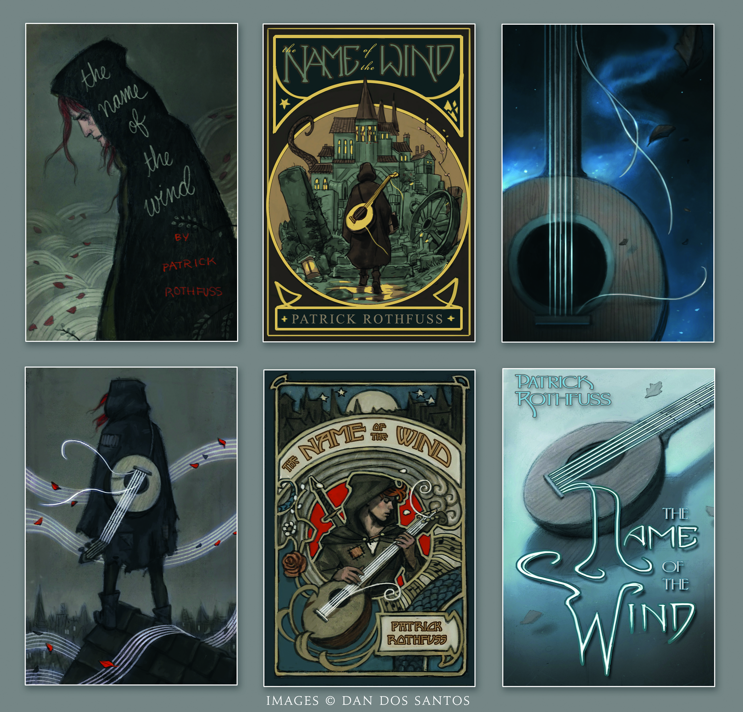
Option 1 & 2 (left): This book deals with both wind and music a lot. As a result, I felt the musical staff lines could serve as a clever visual device for both of those elements in this image.
Options 3 & 4 (middle): There are many things about this book that make it feel like an old, sprawling, epic fantasy novel to me. As such, I tried to evoke a sense of classic fantasy and treat the cover like an old fashioned embossed edition, as you might see on a Jules Verne book.
Options 5 & 6 (right): For these sketches I focused on only the lute, omitting the hero completely. The lack of a figure on a cover sometimes gives a title a more adult-focused mainstream appeal, which helps to invite non-fantasy readers into picking up the book.
Sketches were vital for developing the concept for Dan's book cover art for the illustrated version of Patrick Rothfuss’s The Name of the Wind.
“Sketches are an opportunity not just to explore options, but for my clients and the authors to explore. The same book can be targeted to a variety of different demographics with just a few tonal shifts. For this project, I explored a lot of options.
“In this grouping, you can see how I’m presenting my client not just with different compositions, but totally different approaches as well. You’ll also notice that I’m already playing with the type design at this point.
Although the type will ultimately be designed by a professional graphic designer later on, I sometimes incorporate it into my sketch, especially when it’s an integral part of the composition. In the last sketch for instance, the concept is entirely dependent on the type and vice-versa.
How to choose the sketch for a book cover
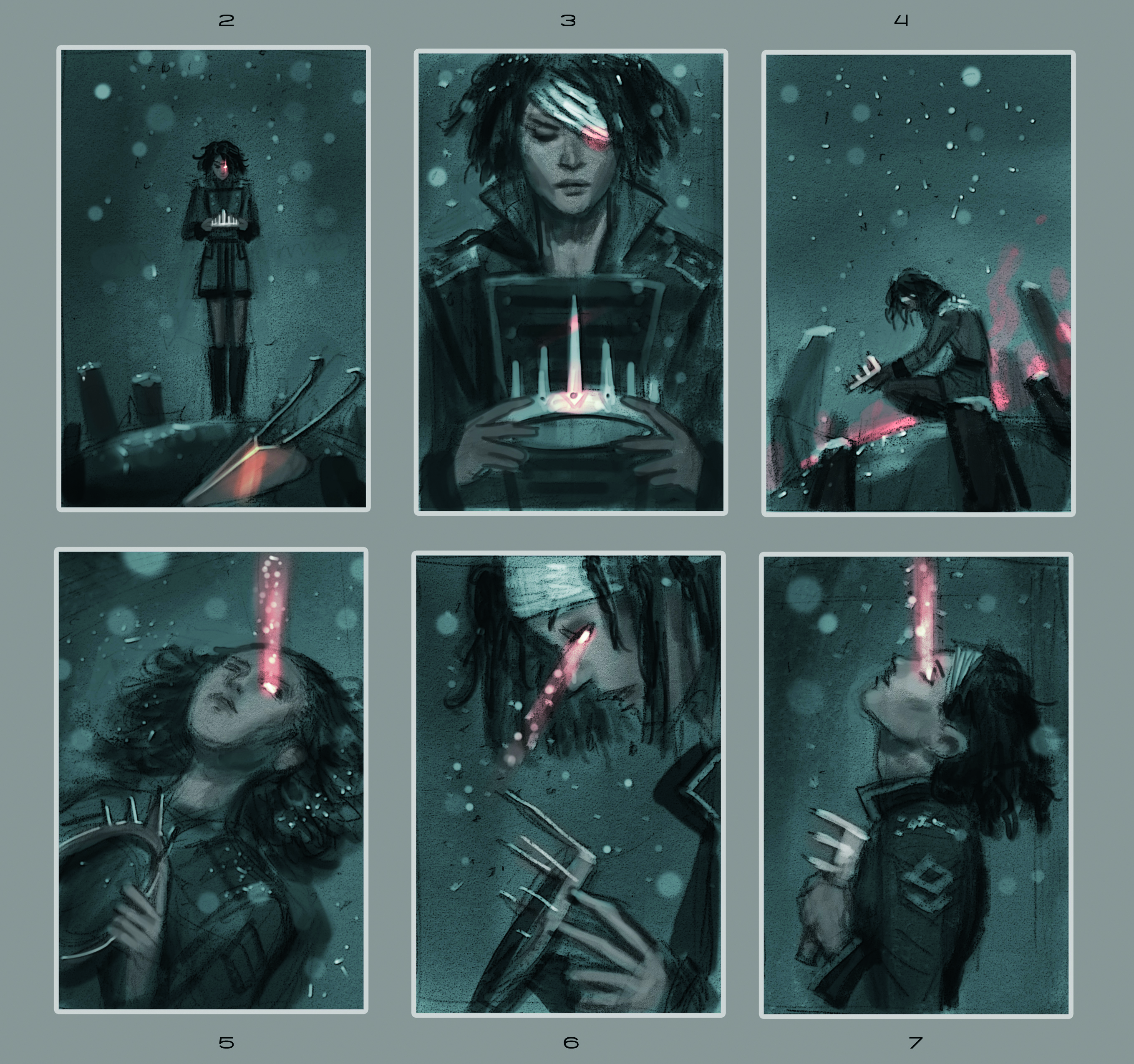
Dan recommends grouping your sketches together. “Having one sketch right next to another ensures I’m looking at the bigger picture and really offering something different with each option,” he says.
“Even in this case where I decided to stick with the same palette and narrative for every sketch, I make a conscientious effort to explore a wide array of camera angles and figure sizes. On top of that, when I see my sketches together like this, I can see which ones have the most impact at a distance, not unlike the way it will be viewed on the book shop shelves.
“Quite often I’ll pick just a few of the strongest sketches to submit and then pre-emptively edit down the sketch options. If I submit three sketches to a client, it’s likely I produced five or six decent ones, and simply culled the options down to the strongest contenders.”
You can see more of Dan dos Santos's work on his website.
For more inspiration, see Tony DiTerlizzi's tips for how to design book cover art and Rittsu Kogarasuashi's tips for book cover design. You might also want to see our roundup of other digital artists' work.
This article originally appeared in ImagineFX. Subscribe to ImagineFX to never miss an issue. Print and digital subscriptions available.

ImagineFX is the No.1 selling digital art magazine for fantasy and sci-fi enthusiasts! Featuring digital and traditional drawing skills, game design, manga and film art each issue is crammed with training and inspiration from leading artists in their fields. Whether it's learning from comic art's Adam Hughes, fantasy art's John Howe, or digital painting's Loish, ImagineFX has you covered. ImagineFX has been inspiring artists for over 20 years!
You must confirm your public display name before commenting
Please logout and then login again, you will then be prompted to enter your display name.
