How to draw like a 19th century master
Silent Hill 2's creative director Mateusz Lenart shares his workflow for intricate ink art.
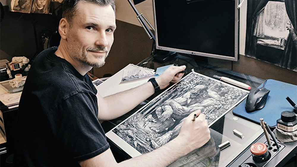
The best illustration isn’t just about craft – it’s about storytelling, rhythm and intention. In this tutorial, I’ll walk you through an illustration from concept to final touches. The goal is to share not only techniques, but also the reasoning and philosophy behind each step.
The subject I chose, a reversal of the classic knight-versus-monster dynamic, allowed me to play with the scale, tension and the viewer’s expectations, while still staying grounded in traditional methods.
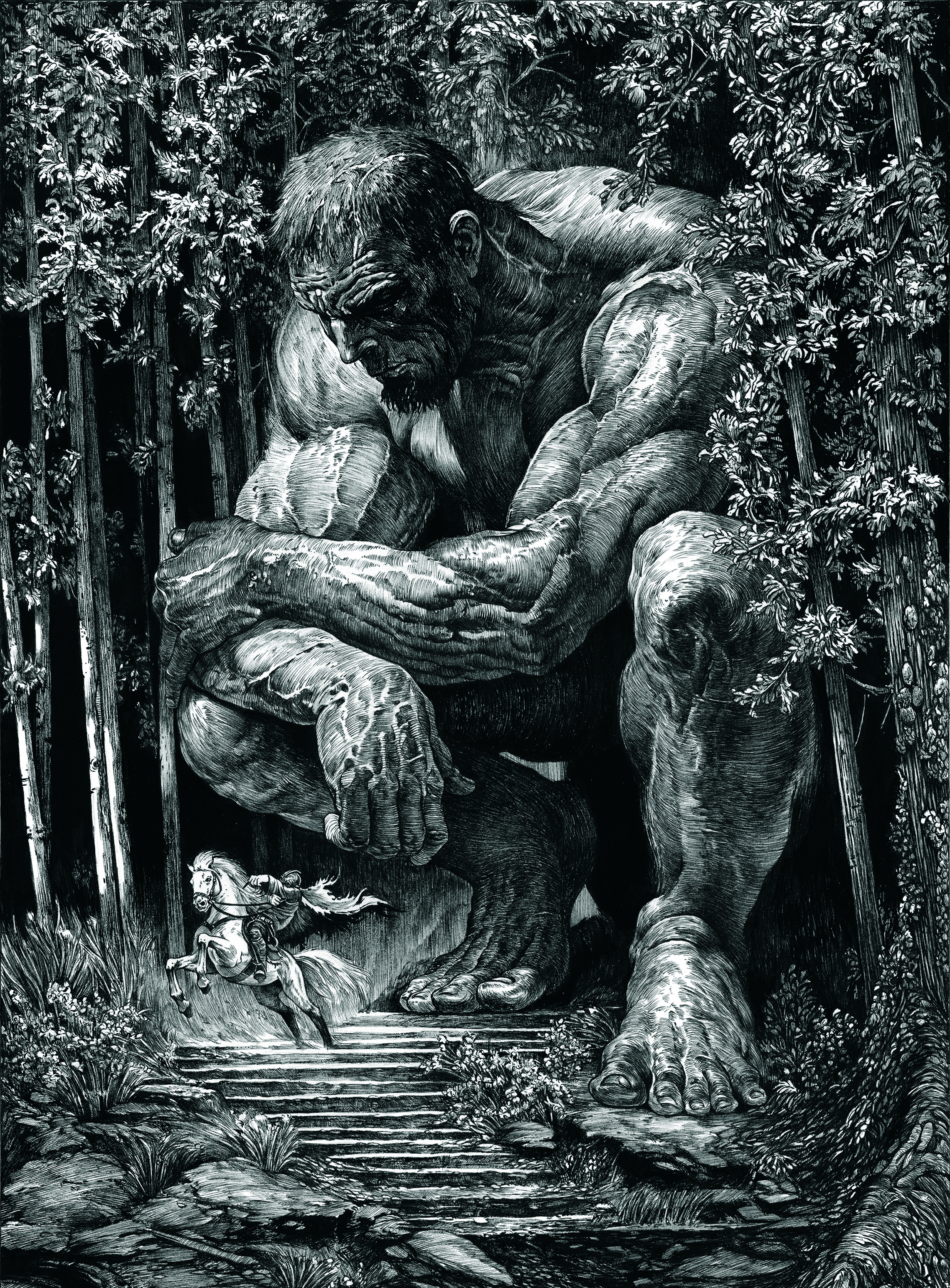
Pen and ink is a demanding, often unforgiving medium. Every line counts and there’s no undo button, so each mark must serve the bigger picture. That’s why I emphasise planning and structure from the very beginning; sketching, studying values, and understanding how line direction can enhance form.
Article continues belowWhile I draw inspiration from 19th-century masters such as Franklin Booth and Gustave Doré, as well as more modern artists like Bernie Wrightson, I also experiment with tools, combining my precise technical pens with expressive brush pens, and even some dry brush techniques to bring a little organic energy to the page (see our guides to the best pencils for artists and the best pens for artists).
You’ll see how different textures require different tools and strokes. I’ll discuss how to maintain a sense of depth, light and composition while keeping the line work alive and dynamic. Throughout, I focus on clarity, contrast and pacing, making sure the viewer’s eye flows where I want it to go.
I hope this workshop helps you look at ink not just as a tool, but as a language – one that you can bend, break and master.
01. Choose the subject
Every compelling illustration begins with a strong concept. I aimed to subvert expectations by flipping the classic hero in peril narrative, playing with scale and perspective. The key is to build a story within the image, encouraging the viewer to pause, reflect, and imagine the events that preceded or will follow this moment. I chose to explore the classic knight-versus-giant trope.
Sign up to Creative Bloq's daily newsletter, which brings you the latest news and inspiration from the worlds of art, design and technology.
02. Learn from the masters
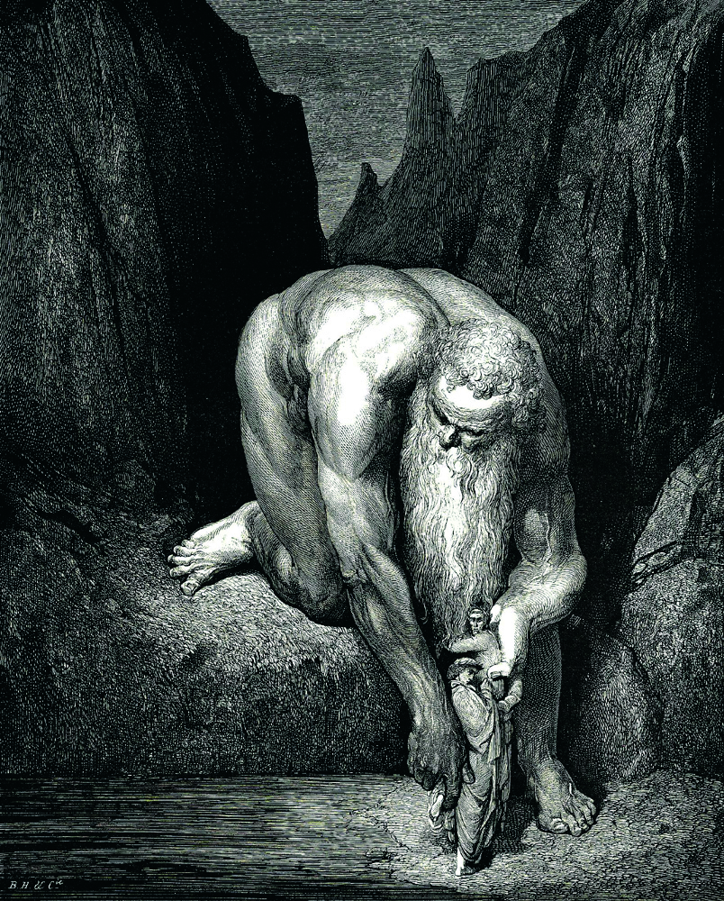
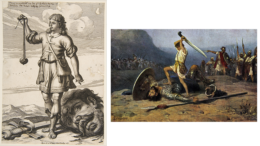
We’re all students of the great masters, and there’s no better way to improve our skills than by studying the works of our idols. My series draws its inspiration from 19th-century pen and ink techniques. I reference classical masters such as Franklin Booth, Gustave Doré, Bernie Wrightson and Joseph Clement Coll, analysing their line work and shading to achieve a traditional style.
03. Plan early and sketch the composition
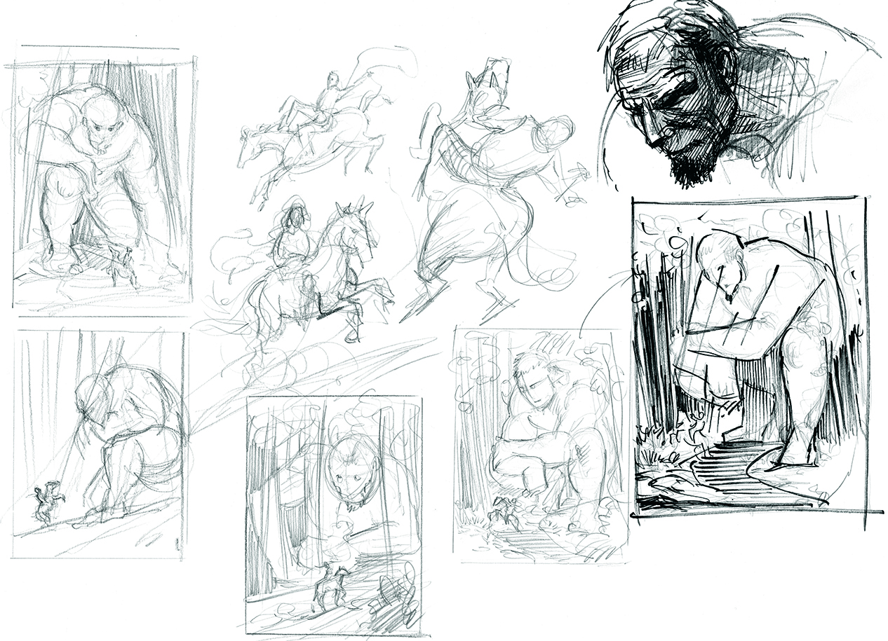
Planning starts with quick sketches to explore impactful compositions. The goal is to direct the viewer’s attention through lines and energy. I aimed to place the knight in a challenging situation, highlighting the contrast with the giant. Ultimately, the giant’s gaze and hand guide the audience’s focus towards the knight, with the tree directions further steering the eye.
04. Understand values
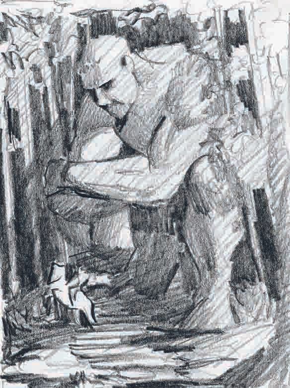
Image credit: Mateusz Lenart
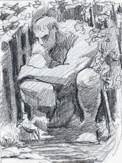
Image credit: Mateusz Lenart
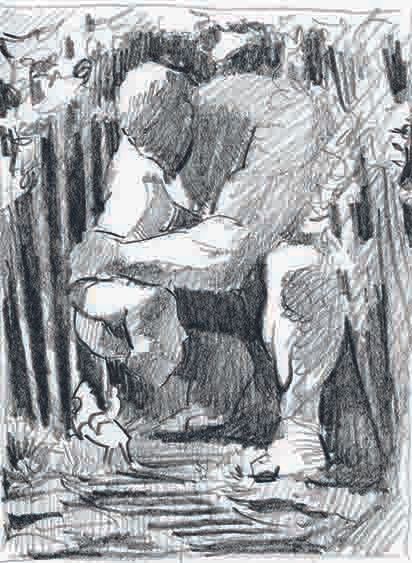
Image credit: Mateusz Lenart
At the sketching stage, it’s important to test how light and shadow will distribute across the image. Playing with the values is key to creating depth and realism.
By balancing light and dark areas we can enhance the composition, which draws attention to the image’s focal points. The giant and knight should emerge from the dark background with the giant in half shadow to direct the focus onto the knight in the light.
05. Refine the sketch
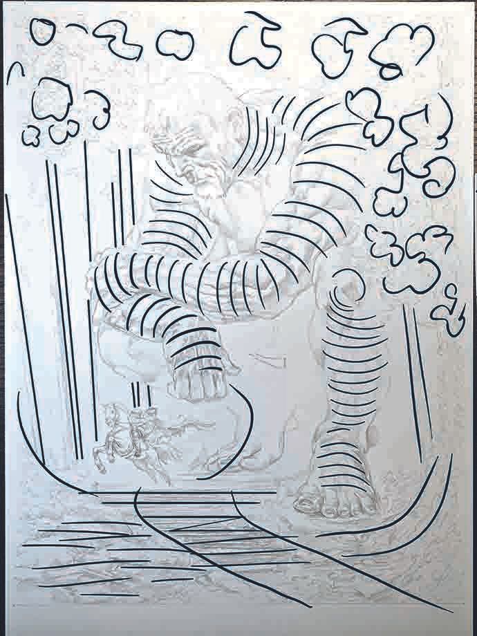
Image credit: Mateusz Lenart
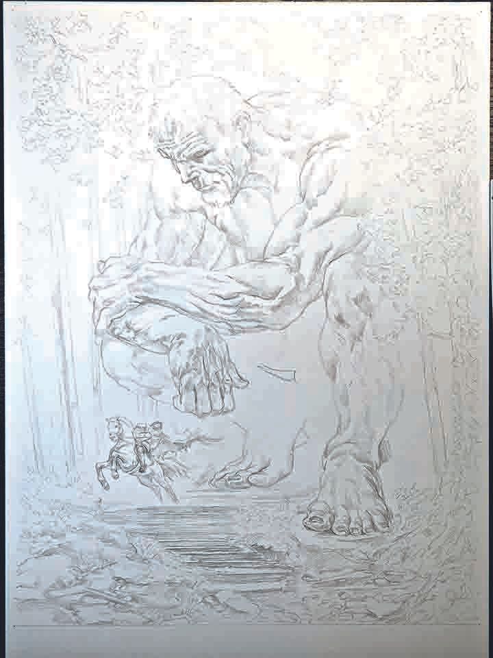
Image credit: Mateusz Lenart
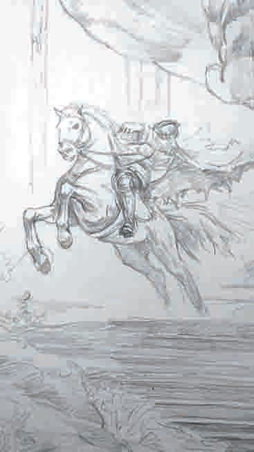
Image credit: Mateusz Lenart
Once the composition is in place, it’s time to refine the sketch. At this stage, lightly block in the line work and shapes. I use horizontal lines for the ground, vertical ones for the trees, and organic forms for the giant in order to provide a solid foundation for building the piece while helping with the visual balance of the scene.
06. Establish shapes with ink
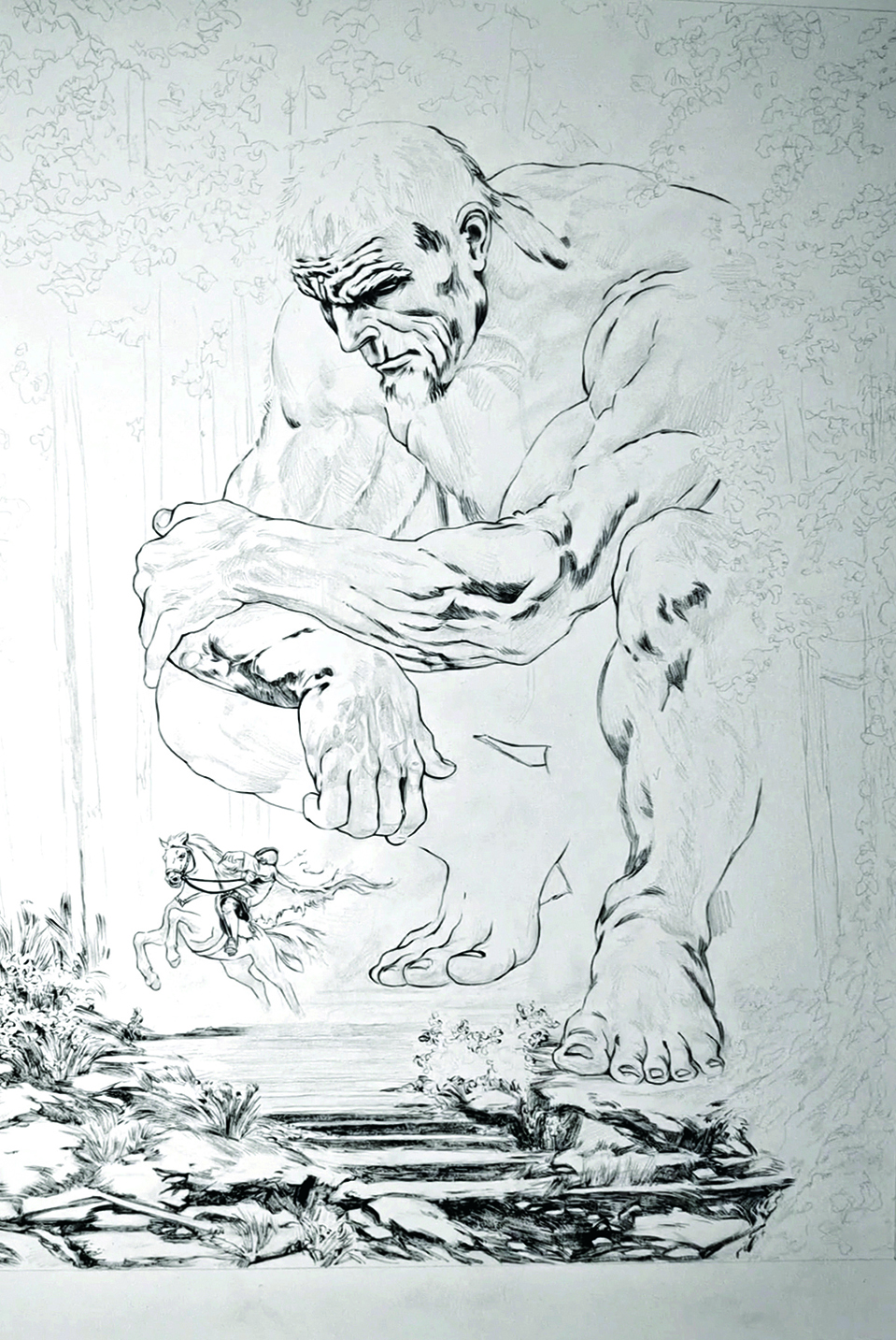
Begin blocking in the shapes of the image using a brush pen to solidify the structure. It’s important not to commit too heavily to dark tones too soon, as it will limit your flexibility. Gradually introducing darker areas as we progress keeps the artwork fresh and allows for adjustments to be made in terms of light and shadow, which create the depth in our image.
07. Stone surface detailing
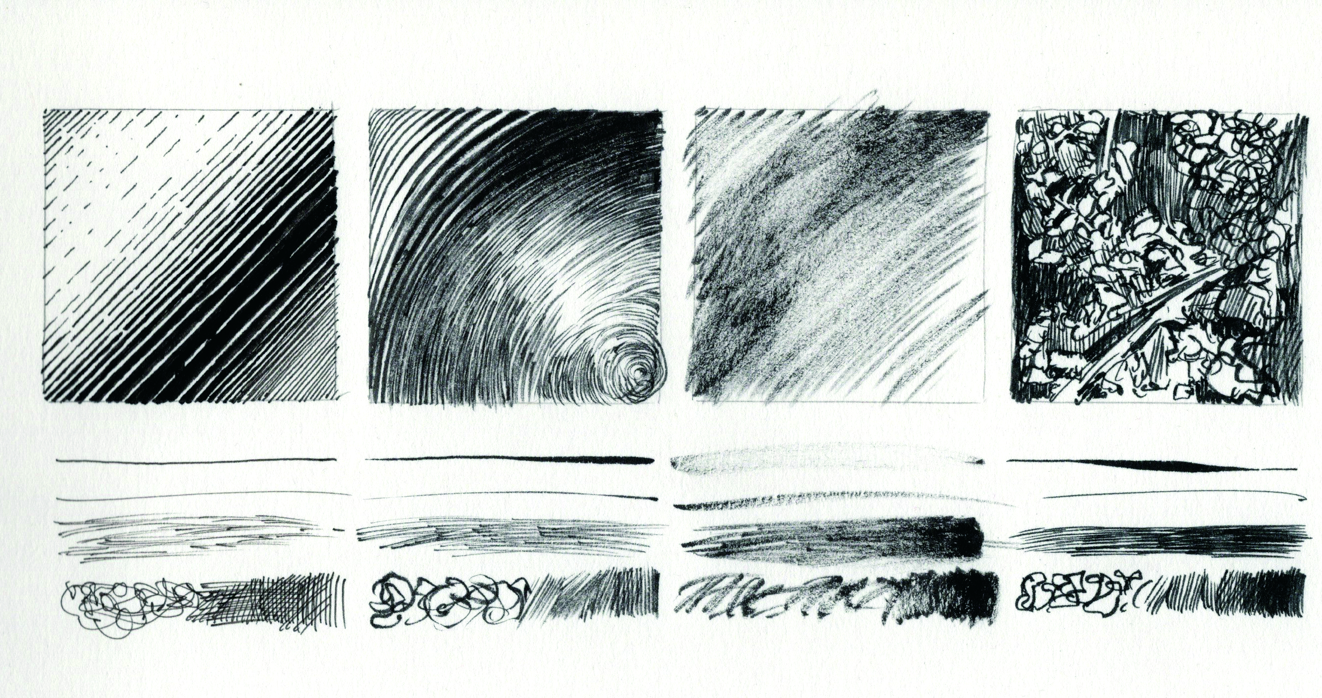
I like to vary tools depending on the part of the illustration I’m working on. For stones and hard surfaces I often switch techniques, using firmer tools like a Micron pen. Start with the darkest areas, working from dark to light, and maintain horizontal lines as this anchors the composition, stabilising the image while differentiating the stone texture from the other elements.
08. Depict the vegetation
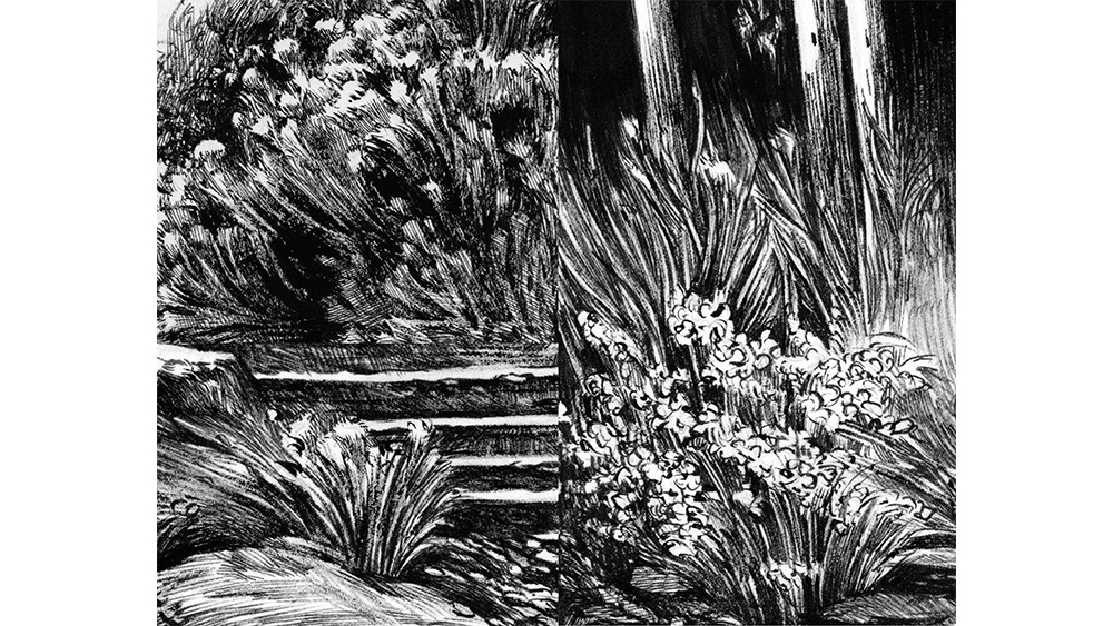
This requires a softer touch, so I often use dry brush techniques for the grass to allow for a delicate, windswept look. The brush should be slightly worn for subtler lines, which creates a more fluid and natural effect. This technique helps the plants to feel dynamic, adding life to the composition.
09. Use the dry brush technique
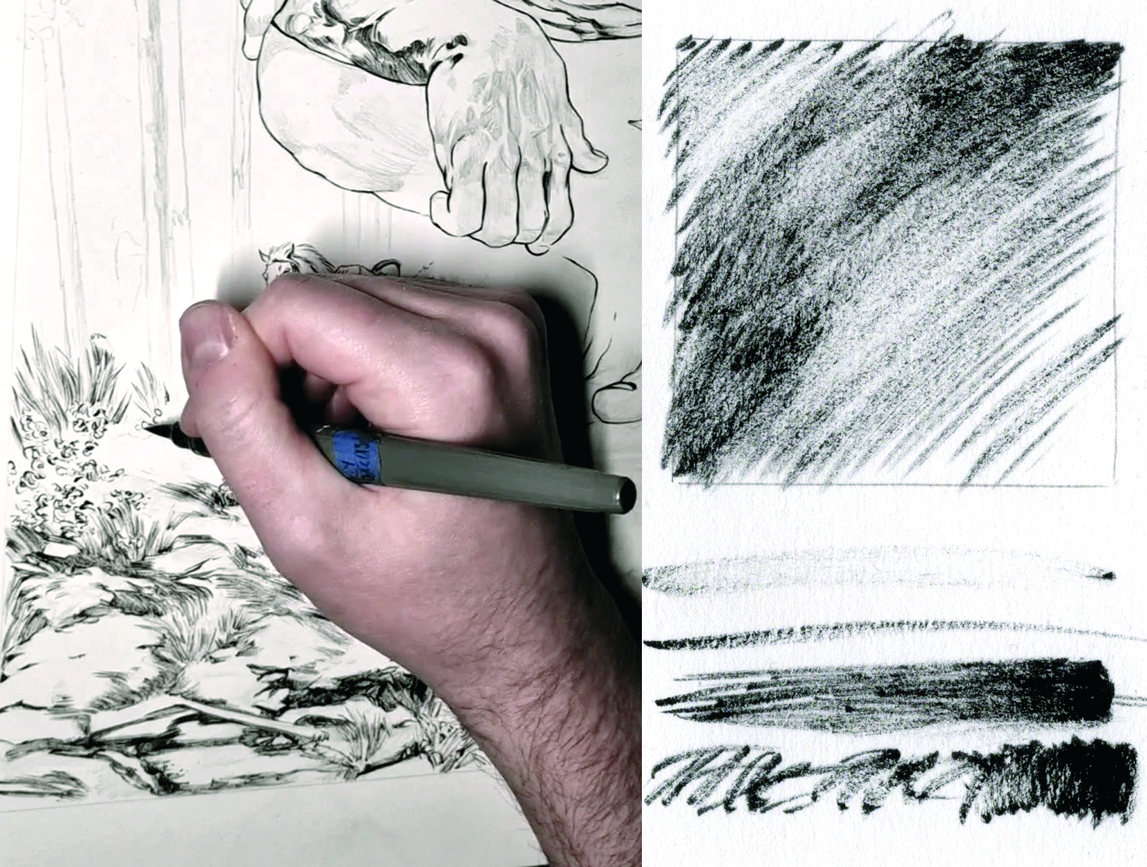
Ink is an unforgiving medium; without water, every mark is permanent and bold. By adjusting line thickness and density we can suggest tone. The dry brush technique, when used well, breaks traditional pen and ink rules by creating soft, pencil-like greyscale textures.
It takes a light, fast touch to avoid harsh strokes and keep the effect subtle. I’d recommend using a slightly worn-out brush for this purpose.
10. Block out the entire illustration
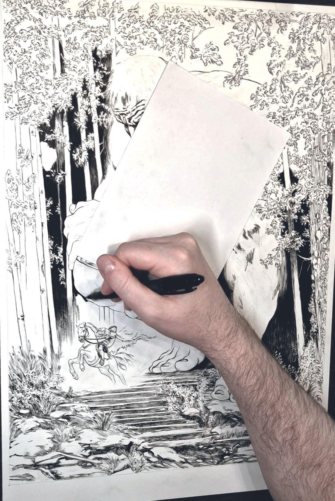
Image credit: Mateusz Lenart
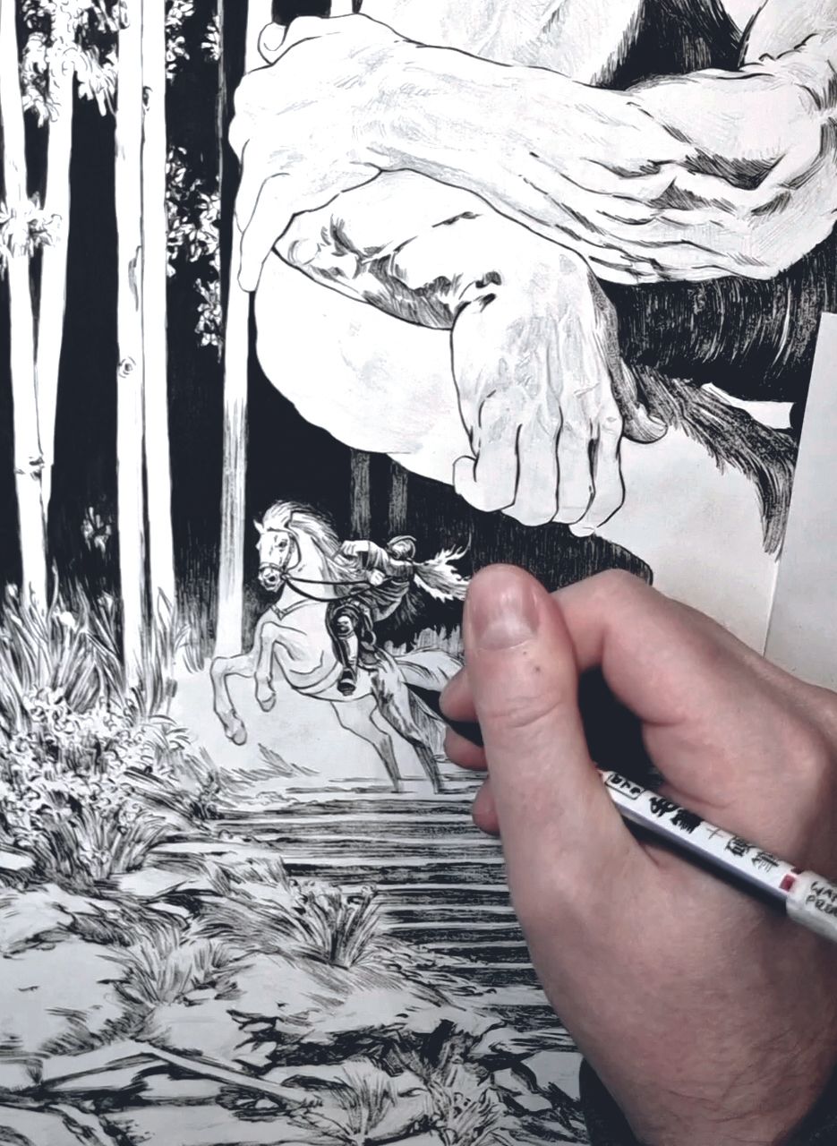
Image credit: Mateusz Lenart
At this stage, move through the entire image to refine the blockout and add layers. I keep whites intact for a long time to maintain flexibility for adjustments. Make sure to leave room to darken areas where necessary to strengthen focus. You’ll also start to see which areas are supposed to be filled with solid blacks.
11. Detail the trees
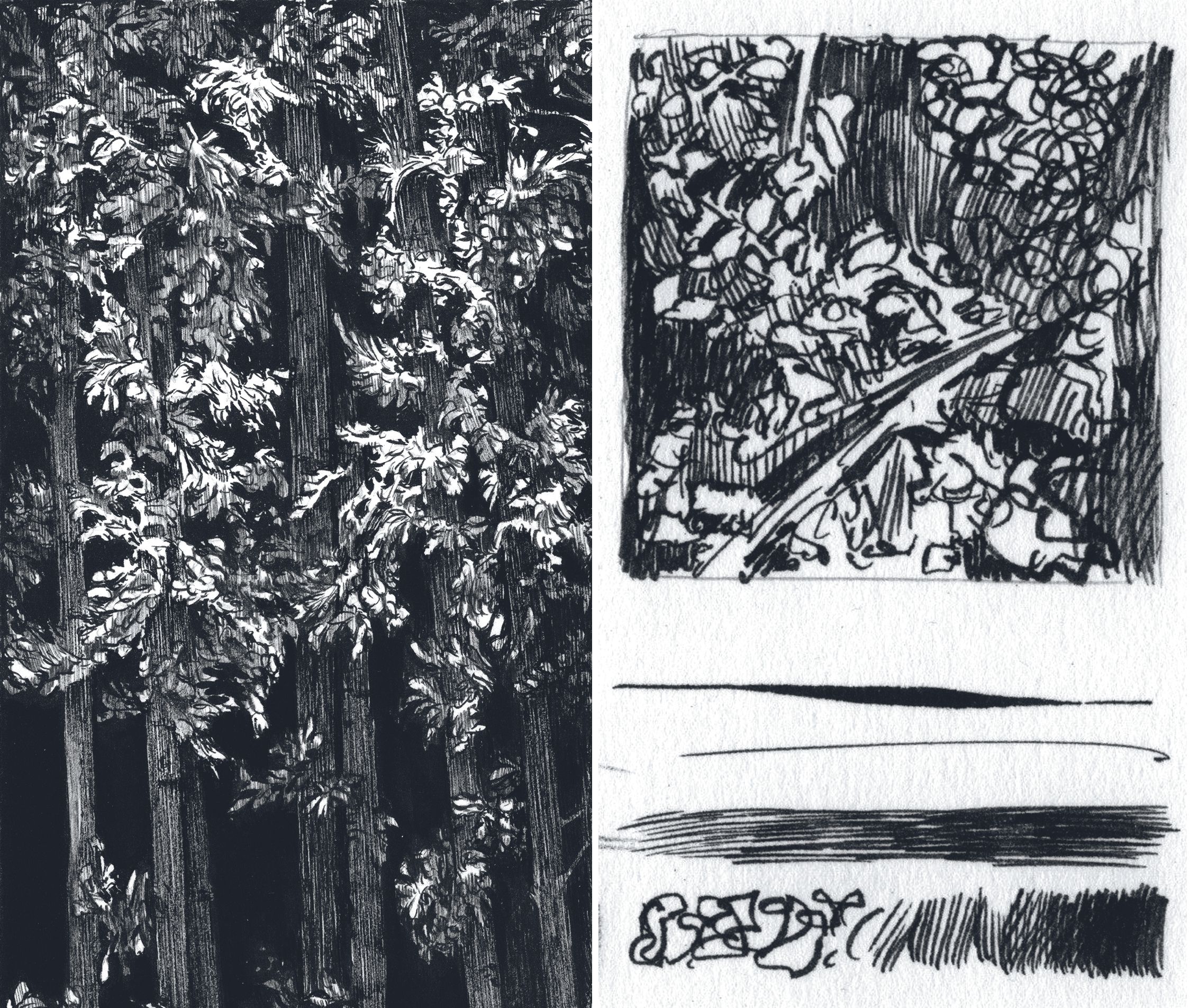
Image credit: Mateusz Lenart
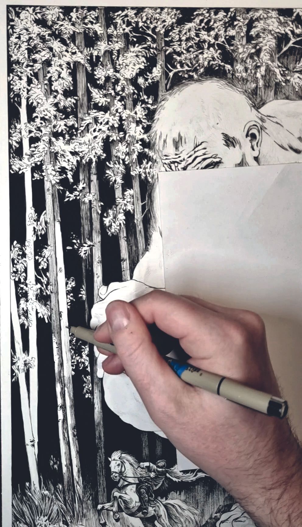
Image credit: Mateusz Lenart
For the trees, I employ a combination of Micron pen and fine brush techniques. For the barks, I’m using vertical lines in particular, as these marks bring out the texture and help create a natural flow in the illustration.
For the leaves I use an ultra-fine brush pen from Pentel, creating loose, organic lines. This section is where I can allow myself more freedom and let the lines flow in various directions without a rigid structure.
12. Control the line work with a brush pen
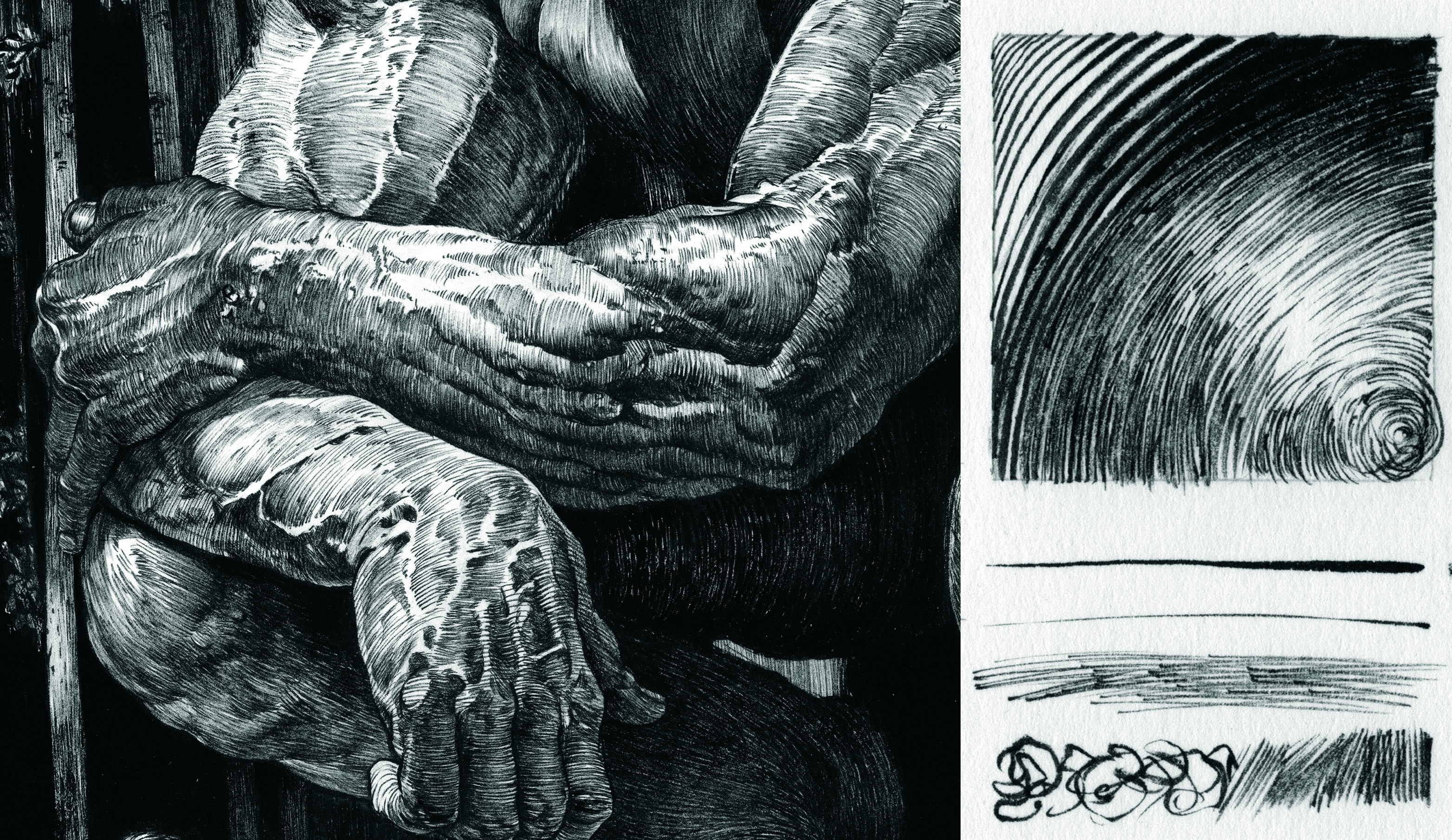
Brush pens are also great for creating the detailed line work, as they offer you excellent control over the thickness of the lines. This is especially useful for delicate areas such as the skin.
For the shading on my giant, I used a softer tool in the FD-502 Double Tip Brush Pen from Zebra to create finer, subtler lines that enhance texture and depth within the character.
13. Follow the anatomy
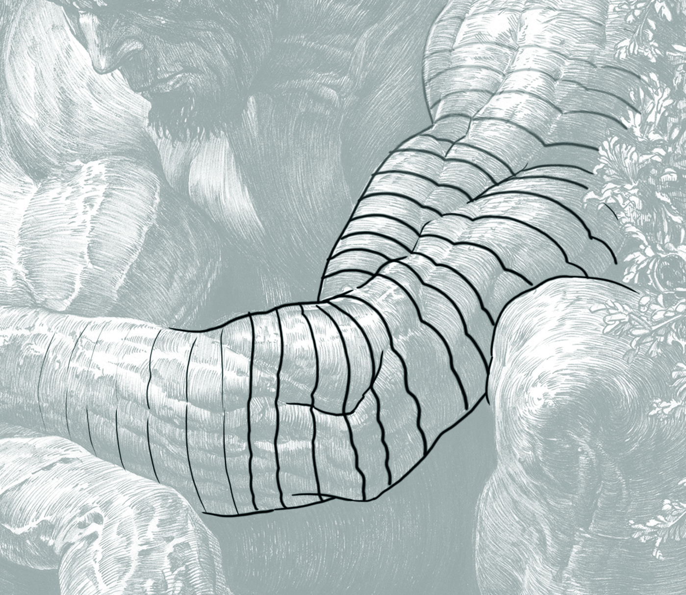
When inking organic forms like the body, it’s crucial to follow the muscle shapes with line direction. Plan out your line flow before shading to maintain structure and visual continuity. It’s almost like tracing a dense 3D wireframe, using lines to build the illusion of volume and form. With the pen and ink technique it’s also good to keep the balanced rhythm of the entire image.
14. Evaluate the illustration
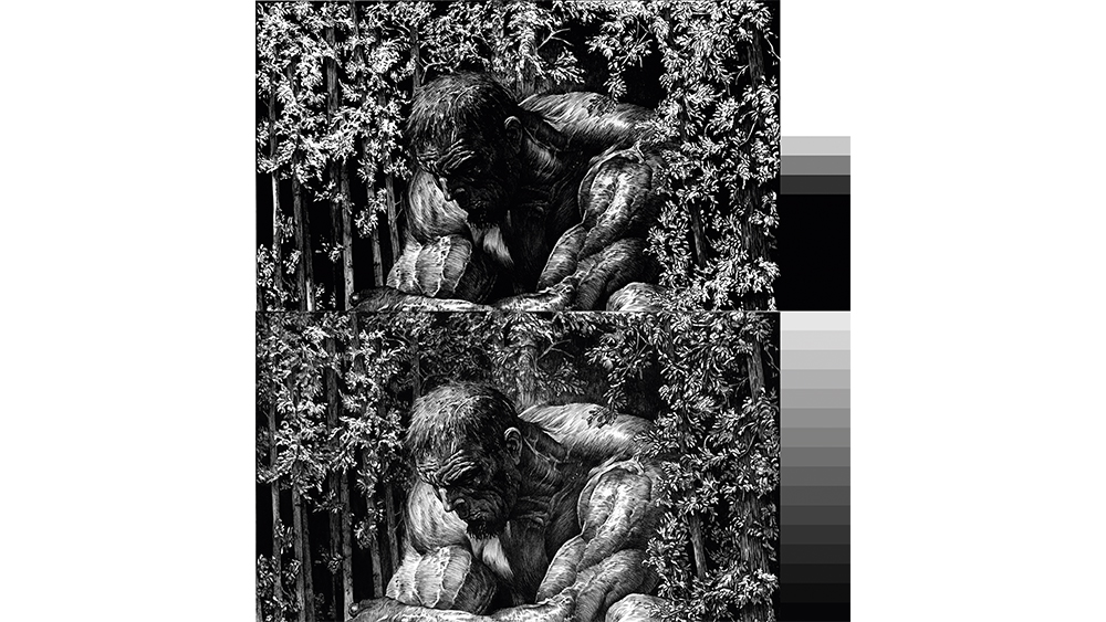
This is the moment for a critical review. Assess whether certain areas need further darkening to enhance tonal transitions and the focus points.
A good practice here is to apply principles used in black-and-white photography, balancing the full greyscale spectrum to avoid over-contrasting the image. Taking a break to let the image rest before returning with fresh eyes often leads to better decisions during this phase.
15. Wrapping up
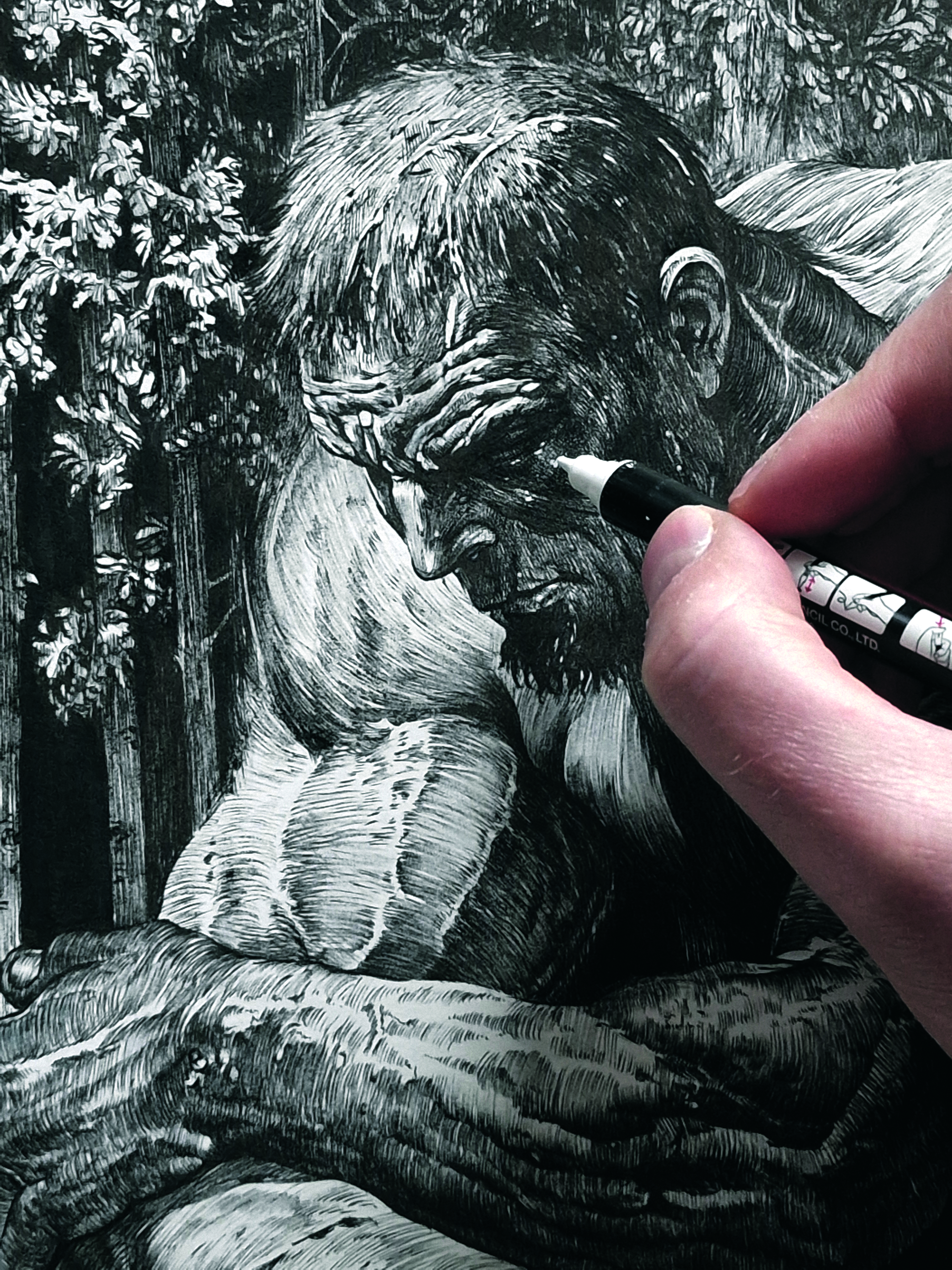
The final step is refining the smaller details – adding fine lines, textures, subtle touches and so on to bring it all together. I try to avoid using white ink in this kind of work, but occasionally I allow myself to add a hint of dust or glint. Finally, sign your piece, and the illustration is complete.
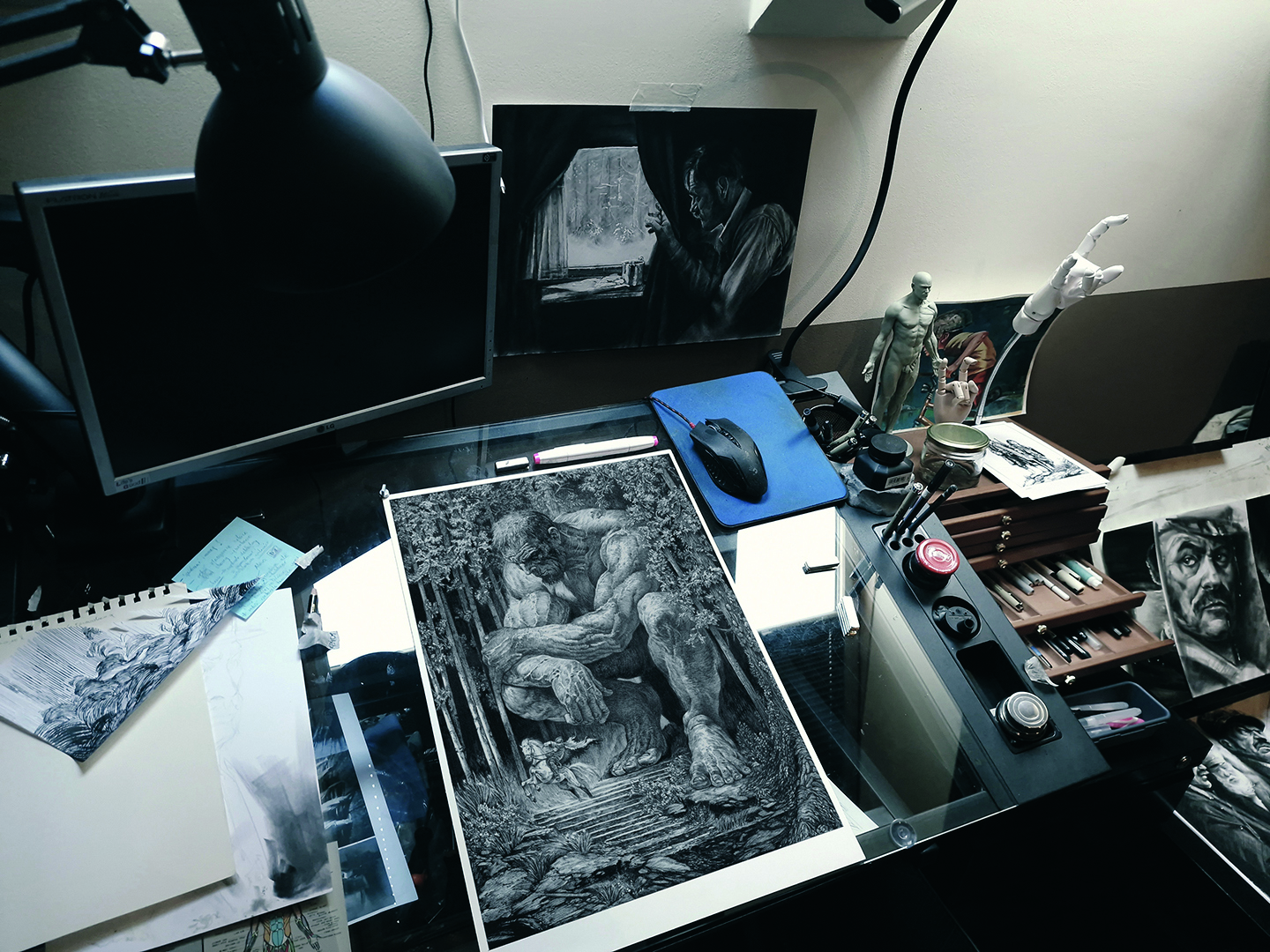
For more inspiration, see our round ups of comic art resources and line art exercises.
This article originally appeared in ImagineFX. Subscribe to ImagineFX to never miss an issue. Print and digital subscriptions available
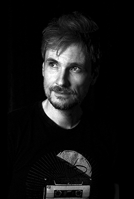
Mateusz Lenart has over 18 years of experience working in the video games industry and is the creative director of the Silent Hill 2 remake.
You must confirm your public display name before commenting
Please logout and then login again, you will then be prompted to enter your display name.
