Sign up to Creative Bloq's daily newsletter, which brings you the latest news and inspiration from the worlds of art, design and technology.
You are now subscribed
Your newsletter sign-up was successful
Want to add more newsletters?
For the last 20 years, I’ve worked almost exclusively with digital tools for commissioned jobs. At the beginning, I would be sketching my art on paper, scanning, and then colouring with Photoshop. Later on I had the chance to get a Wacom Cintiq tablet, and at that point paper and pencils basically disappeared from my life.
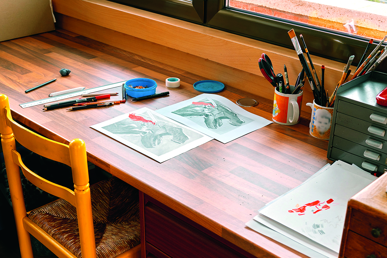
But since AI-generated art has become so prominent, a few months ago I decided to go back to basics in protest, and to feel the texture of the paper, the sound of pencils scratching, the dirty hands, and working without the safety net of being able to hit Ctrl+Z.
Each time I start a drawing with pencil and paper, I feel like a total newbie. But I love how the final results – and the accidents that happen along the way – are all unique and something that a machine won’t be able to replicate. So I invite you to see how I take on these artistic adventures, working up a rough initial composition using Photoshop before swapping over to traditional tools to create the final image itself, adding a little blast of vibrant colour along the way.
Article continues belowWhenever I sit down to create, I honestly don’t always know what the result will look like. But as we’re so often told, it’s not about the destination, but the journey we take there… and the dinosaurs, of course. If you need supplies, see our guides to the best pencils for artists and the best erasers.
01. Lay out a basic composition
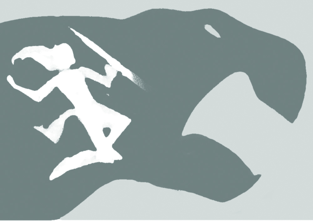
I haven’t completely erased digital from my art; 20 years of Photoshop doesn’t disappear just like that! After getting an idea, I first work digitally on a simple composition with silhouettes and shapes. Two characters mean two silhouettes with different proportions and values for contrast, and an interesting composition.
02. Make a rough sketch
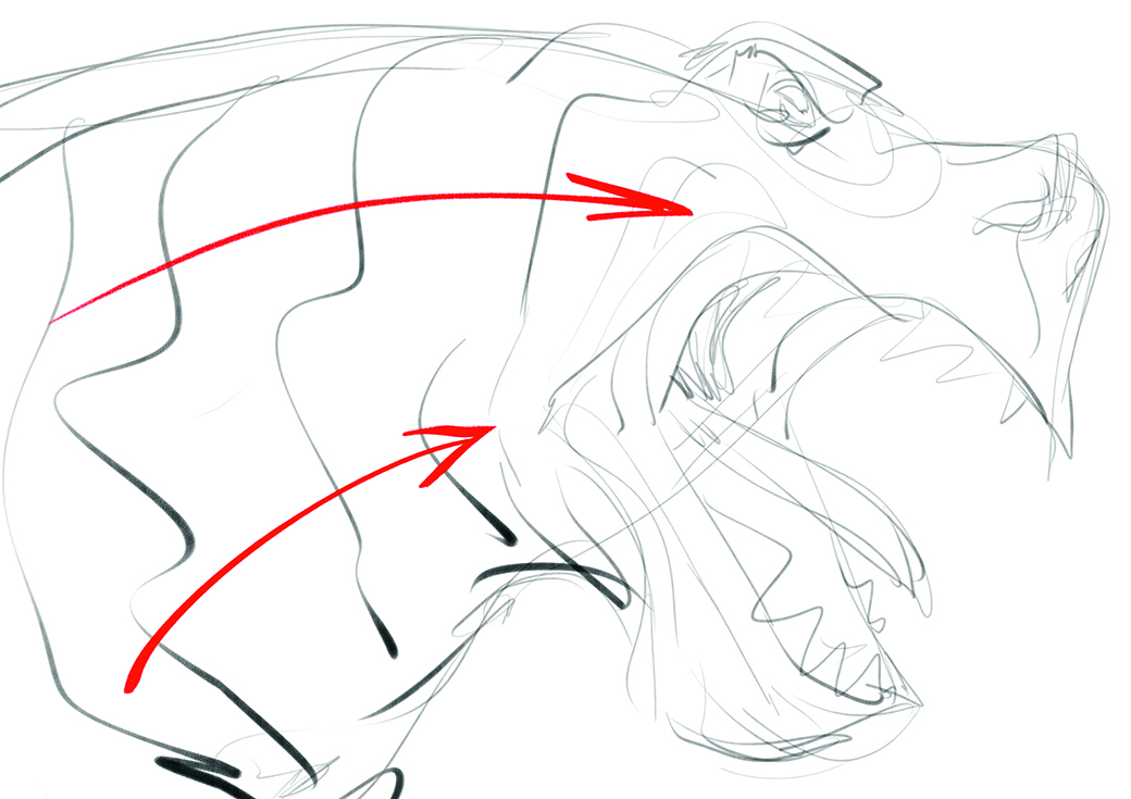
Now that we have a primary composition, it’s time to roughly sketch the different parts of the illustration, which I’ve done in Photoshop while still ideating. Begin with a swift sketch of the main shape of the illustration, in my case the T-rex. This character brings dynamism to the image as the main source of movement. You only need a few lines at this stage, so don’t worry about details.
03. Make silhouettes and shapes
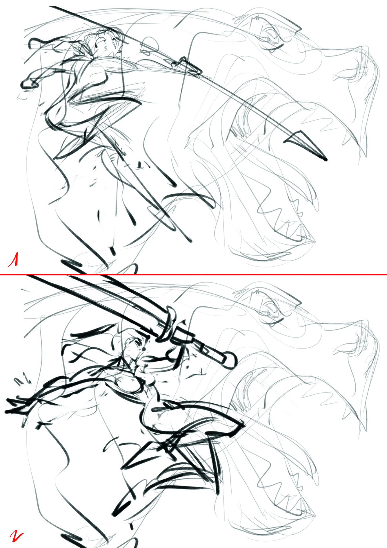
Next we want an interesting silhouette for the foreground character. With Photoshop, it’s easy to draw on a different layer and try out different versions without altering anything else. Play with the silhouette to make something interesting and appealing. In the two poses here, one seems more dynamic and readable than the other.
Sign up to Creative Bloq's daily newsletter, which brings you the latest news and inspiration from the worlds of art, design and technology.
The first is interesting, but the spear can be confused with the T-rex’s tongue. I preferred the second pose, with the contrast between the character and the sword, plus the movement. The right leg is a bit difficult to read, so I’ll be careful drawing the final character.
04. Add the details
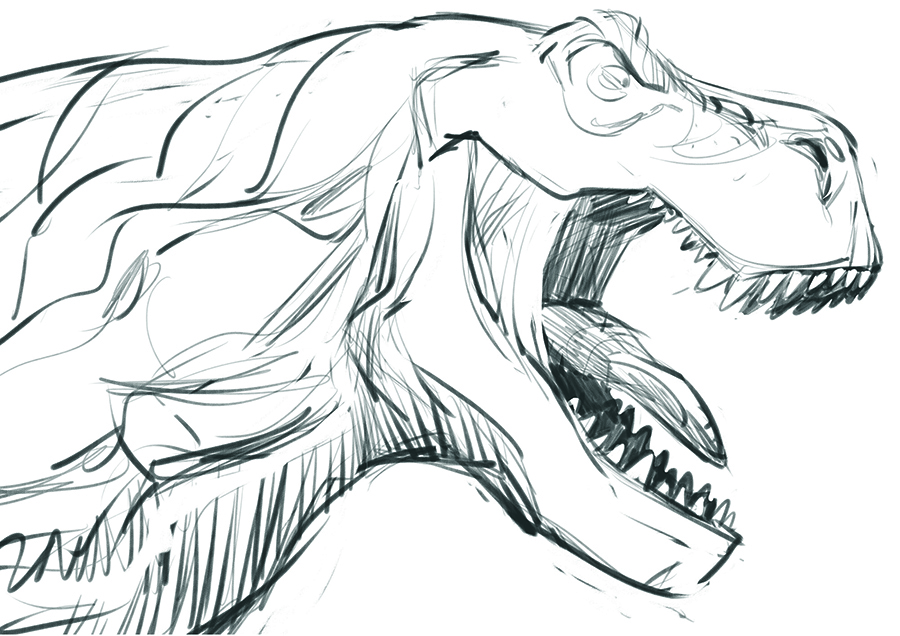
Now that we’ve chosen our characters’ poses, it’s time to sketch in the details. Again, I began with the dinosaur, using photo references to make it more realistic. This can be tricky, as sometimes adding details and anatomic realism can diminish the dynamism of the character, so you need to find a balance between the realism and the style to maintain the movement.
What’s important is that the viewer believes what you draw, even if you cheat with the reality a little.
05. Build up the second character
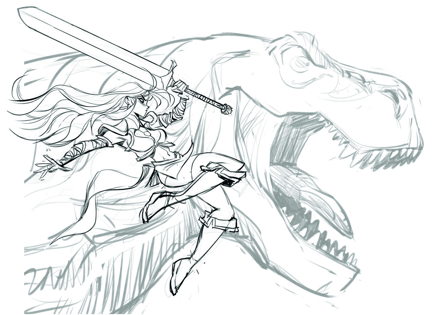
This is a bit easier for me as I’m used to human characters. While adding details, try to keep the dynamism of the figure. For any good illustration, the character must have interesting contrast and be easily readable.
Asymmetry is the key, especially with a dynamic pose like this; straight lines versus curves, fat shapes against thin ones, avoiding parallel lines, and so on. This is also a great time to design and refine the visual aesthetics of the character, like the clothes and hair.
06. Plan the shading
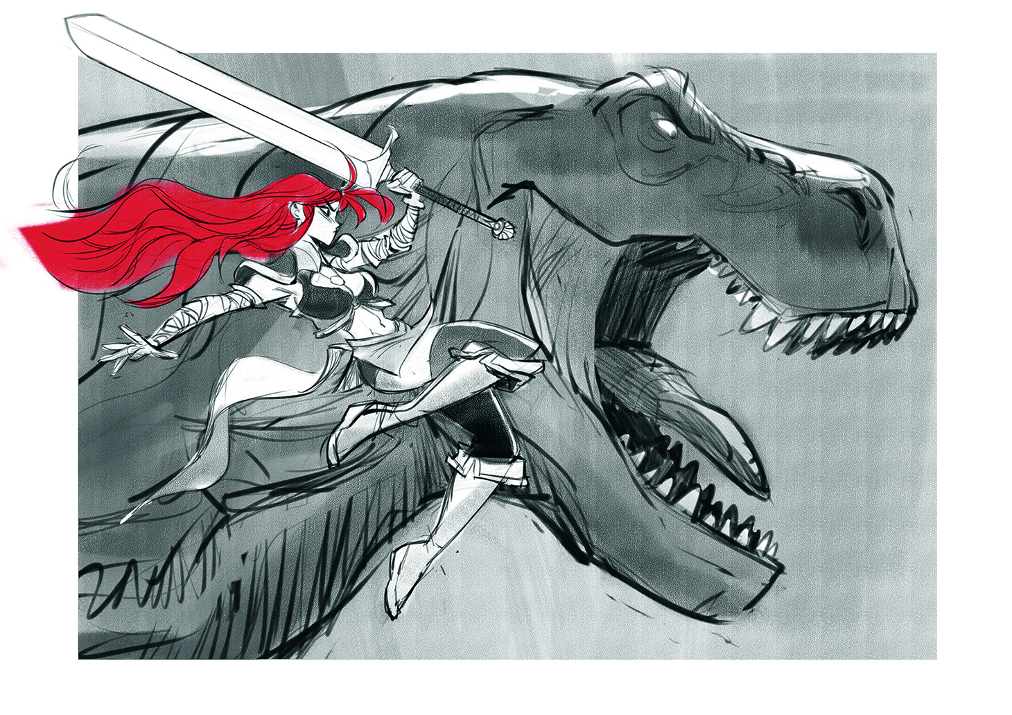
Let’s test the contrast of the illustration by quickly adding some shading. While doing so I had an idea: why not add some colour to the drawing? I’m a huge fan of Red Sonja and her vivid hair, so I decided to give my character bright red locks.
As I said, I had no idea where the illustration would go when I began drawing. After testing this out, I found that the bright colour helped the character pop out of the image.
07. Prepare for traditional drawing
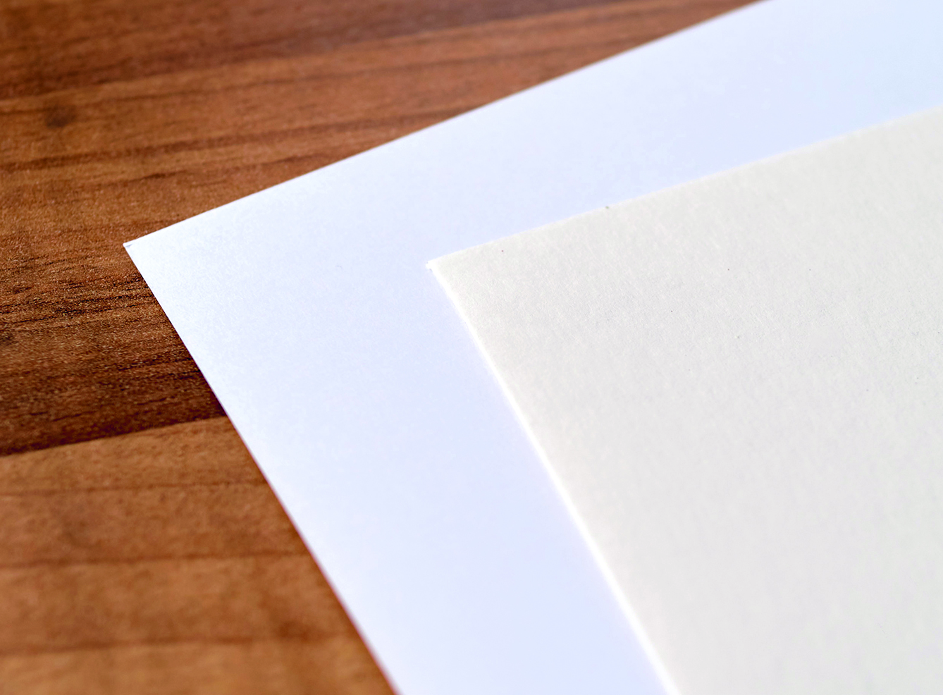
Print out your line-art, which will be the base of our final pencilled illustration. Pick your paper wisely as it’s more important than it might seem. Some paper can be difficult to draw over. Sometimes it’s too smooth and lacking the typical sensation of using a pencil, and others can be too grainy, making thin, consistent lines a challenge to draw.
This can be different for everyone, so you’ll have to experiment first-hand with different types of paper to find the one that best fits your style and technique. I’m still looking for the perfect paper for me. For this piece, I went back and forth between smooth paper and a more grainy type with a warmer tone. After quickly experimenting with the options, I settled on the grainier one, although this is ultimately subjective and merely a personal preference for me.
08. Tape your paper
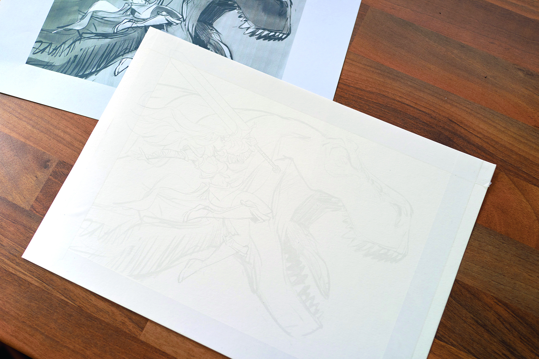
Stick down the perimeter of your illustration to give the edges good definition and a touch of contrast with your curvy lines. It also gives a sensation of cleanliness, and it’s incredibly satisfying when you peel the adhesive tape from your paper. Before you get going, it’s also wise to print out your digitally shaded version to check the values as you draw the final illustration.
09. Make your first traditional strokes
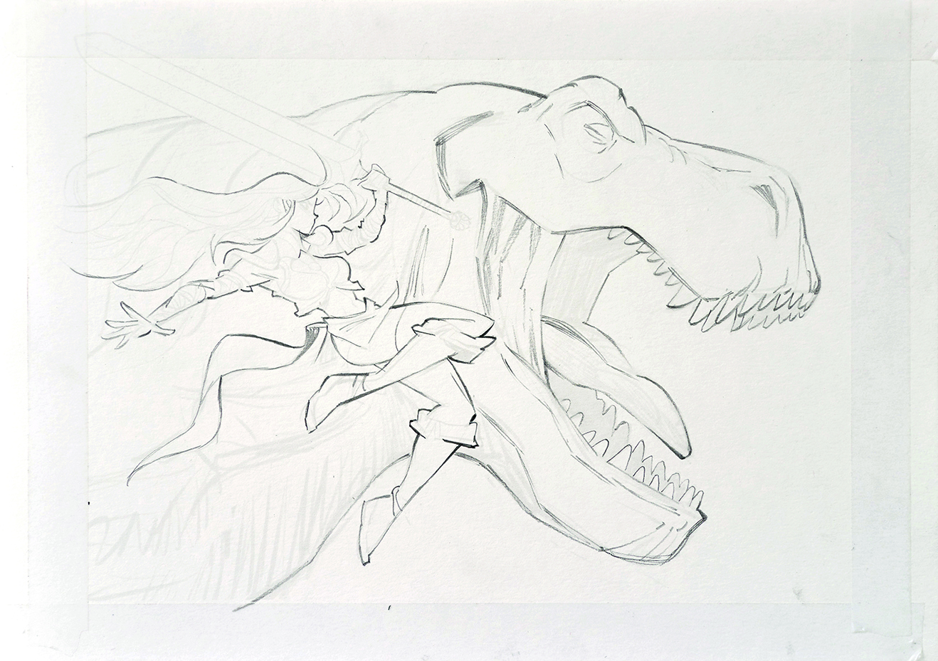
And now it’s time to have fun! Start off by drawing out the line-art, for which I used a mechanical pencil to keep my lines as clean as possible. This needs a lot of focus, so I suggest switching off your music, screens and smartphone; it’s only you and the drawing now, almost like meditation.
This flow state can be difficult to reach when you work on a computer as there’s always a notification popping up or something distracting to watch on YouTube. Without noticing, you’ll quickly find you’ve lost 30 minutes drawing the line-art. In my opinion, traditional drawing requires a lot more focus and dedication than working digitally.
10. Choose your tools carefully
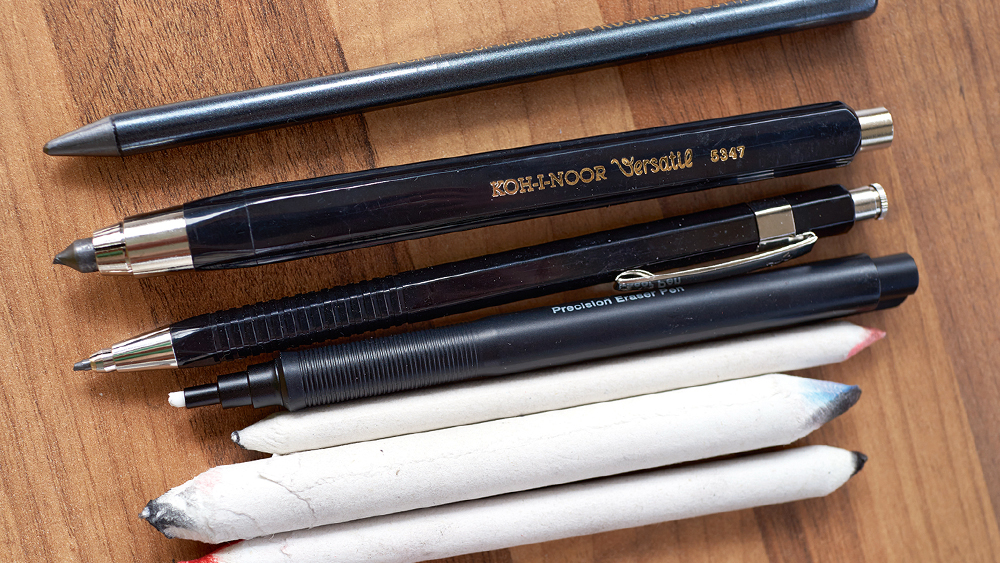
When you draw with pencils, I’d advise having at least two different sizes and grades of lead, with HB (harder) for the line-art and 2B to 4B (softer) for shading. The harder the pencil lead is, the finer the line. I also use a woodless graphite pencil, which is a bit soft, for hatching and can be tilted to draw thicker lines if needed.
For erasing, I like to use a thin mechanical eraser and a putty rubber, and last but not least my toolbag also includes three different blending stumps.
11. Add shadows and smaller parts
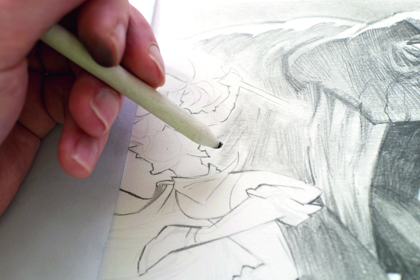
Start to work on the background and the T-rex by adding some shadows. Use hatching before blending the pencil strokes with the blending stump – it’s better to use a stump than your finger as it’s more precise. You can add some details in the shadows too, for which I bring out the smallest blending stump.
12. Work on the lighting
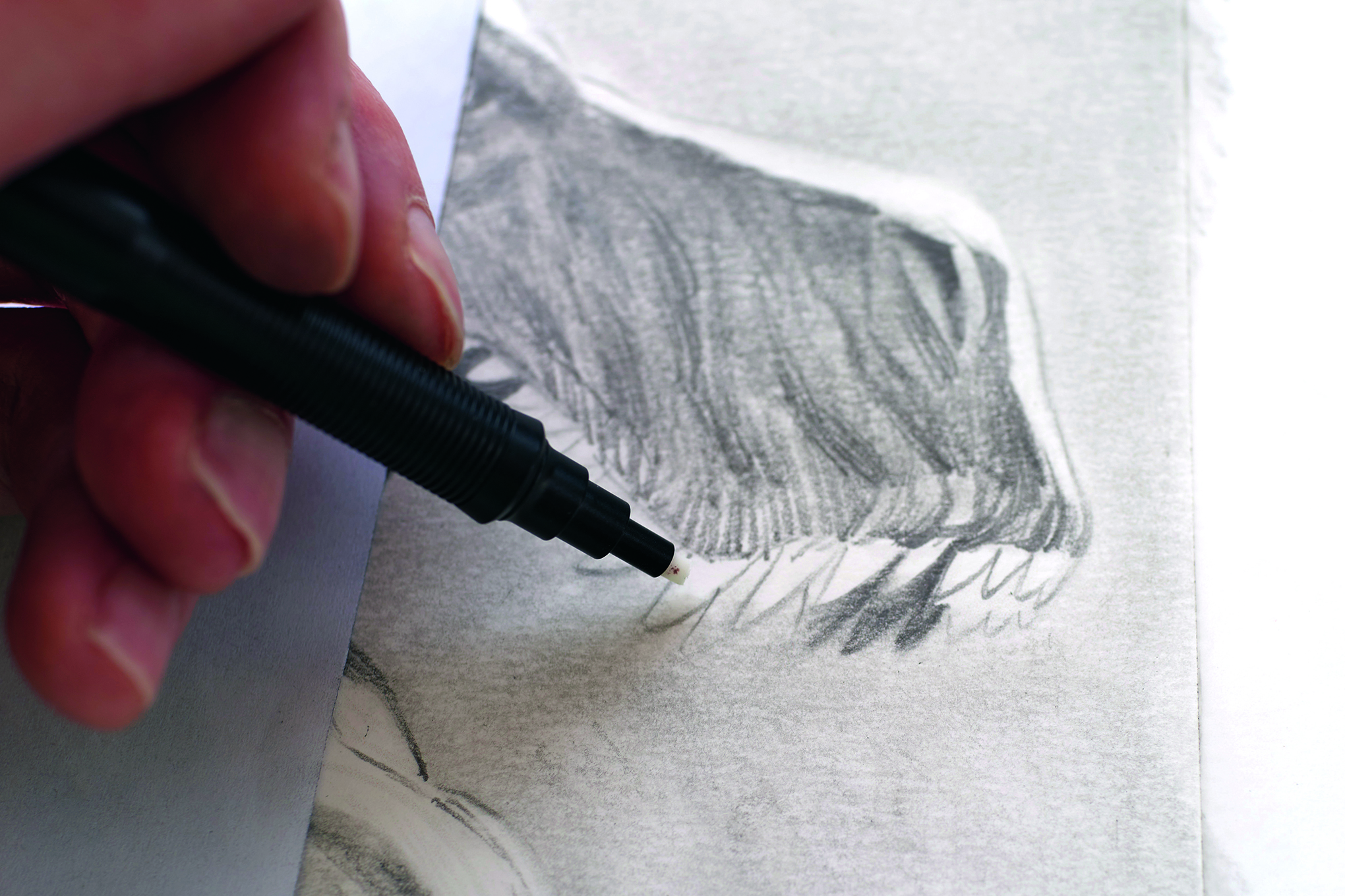
Use a mechanical eraser for the rim lights and other lighter parts; they are super precise and work perfectly with lead pencils. I used this to separate my T-rex from the illustration’s background.
13. Create textures
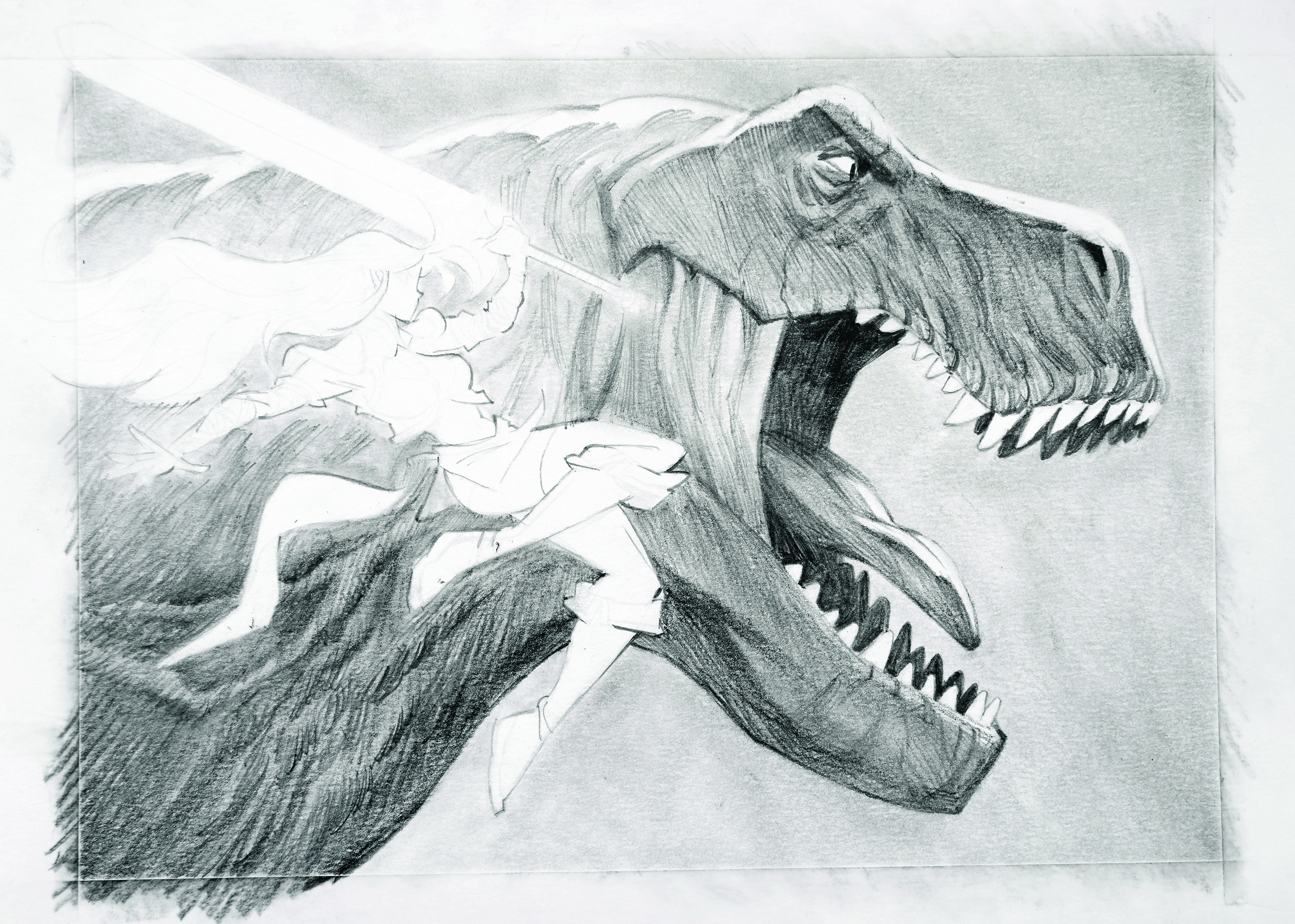
Even when blending the shades, try to keep some of the hatching textures while adding volume where needed, such as my dinosaur’s neck. I don’t like it when the shadows are too blurry, as it softens the drawing and in my opinion is overdone. Hatching gives more strength to your drawing and you can enhance volume through the direction.
14. Contrasting characters
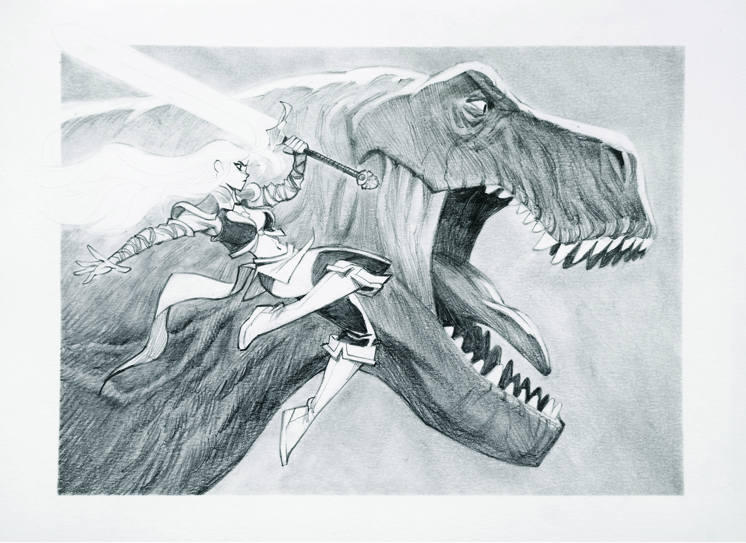
In contrast to the T-rex, I wanted to keep my human flatter so they stand out. I kept some parts white with almost no shadows or volume to provide a more 2D aspect to the character, which makes them pop out against the 3D dinosaur.
15. Give it a flash of colour
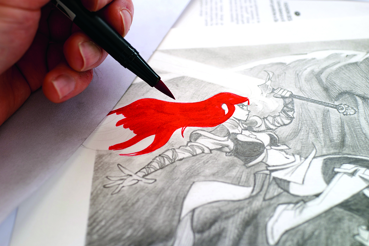
The bolt of vivid red in my human character’s hair was simple, done with a Tombow marker. I love the contrast of it against the grey pencil laid down across the rest of the illustration.
Next I draw the details in the hair using my mechanical pencil to create a feeling of movement and dynamism. For hair, try to vary thickness, and avoid parallel lines to create a wavy, flowing effect. I used an orange pencil to slightly lighten the hair after.
16. Look back
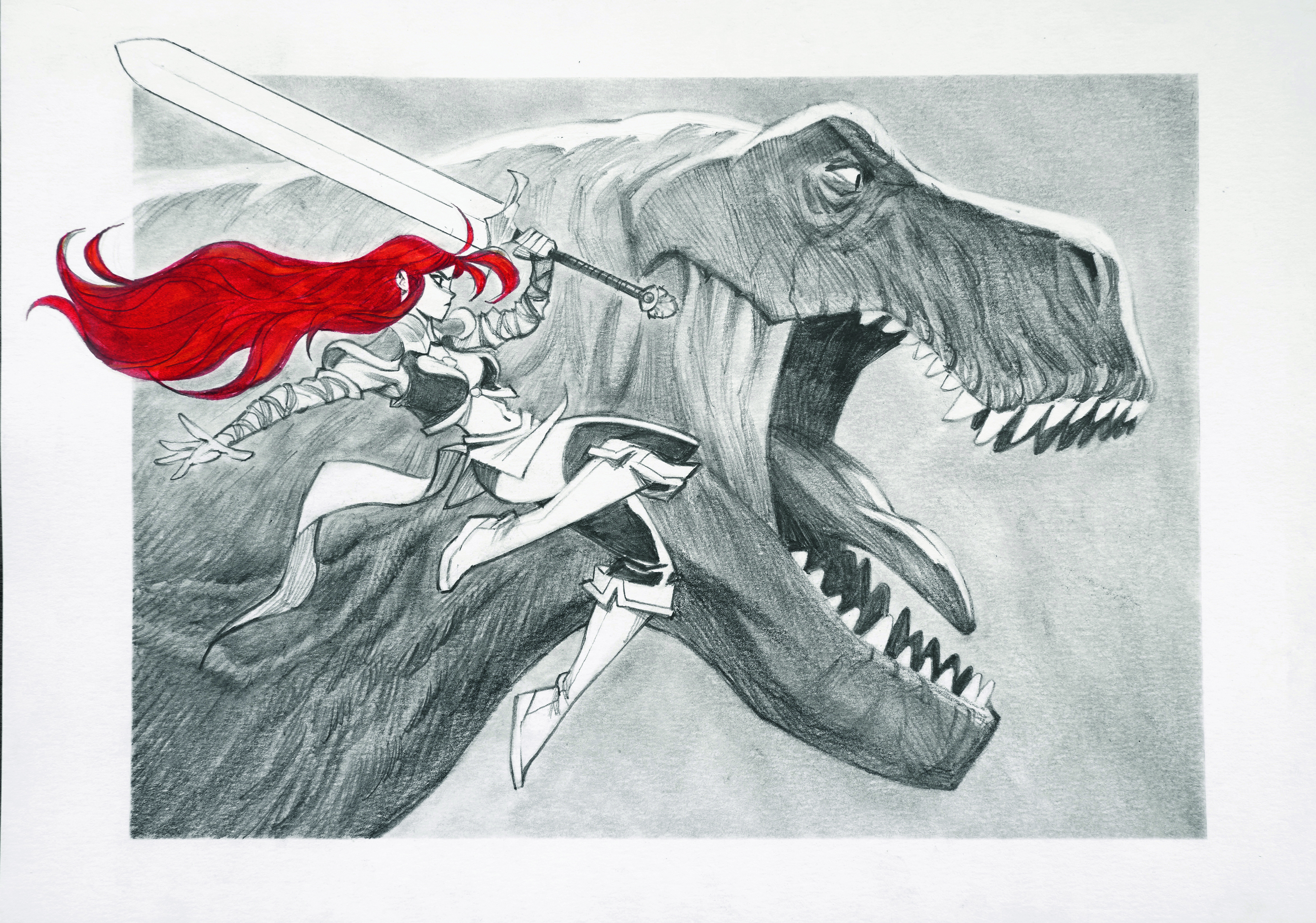
And with that, the drawing is done! On reflection, I’m not completely satisfied by some parts of the image, but that’s almost always true. The hair came out a bit too dark for my taste and the rendering could be improved in places.
But that’s the great thing about art: no matter the end result, there’s always something learned, and your next drawing is always the best one yet!
This article originally appeared in ImagineFX. Subscribe to ImagineFX to never miss an issue. Print and digital subscriptions available.
For more art workshops, don't miss Thomas Elliott's step-by-step guide to how he made the video game cover art for Doom: The Dark Ages.
El Gunto AKA Guillaume Poux is a freelance illustrator and concept artist. He was born in France and now living in Spain, he illustrates books, board games, comics and work for the animation industry.
You must confirm your public display name before commenting
Please logout and then login again, you will then be prompted to enter your display name.
