Your character art will be transformed if you apply these 15 tips
Here's how I paint characters that leap off the page.
My focus has always been to stay true to my artistic vision. For years I tried to follow the “rules” of art, hoping to fit into what was supposed to be my style to get work. However, I realised that this didn’t make me happy or help me stand out. It was only when I decided to simplify my art and focus on the essentials that my work truly began to resonate with myself and others.
In this workshop, you’ll learn to create characters that don’t need busy backgrounds or excessive details to stand out. I’ll show you how to strategically use poses, anatomy and composition to create striking and expressive characters. The key is focusing on the details that really matter and letting go of any unnecessary elements.
What I want you to take away is the confidence that sometimes less can be more. You’ll learn to simplify your work without losing power or emotion, and discover how that simplicity might be what truly makes your art stand out. If you need new tools, see our guides to the best digital art software and the best drawing tablets. In the meantime, let's dive into my 15 character art tips.
Article continues below01. Strike the perfect pose
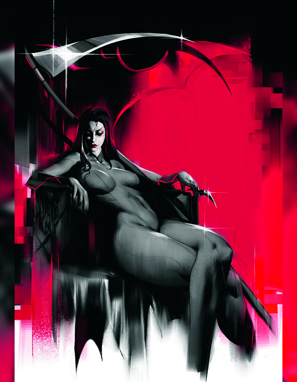
A character’s pose is essential to express their personality and emotion without words. Through posture, we can show action, power or vulnerability. I think about how my characters interact with their environment: are they standing tall, in motion, or relaxed?
Sometimes a slight tilt of the head, eyes, or a hand at a specific angle can say more than a background full of details. Each pose should tell a story, but what’s key is making sure the character’s body speaks for itself, revealing their emotional state and role in the story.
02. Use anatomy as a foundation
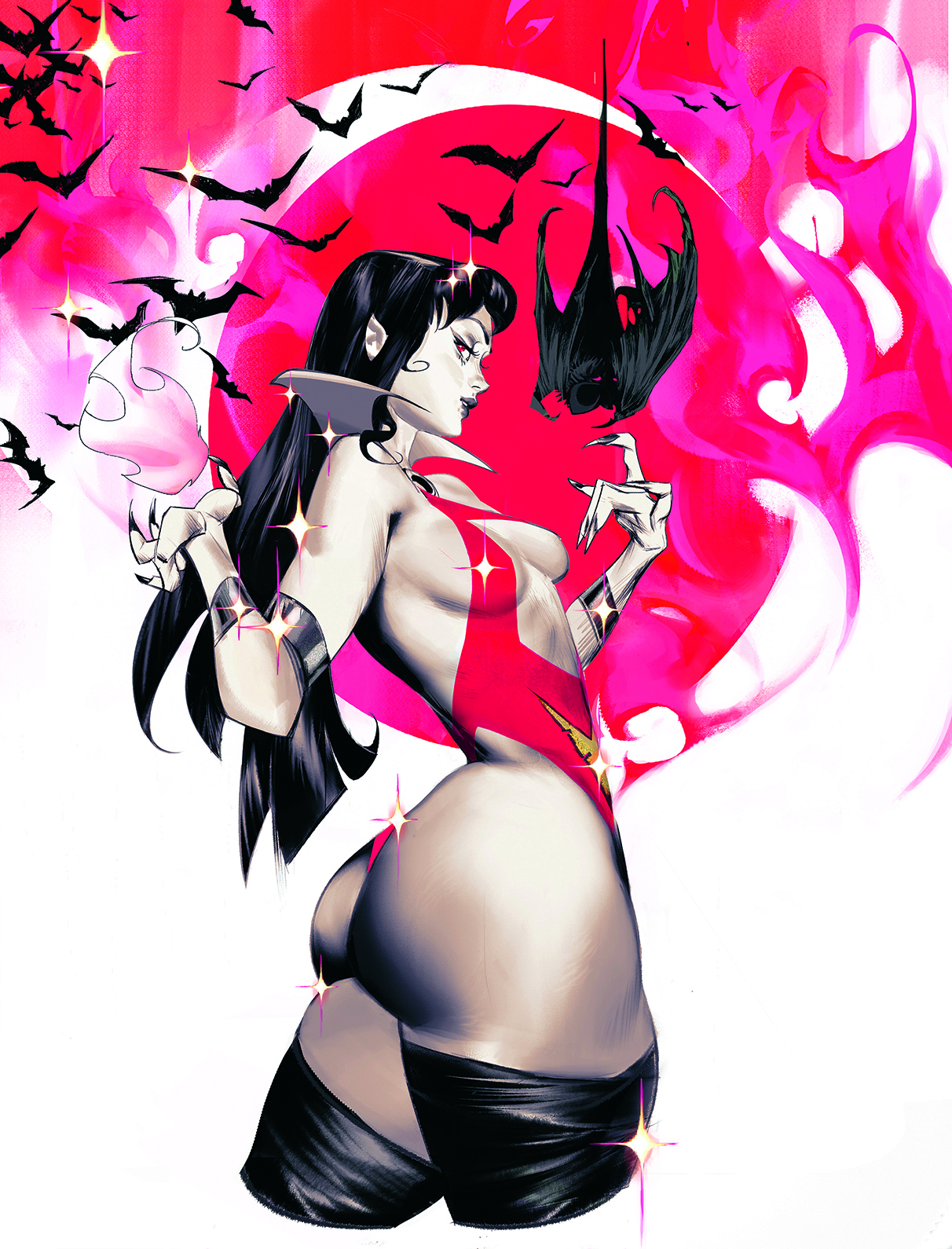
Anatomy is essential to make your characters feel real. You don’t need to know every muscle in detail, but understanding how the body works is fundamental. I focus on the basics: the bone and muscle structures. This allows me to create characters with natural poses, even when I work in a stylised way.
I’m not looking for perfect bodies, just believable ones. I practice constantly and experiment with different positions. This way, I can bring my characters to life while keeping them dynamic and consistent.
Sign up to Creative Bloq's daily newsletter, which brings you the latest news and inspiration from the worlds of art, design and technology.
03. Remember that less is more
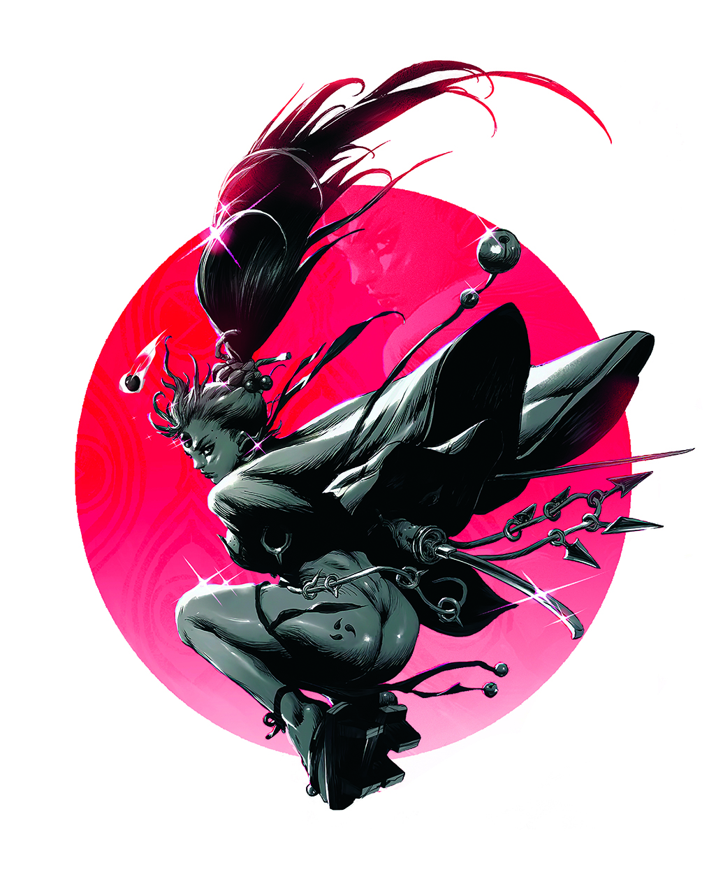
Simplicity doesn’t make your art less impactful. On the contrary, removing details helps your character stand out more. Using a clean background or a vibrant colour, like a red circle behind them, focuses the viewer’s attention on what matters: pose, anatomy and expression.
By removing the unnecessary, the visual message becomes stronger. It’s not about skipping elements, instead it’s about focusing on what really matters. A minimalist design can be just as powerful as a detailed one if you use it strategically.
04. Colour as an emotional tool
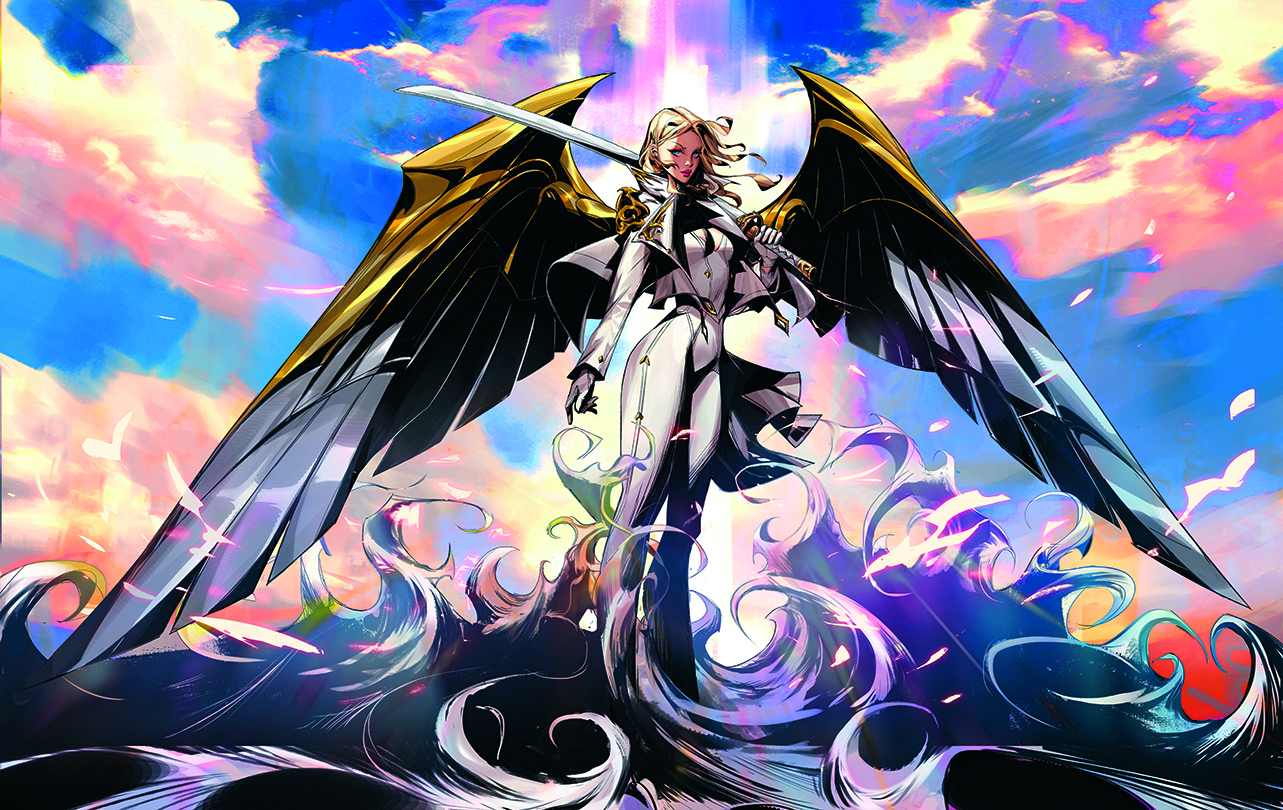
Colour has a direct impact on the emotion we want to convey. Warm colours like red or orange can suggest energy, passion or tension, while cooler tones like light blue or violet evoke calm, serenity or mystery. When choosing colours, ask yourself what you want the character to express.
Are they strong and dynamic, or more calm and reflective? Use colour to complement the character’s personality, set the right mood, and reinforce the main emotion of the image. Colour is just as important as pose when it comes to what we try to communicate.
05. Highlight the personality of your character
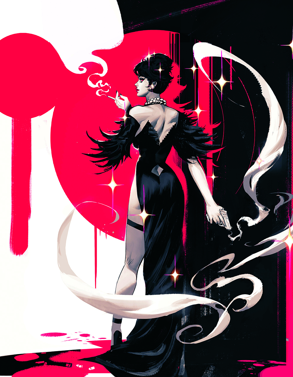
To create an effective composition, focus on keeping things simple. Use basic shapes and empty space so the character stands out. It’s not necessary to fill every single corner of the image with details. By keeping the background clean and placing a few elements strategically, we can highlight what really matters: the character’s personality.
Following this minimalist approach not only makes the image more visually appealing, but it also helps the viewer to focus on exactly what the character in question is expressing, without any distractions. Simplicity has an incredible power to convey emotion in our work
06. Guide the composition with patterns
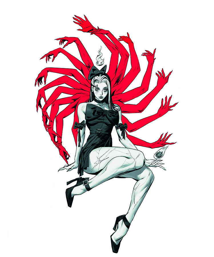
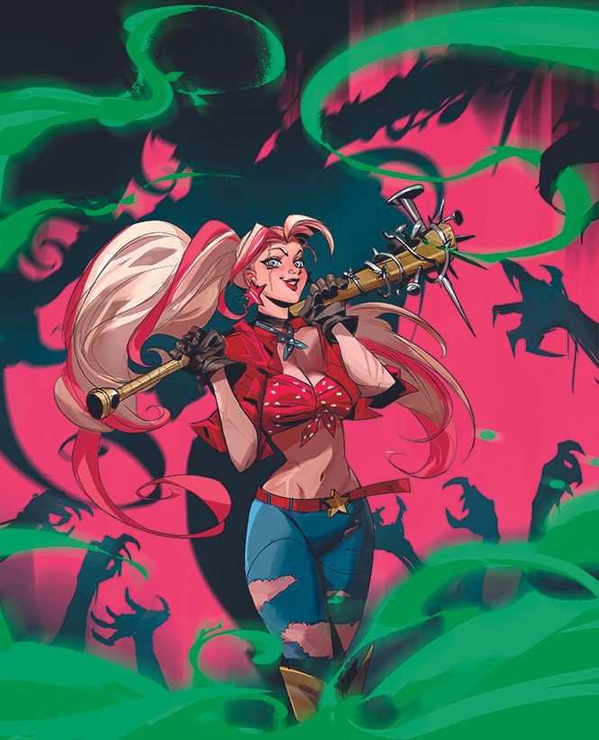
Sometimes using a simple pattern in your composition can be every bit as effective as any complex background. I use circles or a repeating shape as a base to direct the viewer’s attention and give visual flow. Here, I used a circular sequence of hands as the background.
It’s not just about drawing a literal figure, but creating a structure or cycle that guides the eye without being too obvious. Experiment with silhouettes or repeating elements and see how your image gains coherence without needing unnecessary details.
07. Master composition

When composing an illustration, I think about what’s happening between the characters. It’s not just about how they look, but also what their posture, gaze and placement say.
A sword dividing the image, a gaze in another 60 direction, or a figure in the background illuminated by the moon can suggest influence or importance to the narrative.Using composition to show what’s happening between the characters is a powerful way to tell a story without words.
08. Perfect lighting and contrast
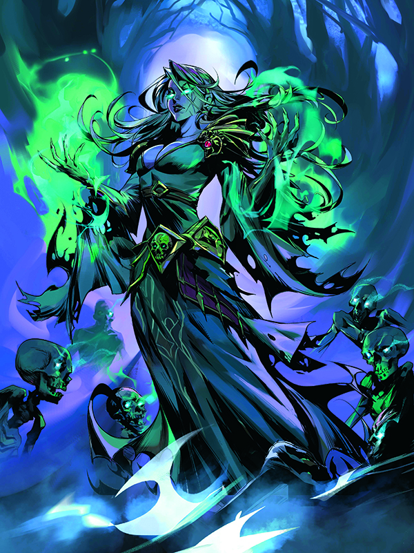
This can completely transform how a character is perceived. I use light and shadow not just to define form, but to create emotion and drama. The contrast of light and shadow creates focus and highlights what I want to be seen.
By playing with lighting, you can give characters a sense of depth or make them stand out further against a minimalist background. Simple shifts in lighting can make the whole composition more impactful.
09. Remember that movement brings characters to life
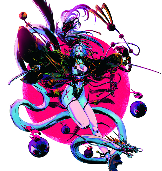
Adding movement brings energy to the composition. When I created a character with the idea of a “leap of faith,” I thought about how to express that feeling using the pose.
Even if the image is static, I can show motion through the position of the arms, the direction of the gaze, or how the elements are arranged. Movement can be subtle or very clear, but always try to include it, as it helps bring dynamism and gives life to the piece, as if the character exists beyond the canvas.
10. Use body language
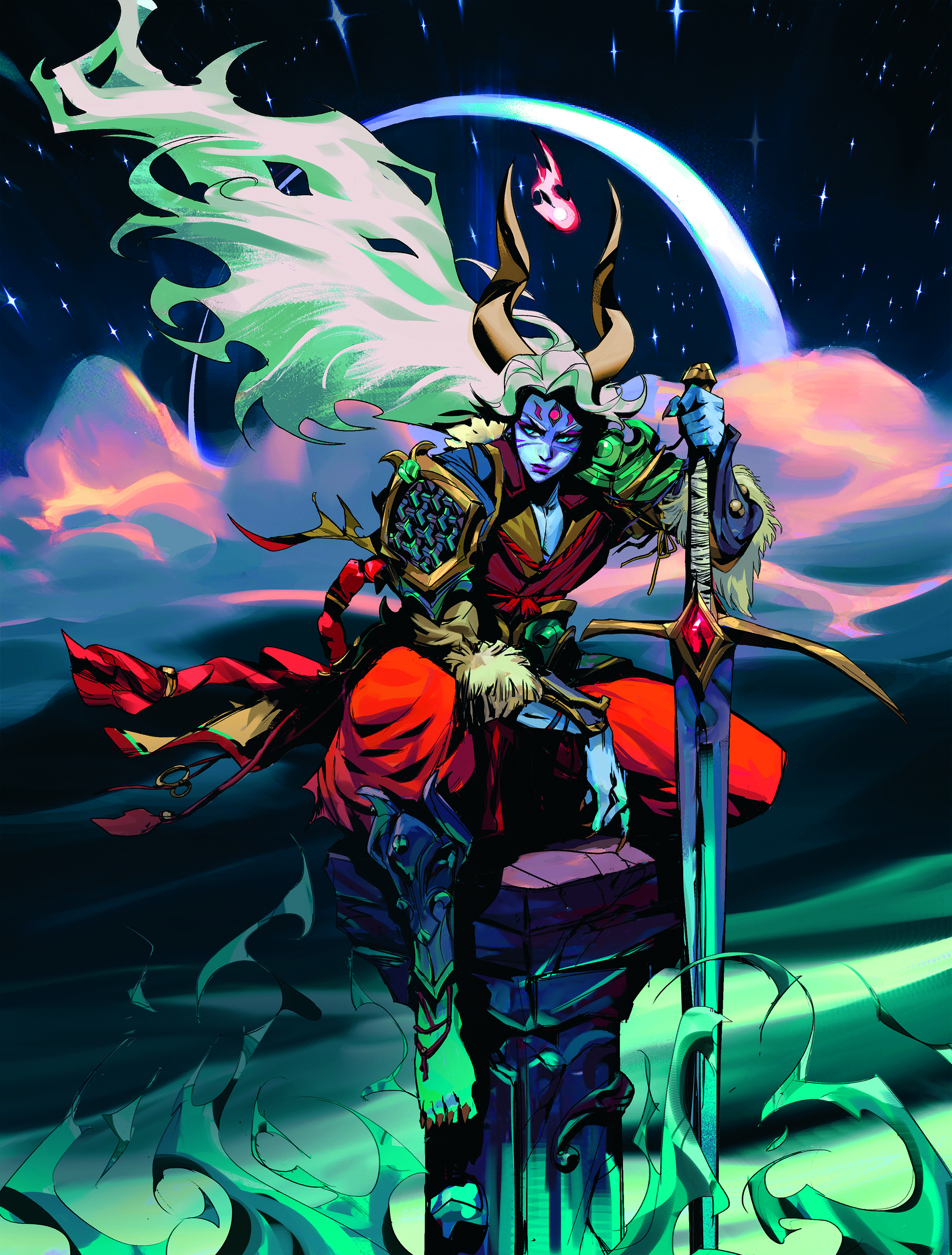
The body also speaks. When I draw, I pay attention to how the characters stand, where they look, and what they do with their hands. A hunched pose shows insecurity, but a firm one portrays confidence.
With a single change in posture, we can say a lot without adding a single word. That helps the viewer understand the emotion or intention right away.
11. Give you characters charisma
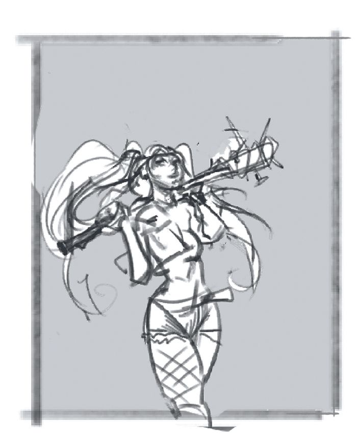
A) Sketch the energy
Image credit: Yona Saura
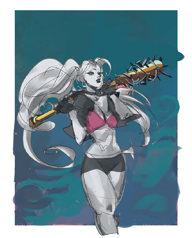
B) Clean up and shadows
Image credit: Yona Saura
C. Add the colour, depth and attitude
Image credit: Yona Saura
A) Sketch the energy. Start with a simple sketch where you define the pose, space and energy of the character. If the sketch conveys what you want to say, the rest will flow. Focus on making sure the character’s attitude feels strong from the very first line, which should help it continue throughout.
B) Clean up and shadows. Begin cleaning up the sketch, defining the silhouette and volumes. I use shadows as a tool to create depth and direct attention toward the character. Even if I’m still in the pre-inking phase, I’m already building the mood that I want to reinforce later with the colours.
C. Add the colour, depth and attitude. With the colour and inking done, we can define the layers. For me that’s her shadow and the zombie hands in the background, the character, and a green foreground mist. The environment adds tension, but the scene revolves around her confidence.
12. Focus the viewer's gaze
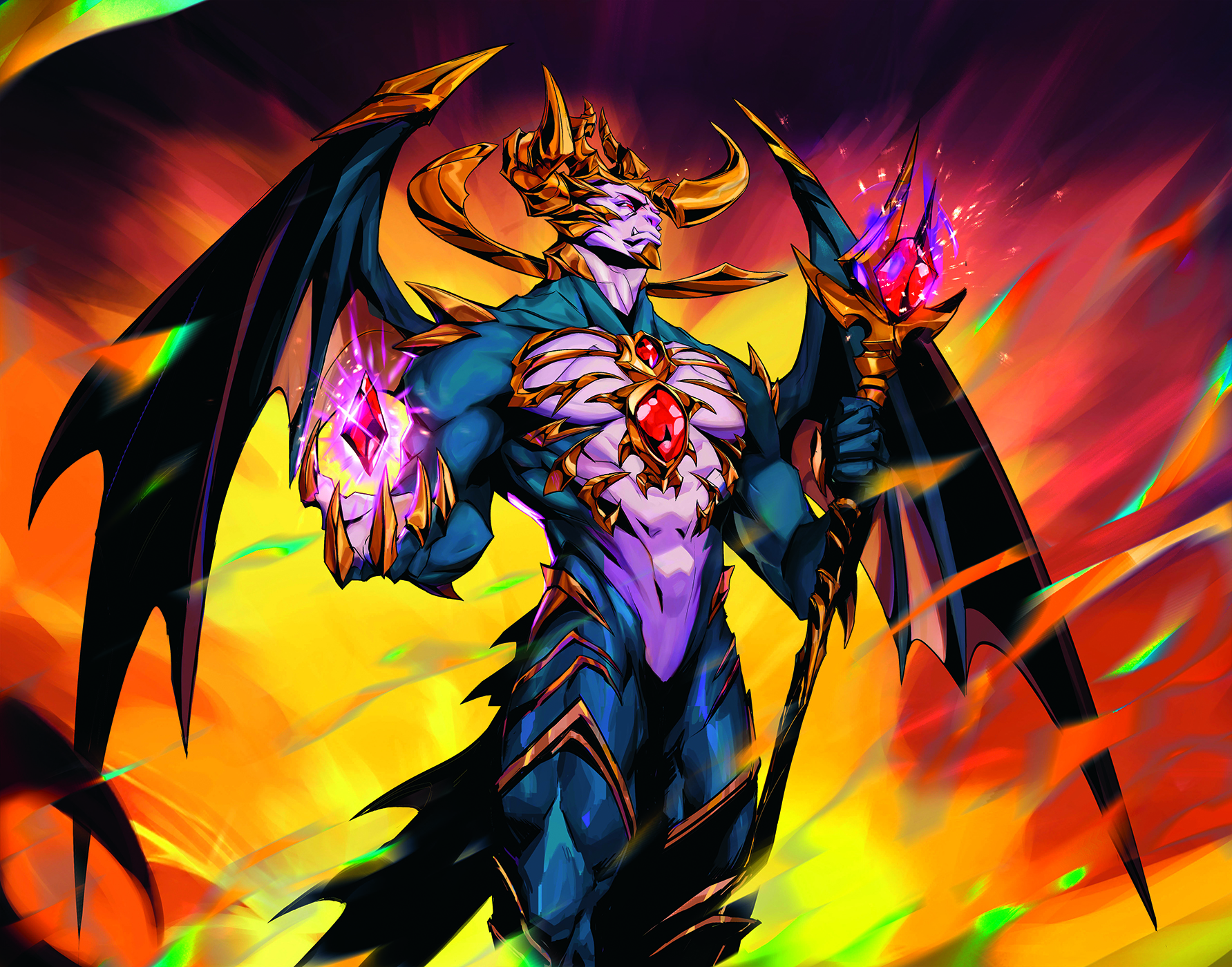
When I start out on an illustration, I always think about which part I want the audience’s eyes to see first. Use contrast, lines or gesture direction to guide the gaze. For example, if I want them to notice an intense expression, I’ll make sure there are no distractions nearby. The clearer its focus, the stronger an impact it makes.
13. Balance the visual rhythm

I like to give the character space to breathe. If everything is filled with detail, the image feels crowded. That’s why it’s good to alternate busy zones with simple ones, like flat shadows or clean backgrounds. This creates a balance between chaos and order, and makes the character stand out much more.
14. Create details that tell stories

Don’t draw details for the sake of it. Every accessory, scar or torn garment says something about the character. Sometimes a single object tells their whole story. Try to choose carefully what to show and what to leave out. Fewer elements, but with intention, make everything carry more weight.
15. If the silhouette reads, it works

Many times my characters start from shapes. I always try to give each one a clear silhouette that works even in shadow. Play with proportions, angles and poses to break repetition. Varying the silhouettes keeps everything feeling fresh and helps each design have its own identity.
For more inspiration, see our piece what is concept art and our feature on the importance of indie game art.
This article originally appeared in ImagineFX. Subscribe to ImagineFX to never miss an issue. Print and digital subscriptions available.

Yona is an illustrator from Uruguay with a focus on creating comic covers, characters and game art. He works across the comics and publishing industry.
You must confirm your public display name before commenting
Please logout and then login again, you will then be prompted to enter your display name.
