Designers react to the new Aldi logo
Supermarket chain Aldi has bucked the flat design trend with its new logo. How has it gone down with the design community?

Sign up to Creative Bloq's daily newsletter, which brings you the latest news and inspiration from the worlds of art, design and technology.
You are now subscribed
Your newsletter sign-up was successful
Want to add more newsletters?
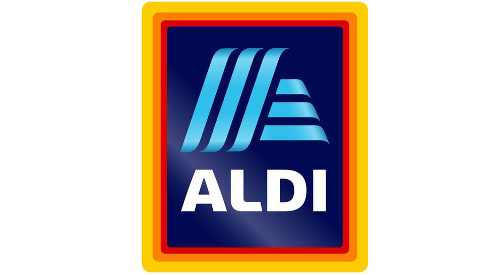
Budget supermarket chain Aldi has been a favourite amongst UK shoppers for 25 years thanks to its bargain prices. The German brand, which can trace its origins all the way back to 1913, has continued to increase its share of the retail market in 2017. To strengthen its position and appear more contemporary, Aldi has built on this year's success with a new logo design (above).
Bucking the trend of flat designs which have become par for the course in the last few years, Aldi has instead opted for a 3D look with a colour gradient. Designed by illion. Markensocietaet, the new logo will be accompanied by a refreshed product range and store redesigns.
"The fresh visual design of the new logo is ideally suited to the current modernisation process of ALDI SÜD, " says Kirsten Geß, communication director at ALDI SÜD.
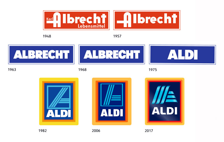
Article continues belowThe newest version of the Aldi comes with a refined border and a curved typeface which builds on a design that was first introduced in 1982. The familiar 'A' logomark is still there, but the shape of the letter has been squashed into a more abstract version. The recognisable blue stripes that make up the design have also made it into the new design, which should help reassure shoppers. Expect to see it rolling out from June 2017 onwards.

But never mind shoppers, what have designers made of the update? Nothing seems to get designers talking quite like a brand update and Aldi is no exception. Here's what the online community of designers had to say.
Not keen on the new #Aldi #logo. Looks too much like a car co. to me, and going into 3D rather than flat is going against trends? #branding pic.twitter.com/Xdzu3TYZkBMarch 15, 2017
Aldi's new #logo: the gradients are not contemporary &still got the borders. A missed opportunity. https://t.co/sac6CXQk9L Via @Design_Week pic.twitter.com/lZG4YJxowKMarch 15, 2017
I feel like Aldi missed an opportunity with the redesign of their logo. Could have gone more high-end, not Adidas. https://t.co/8YdoljEftNMarch 14, 2017
To anyone listening: adding 'reflective' gradients to your logo to make it look more contemporary does not work. Esp Aldi. https://t.co/VN65KqHaZ4March 14, 2017
new Aldi #logo tries so hard to look 'modern' that it actually looks more retro... kind of reminds me of an airline logo tbh #GraphicDesign pic.twitter.com/ZpILJeNXNXMarch 14, 2017
No!!! Their logo was my favorite thing next to the cheap prices! "Aldi rebrands to appear more 'contemporary'" https://t.co/OTahRhL4TEMarch 13, 2017
What do you make of the new Aldi logo? Let us know in the comments below!
Related articles:
Sign up to Creative Bloq's daily newsletter, which brings you the latest news and inspiration from the worlds of art, design and technology.

Dom Carter is a freelance writer who specialises in art and design. Formerly a staff writer for Creative Bloq, his work has also appeared on Creative Boom and in the pages of ImagineFX, Computer Arts, 3D World, and .net. He has been a D&AD New Blood judge, and has a particular interest in picture books.
