This weekend saw creative crowdfunding site Kickstarter roll out a surprise rebrand that flies in the face of recent design overhauls. Whereas the likes of Dropbox and eBay have reinvented themselves with vibrant colour palettes in an attempt to grab attention, Kickstarter has done the opposite and launched a bloated, single colour logo, and a pared-back website design.
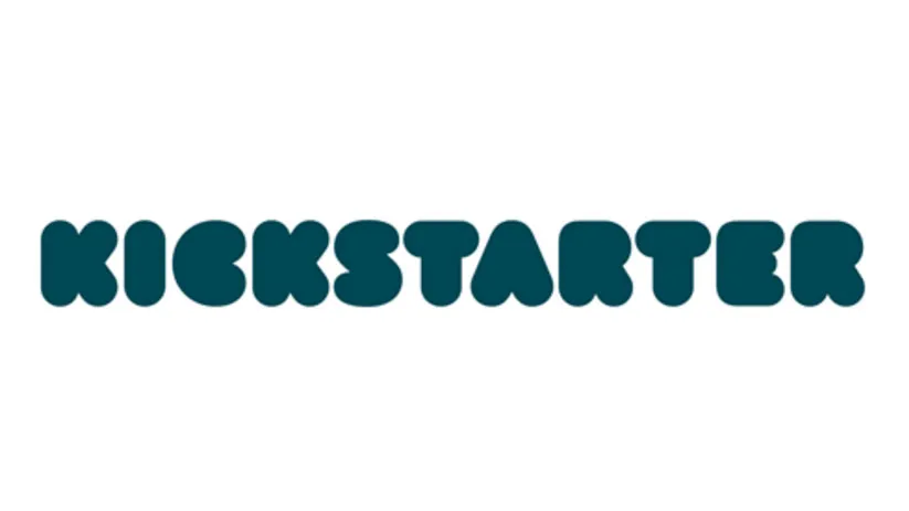
Created in partnership between Kickstarter's in-house design team and New York-based design office Order, the new identity is centred around a puffed up wordmark that does away with the black and green colours from the old logo.

Instead, what we can now look forward to when we're visiting the site is a logo that emphasises and blurs together previous Kickstarter design elements. The typography has always been firmly on the bubble writing spectrum, but the new lettering, drawn by typographer Jesse Ragan, inflates it as far as legibility allows.
In terms of colour, the new logo appears to mix together the palette from the previous design to create a dusky teal that gives the design an air of seriousness. This might seem like a counterintuitive choice when you consider that Kickstarter is all about encouraging creativity, but when there's money involved it can't hurt to show that you mean business. Especially when your font is that bouncy.
Accompanying the new logo is the introduction of two new website typefaces: Cooper Light and Maison Neue. These are both used throughout the new website design, which continues the logo's angle of being professional-looking monochrome text against a while background, carrying over everything that make Kickstarter a success.

The result is a crisp and clean site that's easy to navigate and puts the emphasis, rightly so, on finding the creative projects.
As with any rebrand, though, there are going to be critics. We've seen creatives and design critics taking a pop at the date that appears on the top-left corner of the homepage, but for a site that's all about project deadlines we think this makes perfect sense – or at least it stops you checking the date on your phone and getting sidetracked.
Meanwhile, other designers have been leaving less than favourable reviews on Twitter...
I hope that the new chunky Kickstarter logo is in it’s cocoon stage and will emerge as a beautiful butterfly logotype.November 17, 2017
What happened to @kickstarter logo? I sincerely thought it was a joke when I first saw the icon. Please do not fix what ain't broken. #kickstarter #redesign #logo 😣 pic.twitter.com/KG6RYz46Q7November 18, 2017
Man the new kickstarter logo is such a downgrade. :/ pic.twitter.com/eFRTYlcRXTNovember 19, 2017
@kickstarter ‘s new logo it is a complete disaster. #Horrible #kickstarternewlogoNovember 18, 2017
Interesting new redesign by @kickstarter the #ui looks amazing but the logo looks like someone kept pressing the 'bolder' button until they got to the max setting #typography #logodesignNovember 17, 2017
Related articles:

