Science Museum rebrand courts controversy
Why has it replaced its 2011 D&AD award-winning branding by Johnson Banks?

Sign up to Creative Bloq's daily newsletter, which brings you the latest news and inspiration from the worlds of art, design and technology.
You are now subscribed
Your newsletter sign-up was successful
Want to add more newsletters?
London's Science Museum has revealed its new look courtesy of top branding agency North Design – much to the annoyance of the team behind the museum's previous award-winning identity, Johnson Banks, which took to Twitter to voice its opinions.
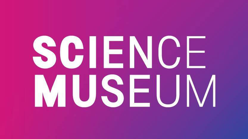
The rebrand was announced on the Science Museum's Twitter page this week, complete with an eight-second animation that showed off its new typographic logo. Typography is the centrepiece of the rebrand, with 'Science Museum' now spelt out in an all-caps, sans-serif font that becomes thinner and thinner as the letters go on. This echoes the gradient shading and colour palette that accompanies the redesign.
The agency behind the rebrand, North Design, has been remarkably low-key about the rebrand so far. There's no mention (at the time of writing) of the work on its website, and the museum itself hasn't further explained the thinking behind the new identity.
Article continues below 
What we do know is that the rebrand covers the brick and mortar museum itself, plus the Science Museum website and social media platforms.
And while the typography thins out in the name of the museum, this distinctive typographical quirk is saved only for one headline on the Science Museum's site. Perhaps this is for the best: if you were to type a sentence with that font, it would vanish before you finished.
Hello world! Today we are proud to unveil our new visual identity and website https://t.co/UXGsUy54Ob pic.twitter.com/QnZWdM3rdpOctober 3, 2017
Controversial rebrand
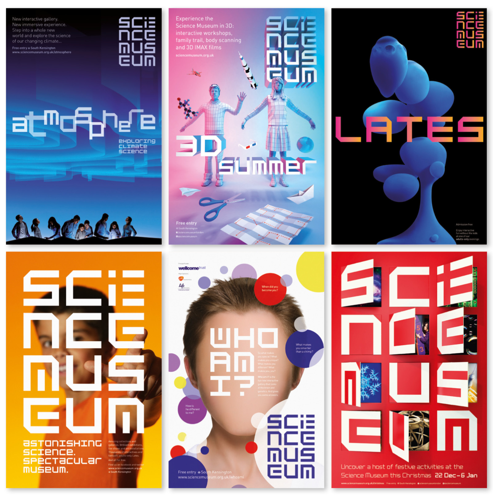
So why has the Science Museum rebranded? The old identity by Johnson Banks – with its angular font, which looked like it needed decoding – won a D&AD award in 2011, the year after it launched. Today, it’s firmly entrenched as a design favourite in the public eye.
There are some similarities: Johnson Banks' branding for the Science Museum was also typographically playful, for example. Blocky and laid out in rows and columns, the logo took its cue from code and digital typefaces.
Sign up to Creative Bloq's daily newsletter, which brings you the latest news and inspiration from the worlds of art, design and technology.

"It takes a little bit of working out, but ‘decoding and sharing’ seemed an apt analogy for the museum itself," Johnson Banks explained on its website.
"It also provided [the Science Museum] with what they’ve never had – a unique wordmark to identify themselves which could be literally ‘stamped’ onto everything they do, and an immediate solution to their brand architecture issues, which were solved virtually overnight."
There's no information currently available about North Design's brief. But one thing’s for sure: Johnson Banks isn’t impressed.
Well we knew this was coming. But, still, a bit of a clunker from the @sciencemuseum? #dodgykerningmethinks #notbitter pic.twitter.com/OoQCTWhIK6October 4, 2017
So far, Johnson Banks' negative reaction to the new Science Museum identity hasn't quite hit Spiekermann levels of backlash, but it has invited other designers to weigh in with their opinions on the rebrand.
What were they thinking? @johnsonbanks’ Science Museum was a gem. This is just a type foundry sampler. https://t.co/QmbVZZWBrOOctober 5, 2017
The general consensus within the Twitter design community seems to side with Johnson Banks. But that's not surprising: we're hardwired to resist change. And we see this initial knee-jerk reaction time and time again with rebrands.
We're more interested in how opinions will sit in a few months' time, when the public have had time to digest the new design – and when we have more information on the brief given to North Design.
North Design is remaining tight-lipped in the midst of all this drama. So we won't be seeing a bitter (or comedy) back-and-forth Twitter spat between the studio and Johnson Banks, with the Science Museum caught in the middle. It's a family institution after all, won't somebody think of the children?
Related articles:

Dom Carter is a freelance writer who specialises in art and design. Formerly a staff writer for Creative Bloq, his work has also appeared on Creative Boom and in the pages of ImagineFX, Computer Arts, 3D World, and .net. He has been a D&AD New Blood judge, and has a particular interest in picture books.
