10 top tips for kerning type
Follow our pro advice and you'll soon be on your way to achieving typographic perfection.
Designers are spoilt for choice when it comes to typefaces these days, with thousands of fonts to choose from. But what about if you want to make your own? Just like creating a new logo design, developing your own font is no easy feat, and there are many factors to consider when doing so.
One of the most important considerations is kerning; the process of adjusting the spacing between letters to achieve a visually pleasing result. Some designers find it easy, others find it a tricky process where success is achieved more by luck than real judgement. And as Zara's rebrand shows, kerning can be extremely controversial. But follow these tips and you should find yourself on the right track... Want to learn even more about typography? Check our list of top typography tutorials.
01. Choose your typeface early on
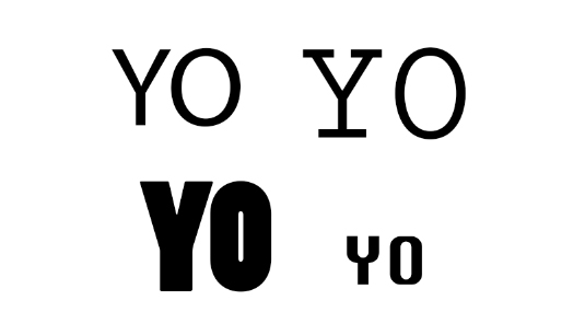
Each typeface requires its own kerning, adjustments and attention to detail. So it's important that you make a decisive decision on the typeface you're going to be working with early on within the design process. Making last-minute changes can significantly change the direction of your design as well as the kerning that specific typeface needs. Rushed, last-minute kerning is rarely successful kerning, so don't put yourself in that position.
02. Consider specific letter combinations
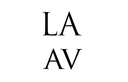
Remember that some letters that don't kern as well as others within a word. Letter combinations such as 'LA', for example, are not as complementary as 'AV'. In such cases, attention to kerning needs to be considered and focused in regards to the negative space.
03. Blur your eyes

While kerning display typefaces (you should only be kerning display typefaces by the way), try blurring your vision a bit by squinting or crossing your eyes. This enables you to focus on the contrast and white space of the letterforms without becoming distracted by the characters themselves.
04. Flip the typeface upside down
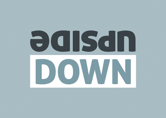
Another useful exercise for kerning is to turn the typeface upside-down. This allows you to focus on the form of the characters rather than getting distracted by the actual word being viewed. Upside-down text becomes more abstract and enables you to focus on lights (white space) and dark (the characters) areas.
05. Create rhythm and consistency

The best font kerning (and the best typography) has good rhythm and consistency. One character sitting next to another should appear rhythmic and balanced. One way of achieving this is to step back from the monitor and observe the text. Does the text 'box' appear as one equal shade? Or does it appear darker between some characters and lighter between others?
Sign up to Creative Bloq's daily newsletter, which brings you the latest news and inspiration from the worlds of art, design and technology.
06. Remember spacing between words
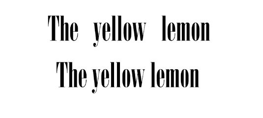
The main focus of kerning is usually the spacing between characters, but don't forget the spacing between words. This can be especially relevant when working with free fonts you've downloaded online, which are sometimes poorly constructed in terms of spacing.
07. Supply two versions of a logo

Kerning typefaces for logos can be quite tricky, since logo typefaces can be viewed at very large or very small sizes. I recommend supplying clients, when needed, with two sets: more tightly kerned pairs for large sizes and looser for the smaller uses of the logo.
08. Test yourself
Like mastering any technique, the best and most effective way to improve your kerning skills is through practice. The Kerning Game is a great way to brush up on your technique as well as learning by trial and error the most common mistakes made whilst kerning.
09. Try out a kerning tool
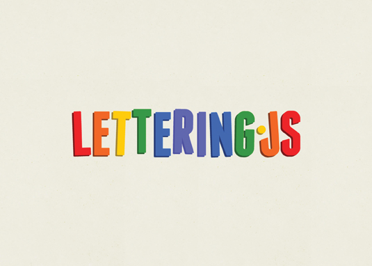
For us really picky, detailed web folk, try looking at Kern.js and Lettering.js. The second one is a jQuery plugin that enables selectable HTML text on the web to be kerned and controlled in other profound ways.
10. Learn your terms
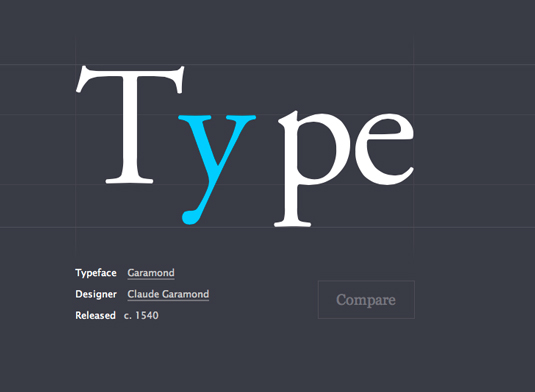
There are lots of specific terms related to typography. For instance, you may hear other designers talk about 'tracking' and assume it's the same thing as kerning. It's not. Tracking is about controlling the uniform spacing between all the letters in a piece of text, while kerning refers to the spacing between two specific letters.
For a full glossary, take a look at our article Typography rules and terms every designer must know.
Read more:

