Brand typography: A complete guide
Deliver your message with the perfect brand typography.
Sign up to Creative Bloq's daily newsletter, which brings you the latest news and inspiration from the worlds of art, design and technology.
You are now subscribed
Your newsletter sign-up was successful
Want to add more newsletters?
Brand typography is key to the message being delivered. From a distinctive approach to using type, right through to a fully bespoke typeface, brands are exploiting the wide-ranging potential of typography to express themselves. There's no one-size-fits-all solution, but every brand should be aware of typography's power as a differentiator, and have a strategy for using it in the most appropriate way.
Typography in branding so important that it's recently been added as one of three new craft categories in our annual awards scheme, the Brand Impact Awards. Enter your best typography in branding by 26 June, and learn more about using type in visual identities below.
For this article, we talked to professionals who gave us five approaches to creating brand expression through typography – related to actual case studies. Then, (on page 2) we share five expert tips to help you to choose the perfect typeface for your brand. If it's resources you need, check out our list of top free fonts and italic fonts. Or, for tips on creating your own font, see our guide to font design.
Article continues belowType is crucial to brand expression
"No matter the medium or the audience, type is everywhere that a written message needs to be conveyed," says Lukas Paltram, creative director at leading type design studio Dalton Maag. "Creating a unique expression at that essential level of communication is extremely powerful. It can be a big asset for brands to stand out, and it enables them to use a unique voice in their visual communication."
Creating bespoke typefaces is expensive and time-consuming, and may not always be worth the investment. However, the one-off cost for a truly ownable asset may be more attractive than buying multiple licenses to an existing typeface that others can use. For more on this, see our guide to font licensing.
How is personality conveyed through type?
When it comes to conveying personality through type, certain details within letterforms offer particularly rich opportunities. "Characters with more curvature are always easier to build a sense of personality into," says multi-disciplinary designer Caterina Bianchini, who has created many custom fonts for her clients. "For instance, a G, C or O lends itself nicely to having a more charismatic aesthetic," she continues. "Crossbars are also interesting: they can be manipulated even just a small amount to give a different feeling: perhaps they sit lower or higher, or have a curve added."
"Virtually anything is possible, as long as it looks good," agrees Pentagram partner Paula Scher. "Small customisations can make fonts more recognisable, such as filling in the inside of a lower case o, g, d or b, stencilling it in a creative way, or slicing parts of letterforms."
Sign up to Creative Bloq's daily newsletter, which brings you the latest news and inspiration from the worlds of art, design and technology.
However, Paltram cautions that while certain characters have greater potential for personalisation – he adds the capital Q and ampersand to the list above – a typeface needs to be balanced across the entire character set. "It's not about individual letters that stand out, it's the entire system that needs to be convincing," he argues.
Read on to discover how to create brand expression through typography…
01. Put typography at the heart of brand expression: The Public
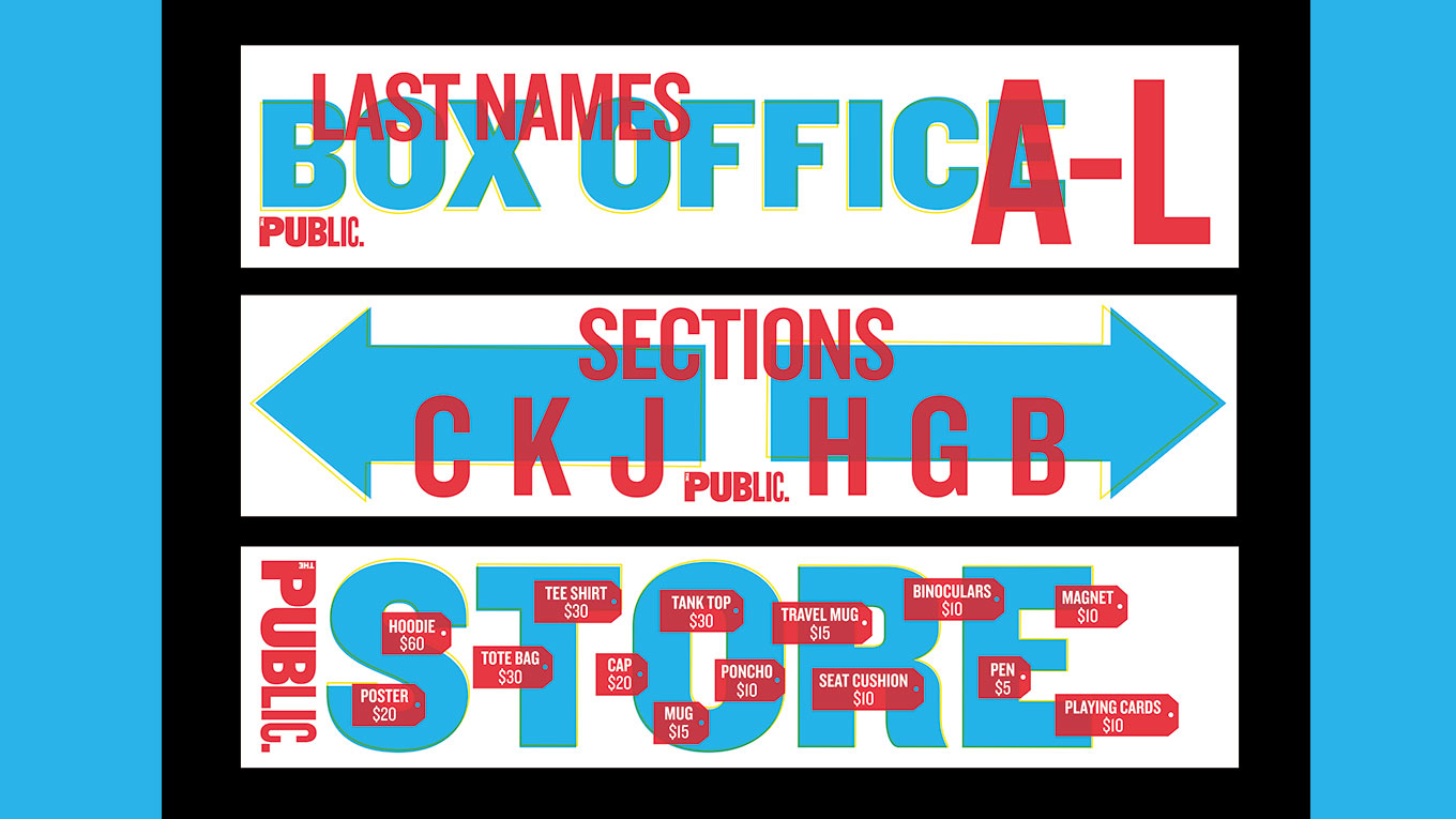
Typography has defined The Public Theatre's brand identity since 1994, when Scher crafted its logotype using original wood-block letters that had not yet been digitised. Fourteen years later, in 2008, Scher updated the logotype, setting it in six different weights of the Knockout typeface.
"I selected the wood fonts, and later Knockout, because they were used in newspapers in the late 1800s, and then in boxing posters in the 30s, 40s and 50s," she explains. "The type is populistic, so it was perfect for this not-for-profit, inclusive, and often groundbreaking theatre."
Each season, Scher collaborates with artistic director Oskar Eustis to agree a summer headline that captures the spirit of those productions – past examples have included Free Love and War and Love.
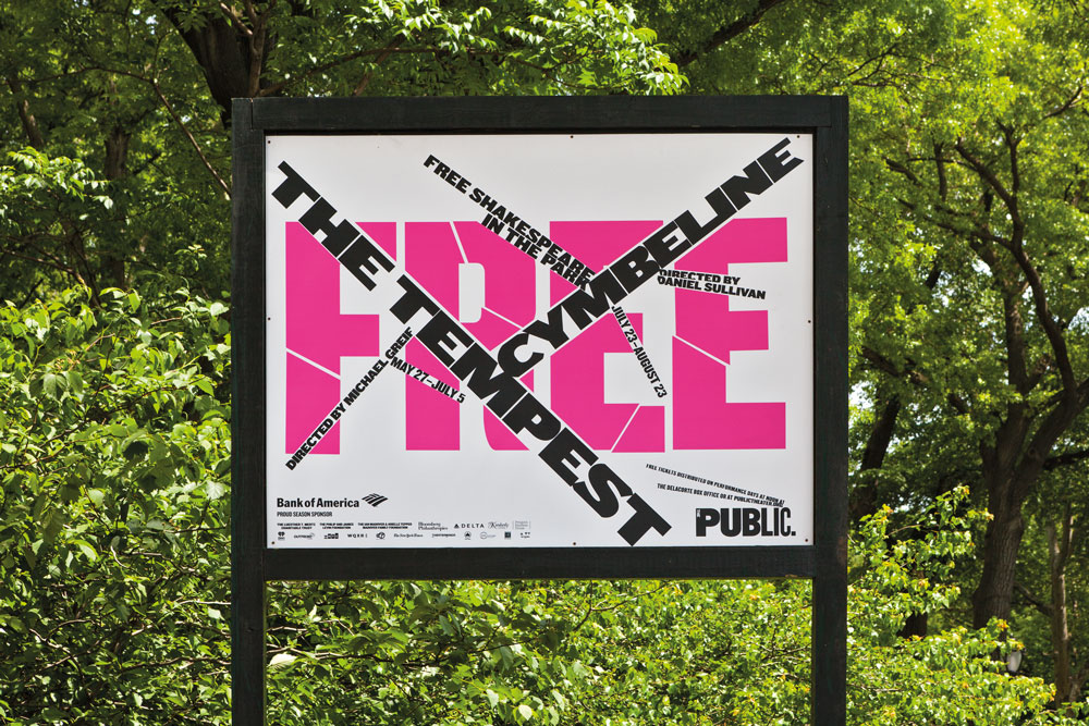
Working primarily with different weights and colours of Knockout, with some creative tweaks to the typeface where necessary, Scher and her team at Pentagram design a distinctive look and feel for Shakespeare in the Park every season. This then serves as a creative framework for a range of other promotional material rolled out by The Public's in-house team.
"Generally, I try to design each season as a counter-balance to the one that came before it," says Scher. "The 2018-19 season used a gradated background and heavy black typography, where the left-hand side of a straight letterform, like an F or an L, might be extended by as much as an inch, giving the typography a rather heavy black appearance."
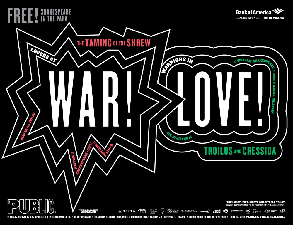
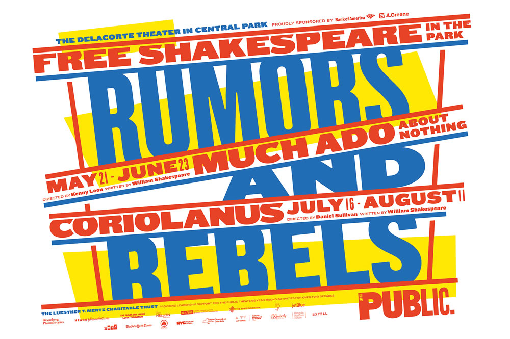
The most recent 2019-20 season, meanwhile, is a riot of colour by contrast. "It has type at tangents using underlining bars," she continues. "The blue, red, and yellow is upbeat, influenced by the colours of Wonder Bread packaging and Bazooka gum."
Scher admits that each season some trial and error is required to achieve a suitably eclectic range of brand expression using the same typeface. "I'm trying to find the right eccentricity to build into the typography," she says. "Typefaces have spirit, and can be highly recognisable. If the typographic style used by an organisation has enough specific eccentricity, it can be recognised by the typeface alone – without a logo."
02. Build type on a versatile grid-based system: SKP Beijing
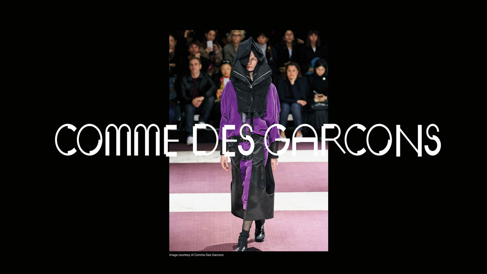
Designer and art director Bianchini worked with luxury Chinese department store SKP on a bespoke typeface that pushed the boundaries of convention. "A brand's typeface is usually one of the first things a consumer interacts with, and it's a very simple way to showcase a sense of feeling or character," Bianchini says. "SKP is streetwear focused, so it wanted the font to have an edge to it. "The overarching concept was a five-sided shape, which we named Wu. This became a visual metaphor to represent different parts of the store and SKP's brand, as well as touching on Chinese culture."
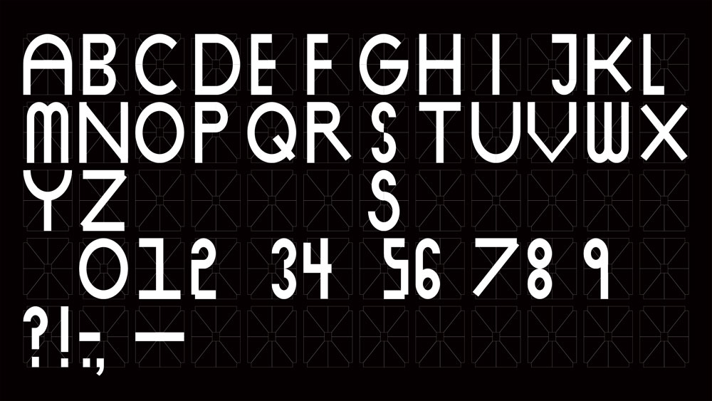
This simple shape was the foundation of a grid, which in turn became the basis for the entire graphic system. Once the grid was established, it became a tool for building SKP's iconography and wayfinding systems.
"The result is something that feels quite multi-dimensional and multi-faceted," says Bianchini. "We developed three different weights: light, medium and finally faceted. The font is blocky and black, which gives it a distinct and instantly recognisable aesthetic."
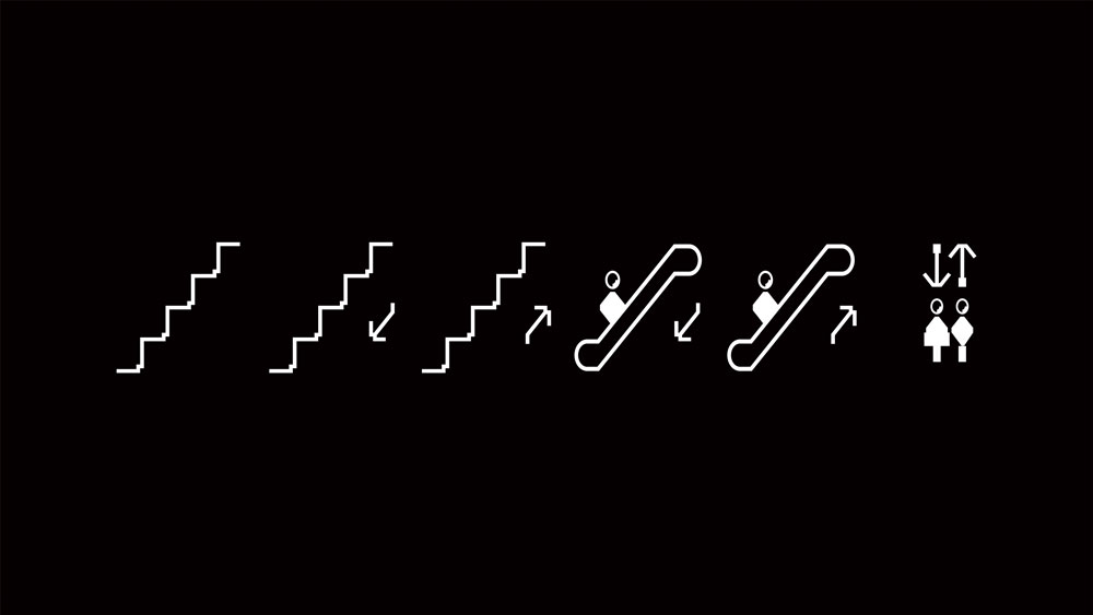
Bianchini adds that this multi-faceted approach helps establish a unique identity for the department store. "A lot of the time people try to create something more functional, with the idea that less is more," she says. "With this type we wanted to create more. We wanted it to feel like the pioneer, the one doing things differently. We also always try to build a sense of something being a little 'off' into our work, and I think the unbalanced feeling of the shape pieces when they come together gives the typeface that exact feeling."
Conscious of not creating something that felt too 'over-designed', Bianchini had to strike the right balance between intriguingly esoteric, and overly confusing. "The font is heavily rooted in the grid formation, which usually simplifies things, but in our case it created a complicated system that could have been pushed too far in the wrong direction," she says. "We pushed it just enough."
03. Provide ownable typographic personality: City of Vienna
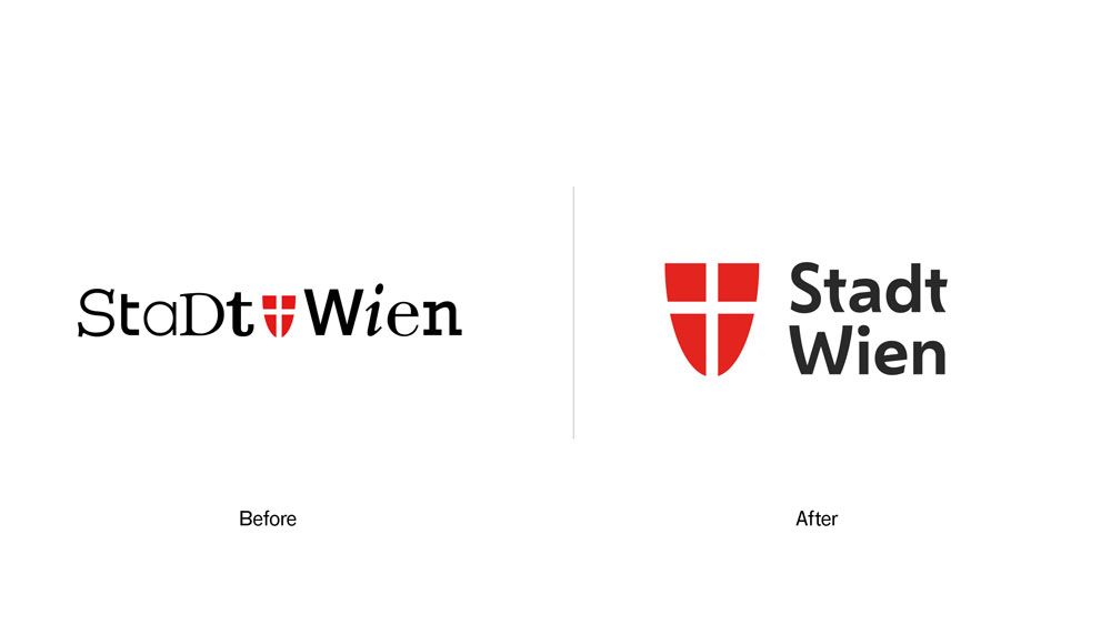
Working alongside Saffron Brand Consultants, Dalton Maag put together a bespoke typeface for the City of Vienna entirely from scratch. The brief was for a contemporary sans-serif font family, with three weights, that could convey a uniquely 'Viennese' feeling across all media.
"We started by gathering inspiration from the city itself – its architecture, culture and history – and used these references to directly inspire the typeface's design language," explains creative director Paltram.
"It's this unique process that makes the typeface distinctive and ownable. The typeface is clean and mature enough to support the efficiency of the government, but it also embodies the diversity and humanity of Vienna and its residents."
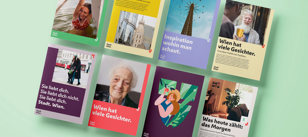
When Dalton Maag came on board, Saffron had already established the foundations of the visual identity, but the typeface remained a critical component. It needed to be expressive, giving the city a friendly yet confident tone of voice without compromising functionality or readability.
"Next to historic and cultural references, we used the long-established shape of the shield, the coat of arms of the city, as an inspiration," says Paltram, giving the example of the diagonal glyphs on the W and V.
"There's a specific tension in the curvature which is repeated across multiple characters, together with other unique elements such as the e with an inclined middle bar, and the simplified u shape," Paltram continues. "The softened diagonal strokes of the letters, round shapes and open counters give the typeface an approachable and warm expression throughout, but also deliver excellent legibility – even at smaller sizes."
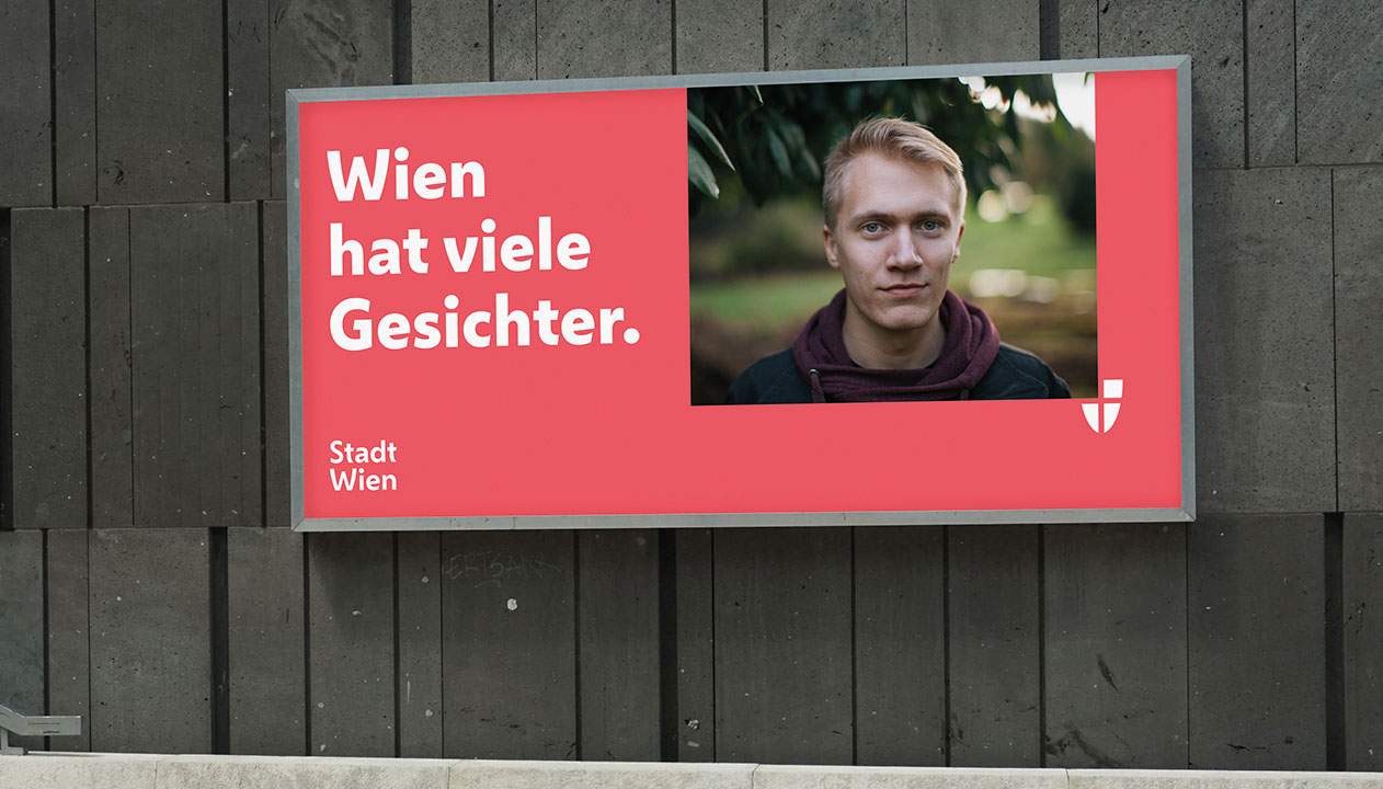
As Paltram points out, the ultimate end clients are the citizens of Vienna. "In my opinion, Vienna is a modern and cosmopolitan place, but you can feel the history and tradition in the city," he says.
"Merging these elements and understanding the right level of influence to the typographic expression was key," continues Paltram. "Together with the working group of agencies, and the client's team, I'm confident we achieved something that doesn't just follow a fashion, but will last and find the right place in our time."
04. Create a cohesive design system driven by type: Top Gear
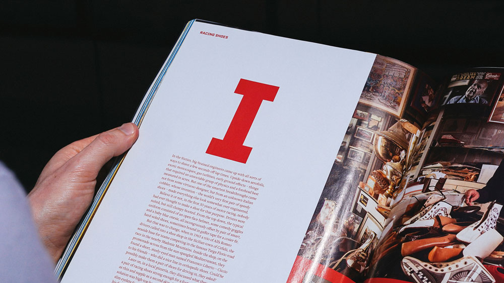
To help drive brand recognition for BBC Top Gear, DixonBaxi developed TG Industry: a distinctive typeface designed to give the global motoring brand a consistent, ownable presence across its many platforms.
According to co-founder and creative director Dixon, an extensive range of weights was essential to create enough nuances to work with across print, broadcast and digital applications. "At times sleek and reductive with a cinematic quality, yet bold and expressive in other moments, it packs a punch for eye-catching headlines and iconic title sequences," says Dixon. "It's a digital-first typeface, crafted to remain highly legible on the smallest of screens."
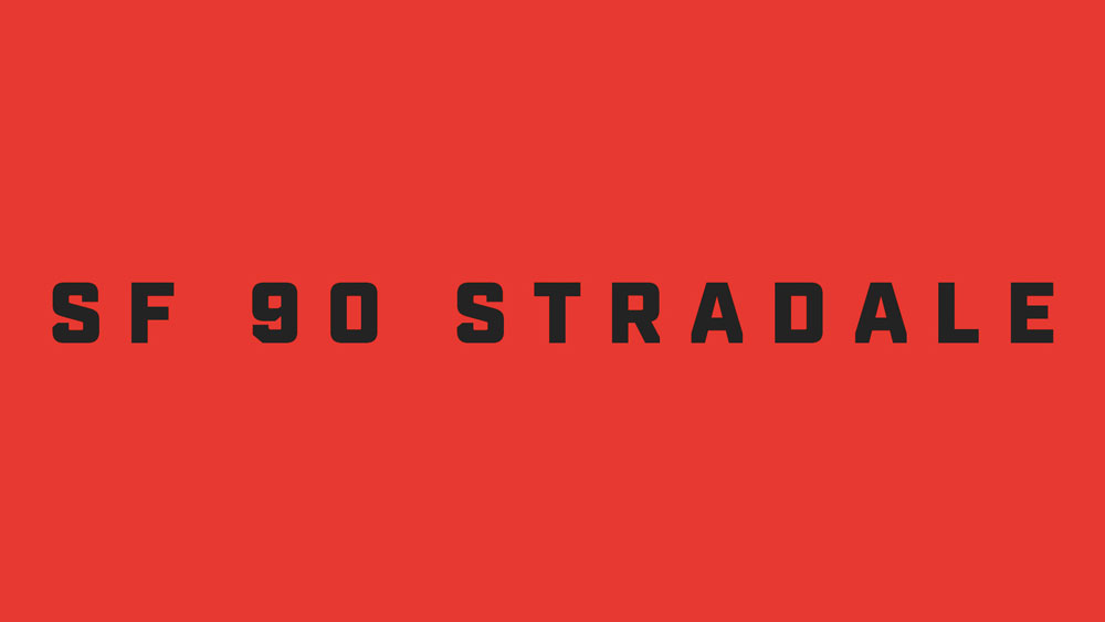
Created in close collaboration with Mattox Shuler from Fort Foundry, the typeface is at the heart of a cohesive and creative design system for Top Gear – and clear visual signifiers emphasise its relationship to the main brand. "TG Industry is inspired by the angular cuts of the Top Gear cog, a core part of the logo," continues Dixon. "The blunt end of the uppercase A is a good example, or where the curved part of the lowercase b meets the upright stroke – this has been given an aggressive angular edge that is inspired by the shape of the teeth on the cog icon."
As Dixon points out, great branding tends to be in the detail. "It's the specifics that make the experience more relatable and ownable," he adds. "The tracking and kerning. The legibility and different sizes. The satisfying feel of a font that feels right in many applications."
Dixon's advice is to be clear from the outset why you're choosing to design a bespoke font. "It needs a clear rationale," he insists. "See the typeface as part of a larger design eco-system. The typeface is delivering the brand's voice. Look at the details: it's easy to skim through the finer points, so diligence pays off. It can't be rushed."
05. Evolve a full typeface from a logo design: Duolingo
Sometimes the development of a typeface evolves as part of the creative process, even if it wasn't originally part of the brief. That was the case with Johnson Banks' recent rebrand of language-learning platform Duolingo.
"The first type conversations stemmed from a desire to improve its logotype," reveals creative director Michael Johnson. "It was based on a typeface called Chalet, which we all felt wasn't fit for purpose."
Although discussions initially turned down the 'neutral' sans-serif route, Johnson pointed out the ubiquity of the style in the tech space. "We were keen that they had something more unique," he adds.
"As we experimented with juxtaposing the mascot with their name, a 'What if?' unlocked the solution," continues Johnson. "We redrew the logotype, drawing inspiration from Duo's feathery form to reflect the company's quirky personality."
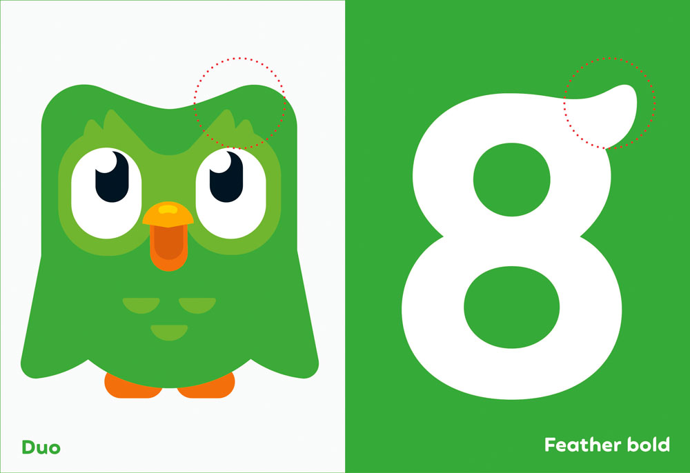
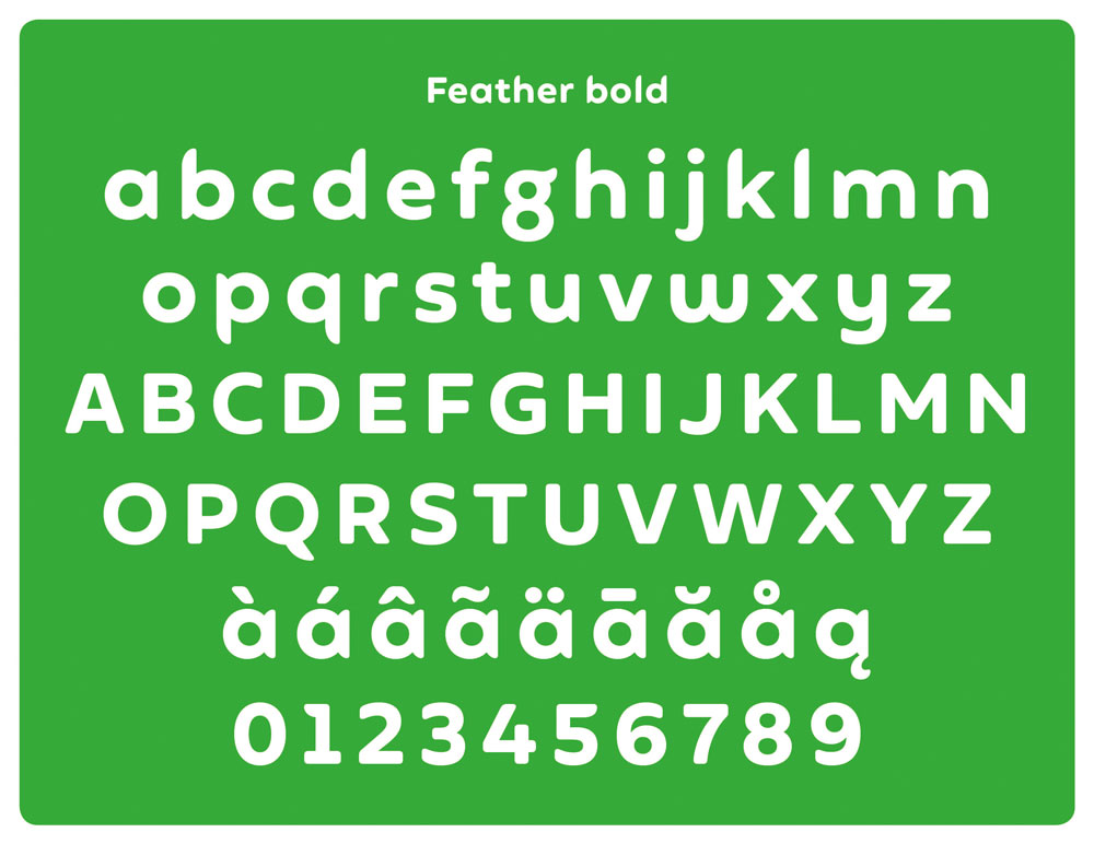
While he admits the first few attempts looked "very odd", as the concept was refined the potential emerged for a bespoke typeface – developed in partnership with Fontsmith. "A lot of the initial decisions stem from the logotype, where you have round characters (the d and two o's), a repeated character (the u and n) and the relatively neutral l and capital i," says Johnson. "Then you have the mnemonic character: the g. Little quirks, such as the flick of the lowercase g were used sparingly, beta versions were crash-tested, and eventually 'Feather Bold' was ready."
The Feather Bold typeface was reverse-engineered from the shapes used to draw Duolingo's mascot, Duo the owl. Johnson reveals that, "It finally let us put the word 'duolingo' next to their mascot without it looking like an unhappy marriage."
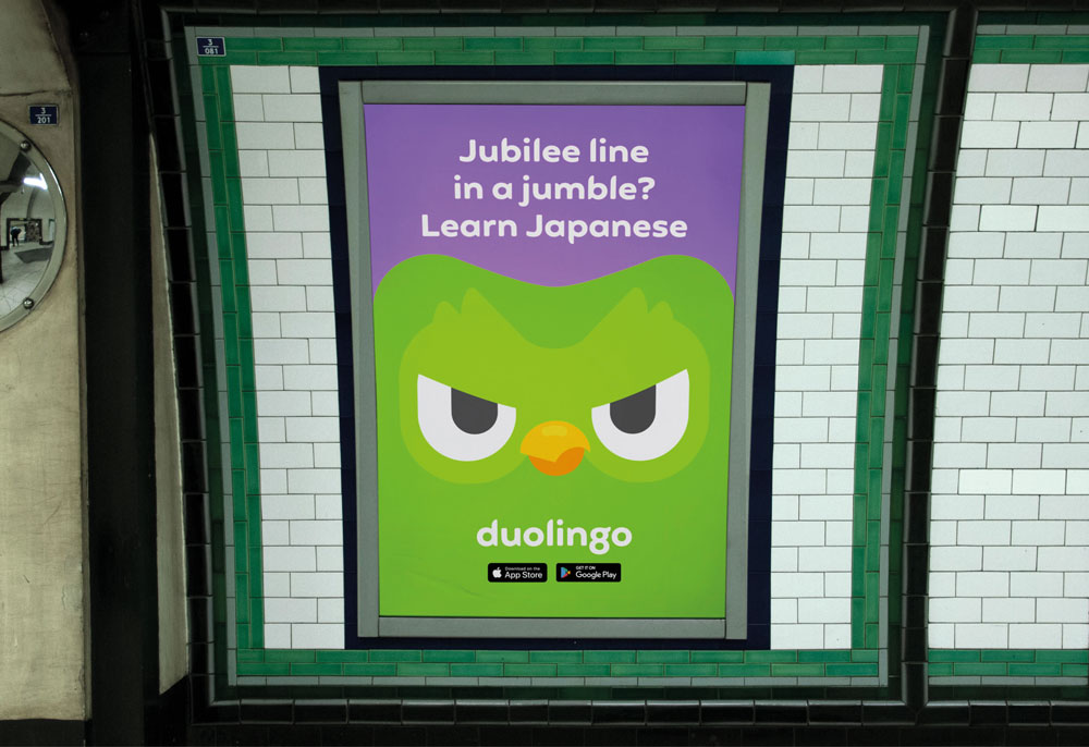
For Johnson, a brand's use of typography is interlinked with its tone of voice. "It's rare for us to use the same typeface from project to project," he says. "We're always looking for something that can encapsulate the unique feelings that we're trying to convey with the brand. Using 'generics' like Helvetica strikes me as a cop-out, unless there's a good reason to look and sound the same as others."
- 1
- 2
Current page: How to define your brand through typography
Next Page How to choose the right typeface for a brand