17 typography tips for creating your own fonts
Struggling to find the right font design? Here's how to make your own.

Sign up to Creative Bloq's daily newsletter, which brings you the latest news and inspiration from the worlds of art, design and technology.
You are now subscribed
Your newsletter sign-up was successful
Want to add more newsletters?
The right font can be crucial in all kinds of creative work, from branding to individual graphic design projects, and it makes sense that you may want to create your own typeface for something completely unique.
If you're a designer or illustrator who's new to font design, you'll need to understand certain practicalities, including what software to use and which elements to consider. It's often worth enrolling in a short type design course, either locally or online, but if that's not possible, the typography tips below should help set you on the right path to creating your own font designs.
If you're feeling inspired to take your skills further, explore our guide to the best typography tutorials. And if you don't have time to create your own font, check out our roundups of the best free fonts and the top professional fonts.
Article continues belowTypography tips for designing your own typeface
01. Create a brief for your font design
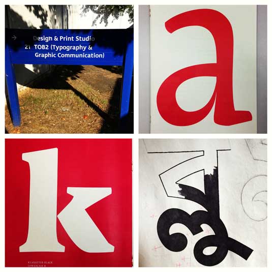
Fonts have many uses and designing your own can be a long journey. It's wise to start out with a clear vision of what your font's purpose will be in order to provide some focus. You might begin with something purely as a form of self-expression, but the usual practice in font design is to create a typeface in response to a brief. You may want to write yourself one if you don't have one. Your brief should make it clear what your font needs to achieve and how it will be used.
This usually requires a good amount of research and reflection. You'll need to ask yourself how your font design will be used whether it's a specific project or for personal use and whether it needs to solve a specific problem. You'll also need to consider how your typeface will compare in a landscape alongside similar designs. What will make it unique?
The options are vast. There are monospace typefaces that were created specifically for coding, for academic texts, to provide better number systems for engineering documents or as bespoke one-offs for public lettering. Only when you know what your typeface will actually be used for can you really get started on the design.
02. Make your fundamental font design choices
Font design involves a number of important choices that you need to make early on. Will your font design be a serif or sans-serif typeface? Will it be based on a writing implement or will it be more geometric? Will your design be a text face, comfortable at small sizes and suitable for long documents; or will it be a display face with an imaginative style that works better commanding attention at a larger size?
Sign up to Creative Bloq's daily newsletter, which brings you the latest news and inspiration from the worlds of art, design and technology.
Designing a sans-serif typeface is often more challenging for beginners because the features that distinguish such typefaces are much more subtle. Meanwhile, if you're a more advanced type designer, you might want to explore the world of variable fonts. As the name suggests, variable fonts allow type designers to personalise their letters, essentially enabling one font to act like multiple fonts. For more advice on this, see our 4 steps to using variable fonts.
03. Start your font design from scratch
One good way to get started with font design is by digitising your own handwriting. This can be a useful practice exercise because handwriting is so individual. Avoid basing your design on the outline of an existing typeface. 'Helvetica with wings' won't produce a better typeface or help you develop your skills as a type designer. This should go without saying, but typefaces like these get submitted (usually unsuccessfully) to foundries fairly regularly.
04. Try designing fonts by hand
Even if you're a Bézier curve master, it's a good idea to define your letterforms by hand in the first instance. Articulating certain shapes via a computer from the outset can be awkward and time-consuming.
Try to create graceful shapes on paper for the first few characters, and then refine them digitally. Further characters can then be designed on-screen by matching key features, such as terminal endings and stroke widths.
Note that the hand naturally draws smoother, more accurate curves in a concave arc pivoted by the arm and wrist. To take advantage of this, keep turning your paper rather than adjusting your position or drawing against this pivot point.
05. Use control characters for your font design
It makes sense to start your font design with certain characters that will help set the style of your typeface. You can then bring in the other characters in a harmonious way.
These initial characters are often called 'control characters' since they serve to control the design. In a lowercase Latin typeface, they would be the 'n' and o, and in the uppercase, 'H' and 'O' are often used. You can then steadily add to these. The word 'adhesion' is often used as an example to test a font design's basic proportions.
06. Move to your computer
There are a variety of ways to get your drawings onto the computer. Some people advocate tracing programs, however I prefer manually tracing my drawings because I want full control over where the points on my curves go.
Most software requires a well-defined drawing to work with effectively, so when you're happy with a sketched character, try outlining it with a fine tipped pen (to get a shape edge) and then fill in the shape with a marker.
You can then take a snap with your phone's camera and send it to your computer.
07. Choose your software
Many designers from a graphic design background will naturally turn straight to Adobe Illustrator to start drawing their type. For drawing individual letterforms and experimenting, this is fine, but it will soon become obvious that this isn't the right tool for creating a whole typeface.
It's better to start working in an environment that gets you thinking about letter spacing and word creation. There are several options depending on personal preference, but FontLab Studio, Glyphs and Robofont are popular type-based software options for font design. These programs aren't cheap, although Glyphs has a decent 'Mini' version for the Mac, with some functionality removed. The other obvious advantage of these packages is that you can export your work-in-progress as a font.
08. Draw some letters
Like any software, these programs take a little time to get used to, but they have good interfaces and there are handy tutorials available online. On Glyphs, for example, once you've imported your image, the drawing interface is pretty close to Illustrator CC, and the control of Bézier curve points might actually be more accurate. For greater control of your font design, where possible, place your points on the extremities of the letterform curves (top, bottom, left, right).
09. Switch to text view mode
Once you have drawn a few letters, you can start typing words using the text view mode. One major advantage of Glyphs is that you can edit your shapes in the same text view to start making the characters harmonise together in words.
You can then begin making adjustments to the letter spacing, looking at the rhythm of the counters and refining the overall proportions, like the x-height, weight and width of your typeface (if you're in need of a refresher, take a look at our typography glossary).
10. Test your font design at line level
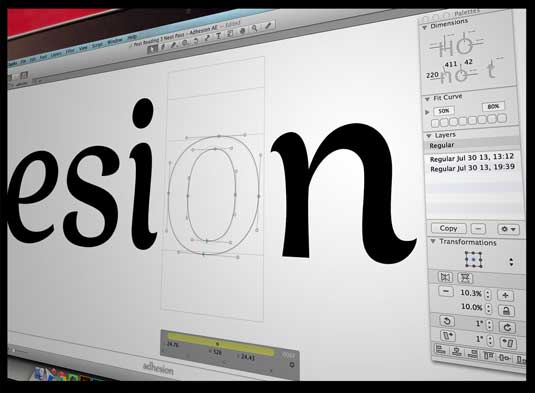
As type designer Matthew Carter is often quoted: "Type is a beautiful group of letters, not a group of beautiful letters". With this in mind, aim to start looking at your design from a line and paragraph level as early as possible.
Create a simple InDesign CC document, with text frames and paste some words into them. Set each text frame to a different font size for comparison (the sizes will depend on what your typeface is to be used for). Finally, export your typeface and select it within your document to see it in action.
While you're still in the early stages of your design, before you've settled on any spacing, you can use InDesign's built-in kerning tool to optically space your letters, maybe with some extra tracking, for a quick and dirty impression. When it comes to doing the job properly, take a look at our guide to kerning.
When you're happy, export your typeface and select it within your document to see it in action.
11. Study other typefaces
To create a credible typeface, you need to study other good examples of font design and looking at them in a critical way from a contextual or historical perspective. This can help you understand why certain design choices in these, and in your own typeface, have a particular effect.
Look at how the system of shapes work together consistently while forging an identity. Our article 5 ways type can define brands looks at the different effects certain type features can have. Look at both typefaces that are in a similar style to your own and those text typefaces that are generally accepted to be good examples.
12. Scale your font design down
It's important to review your typeface at different sizes in your test document. Depending on your brief, readability might be critical at smaller sizes, or you might be concerned with how your display text reads at a distance.
A change of scale can cause problems to emerge. Looking at how your shapes behave at a variety of sizes, and learning what design decisions affect them, takes practice and experience.
13. Print your font design
Printing your progress so you can see it away from the confines of pixels and backlighting will help you view it from a different perspective. Many people find it easier to spot problems with misshapen characters, the rhythm of counters, the modulation of strokes and so on when a font design is printed out and pinned up on a wall.
It's also easier to make notes and sketches for adjustment. Another benefit of printing is that when making thousands of micro-adjustments over a long development period, a printout can help you track your progress.
14. Add special characters to your font design
Your typeface might have a limited set of characters because that's what's needed for a specific project or because it's a very decorative design. However, if your aim is for for other designers to be able to use your font design in a variety of projects, then it needs to be flexible. That means having a broad character set. This should generally include small capitals, diacritic signs (accents), a choice of numerals, ligatures and more.
15. Explore different styles, weights and widths
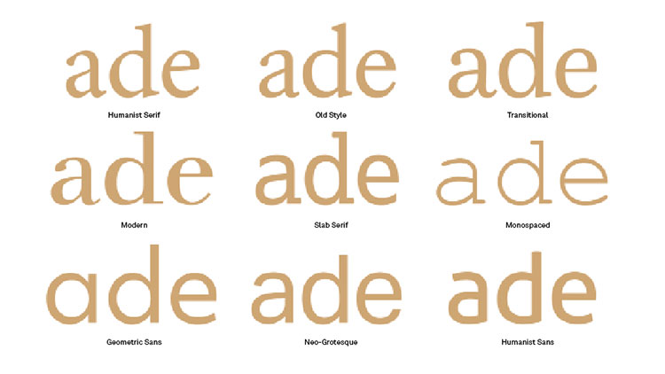
When a designer is choosing a particular typeface, they usually want a palette of different options to design with. Does your typeface have a true italic, not just a slanted roman? Would your typeface suit a condensed version? These questions go back to your brief and the intended uses of your typeface.
16. Take your font design global
So you've created a font design that you're proud of. If you're reading this, the chances are that you started with the Latin alphabet. But what about the 250 million readers of Cyrillic in Eastern Europe and central Asia? Or the 220 million Devanagari readers in India and Nepal?
There's a growing market for non-Latin typefaces and some scripts are woefully under-served. But can someone design a good script for a language they can't read? I hear you ask. The answer is emphatically yes.
It takes a lot of research into the script's history and culture, meetings with native speakers and exploration of historical examples, but a great number of excellent typefaces have been designed this way. See our top multilingual fonts for some examples.
17. Put your font design to the test
One you've crafted something you're happy with, you'll want to start seeing how it performs at a range of tasks suited to the original brief. Try using your font on some previous design projects, replacing the original typeface. Create some specific artwork that will put it under pressure, or perhaps ask a designer friend to test it out and give you some feedback. All feedback is useful, both for the current project and to take on board for future font designs.

Jamie Clarke is a type designer and lettering artist, expertly bridging both fields. Since refining his skills at Reading University in 2013, Jamie has created a growing collection of contemporary typefaces. He unveiled his first font, Brim Narrow, in 2015, followed by his award-winning 3D font, Rig Solid, which became part of Canva’s library in 2018. His lettering projects are known for blending words and imagery to create meticulously crafted illustrations. Notable examples of his work include branding for Kelmscott Bakery and his cover design for The Woman in Black.
