Designers react to the new Medium logo
Yesterday Medium rebranded as Medium 2.0, which includes a new logo that got designers talking.

Over the last three years, online publishing platform Medium has been a fantastic way for writers to increase their portfolio, as well as helping readers to curate content based on topics that interest them the most. Yesterday saw the launch of Medium 2.0, a redesign introduced across web and mobile.
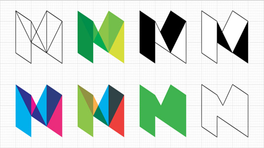
Part of the rebrand is a new logo design that Medium CEO Ev Williams says "better reflects the depth of perspective you can find on Medium. It also just looks cool."

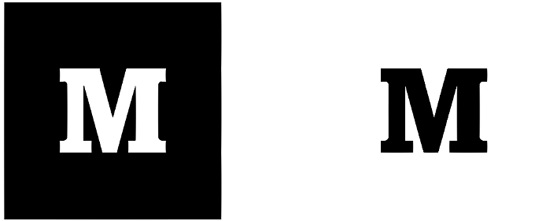
Cool or not, it's certainly got designers talking online. Medium's old logo, a chunky serifed wordmark, was seen as straightforward and effective, and was generally liked by users.
The new logo still focusses on the capital 'M', but this time it has an extra dimension and more of a geometric shape. Medium art director Erich Nagier describes is as a "delightful game or a deeply satisfying puzzle."
The revamp has certainly delighted some online design critics...
Mmmmmmmedium. (So fresh. So nice.) https://t.co/nN1Cqak8fY pic.twitter.com/OmtjPmH66ZOctober 8, 2015
I love @Medium's new logo. Well done @psyopstype ! pic.twitter.com/ITio0iW57tOctober 8, 2015
Although not everyone is convinced that the new Medium logo is an improvement on the previous distinctive design...
The new Medium logo. Hmmm… not sure. https://t.co/Dzqf6x6niyOctober 8, 2015
whoever praises the new Medium logo doesn't have the slightest eye for detail. it's also meaningless. a Metro logo? pic.twitter.com/G6esW5bpd3October 8, 2015
I'm into serifs and slabs, so I kinda miss that in the new @Medium logo. https://t.co/HRC3Y3nKFAOctober 8, 2015
New @Medium logo looks like a classic high school/college branding project. Not a fan sorry!October 8, 2015
Hey Designers, let this serve as a warning… Don’t do drugs. https://t.co/sAsnzRClRE pic.twitter.com/B0VdLv2cSxOctober 8, 2015
Probably needs time, but the new Medium logo really isn't working for me. Loved the old one.October 8, 2015
But what do you think? Is this a bold refresh for Medium or a massive step backwards? Let us know in the comments below!
Sign up to Creative Bloq's daily newsletter, which brings you the latest news and inspiration from the worlds of art, design and technology.
Liked this? Read these!

Dom Carter is a freelance writer who specialises in art and design. Formerly a staff writer for Creative Bloq, his work has also appeared on Creative Boom and in the pages of ImagineFX, Computer Arts, 3D World, and .net. He has been a D&AD New Blood judge, and has a particular interest in picture books.
