Create a unique logo identity in just 7 steps
If you're setting up on your own, you're going to need a logo. Follow Alan Wardle's advice on how to create a unique design.
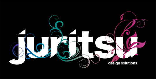
Your logo is one of the most important things you can create. It's the image that will represent you as a freelancer; an opportunity to embody your brand and separate yourself from the competition. Above all, it's a tool for immediate recognition.
Hone your Illustrator skills with these brilliant tutorials
It's also one of the most difficult to design. Think about the image you want. Choose colours that fit your brand, but also check that they work in black and white for printouts. And consider the message that the name communicates – do you want a word that conveys your services, or part of your name or surname?
I love designing logos from scratch, and have created a variety ranging from identities for small businesses and charities, to personal portfolio work. Selecting the right typeface to express the message of your logo is essential. I always find it beneficial to research the trends in the scene that I'm targeting for inspiration: check out what clothing brands people are wearing, find out what CDs they're buying and look at the covers. Sometimes it can be better to go in a completely different direction to everyone else though, to make your design more unique.
For our fictional freelancer, who had studied in Japan, we chose the name 'Juritsu' for this project, which is the Japanese word for 'create'.
01. Choose a font
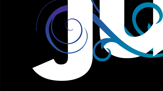
When I sit down to design a logo, I begin by typing the name out in Illustrator and scrolling through the different fonts to see which one suits the word best. For the Japanese word 'Juritsu', I chose a Japanese font called Hirangino Kaku Gothic Std W8. Once I was happy with the tracking of each letter, I turned the text to paths so that I could edit it.
02. Tweak the font
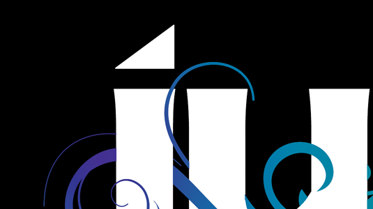
With the text now converted to paths, I tweaked the font to make it more unique. I wanted to add some angles to enhance the Japanese theme and make it look stylish and sharp, so I removed a point from the dots on the characters 'J' and 'I' to make triangles.
Sign up to Creative Bloq's daily newsletter, which brings you the latest news and inspiration from the worlds of art, design and technology.
03. Continue customising
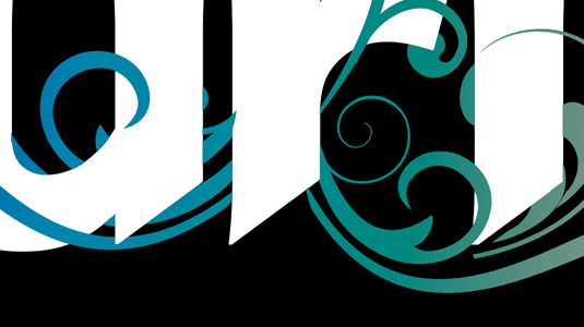
Continuing with the customisation of the font, I duplicated the triangle 'dots' and used them to knock out the straight tails of the font to give an angular effect.
04. Export to Photoshop
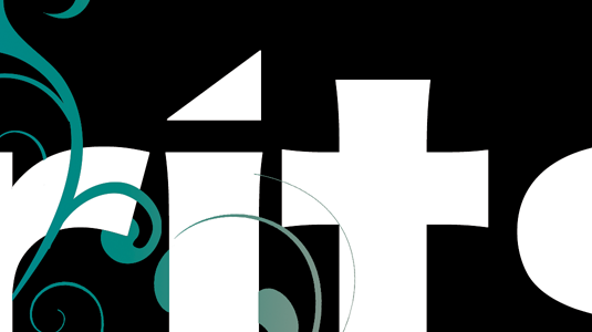
Once I was happy with the tweaks to the font, I exported the file to Photoshop as a transparent background layered PSD file.
Next page: the final steps to your new logo

The Creative Bloq team is made up of a group of art and design enthusiasts, and has changed and evolved since Creative Bloq began back in 2012. The current website team consists of eight full-time members of staff: Editor Georgia Coggan, Deputy Editor Rosie Hilder, Ecommerce Editor Beren Neale, Senior News Editor Daniel Piper, Editor, Digital Art and 3D Ian Dean, Tech Reviews Editor Erlingur Einarsson, Ecommerce Writer Beth Nicholls and Staff Writer Natalie Fear, as well as a roster of freelancers from around the world. The ImagineFX magazine team also pitch in, ensuring that content from leading digital art publication ImagineFX is represented on Creative Bloq.
