The biggest logo designs of 2015
We review the most impactful logo designs and redesigns we've seen since January.
On the day a new logo design is launched for a familiar brand, the first reactions are usually overwhelmingly negative. Once some time has passed and the new design has entered daily use, though, it can be a different story.
So here we take a look back at the biggest brands to release a new logo in 2015. Now you've got used to them, what do you really think of them? Let us know in the comments below! Be sure to also check out our guide to web design trends in 2015.
01. Medium
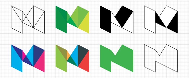
October saw the launch of Medium 2.0, a redesign of the popular publishing platform that reaches across mobile and web. In the wake of its release, Medium CEO Ev Williams says that the new three-dimensional logo "better reflects the depth of perspective you can find on Medium. It also just looks cool."
Article continues belowThe new logo is a mssive departure from the previous design, which saw Medium represented by a blocky, serifed Stag typeface. Erich Nagier, Medium's art director, defends the controversial rebrand by describing the geometric logo as "a delightful game or a deeply satisfying puzzle."
However the new look has not satisfied everyone, with online critics attacking the inconsitent shapes and demanding the return of the old logo. None of these comments have diminished the popularity of Medium though, which is sure to continue encouraging conversations in 2016.
02. Amaze
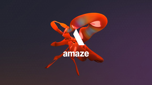
Taking responsive design to a whole new level, the Amaze logo is a 'living' piece of branding that reacts to the movements and sounds of the user. Created by the agency to celebrate two decades of digital innovation, this fluid logo is made up of more than 10,000 polygons to produce smooth animations.
Amaze CEO Natalie Gross says: "We're fascinated by the combination of technology and human behaviour, and are deeply passionate about creativity borne out of multi-disciplinary people and teams. The new brand mark embodies both of these values."
Sign up to Creative Bloq's daily newsletter, which brings you the latest news and inspiration from the worlds of art, design and technology.
By using webcams and microphones to manipulate the logo, users can play around with the design on desktop and mobile devices. Could we be seeing more interactive branding like this next year?
03. Channel 4
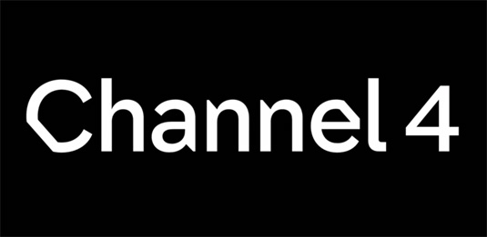
Don't panic, the recent Channel 4 rebrand hasn't thrown away its signature blocky logo. (It seems some designs just can't be improved) However the update of the channel's idents has also produced this one-of-a-kind wordmark that looks like it's being peeled off the screen.
Hitting UK screens back in September, this rebrand by DBLG and SQUA represents the biggest change to Channel 4's aesthetics in a decade.
Finished off with the new unique typeface by Brody Associates, the new look harks back to the broacdaster's remit of focusing on diversity and taking creative risks.
04. DKNY
September also saw DKNY saying goodbye to its old look as it revealed this sleek ribboned logo on Instagram. With maturity being the fashion house's focus for 2016, it made sense to introduce a new brand identity to match.
As it aims to sell to women instead of girls next year, DKNY decided to opt for a subdued typeface to reflect their change of direction. Now represented by an elegant Franklin Gothic typeface, the logo's creator Maxwell Osborne says the "bold American font" will help DKNY to become "its own icon."
05. Kraft Heinz
Heinz and Kraft foods are known the world over by millions of shoppers, with the logos of the two biggest food processors a handy sign that shoppers are in for a quality canned meal.
Upon merging in July, the companies took a very literal approach when it came to their rebranding. The straightforward Kraft Heinz Company is represented by the two distinctive logos that are joined by tapered serifs.
While some have seen this rebrand as uncreative, this new logo and business name won't confuse shoppers. It also means both companies get to trade on each others glowing reputations, win win!
06. Google
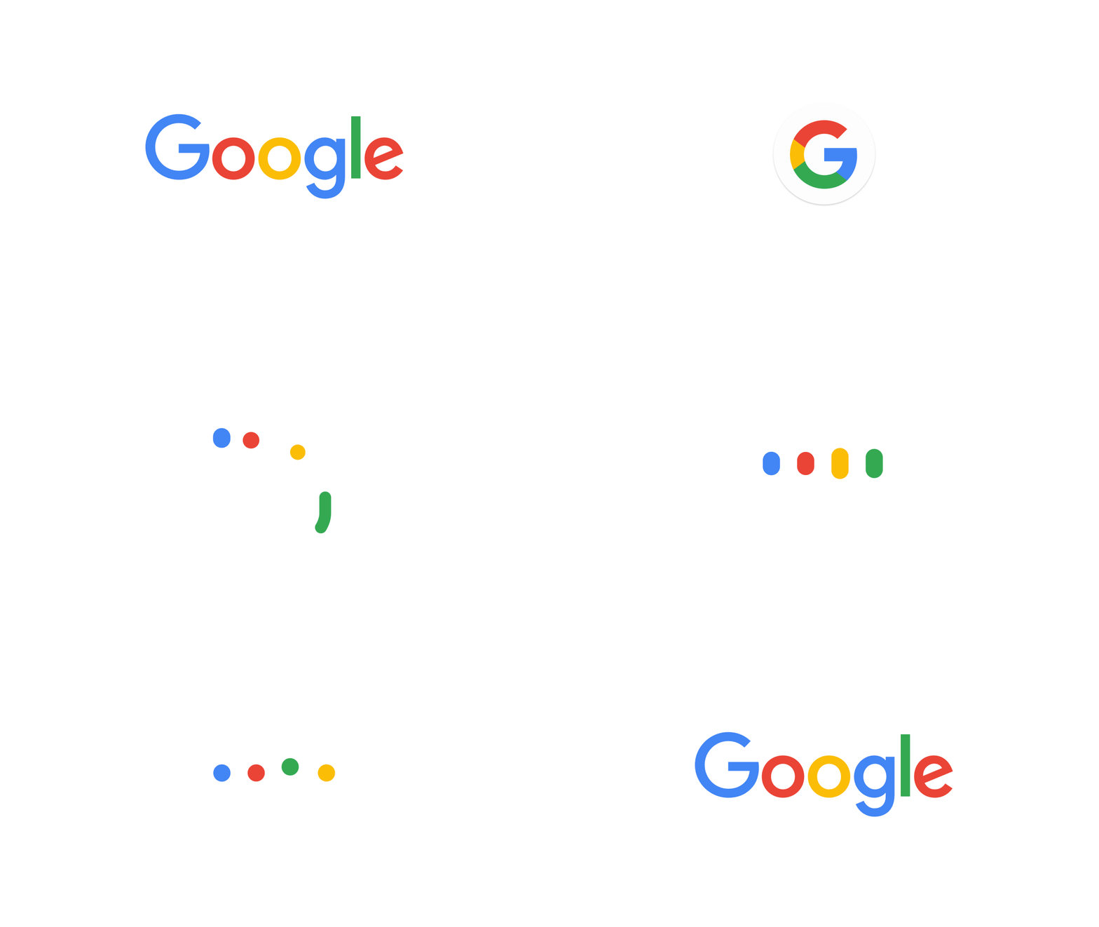
It comes as no surprise that Google's redesigned logo caused a bit of a stir when it launched at the start of September. When you're the world's most visited website, everything you do is going to be picked apart by online commentators.
The tech giant's latest logo represents the biggest rebrand since around 1999, when the search engine had settled on the thin flowing letters that millions now instantly associate with internet exploration.
Now with flat shapes and sharp colours, Google works better across a multitude of platforms, most notably the new 'G' logo which brings together all of the colourways. The company's playful attitude is also hinted at in the cheeky slanting 'e'. Our online overlords have never looked so friendly.
07. Verizon
At the same time Google revamped its logo, America's largest telecommunications provider Verizon updated their signature wordmark design. But whereas Google's simplicity was welcomed, Verizon seemed to take it too far for many.
Designed by Pentagram, the new Verizon logo was deliberately crafted to not be flashy or showy, which it certainly isn't. While 'less is more' is a mantra drummed into designers everywhere, the simple type and a timid red tick irratated a lot of people.
However, if their aim was to become an easily adaptable, ubiquitous part of American life, Verizon have improved on their previous design.
With its gradient shading, irregular shape and highlighted 'z', the old Verizon logo seemed like it was trying to do too much at once. Perhaps its time they settled down with this more sensible design.
08. Hillary Clinton
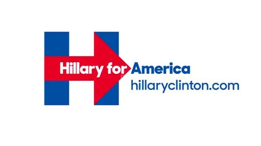
In possibly the least surprising political story of the year, Hillary Clinton declared she's officially running for US President. What was more surprising, though, was the new logo she released along with the announcement.
Created by Pentagram, the new design set social media blaze, with commentors pointing to the logo's similarity to both the WikiLeaks logo and a hospital sign; the irony of the arrow pointing to the right; and even some bad-taste jokes about the Twin Towers.
Lots of designers joined in the fun, coming up with their own alternative designs for the Hillary logo. Creative Bloq readers joined in the fun with their own, tongue-in-cheek versions of the logo - check them out in the comments at the bottom of this news story.
09. Facebook

Earlier this year came the latest update to the Facebook logo – a subtle tweaking of its iconic Klavika typeface.
Frequent users will be familiar with the social media platform rolling out new logo redesigns. But this was the first time the company had changed its logo's typeface since it launched as 'Thefacebook' way back in 2004.

The new typeface was a collaborative effort between Facebook's own in-house design team and Process Type Foundry's Eric Olson.
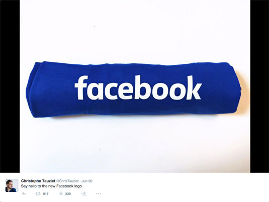
Obvious changes to the font include a single-deck 'a' and a more organic stem on the letter 'b', while the all important 'f' remains instantly recognisable.
Next page: more logo designs of 2015...

The Creative Bloq team is made up of a group of art and design enthusiasts, and has changed and evolved since Creative Bloq began back in 2012. The current website team consists of eight full-time members of staff: Editor Georgia Coggan, Deputy Editor Rosie Hilder, Ecommerce Editor Beren Neale, Senior News Editor Daniel Piper, Editor, Digital Art and 3D Ian Dean, Tech Reviews Editor Erlingur Einarsson, Ecommerce Writer Beth Nicholls and Staff Writer Natalie Fear, as well as a roster of freelancers from around the world. The ImagineFX magazine team also pitch in, ensuring that content from leading digital art publication ImagineFX is represented on Creative Bloq.
