The biggest logo designs of 2015
We review the most impactful logo designs and redesigns we've seen since January.
10. Royal Albert Hall
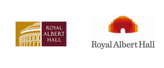
The famous London performing arts centre had a communications overhaul in February, in a bid to appeal to a wider audience and a logo change was part of its new look.
The institution worked with strategy consultancy firm BrandPie's charity arm and the purpose of the new logo was to emphasis the centre's reputation as a world class venue.
The Hall's distinctive silhouette is featured on the new five-colour logo which is designed for use across different media.
Article continues below11. Daily Motion
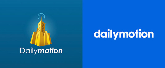
One of the biggest video platforms on the web, boasting 300 million viewers on its player and 30 billion video views worldwide per month, Dailymotion came up with this new logo in March (right), saying goodbye to its icon and opting instead for a simple wordmark. It was created by London-based agency venturethree.
12. Electrolux
Electrolux has been the leader in home and professional appliances since 1909. In January it unveiled a brand new identity (above) with an original font that's unique to Electrolux.
The logo was designed by Prophet in London, who worked in close partnership with the Electrolux marketing team on the project.
"We set out to create a visual identity that would enable Electrolux to tell its story to the world in an appealing way," says Hector Pottie, Associate Partner and Creative Director from Prophet, London.
Sign up to Creative Bloq's daily newsletter, which brings you the latest news and inspiration from the worlds of art, design and technology.
"It was crucial to present the benefit of a product and not focus on features. In addition, the identity has to work hard to stand out from the crowd and unify the brand at every point people encounter the brand."
13. Lemark

Lexmark, the well-known global manufacturer of laser printers, has unveiled a striking new logo and branding (above) in April.
When compared with Lexmark's familiar red diamond motif (below), the new green shutter logo was a huge departure.

The new design, it says, captures the company's continuing evolution.
Danny Molhoek, managing director and country general manager UK/Ireland at Lexmark, explains that the previous diamond shaped logo was intended to evoke clarity and durability.
By adopting a shutter, the new design is intended to suggest opening and expanding possibilities. It was created by Moving Brands.
14. Alitalia

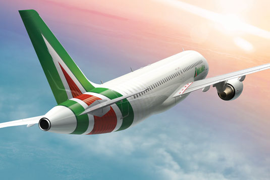
Italy's flag-carrier received a new brand identity in June courtesy of Landor. The new logotype was given a more dynamic makeover, retaining the green, red and white colours of the Italian flag, and a more dominant 'A' was introduced. It was described as "a bold statement of the heights the airline is striving to reach and its enviable experience in the field of aviation".

Inspired in part by Formula 1 racing cars, striations were added to the red triangular interior of the Alitalia 'A', creating a pinstripe effect designed to reflect exclusivity, attention to detail and a strong focus on design.
The airline's aircraft fuselages are now painted in ivory to reflect of understated Italian style, reminiscent of both original and new Fiat 500 colourways, and progressively banded rearward to create an impression of movement, speed and unhindered progress.
Peter Knapp, Global Creative Officer at Landor, said: "Walter Landor was involved in the design of the project nearly 50 years ago and now is the time to evolve this enduring brand and update it for today’s market challenges. We have added a subtle sophistication to the design, to the interior and exterior of the aircraft, which connotes the style, passion and craftsmanship of modern Italy."
15. The New York Times magazine
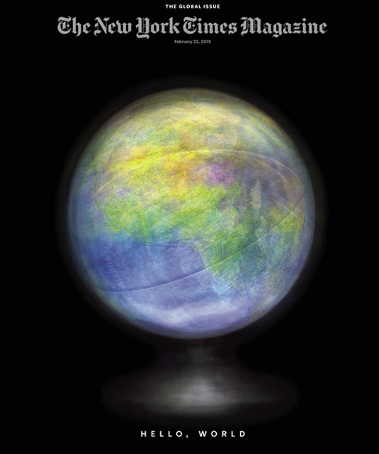
New York Times magazine, founded in 1897, regularly refreshes its design. In February it revealed its latest look, includes a new logo, shown below. The previous logo (top) has been redrawn by the typographer Matthew Carter, with the new design (bottom) described by the title as being "more modern, more graciously spaced".

More strikingly, there was also a new short-form logo for the magazine, for use in smaller and more casual settings like its Twitter page.

The redesign was led by the title's design director, Gail Bichler and art director, Matt Willey, working closely with the designer Anton Ioukhnovets.

Bichler and Willey have also also overseen the creation of an entire suite of typefaces for the publication, shown above.
16. Freeview
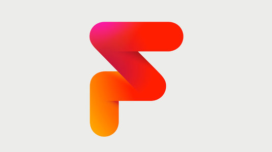
In February Freeview, the UK's most watched digital TV service, underwent a major rebrand, led by creative agency DixonBaxi. The move is part of Freeview's strategic drive to bring connected television to a mass UK audience.
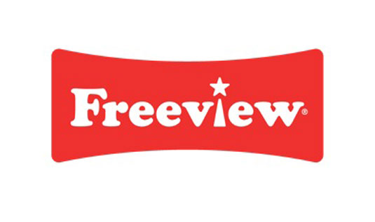
The new logo retains the red heritage of the brand, but has been completely redesigned with added dimension - an angular form that suggests agility, choice and a sense of fun.
17. YouTube kids
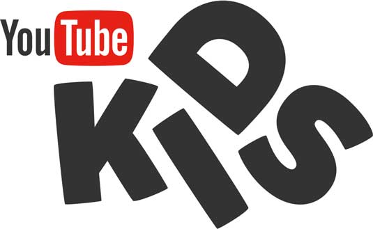
On 23 February, YouTube launched a free app titled YouTube Kids for Android and iOS, described as "the first Google product built from the ground up with little ones in mind."
Its logo was created by Hello Monday, who also designed the entire brand identity, including the product interface.
"The visual identity draws from the original aesthetics of YouTube, the mother brand," they explained. "It's fun, quirky and embodies the YouTube Kids brand."
18. Andy Murray
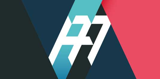
Yes, you read that right. Andy Murray now has an official logo. It was created by brand storytelling agency Aesop to create a uniform visual identity across of the tennis player’s commercial ventures, from endorsed products to his own branded products.
The design combines Murray's initials with the number 77, to celebrate his Wimbledon victory on the 7th day of the 7th month, a full 77 years since a British player had won the contest.
Like this? Read this!
- The 20 biggest logo designs of 2014
- 20 fonts every graphic designer should own
- Will this stunning Mac concept revolutionise your desktop?

The Creative Bloq team is made up of a group of art and design enthusiasts, and has changed and evolved since Creative Bloq began back in 2012. The current website team consists of eight full-time members of staff: Editor Georgia Coggan, Deputy Editor Rosie Hilder, Ecommerce Editor Beren Neale, Senior News Editor Daniel Piper, Editor, Digital Art and 3D Ian Dean, Tech Reviews Editor Erlingur Einarsson, Ecommerce Writer Beth Nicholls and Staff Writer Natalie Fear, as well as a roster of freelancers from around the world. The ImagineFX magazine team also pitch in, ensuring that content from leading digital art publication ImagineFX is represented on Creative Bloq.
