5 new redesigns of Hillary Clinton's logo
Many people don't like the Presidential hopeful's new logo design. But can they do any better?
Sign up to Creative Bloq's daily newsletter, which brings you the latest news and inspiration from the worlds of art, design and technology.
You are now subscribed
Your newsletter sign-up was successful
Want to add more newsletters?

Hillary Clinton may be keen to talk about issues such as the budget and foreign policy, but for designers there's only one issue worth discussing – the launch of a controversial new logo design (above). Yesterday we brought you 5 reasons why this design has divided the globe, last of which was the allegedly amateurish nature of the design.
But could other designers do any better? Here are five redesigns of the campaign logo that have surfaced on the web in the last 24 hours – what do you think of them?
01. monkeysniffer08
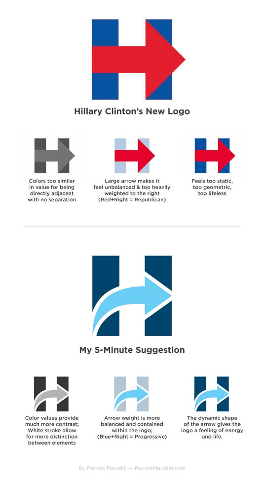
monkeysniffer08 has been getting a lot of love for this redesign posted on Imgur.com, although one commenter suggests: "The curve gives the impression of past failure, not good if you were in the last administration."
02. Nio Subaran
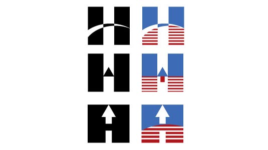
"After seeing the logo they used for [Hillary's] campaign I needed to make an attempt to re-design the logo, just to test out possibilities," writes Seattle graphic designer/artist Nio Subaran, who posted this test image on Dribbble. "I will continue to play around with this logo and see what else happens."
03. Nikkolas Smith
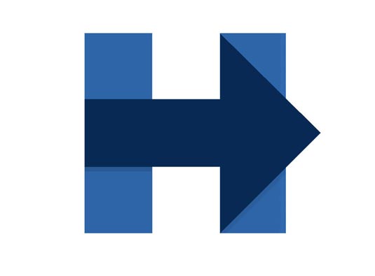
Like monkeysniffer08, Nikkolas Smith feels Hillary's logo could do with a colour makeover, and posted this all-blue, deeply Democrat version on Deviantart.
04. sawarahh
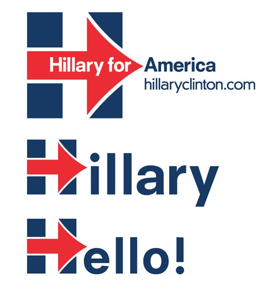
This redesign posted by Sawarahh on Imgur has attracted praise on Reddit ("adding the white border and rounded shapes just gives it much more of a modern and energetic feel") but also calls for less white space ("The vertical sections of the H disappear to my eye broken up so much by the arrow") and a colour rethink ("It reminds me too much of the Union Jack").
05. Frode Skaren

Norwegian graphic designer Frode Skaren – aka @uglylogo – posted this design on Twitter with the pithy message: "Here you go Hillary, don't mention it."
Sign up to Creative Bloq's daily newsletter, which brings you the latest news and inspiration from the worlds of art, design and technology.
Like this? Read these!
- The 5 biggest logo designs of 2015 so far
- Useful and inspiring flyer templates
- Download free textures: high resolution and ready to use now
Have you seen an impressive redesign of Hillary's campaign logo? Tell us about it in the comments!

Tom May is an award-winning journalist specialising in art, design, photography and technology. His latest book, The 50 Greatest Designers (Arcturus Publishing), was published this June. He's also author of Great TED Talks: Creativity (Pavilion Books). Tom was previously editor of Professional Photography magazine, associate editor at Creative Bloq, and deputy editor at net magazine.
