The secret to composing a fluent painting in Photoshop that feels natural and expressive
Emanuel Dias shares how he developed a dramatic scene.
Sign up to Creative Bloq's daily newsletter, which brings you the latest news and inspiration from the worlds of art, design and technology.
You are now subscribed
Your newsletter sign-up was successful
Want to add more newsletters?
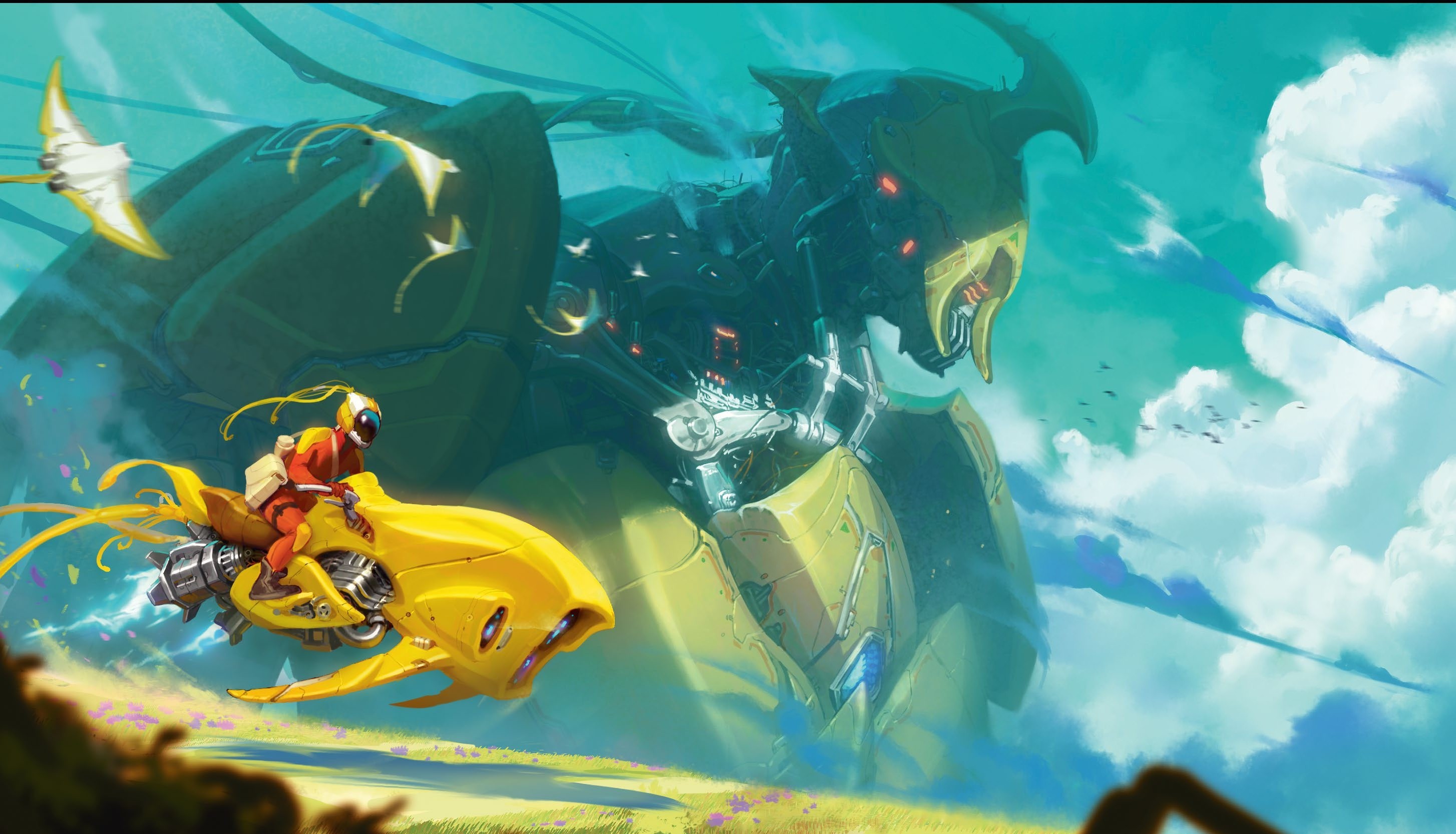
This image of a big robot – which I still haven’t been able to come up with a good name for – started out as an unpretentious sketch for the mentoring I did in 2023 with Joon Ahn. At the time, it was a sketch that had an interesting composition, and I liked its dynamism and initial look, which included both very large and very small elements.
I wanted to explore my ability to conceive an illustration further while creating a functional, well-thought-out design rather than painting for the sake of it without a focus. Working digitally, I made full use of some of the best digital art software available, alongside one of the best drawing tablets I’d used to date – both of which played a big role in helping me refine the piece with precision and flexibility.
At the time, I’d already been thinking about starting a course to demonstrate my painting process for scenes, and to help other artists understand how I solve paintings. They always start differently from how they finish, though I usually still like the final results. I’ve also learned a lot myself over the years by breaking down my process and referring to helpful Photoshop tutorials, many of which offered new techniques or perspectives I hadn’t considered before.
Article continues belowIn this image, I also wanted to create a strong contrast between light and dark, and warm and cool areas, using complementary colours and other tools to generate a striking, memorable focal point. Gunning for that level of contrast has always helped me when trying to work out a strong composition.
How I create effective compositions
1. Drafting the basic shapes
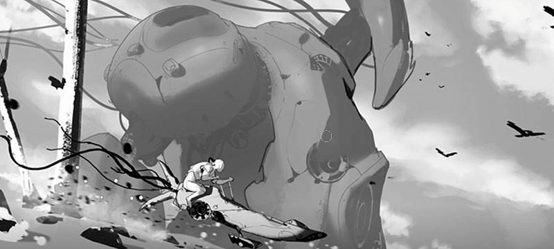
Before starting, I had the idea of creating contrast by having the vehicle in the foreground look bigger than the robot figure in the background. At the same time, I wanted matching shapes present in both the vehicle and the robot to form a relationship. I start with a basic line sketch and brushwork, and sometimes a texture brush for rocks or trees. It’s key for me to visualise the image before I begin, then try to get the feeling I want quickly.
2. Pushing my style
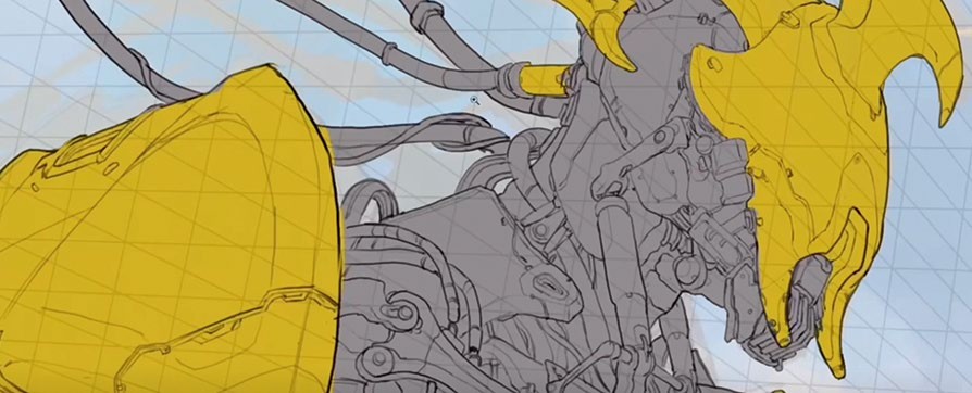
I pragmatically drew everything beforehand to help me get a good understanding of the perspective and shape design, especially the robot. The goal was to make it feel like Transformers, which led to me looking at a lot of cars, engines, planes, and so on – anything that could help me create a less sophisticated robot. As a result, my design uses interesting shapes in the yellow areas, and more functional elements in the darker parts.
3. Working with shadows and light
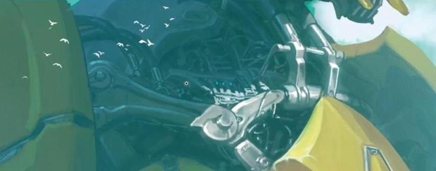
Towards the end of the image, I’m working with a few values and creating obvious contrast between light and shadow. For me, they are distinct. This helps me create the luminosity I need, especially the bluish colour in the shadow that’s taken from the sky in order to contribute to the depth and remove a little contrast. The hard edges and most emphatic details are in light. We always need to decide where to put details and where not to; when we’ll shout and when we won’t.
4. Blending to create clouds

I love clouds and smoke, and always keep an eye out for references and good smoke or cloud brushes. The Smudge tool is great for creating smooth transitions for these elements, while an Outer Glow on clouds can provide an interesting, artistic look.
5. Creating a electrical glow
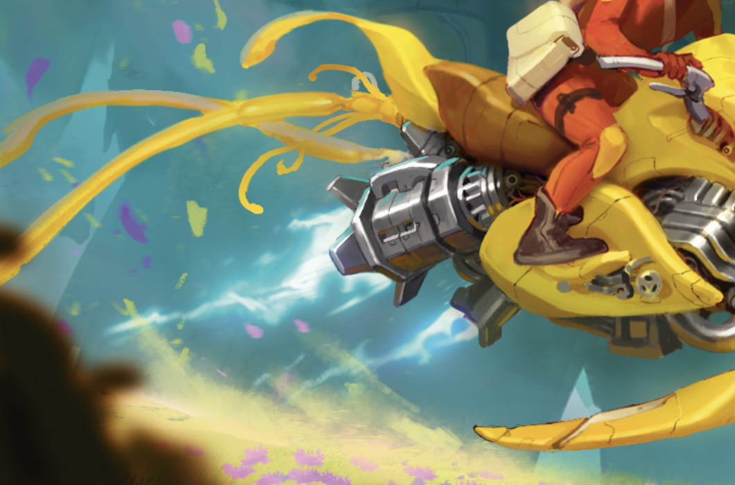
To create this electrical exhaust effect, I started by thinking about the direction of the design and creating a sense of thick to thin for interest. I also use the Outer Glow technique here; it’s great for lightning, magic and sci-fi style effects. The possibilities are almost endless!
6. Defining a sense of scale
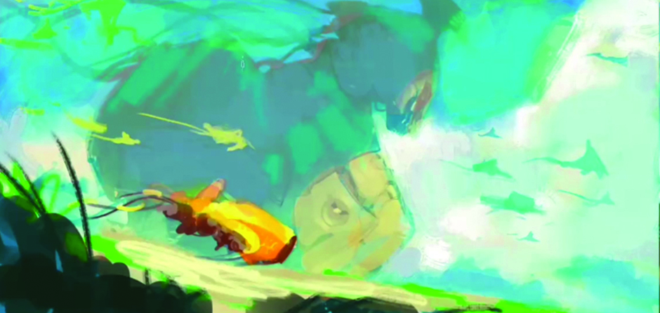
As you can see, I wanted the colours in my composition to create strong contrast. I opted for complementary yellows with blue-greens, as the blue works well for dark values and the yellow for lighter values such as the vehicle. One thing that helps with the sense of scale and amplifies the image is that the robot has no details in the shadows, mainly due to the atmospheric perspective and use of smoke. The idea is to show a sense of scale and grandeur in the shot using these devices.
7. Creating a hint of humanity
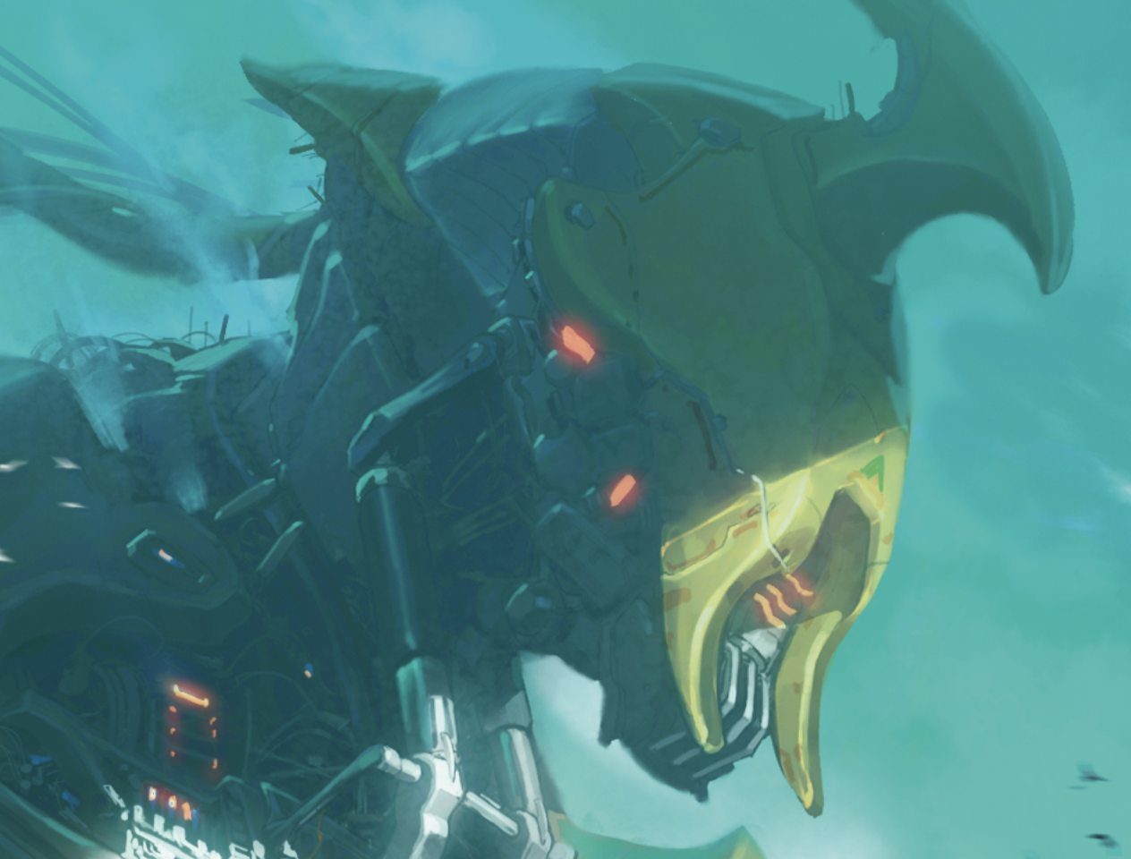
To create the big robot and some complex areas, I like to design separately. In this case I used a lot of references from excavators and other big mechanical objects to understand how they function, and then make a combination of them in a somewhat human appearance – the collarbone, neck muscles, and so on. As a result, I built a look that I hadn’t considered beforehand. I’ve always struggled with this, but good research and persistence certainly brings good results.
8. Refining the details
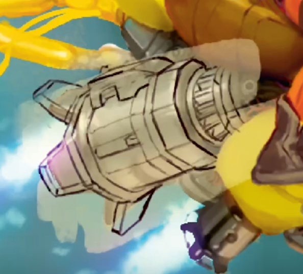
When finishing up the image, I felt there were areas for improvement. Looking at the vehicle, I noticed that this part of the engine, where the spokes and turbo jets come out, didn’t have any interesting design elements despite being quite large. I needed more information about how that object interacts with the lighting, interestingly. I did a basic redesign with cubes and cylinders, then painted over it for a good result. Never be afraid to redo parts of your image you don’t feel are right. They all contribute to the final scene, and you won’t have any regrets if you’ve done your best.
This content originally appeared in ImagineFX magazine, the world's leading digital art and fantasy art magazine. ImagineFX is on sale in the UK, Europe, United States, Canada, Australia and more. Limited numbers of ImagineFX print editions are available for delivery from our online store (the shipping costs are included in all prices).
Sign up to Creative Bloq's daily newsletter, which brings you the latest news and inspiration from the worlds of art, design and technology.
Emanuel has been a passionate artist for as long as he can recall. He began studying drawing and painting in 2018, and has continued to search for his artistic voice to help express the way he sees life and the world.
You must confirm your public display name before commenting
Please logout and then login again, you will then be prompted to enter your display name.
