Designers react to the Huffington Post rebrand
News site Huffington Post has revealed the first visual redesign in its 12-year history.
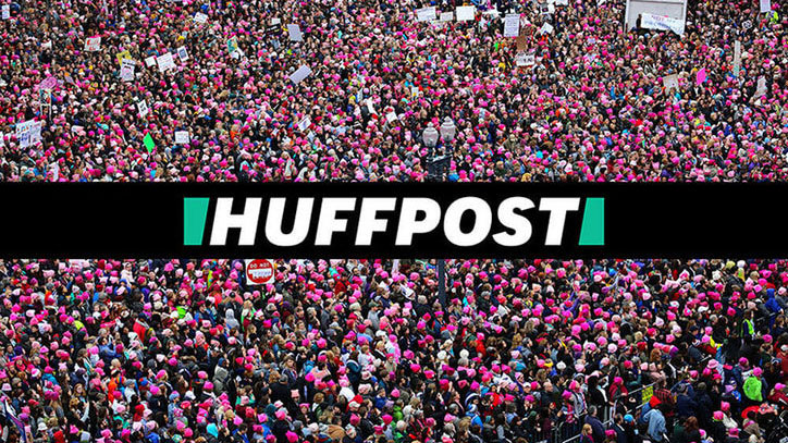
Yesterday saw the launch of a new look for The Huffington Post by New York design agency Work-Order. Rebranded as the snappier Huffpost, the redesign is the first visual overhaul in the site's 12-year history, and comes complete with a new logo design that pays homage to the company's status of being the first digital-only news brand.
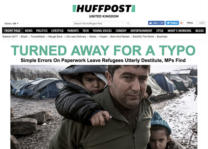
At the heart of the rebrand is a bold sans-serif font, which is a major departure from the thin, serifed typeface previously used to represent The Huffington Post. The site's signature green colour has also been shifted over to the minty end of the spectrum.
The italicised logo suggests a tabloid masthead, with all the plain speaking empathy, urgency and outrage that entails. Meanwhile the slashed blocks that bookend the logo hint at the site's forward momentum, as well as acting as a subtle nod to Huffpost's status as the first digital-only news brand. When squeezed together, the green square also forms an abstract 'H'.
The rebrand comes as Huffpost nails its colours to the mast with a new editorial mission. This includes providing "a platform that presents news in an inclusive and expansive manner," according to Work Order's case study. "Its goal is to listen to the people and inform both sides."
With a logo that extends out to the margins to encompass the site's famous no-holds-barred headlines, and can also be snugly collapsed back together to create a slashed brick motif that encapsulates Huffpost's aim of bringing people together with divisive stories.

New Huffpost logo

Old Huffington post logo
Currently all 17 of Huffpost's international editions carry the new logo and branding, while a full redesign is expected to roll out for each edition later in 2017.
Rebrands are notoriously difficult to get right, though, so what does the design community make of the new look?
Daily design news, reviews, how-tos and more, as picked by the editors.
"It’s nice to see Huffington Post’s iconic journalism delivered by a brand as bold and as impossible to ignore as they are," says Brand Union's ECD, Sam Becker. "The slanted sans serif typography and assertive geometry do seem to push the brand into tabloid territory but Huffington Post has the reach and history to redefine what those cues mean and take ownership of them.
"The way the logo connects to the sturdy hyperlink underlining and the way the symbol frames their animated content, it’s clear this brand was built from the ground up for digital," he adds. "Between the name change and the new visual identity, HuffPost has the tools they need for this next chapter of the company."
Meanwhile, plenty of designers took to Twitter to chip in with their thoughts and opinions.
I'm Huffin' excited too! Congrats @alisonzack @huffpost and @workorderdesign.Behind HuffPost’s New Logo And Look https://t.co/ErhF7ivbcu pic.twitter.com/YE5ZUuFb3KApril 25, 2017
.@HuffPost Digging the new logo!April 25, 2017
Although not everyone is impressed...
The new Huffpost logo feels so awkward, I can't get over those slanted, teal bookends. pic.twitter.com/v88Z0r4kFKApril 25, 2017
Related articles:

Dom Carter is a freelance writer who specialises in art and design. Formerly a staff writer for Creative Bloq, his work has also appeared on Creative Boom and in the pages of ImagineFX, Computer Arts, 3D World, and .net. He has been a D&AD New Blood judge, and has a particular interest in picture books.
