Johnson Banks responds to Science Museum rebrand
The studio follows up its Tweet with branding advice.

Sign up to Creative Bloq's daily newsletter, which brings you the latest news and inspiration from the worlds of art, design and technology.
You are now subscribed
Your newsletter sign-up was successful
Want to add more newsletters?
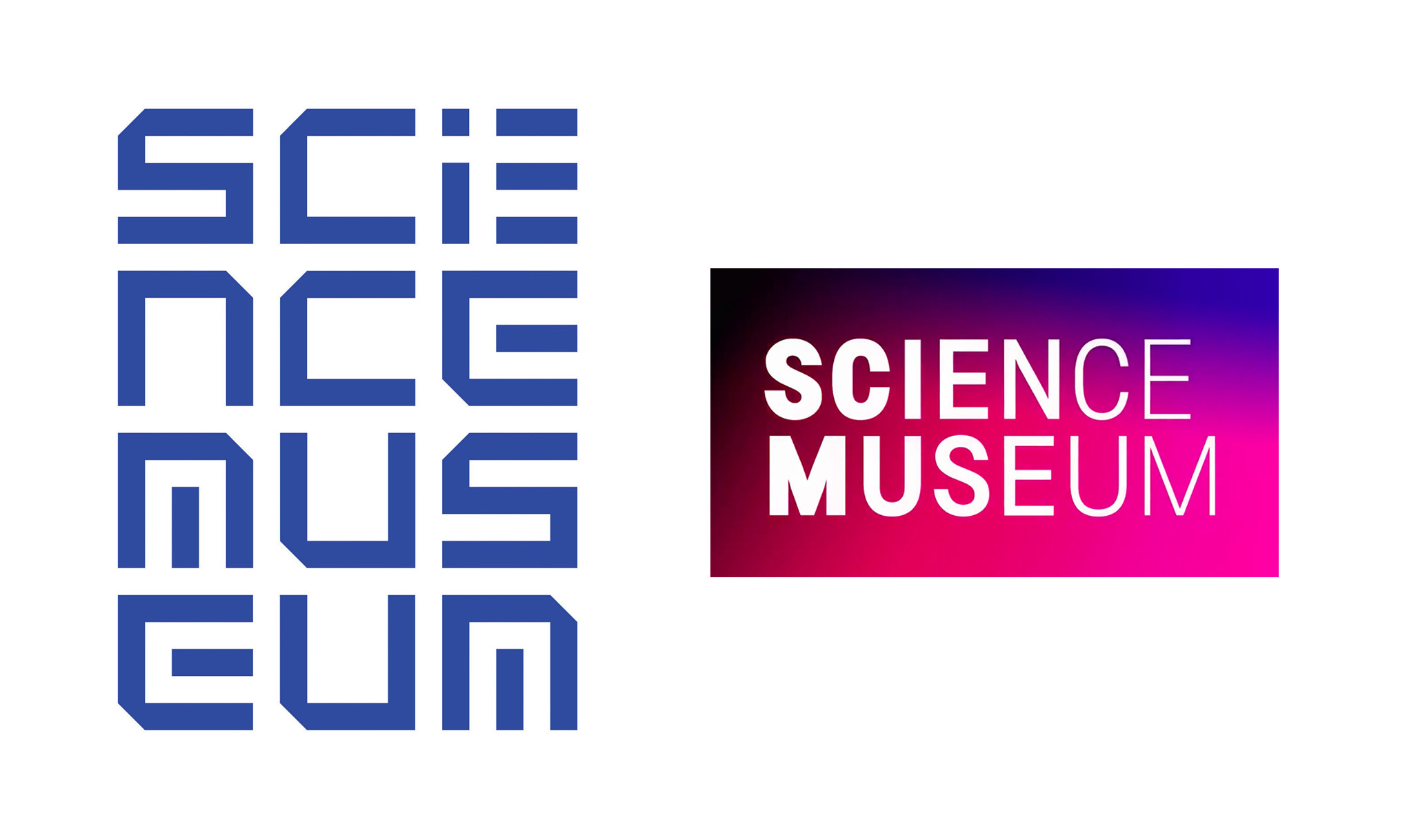
Last week saw the reveal of a rebrand for the Science Museum created by consultancy North. The new look (on the right in the picture above, next to the old logo) is the first visual shake-up for the Science Museum in seven years, and upon being unveiled the rebrand stirred up some controversy in the creative community.
The biggest name to chip in with a negative response was Johnson Banks – the agency behind the old branding scheme – which Tweeted that the rebrand was "a bit of a clunker". Cue Twitter storm and a deluge of designers slamming the Science Museum's new look.
Much of the negative response was levelled at the new typography, which slims down as the lettering pans from left to right. 'Generic', 'cheap' and 'nasty' were amongst the insults thrown at the rebrand, but are these comments overstepping the mark? Was it, in fact, the right time for the Science Museum to bring in a new identity?
Article continues belowNow the dust has settled and the full identity has been unveiled by North, the idea behind the rebrand has found an unlikely supporter in the shape of the very studio that loudly opposed to it: Johnson Banks.

Time to change
On the Johnson Banks blog, the design consultancy took the time to reflect on the Science museum rebrand and more in a post called "Why brands change". It opens with an oblique reference to its Tweet ("[t]he change of an organisation’s brand or logo brings many strong feelings to the surface") before going on to examine when and why it's time to update an identity.
Kicking off its list of reasons looking at when it's a good time to rebrand is the idea that a new identity should tie into a "fundamental change in business circumstances – a merger, or a takeover, for example". In the case of the Science Museum rebrand, Johnson Banks explains that this seems to be the underlying reason for the revamp.

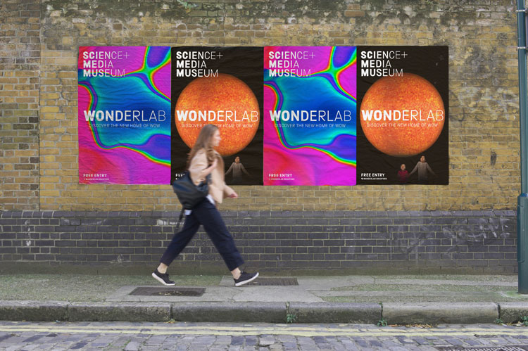
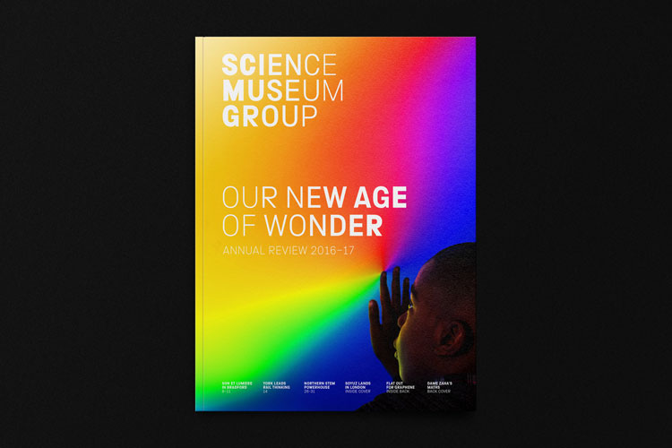
This is because the rebrand is part of a larger branding change that includes other institutions in what was NMSI – the National Museums of Science and Industry. London's Science Museum and the Science and Media Museum in Bradford are the first institutions to undergo the umbrella rebrand with others in the group expected to follow suit in the future.
Sign up to Creative Bloq's daily newsletter, which brings you the latest news and inspiration from the worlds of art, design and technology.
North creative director Sean Perkins echoed these ideas when he spoke to Design Week about the Science Museum rebrand. “This is about sharing the assets around the country rather than just focusing on London,” he reveals. “From York’s railway museum to visitors travelling to Bradford to see rockets, this is about helping people continue their journey through science.
"There are strategic reasons and rationales behind this. It’s not about a logo or what it looks like, it’s there to do a job – it will bring the group together under one visual language."
If it ain't broke...
As well as talking about when the time's right for a rebrand, Johnson Banks also looks at when an identity should stay put. It explains that boredom is usually a motive for change, which often sets in after about three years.
"Yet, paradoxically, about two-to-three years in is precisely when a new brand has just started to seep into the public consciousness, and arguably that’s exactly when a brand should become more consistent, not less," it points out.

The next big reason a rebrand gets pushed through is simply because new directors have joined a team and they want to leave their mark by tinkering with a design. This isn't as accidental as it might sound though.
"Every new business manager for every major branding company in the world keeps an eye out for changes at the top of major organisations," Johnson Banks explains, "because this is when existing branding schemes are at their most vulnerable, new brooms are brought in, and the sweeping starts."
How designers should react
Rounding off the blog post is a look at how brand designers should react when they see their work replaced by a new identity. "Going straight onto Twitter and saying ‘this is a bit of a clunker’ (as we did last week about the Science Museum’s change) is NOT to be advised. Whoops," Johnson Banks admits.
In Johnson Banks defence though, it has put its hands up and delivered a constructive apology we can all learn from. It didn't even delete its Tweets in attempt to run away from the situation, so hats off to the team for that.

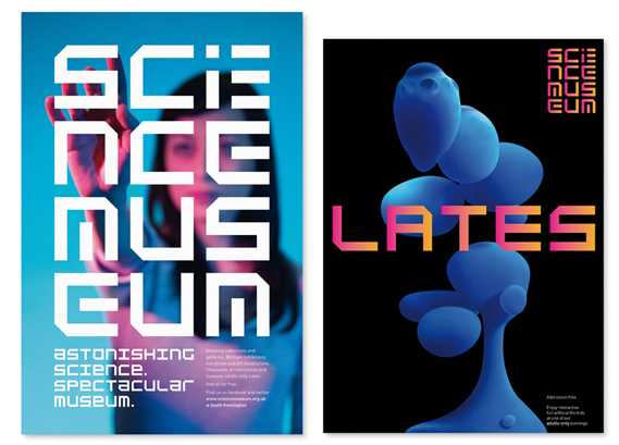
As if that wasn't magnanimous enough, Johnson Banks has even reappraised the work by North. "We can see the ‘idea’ of the fading type working more successfully with the longer blocks of type, rather than the two-word version," it admits. "Our logo had become quickly recognisable as the Science Museum’s – but how would it have coped as the visual link across the group of museums? We’ll never know."
It's tough, but trying to move on seems to be the best course of action. Although, as Johnson Banks confesses, this can be easier said than done.
The branding blog post also covers other examples of when brands changed for the right reasons, so we recommend you head over and read the full article. In the meantime, just think before you Tweet.
Related articles:

Dom Carter is a freelance writer who specialises in art and design. Formerly a staff writer for Creative Bloq, his work has also appeared on Creative Boom and in the pages of ImagineFX, Computer Arts, 3D World, and .net. He has been a D&AD New Blood judge, and has a particular interest in picture books.
