Is no branding the best way to get attention?
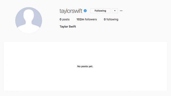
Taylor Swift's social media cleanse got people talking about what she's up to.
Sign up to Creative Bloq's daily newsletter, which brings you the latest news and inspiration from the worlds of art, design and technology.
You are now subscribed
Your newsletter sign-up was successful
Want to add more newsletters?
In a show of bold ultra-minimalism and anti-branding, Taylor Swift – who is arguably as much a brand as a musician – recently wiped all her social media accounts clear of all images and statuses. Every last one. The effect was remarkable, generating a buzz among devoted fans before she finally announced a new album, Reputation. So could this radical approach, a brand cleanse, be a tactic for other brands to try?
Previously, all of Swift's platforms were accompanied by the message 'born in 1989', which kept her image consistent across the internet without having to write 'official' anywhere on the page. By clearing her profiles, Swift not only marked the start of a new stage of her career, but also whipped up a frenzy of media speculation and public attention in the process.
Swift isn't the first big name to have purged her social media accounts – she follows in the footsteps of the likes of Radiohead and The 1975.
Article continues belowA cleared slate creates mystery
In terms of rebranding, allowing a short amount of time for a mysterious void between two looks seems to be a successful move for musicians hoping to generate a buzz.
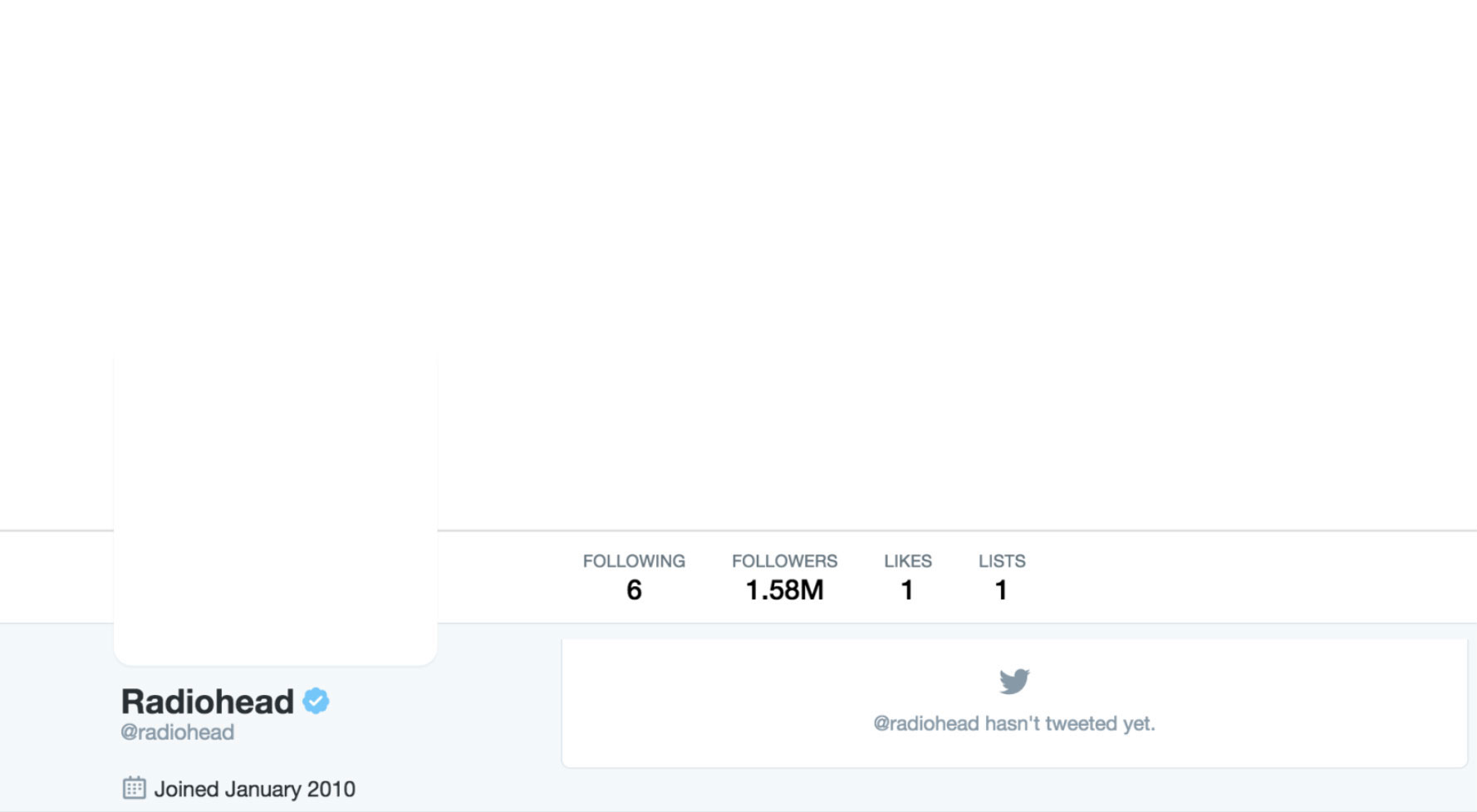
Back in 2016, melancholy music makers Radiohead pulled a similar stunt in the build up to the launch of their latest album, A Moon Shaped Pool. Mysterious leaflets quoting the line 'We know where you live' from upcoming single Burn The Witch were also distributed to fans across the UK to make anticipation levels max out.
Meanwhile, Kerouac-quoting rockers The 1975 took more of an arty approach in 2015. As well as the band members appearing to quit social media, front man Matthew Healy posted a cryptic comic strip on Twitter and Instagram just before the blackout.
pic.twitter.com/BtBrBxwA5wMay 31, 2015
Lines in the comic about 'killing rockstars' resulted in the band's followers going into meltdown, wondering just what it was up to.
Sign up to Creative Bloq's daily newsletter, which brings you the latest news and inspiration from the worlds of art, design and technology.
As it turns out, the band members returned online the next day with white and light pink cover images and profile pictures, and the whole situation was revealed to be a publicity stunt a few months before the release of the album I Like It When You Sleep, For You Are So Beautiful Yet So Unaware Of It.
What separates Taylor Swift from these other profile purges is that she's got the whole process down to a slick art. While Radiohead was building on a five-year absence to help breed rumours, and The 1975 left it a few months before launching an album, Swift brought the turnaround down to just a handful of days.
pic.twitter.com/p2DyY0e2M3August 21, 2017
In fact, it wasn't long until she started Tweeting teasers of snake GIFs (above) and unveiling the cover art for her new album. The whole project came to a head this morning with the release of her new single 'Look What You Made Me Do' and an accompanying animated lyric music video.
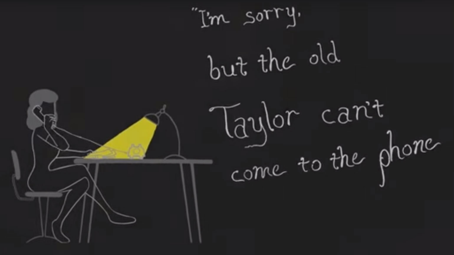
And in the place of 'born in 1989' there's an appropriately self-aware rebranded bio to herald the release of Reputation: 'The old Taylor can't come to the phone right now.'
Silence can make a rebrand feel like a new launch
Taking the time to clear the decks before announcing a rebrand is a technique brands could do well to exploit on social media, according to Computer Arts magazine's editor and chair of the Brand Impact Awards judges, Nick Carson.
"Sometimes, silence can be deafening – and that applies to visual noise as well as sound," he explains. "When it comes to brand standout, we're bombarded with stimuli, and nowhere is this more true than on the infinite treadmill of social media."
"To wipe the slate clean and start again, like Taylor Swift did recently, is a brave move that resets the clock, and leaves fans hungry and expectant. There could be lessons there for any designer working in branding, as starting from scratch like this effectively turns a rebrand into a new launch."
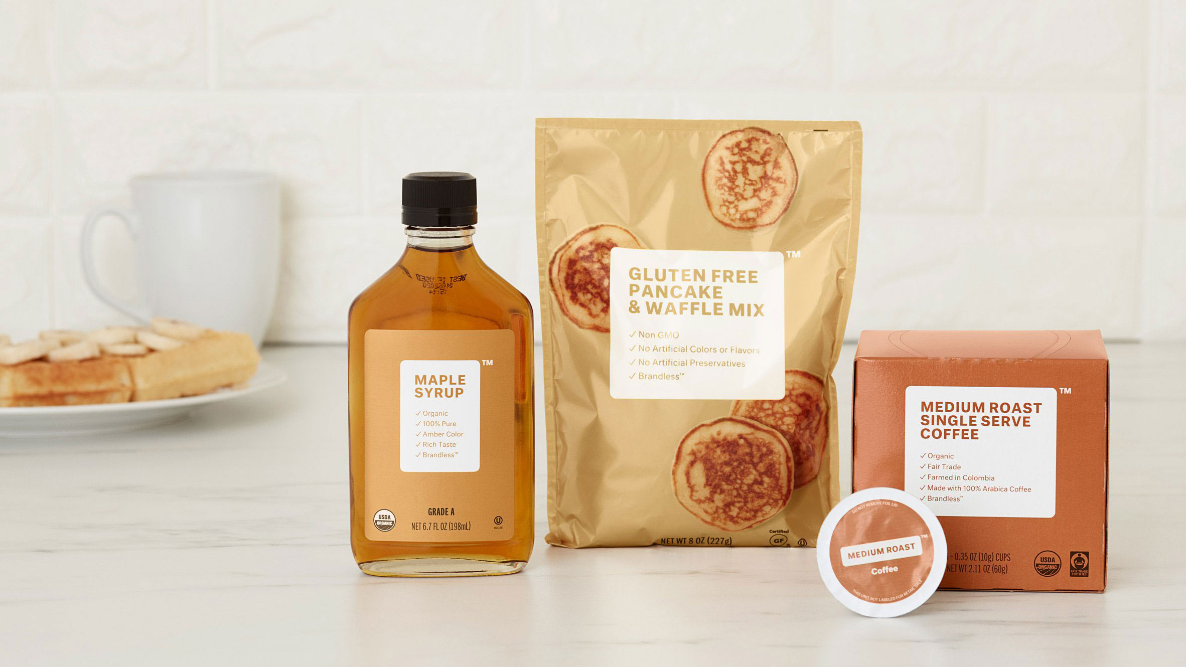
This radical promotion method isn't suitable for everyone, and we don't want our Twitter feed to become too desolate a place to scroll through. But we could see creative ways for big names to make the most of a purposeful lack of branding on social media, just as we have with some ultra-minimal packaging designs.
Think of it as a type of digital minimalism. How much of a company or brand name could you take away and still come across as recognisable and engaging?
Related articles:

Dom Carter is a freelance writer who specialises in art and design. Formerly a staff writer for Creative Bloq, his work has also appeared on Creative Boom and in the pages of ImagineFX, Computer Arts, 3D World, and .net. He has been a D&AD New Blood judge, and has a particular interest in picture books.
