Sign up to Creative Bloq's daily newsletter, which brings you the latest news and inspiration from the worlds of art, design and technology.
You are now subscribed
Your newsletter sign-up was successful
Want to add more newsletters?
Design trends arise for many reasons. They can be driven by popular culture, emerging technologies, new business models or just the random whims of fashion.
Much of the time we don't even notice trends exist, so subtle can their influence be. In fact, we like to think we forge our own path and don't follow trends at all.
But the truth is that trends form a vital part of the ecosystem in which our design work is created, so it's good to at least recognise what they are, even if you then ignore them.
Article continues belowHere we bring you 9 of the biggest design trends of 2016. But if there's an important trend you think we've missed, please let us know in the comments below!
01. Colour overlays
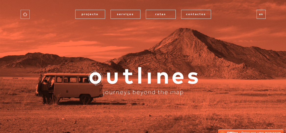
We’d like to think it was our own Generate conference site that kicked it off. But in fairness, Spotify probably had a little more to do with it. We’re talking, of course, about colour overlays, that handy technique for changing the mood of a photograph (bright neon for extra impact; sepia tones for hipster vintage), or just livening up an otherwise less-than-striking image.
The trend has been everywhere on the web this year, from travel agency Outlines, to New York’s Pride 2016, to Birmingham design studio We Are Adaptable. There’s also been a trend-within-a-trend for duotone colour schemes, as showcased by the likes of New Deal Design, MailChimp’s Year in Review and Louis Jeans. You can learn how to use colour overlays in your own designs in this article.
02. Neo-Memphis design
The Memphis Group was an Italian design and architecture group in the 1980s celebrated for its kitsch, knowingly ironic use of geometric shapes, plastic materials and bright neons. (The group actually had nothing to do with Memphis itself; their name was inspired by a Bob Dylan song).
Sign up to Creative Bloq's daily newsletter, which brings you the latest news and inspiration from the worlds of art, design and technology.
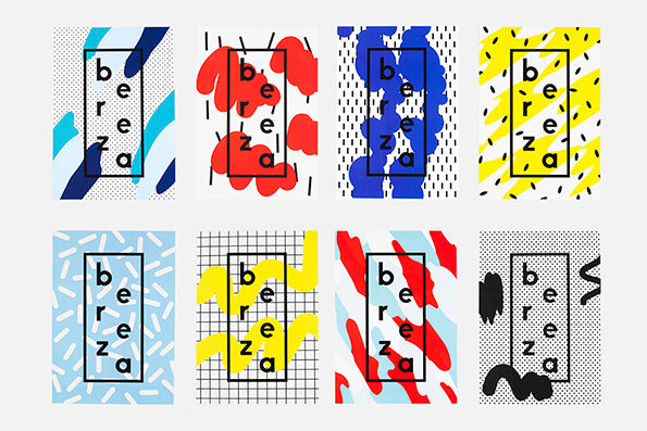
In the 2010s, we’ve seen a resurgence in what the Wall Street Journal has dubbed the “neo-Memphis design aesthetic”. The trend began in product, furniture, interior and fashion design, and it’s now spreading across web, graphic and print design too.
Characterised by the use of flat vectors, geometric patterns, bright pastels, bold blocks of colour, and quirky elements like zig-zags, conftetti and squiggles, the influence of neo-Memphis design can be clearly seen in the work of A-2-O, Muokkaao, Adi Goodrich, Carmen Nacher and others.
With 2016 having been in many ways a depressing year, we expect this bright and upbeat design trend to continue through to 2017. You can see more examples of neo-Memphis design here.
03. More minimalism
If we’re honest, we’re starting to miss skeuomorphism a little. But the day when it makes a comeback still appears to be a long way off, as 2016 saw minimalism and flat design continue to extend their dominance over the creative landscape.
One big driver of this trend has been Google’s Material Design principles which (to oversimplify hugely) promote minimalist, flat design patterns as a way of streamlining the experience of consumers using digital devices. In 2016 the company ramped up its promotion of these guidelines, redesigning its own Google Play icons along Material Design principles, and launching a new Material Design toolkit to get more designers on board.
The near-ubiquity of minimalism has been most obvious in the sphere of logo design, with seemingly every big brand redesign focusing around simplifying their existing identity. Check out the new logos from BT, Subway, Mastercard, Instagram, HP, Bing and Gumtree, and you’ll see what we mean. And this love for minimalism isn’t just influencing logos, but the whole of branding design, with even McDonalds jumping on the minimalist bandwagon.
04. Progressive web apps
For web designers, 2016 was the year when progressive web apps truly entered the mainstream. So what are they?
Definitions vary, but essentially they’re mobile web apps that perform functions previously limited to native mobile apps. So not only do they do sexy things like send push notifications, work offline and load on the homescreen, but they also offer the cool things web apps can do, being linkable, responsive and progressive (in the sense of progressive enhancement for different device capabilities).
Examples of progressive web apps include Flipboard, Washington Post and Google I/O (you can see a longer list here). In short, everyone working in web and app design needs to know about progressive web apps, and there’s an excellent introduction to the subject by Chris Mills here.
05. VR in branding
Virtual reality (VR) technology has been around for a while now. But 2016 was the year it finally entered the branding mainstream, and became something every design studio has to at least consider offering its clients.
A typical project was UNIT9 and BBDO Dusseldorf’s VR installation for Wrigley, which combined the Oculus Rift, the Kinect, 3D graphics, custom sound design, two types of scented air, a harness, and a shipping container to enable users to experience the sensation of flight.
But it’s not just about big-budget, physical VR installations. With the widespread availability of headsets, consumers in 2016 are increasingly enjoying VR experiences in their own homes, and agencies have been responding in kind.
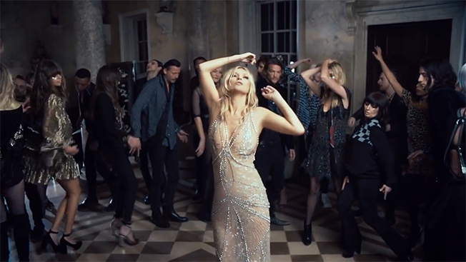
Absolut Labs offered its customers the chance to join musician Deadmaus in virtual reality on an ‘epic night out’; Saatchi & Saatchi created a 35-person VR team to developing VR showrooms for its client Toyota; and make-up brand Charlotte Tilbury let us float around with Kate Moss in outer space to promote its debut fragrance, Scent of a Dream.
Because not everyone wants to spend their money on VR viewers, brands are now giving them away for free. The New York Times shipped Google Cardboard viewers to its print subscribers to promote its new VR app; McDonald's in Sweden gave away its own ‘Happy Googles’ viewers to customers; and charity collectors offered passers-by the chance to experience the life of a Syrian refugee in virtual reality.
Right now, everyone who works in design needs to get on board with at least the basic principles of VR. So check out our guide to VR, tips for using VR in branding; UX designers’ guide to VR; game artists' guide to VR and tips for getting started in VR.
06. Back to the future
Nostalgia has always been an essential element of design. But in 2016 it’s seemed like designers have been digging into the past like never before.
Bringing back classic logos and branding became a design trend in itself, with the Co Op reviving their four leaf clover, NatWest restoring a logo found in their design archives and Kodak’s new logo reviving its classic 1970s camera shutter emblem.
In our opinion, there are plenty of other classic logos that should never have been changed, so we hope this trend continues into 2017.
07. Digital drawing gets physical
There’s long been a divide between digital and physical art. But in 2016, new technologies have continued to bring them closer and closer together.
The iPad Pro, launched at the end of 2015 with the innovative Apple Pen, was the company’s first serious attempt to provide a digital drawing experience that’s resembles drawing on paper. And it was quickly followed by a flurry of apps to enhance the drawing experience, most recently Duet Pro, which offers to make your iPad Pro experience similar to that provided by a high-end Wacom tablet.
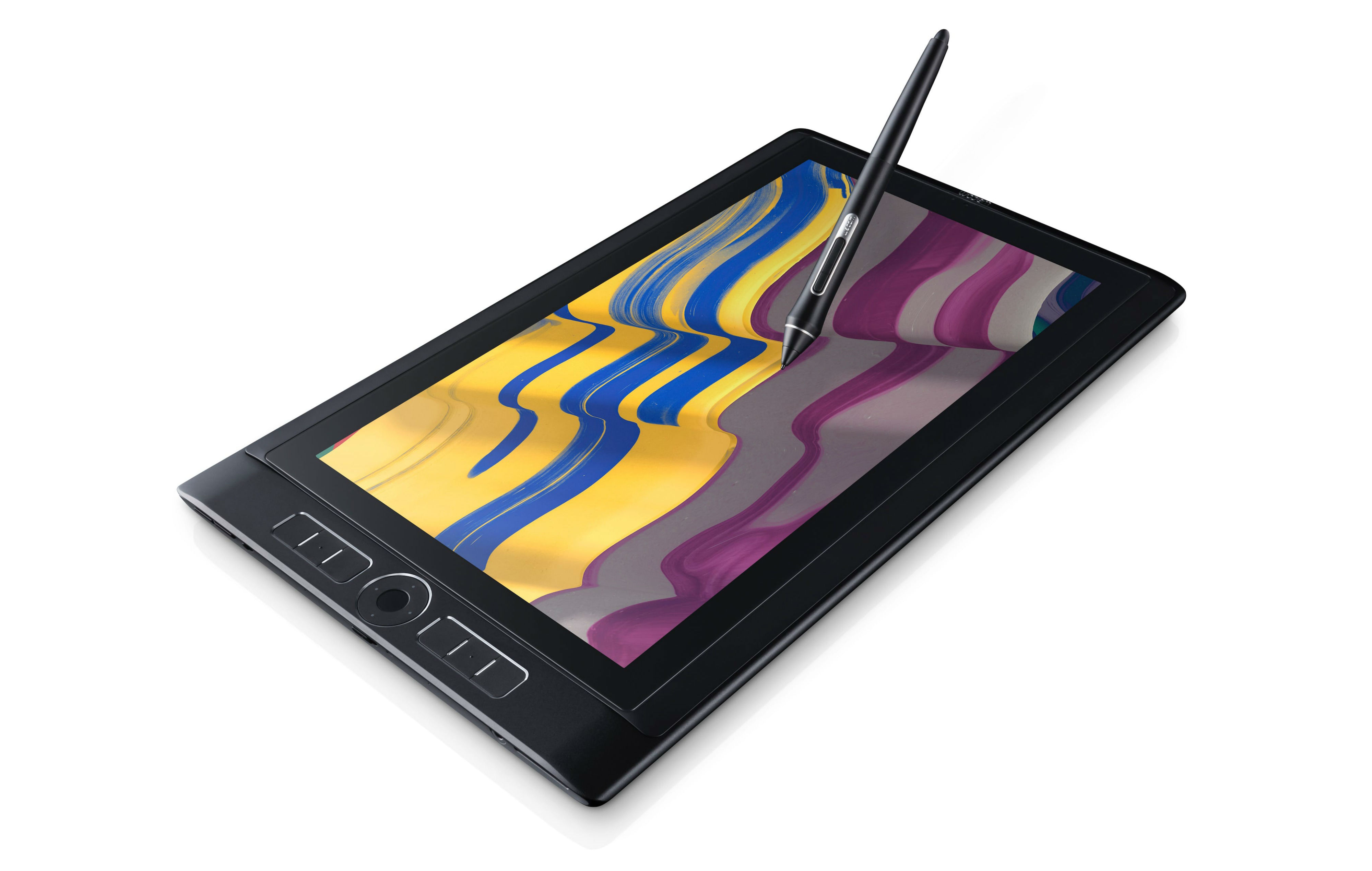
Wacom has, of course, taken none of this lying down, and has been energised into making its own drawing tablets and styluses better than ever. Released this October, its powerful new MobileStudio Pro tablets comes with the new Pro Pen 2, which is claimed to be four times more accurate and pressure-sensitive than its predecessor.
With Adobe working with Tuur Stuyck to create Corel Painter-style, real-time oil painting tools for tablets, and Microsoft openly targeting artists and creatives with its new Surface Studio, it seems everyone wants a slice of the digital drawing space; and that can only benefit creatives going forward.
08. Design software gets super-competitive
Once upon a time, professional design software meant the Adobe suite, and nothing more. Over recent years, that’s all changed, most noticeably with the rise of Sketch, and Illustrator and Photoshop rivals Affinity Designer and Affinity Photo.
This year the race to provide creatives with new, improved tools hotted up like never before. Affinity Designer got a powerful new upgrade and the previous Mac-only tool also launched on Windows. Affinity Photo will follow soon, along with iPad versions of both tools.
Adobe launched Adobe XD launched to take on Sketch, which responded with a series of updates that made the UX tool more powerful than ever. Elsewhere Sketch plugins provider Invision expanded its own repertoire, buying up prototyping app Silver Flows, while powerful new free vector graphics tools like Vectr and Bez had everyone buzzing.
Suffice it to say, design software companies are competing for your attention like never before, so keep an eye on Creative Bloq, where we’ll continue to keep you abreast of developments.
09. AI starts taking over design
In the tech world this year, there was one thing everyone was talking about: artificial intelligence or AI. And it’s not just about driverless cars and automated warehouses; even the work of designers may soon be under threat from this intelligent form of software that can learn for itself and think more like a human.
During his talk at SXSW this March, Wired founder Kevin Kelly predicted that AI would become a utility that can be produced and distributed. "It's going to become a service,” he said. “It's going to be generated in a generating plant that's far from you and sent over the wires to wherever you want, just like electricity."
Kelly predicted the next 10,000 start-ups will use some form of AI, and indeed companies are already using it automate the intelligent and creative tasks traditionally done by web designers (in the case of website building services The Grid and a newly AI-powered Wix) and image retouchers (in the case of the Neural Photo Editor).
So should all creatives be scared for their livelihoods? In this article Jordan Fisher argues that there’s no reason we should be replaced, as long as we rise to the challenge posed by AI and adapt our skills accordingly.

Tom May is an award-winning journalist specialising in art, design, photography and technology. His latest book, The 50 Greatest Designers (Arcturus Publishing), was published this June. He's also author of Great TED Talks: Creativity (Pavilion Books). Tom was previously editor of Professional Photography magazine, associate editor at Creative Bloq, and deputy editor at net magazine.
