Co-op revives its classic clover-leaf logo
The high street food chain has reverted back to an old brand identity, which first appeared in the late 60s.
Sign up to Creative Bloq's daily newsletter, which brings you the latest news and inspiration from the worlds of art, design and technology.
You are now subscribed
Your newsletter sign-up was successful
Want to add more newsletters?
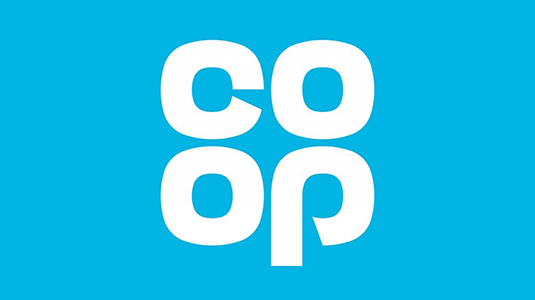
The Co-op has taken its identity back in time by reviving its distinctive clover-leaf logo design, which originally represented the brand from 1968. Created in collaboration with design studio North, the new identity proudly helps the chain go back to 'Being Co-op'.
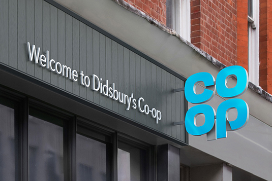
North's founding partner Sean Perkins suggests that reprints of the NYCTA and NASA graphics standards manuals made the studio consider reviving the classic design. "It's a symbol and a wordmark and that's impossible to beat for a graphic designer. It's never dated," he explains.
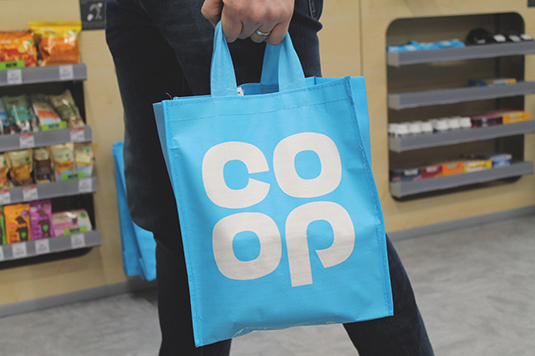
By returning to the classic logo, the Co-op hopes to remind people of what makes the brand truly distinctive. In fact, Perkins makes sense of the rebrand by pointing out that with the 60's logo the Co-op already had a "trust mark, a passion brand, a timeless classic."
Article continues below 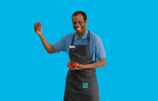
Originally drawn by hand, the four-leaf clover logo identity manual was recalled from the Co-op's archives in Manchester and used as a foundation for the North team. "It was all about building on what they had," Perkins explains.
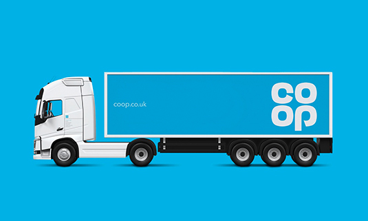
The logo was then redrawn and developed with some geometry by the studio. It was then applied to uniforms, products and vehicles to show how it will link the chain together.
Over 500 stores will be adorned with the rebrand this year, with the rest of the Co-op group getting updated with the design by May 2019.
Sign up to Creative Bloq's daily newsletter, which brings you the latest news and inspiration from the worlds of art, design and technology.

Dom Carter is a freelance writer who specialises in art and design. Formerly a staff writer for Creative Bloq, his work has also appeared on Creative Boom and in the pages of ImagineFX, Computer Arts, 3D World, and .net. He has been a D&AD New Blood judge, and has a particular interest in picture books.
