Kodak updates their classic camera-shutter logo
Kodak are the latest company to revive and polish up an iconic piece of logo design.

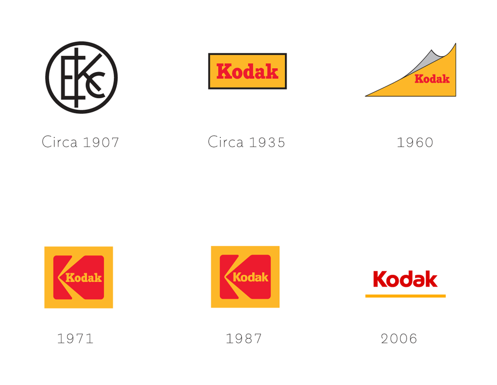
To coincide with their return to the consumer products market, Kodak have polished off their iconic camera-shutter logo design and waved goodbye to the rather uninspiring text based branding they introduced back in 2006. As well as featuring the instantly recognisable red and yellow colour scheme, this latest iteration of the Kodak logo also includes a new typeface and layout which calls to mind perforations found on the edges of old film stock.
The idea of bringing back classic logos and branding appears to be a design trend at the moment, with the Co Op reviving their four leaf clover, and NatWest restoring a logo originally found in their design archives over the last few months alone.

However Kodak's Chief Marketing Officer, Steven Overman, emphasises that the new design by Work-Order isn't a step backwards.
Article continues below“I don’t think of what we’re doing as ‘bringing back’ the iconic identity of Kodak, because in people’s hearts and minds, I don’t think it really went away," he explains. "It’s simply logical to keep one of the world’s most famous brand marks at the forefront of the company’s image and identity.
"We did need to make some updates to the identity design to distinguish it from former eras of Kodak," he adds. "The latest iteration needed to feel fresh, yet classic, yet sit harmoniously alongside a range of logos that you still see on signage and packaging around the world. Our goal is to amplify what is already memorable and resonant around the world.”

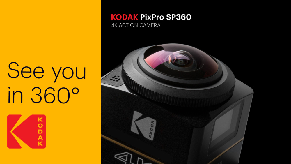
The new logo will appear on Kodak's Ektra smartphone, which prioritises image capturing, as well as the return of their Super 8 cameras and film. With an uncommon vertical sans wordmark that no longer disappears into the crook of the camera-shutter design, this new design really embodies the Ektra's branding of 'a classic is born. Again.'
Sign up to Creative Bloq's daily newsletter, which brings you the latest news and inspiration from the worlds of art, design and technology.

Dom Carter is a freelance writer who specialises in art and design. Formerly a staff writer for Creative Bloq, his work has also appeared on Creative Boom and in the pages of ImagineFX, Computer Arts, 3D World, and .net. He has been a D&AD New Blood judge, and has a particular interest in picture books.
