Google Play logos get uniform redesign
All of Google's Play apps are brought into line with a vibrant flat design revamp.
Sign up to Creative Bloq's daily newsletter, which brings you the latest news and inspiration from the worlds of art, design and technology.
You are now subscribed
Your newsletter sign-up was successful
Want to add more newsletters?

It seems that Google hasn't finished updating its visual identity just yet. Following the new logo design and wordmark which were launched last year, the search engine giant has now tweaked the icons in its Play Store.
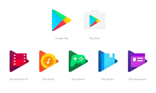
Based around the Play Store's triangular 'play' button icon, the new set of logos now have a more uniform look. The flat design and vibrant colour palette are also more suited to Google's recently updated sans-serif logo.

One of the biggest changes can be found in the new Play Music button. While most of the icons have kept elements from previous designs, such as the games controller and film reel, the Play Music app has ditched its headphones in favour of a musical note. However all of these updates have resulted in a consistent design language which users can expect to see in the next couple of weeks.

Liked this? Read these!
- We reveal where to find logo design inspiration
- Check out these amazing band logos through the years
- Check out these great examples of negative space
- Can you guess the logo in this design quiz?
- The beginner's guide to flat design
Sign up to Creative Bloq's daily newsletter, which brings you the latest news and inspiration from the worlds of art, design and technology.

Dom Carter is a freelance writer who specialises in art and design. Formerly a staff writer for Creative Bloq, his work has also appeared on Creative Boom and in the pages of ImagineFX, Computer Arts, 3D World, and .net. He has been a D&AD New Blood judge, and has a particular interest in picture books.
