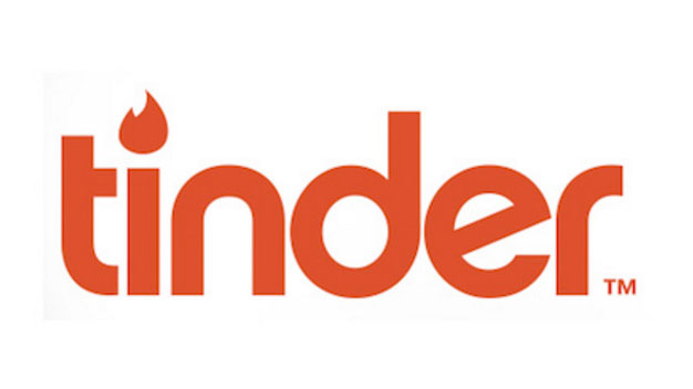
Tinder reveals new app logo
The popular dating and social media app has taken an icon-first approach with its new logo.
The "location-based social search mobile app" (cough – hookup facilitator – cough) Tinder has launched a new logo that gives typography the boot. Distinctively coloured with shades of orange and red, the new flame logo comes hot on the heels of a new look for Tinder, both in terms of branding and navigation.
Getting rid of the name is a sign of Tinder's status as a brand. No longer will it be held back by pesky words, as instead it can let a single gradient-coloured flame do the talking.
Check out how the old and new logos compare by – appropriately – swiping left and right in the gallery below. (Sorry desktop users, you'll have to click.)
Article continues below

Whereas the old logo dotted its 'i' with a version of the flame logo, the new design lets the icon take centre stage. On top of a new colour scheme that follows the colour gradient trend, the new flame is rounder than the previous iteration.
Related articles:
- Why colour gradients are a hot new visual trend
- 10 commandments of logo design
- 15 fantastic logo fonts
Sign up to Creative Bloq's daily newsletter, which brings you the latest news and inspiration from the worlds of art, design and technology.

Dom Carter is a freelance writer who specialises in art and design. Formerly a staff writer for Creative Bloq, his work has also appeared on Creative Boom and in the pages of ImagineFX, Computer Arts, 3D World, and .net. He has been a D&AD New Blood judge, and has a particular interest in picture books.
