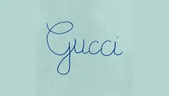
Gucci has caused a social media splash by presenting an updated logo on its Facebook page... and it's quite something. The unusual font, which looks an awful lot like a young child's handwriting, is tied to the luxury brand's Fall Winter 2020 Men’s Collection, which is to be debuted today.
The new-look logo has resulted in some controversy plus a whole lot of noise. Facebook and Instagram users, in particular across Vietnam, have updated their own avatars to a similar handwritten font (to get a similar look, see our pick of the best handwriting fonts). Let's find out why Gucci has chosen such unusual styling for its new collection.

It all began three days ago when Gucci updated its Facebook page (with 18 million followers) with the new logo and accompanying images announcing the collection using the same handwritten font. The scratchy, fountain pen-esque scrawl is imperfect, with blots, wobbles and discrepancies in character size and orientation so there's no surprise that the collection it accompanies is heavily linked to childhood.
Gucci posted a series of teaser posts about the campaign (see the video below), which has the tagline 'Rave Like You Are Five' and is actually inspired by children's birthday parties. The font is based on a typical French child's handwriting. Vietnamese children also learn to write in this style, which is apparently why the image has gone viral in Vietnam.
Alessandro Michele, Gucci's current creative director, masterminded the campaign, which also includes event invitations inspired by the embellished birthday party invitations the children of nobility sent to their friends (below).
The reactions across social media have been mixed. The outright joy sparked for the Vietnamese audience is somewhat countered by other reactions, with user Nguyen Tran Sung commenting: "When you haven't paid salaries for your designers yet. Consequences!!!"
This sentiment was echoed by Ngoc Anh, who wrote: "Thanks for hiring my 2-year-old cousin for this design! 🤣🤣🤣"
But, more positively, Lianne Nguyen commented: "Looking forward to seeing the collection and how it coordinates with this campaign! I'm imagining a bold step towards sth pure and vintage [sic]". And a profound angle from Nguyễn Hà theorises: "When things are highly complicated we do often wish for simplicity."

It's certainly an unusual choice for Gucci, and a huge departure from its usual logo (above). The design could translate in more than one way on the catwalk – though the handwritten choice does sing of simplicity, it is also a playful choice. And the connotations of a children's party nod to a more frivolous angle, as do the retro party images that accompany it.
That a handwritten style can be interpreted in such different ways is a fascinating insight into typography and branding (for more insights take a look at our roundup of the hottest typography trends for 2020). We look forward to seeing how the design relates to the collection itself.
If you want to see what the collection actually looked like, check out this stream of the show.
Read more:

