4 of this year's must-know typography trends
Plus: how to use this year’s hottest trends in your work.
Sign up to Creative Bloq's daily newsletter, which brings you the latest news and inspiration from the worlds of art, design and technology.
You are now subscribed
Your newsletter sign-up was successful
Want to add more newsletters?
According to a popular graphic design YouTube account, 2020 is going to see innovation and modernisation in typography, bringing it hurtling into the new decade (for our pick of the best fonts on a budget, see our free fonts post).
Tom Satori, a designer with almost a decade of experience, has put together a handy video explaining the typography trends of 2020, including how to use them and pitfalls to watch out for. You can watch it below, or read on for a quick summary of the font stylings to put to use in the coming year.
Want a crash course in typography jargon? See our typography design post.
Article continues below01. Bold and heavy fonts
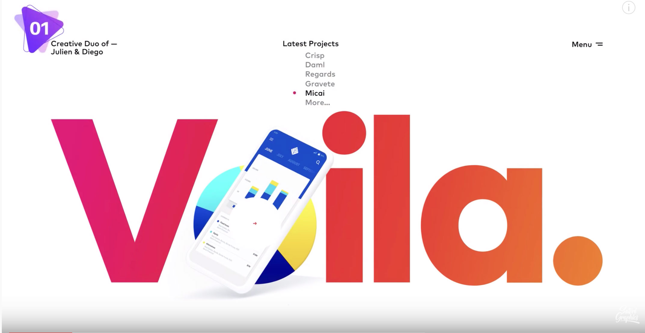
Satori advises that the first typography trend will be to go big and bold. "The heavy use of typography can act as a focal point and draw in a viewer as a visual starting point on your design," he says.
He mentions that it's important to choose the right font family and suggests you adhere to two rules. First, keep the heavy fonts to just a short phrase or a few words or you risk overcrowding, and secondly, contrast the heavy typography with thinner fonts, as it makes the overall design more visually appealing.
02. Typography to create shapes
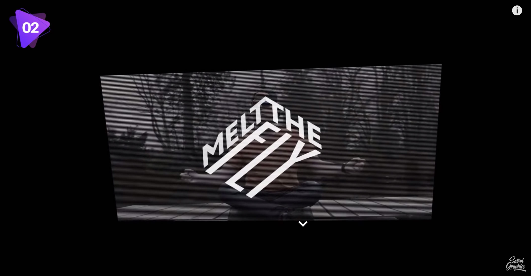
Using typography to create 2D and 3D shapes is about to kick off in graphic design. Satori stresses that it's important to make sure that use of shape fits the design brief, and isn't a random choice that just drops a shape into your design without a reason or "just because it looks cool".
And don't just focus on the use of shape. "Make sure you adhere to other design principles while incorporating this trend," he says. "So use things like balance, focal points, contrast and so forth."
Sign up to Creative Bloq's daily newsletter, which brings you the latest news and inspiration from the worlds of art, design and technology.
03. Maxi typography
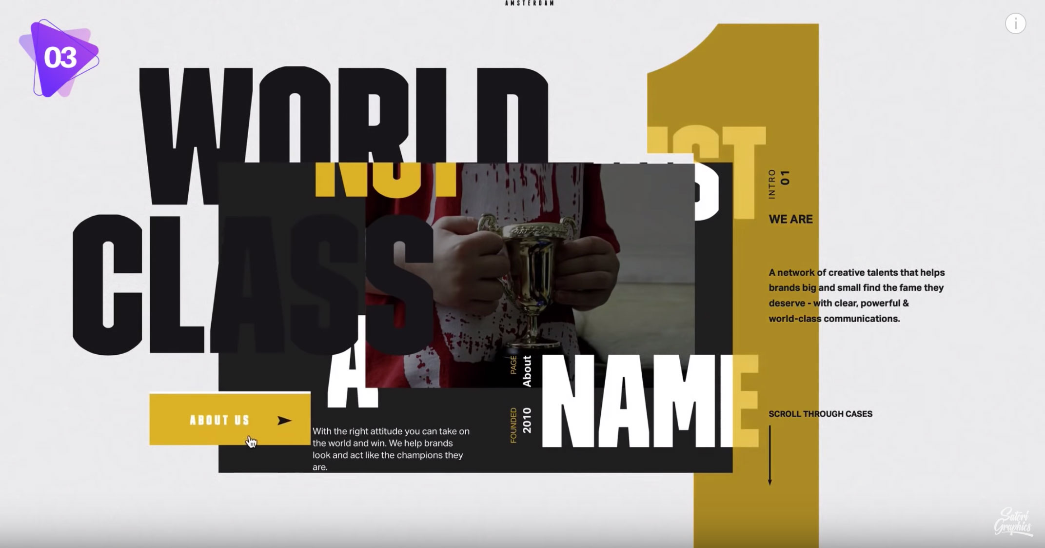
The maxi trend, which began in 2019, is all about attention seeking. "Maxi is the use of typography that is so bold and heavy that it sometimes bleeds off the page, and it really takes centre-stage as a focal point," says Satori.
You can create intrigue and interest with the font becoming obscured by other parts of the design, Satori suggests, and it's important to remember that the maxi typography should always be flat – with zero gradient and no 3D elements.
04. Semi-transparent use of text over design
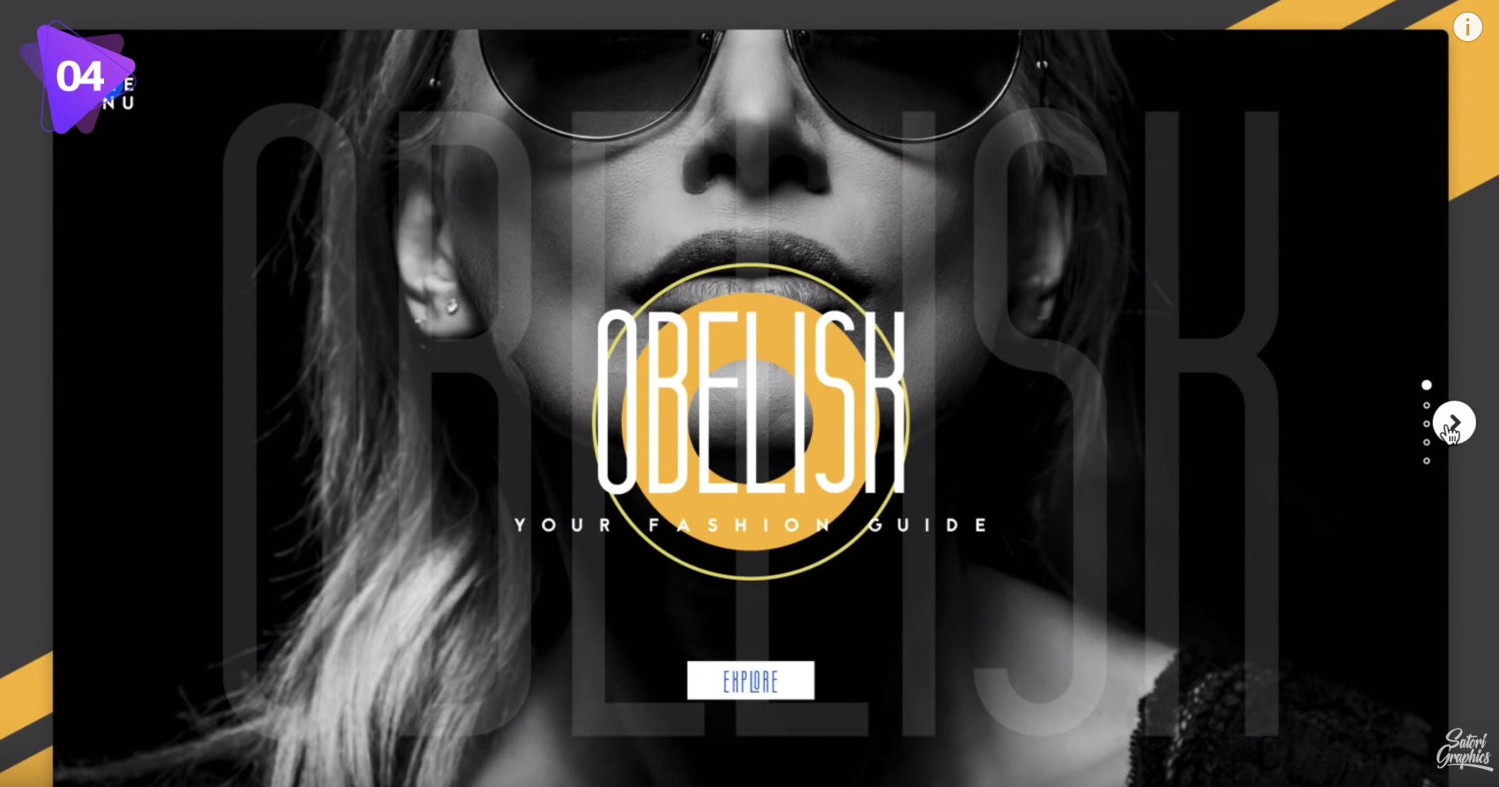
A good choice for busy designs, semi-transparent text works to blend the composition. "It's a nice way to tie everything together and, again, a choice of bold font here is a good move," says Satori.
Satori rounds off the video with a quiz to help cement your new knowledge. The video is a great continuation of the hottest typography trends from the end of last year.
You can check out more of the designer's insights on his YouTube channel, Satori Graphics.
Read more:

Georgia has worked on Creative Bloq since 2018, and has been the site's Editor since 2023. With a specialism in branding and design, Georgia is also Programme Director of CB's award scheme – the Brand Impact Awards. As well as immersing herself with the industry through attending events like Adobe Max and the D&AD Awards and steering the site's content streams, Georgia has an eye on new commercial opportunities and ensuring they reflect the needs and interests of creatives.
