10 unmissable logo design trends for 2021
Get ahead of the game with these predictions.
Sign up to Creative Bloq's daily newsletter, which brings you the latest news and inspiration from the worlds of art, design and technology.
You are now subscribed
Your newsletter sign-up was successful
Want to add more newsletters?
We've seen no shortage of new logo designs in 2020, ranging from the successful to the downright baffling. And we've no doubt we'll be seeing just as many in 2021 – after all, being the first thing many people see, a company's logo is probably the most important aspect of its branding.
A new infographic by logo design service Logaster has arrived to tell you exactly what to expect from the world of logo design in 2021, along with several examples from the past year. While creating something as iconic or instantly recognisable as the best logos ever is far from easy, these 10 tips could help you design a bold and striking logo for 2021.

Some of Logaster's predictions aren't exactly surprising – it'll probably come as a shock to nobody that minimalism is top of the list. Flat, simplified logos have been all the rage for years, with countless companies opting for minimal versions of their existing designs (sometimes to the detriment of usability, as seems to be the case with Google's new logos).
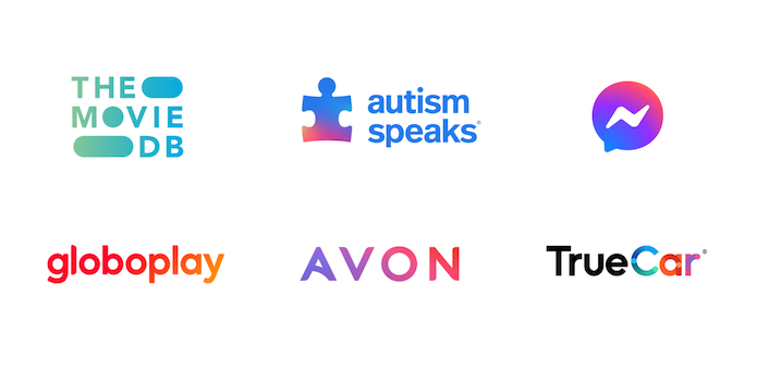
Article continues belowSeveral brands including Facebook Messenger and TrueCar have adopted gradient-filled designs lately, and Logaster predicts 2021 will be all about neon shades and bright, saturated colours. Meanwhile, from symmetrical shapes to the clean, thin lines of logos such as Rolls-Royce's impressive new symbol, the company says we can also expect to see lots of neat and refined designs next year – just the tonic after the chaos of 2020.
You can view the full infographic below, and don't forget to check out these surprising graphic design trends for 2021 for more inspiration. If you're ready to start creating your own symbol, our logo design guide has you covered.
Read more:
- Sony's PS5 London Underground stunt is truly iconic
- The best laptops for graphic design
- 5 huge colour trends for 2021
Sign up to Creative Bloq's daily newsletter, which brings you the latest news and inspiration from the worlds of art, design and technology.

Daniel John is Design Editor at Creative Bloq. He reports on the worlds of design, branding and lifestyle tech, and has covered several industry events including Milan Design Week, OFFF Barcelona and Adobe Max in Los Angeles. He has interviewed leaders and designers at brands including Apple, Microsoft and Adobe. Daniel's debut book of short stories and poems was published in 2018, and his comedy newsletter is a Substack Bestseller.

