5 huge colour trends for 2021
As creative people, we all like to think we don’t follow trends, but do our own unique and original thing. And that’s all to the good. But ultimately, we all swim together in the same cultural sea. And so while you don't want to slavishly copy the latest trends, it’s useful to at least know what they are.
In this article, we’ll look at some of the clearest colour trends to emerge in 2020, that we believe will only heighten over the year to come. We’ll offer examples of the trends in action, and explain why we believe they’re likely to influence creative work across the board, including illustration, graphic design, motion graphics and animation, over the next 12 months.
For advice on how to use these trends in your work, explore our colour theory article.
01. Muted colours and soft pastels
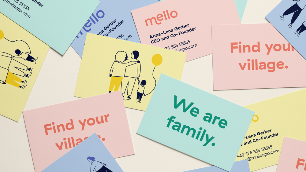
We’ve seen a huge rise in use of muted colours and soft pastels in 2020, and that’s not really surprising. The global pandemic and resulting lockdowns have thrown everyday life into chaos and confusion across the world. It’s the biggest thing to ever happen in most people’s lives, and for many, it’s the scariest. So it makes perfect sense that the design world would respond with calmer colour palettes that provide a feeling of safety and reassurance.
A great example is the visual identity for Mello, an app designed to help parents connect and build support networks during the pandemic. Designed by Studio Skulptur, its colour palette is suitably mellow, clearly conveying the message that everything’s going to be okay, honestly.
When the UK’s first lockdown ended, Camden Town Brewery took a similar approach with its designs for a limited edition beer to celebrate the return to the pub. Based on illustrations by Gaurab Thakali, the palette hit the sweet spot between both warm and inviting, and calm and soothing. And with businesses everywhere struggling to tempt people out of their houses and spending money again, this approach to colour was repeated across the board.
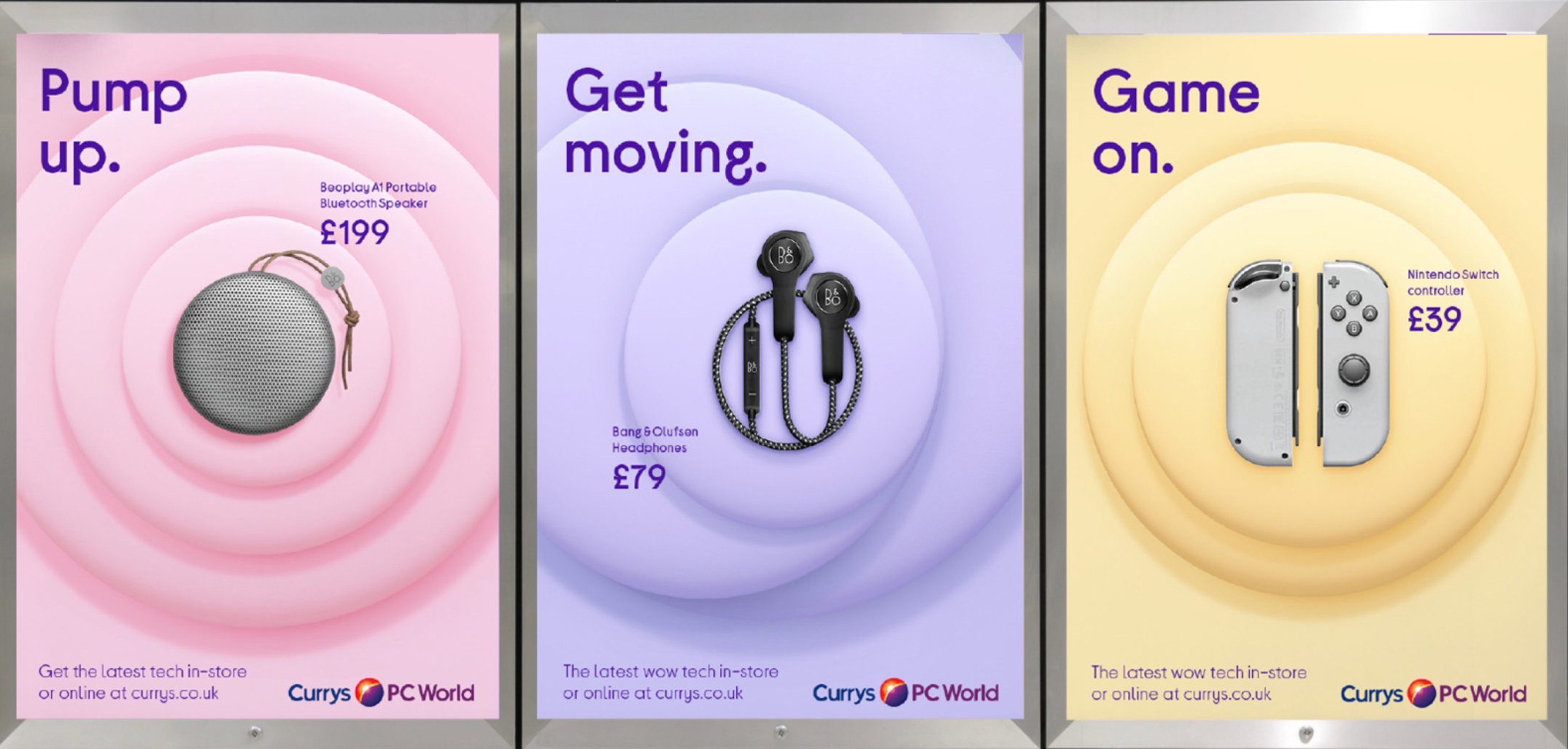
Take the new branding for Curry’s PC World, crafted by Futurebrand (shown above). In a sector that was once dominated by shouty slogans and gaudy, in-your-face colour schemes, it’s striking to see the kind of colour palette you might once have associated with a children’s nursery employed as standard. A similar approach can be seen in Locomotive’s designs for technology company ITI.
02. Nostalgic faded colour
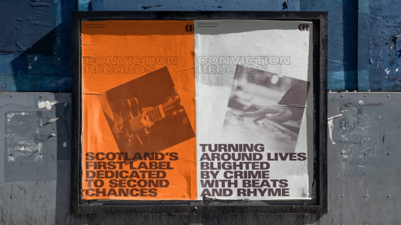
It’s not just muted colours that have been used to evoke calm this year. The faded colours of nostalgia-fuelled designs, harking back to the heyday of print and low-fi production methods, have also been big throughout 2020.
This style has been central to many Covid-centric projects, such as Annie Atkins’ brilliant wartime-parody posters, Virus Slogans, which are now available as postcards. Faded, nostalgia-tinged colours could also be seen in Everything Will Be Fine’s branding for Conviction Records, a social enterprise aimed at crime prevention and rehabilitation (shown above).
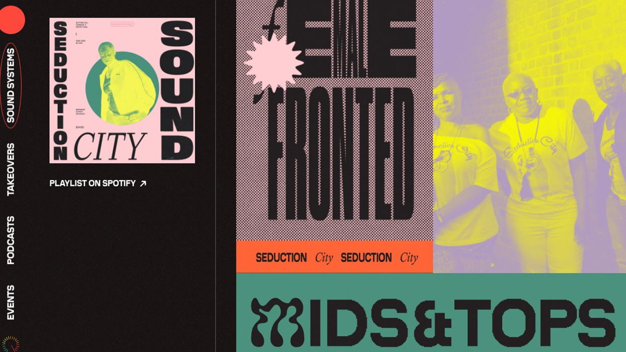
Stink Studios, meanwhile, used a similar approach in their branding for Spotify’s virtual alternative to this year’s cancelled Notting Hill Carnival (shown above). And it can also be seen, too, in Koto’s visual identity for Meatable, a meat company aiming to give its animals a better life.
And the next 12 months? Let's face it, the pandemic's not going away any time soon. And so with more and more of us looking back longingly at the past – a time when we could mingle and hug each other with impunity – we fully expect this colour trend to heighten in 2021.
03. Purposely limited palettes
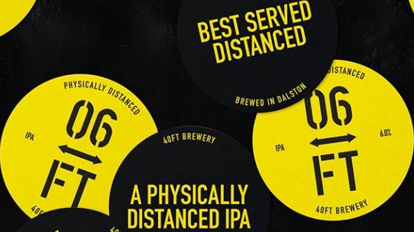
Life in 2020 has been nothing if not limited, with our daily activities stripped-back to the bare essentials. So it makes sense that we’ve seen lots of limited colour palettes across the design world, too.
NorthSouth, for example, took inspiration from the black and yellow tape that’s been spreading across our cities and public spaces when branding 40ft Brewery’s post-lockdown IPA (above). Meanwhile Mouthwash Studio’s visual identities for both fashion label The Museum of Peace & Quiet and furniture retailer Waka Waka kept colour variation to a similarly muted minimum.
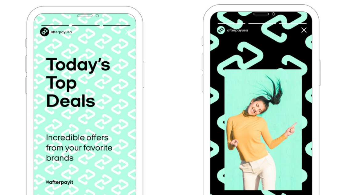
Elsewhere, Yummy Colours took the mint-green trend and ran with it for fintech brand Afterpay, teaming up with Pantone to create a custom colour called Afterparty Bondi Mint, and drenching their new visual identity in the hue (above). This approach was echoed, in other shades of green, by Gretel's celebrated rebrand of NI Instruments.
04. Radical monochrome

When it comes to a nostalgic take on colour, you can’t get much more old-school than black and white. But counterintuitively, we've seen a lot of this colour scheme being used in 2020, not to evoke the past, but herald a radical future. It seems that after the dominance of bright bold neons in the 2010s, monochrome is now the best way to be edgy and disruptive.
Check out, for instance, the visuals on the website for Futurimpose, the rebrand of the design studio previously known as Superimpose (shown above). Monochrome is also used to great effect within the sterotype-busting identity for vegan chocolate Love Raw by Daughter Studio, and the boundary-pushing site for user experience agency Vide Infra.
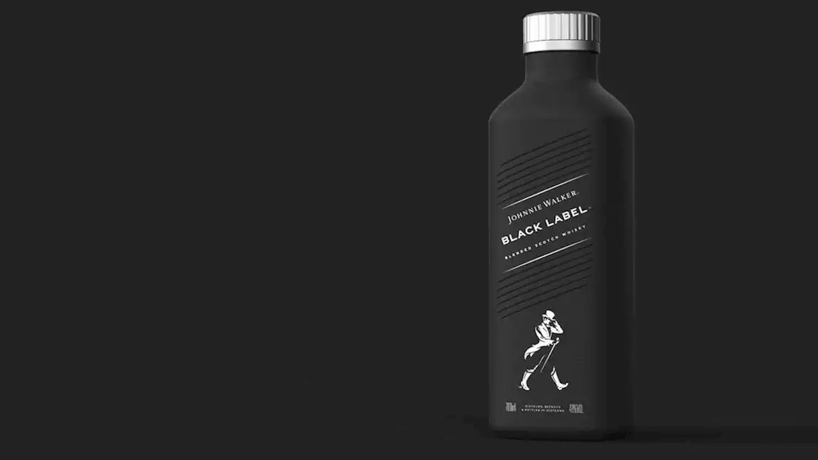
There are signs, too, that this approach to colour is moving from edge cases into the mainstream. Witness the bold and inventive new packaging for Johnnie Walker whisky's new plastic-free bottle by Diageo, for example (shown above).
Also note that monochrome needn't just mean black and white. Beans marketing agency, for one, pulls off the same trick in yellow with its recently redesigned website, crafted by DOPS Digital.
05. Colour as a political statement
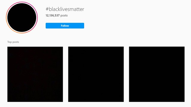
Can you make a political statement with colour alone? That question was swiftly answered following the death of George Floyd this May, when millions around the world posted black squares on their social media feeds in solidarity with the Black Lives Matter movement (shown above).
Another example of the trend was the use of pink by celebrities in the runup to the American elections to show their support for the Democrats, a visual nod to the women’s march of January 2017. Or how in Hong Kong, shops and businesses have signified their opposition or support for the democracy movement, by coding themselves respectively blue or yellow; a reference to the umbrellas used to defend protestors against pepper spray from police.
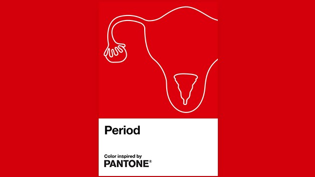
On a different note, Pantone raised eyebrows in October by creating a new colour in collaboration with health brand Intimina called Period (above). An original shade of red that is said to represent a steady flow during menstruation, the release was aimed at creating a conversation around periods and to empower everyone in society, regardless of gender, to talk freely about the subject.
With politics becoming ever more fractured and unstable across the world, and the inevitable economic downturn unlikely to help matters, expect more of this in 2021. And designers would do well to keep on top of the changing political significance of colours, lest they send unintentional signals with their work.
Read more:
Sign up to Creative Bloq's daily newsletter, which brings you the latest news and inspiration from the worlds of art, design and technology.

Tom May is an award-winning journalist specialising in art, design, photography and technology. He is the author of the books The 50 Greatest Designers (Arcturus) and Great TED Talks: Creativity (Pavilion). Tom was previously editor of Professional Photography magazine, associate editor at Creative Bloq, and deputy editor at net magazine.
