Pantone launches a Period colour (and people are seeing red)
It's "active and adventurous" – but is it accurate?
Colour authority Pantone isn't shy about using its colour matching system to highlight social issues and stigmas – and a bold new colour is designed to do exactly that. Made to encourage people to speak more openly about menstruating, the new colour is an original shade of red, simply titled Period.
Launched in collaboration with Swedish menstruation products brand Intimina, the "active and adventurous red hue" is intended to embolden people who menstruate "to feel proud of who they are". (Check out our colour theory guide if you're looking for more shades of inspiration.)
A photo posted by @intimina on Sep 29, 2020 at 9:01am PDT
Made to front Intimina's Seen+Heard campaign, which encourages more accurate conversations around menstruation, the colour is supposed to be "emblematic of a steady flow during menstruation". Intimina has also donated £2,000 to ActionAid, an international charity working with women and girls living in poverty.
Article continues below"We were very honoured to partner with Intimina on the creation of Period, a confident red shade," says Pantone's Vice-President Laurie Pressman. She adds that the colour is meant to empower those who menstruate "to own their period with self-assurance; to stand up and passionately celebrate the exciting and powerful life force they are born with".
We can't fault the intention behind the campaign – creating an official Pantone colour for periods is an admirable way of normalising menstruation and opening up conversation around it. But we're unsure about the execution of the colour itself – and it seems we're not alone.
If your period blood is this colour you should seek medical help. Just sayingSeptember 29, 2020
The worst part about @pantone’s period colour is that it isn’t even really the colour of blood. It’s the colour of a cartoonist heart. This implies that @pantone finds the actual colour too graphic. Which means the insidious message is one of stigma.September 30, 2020
I mean all props to Pantone, but my period’s just never been that colourSeptember 30, 2020
I know yall are pumped about Pantone calling red "period" But I see it as a cutesy and fake ass attempt at feminism. 1. It is called menstruation, 2. It is not the same color red for everyone, 3. Period is a word with a lot of linguistical layers. IF we want to destigmatize...1/2September 29, 2020
That’s more of a Christmas red. I must have chosen the wrong shade when I had periods!September 30, 2020
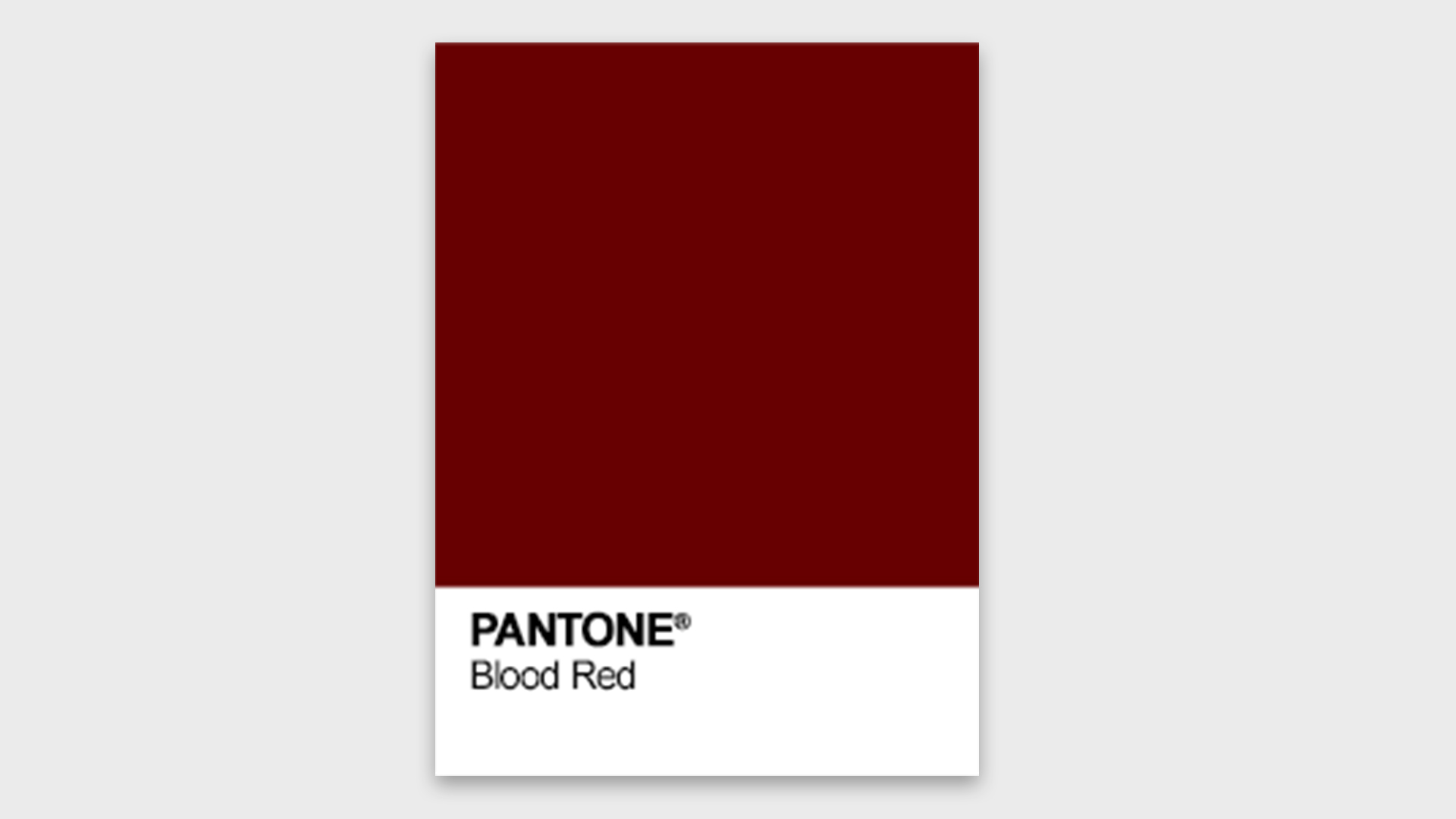
If Intimina and Pantone are looking to encourage more accurate conversations, wouldn't a more accurate colour have helped? There's a distinctly 'ketchup' vibe to 'Period' (now there's a sentence), which, as the above tweets and many more argue, isn't exactly representative of menstruation in real life. And if the "active and adventurous" colour is indeed a deliberately sanitised shade of red, does that not undermine the whole "empowering" message? We can't help but think a variation of Pantone's existing Blood Red shade (below) could have been more appropriate.

It's been a busy year for Pantone, from its recent 'Ultra-Black' collaboration with Nas, and the release of its new real-life Color Match Card. Time will tell what shade the company chooses for its 2021 Colour of the Year – unfortunately, the "calm, dependable and stable" Classic Blue didn't quite turn out to be the most appropriate choice for 2020.
Sign up to Creative Bloq's daily newsletter, which brings you the latest news and inspiration from the worlds of art, design and technology.
Read more:

Daniel John is Design Editor at Creative Bloq. He reports on the worlds of design, branding and lifestyle tech, and has covered several industry events including Milan Design Week, OFFF Barcelona and Adobe Max in Los Angeles. He has interviewed leaders and designers at brands including Apple, Microsoft and Adobe. Daniel's debut book of short stories and poems was published in 2018, and his comedy newsletter is a Substack Bestseller.
